►
Description
Today’s design agenda: http://bit.ly/1TqgXjn
A
Right,
we
are
on
air,
it
is
50
or
a
11th,
and
we're
gonna
have
a
quick
design
agenda
run
through
with
some
cool
stuff
in
it.
Generally
speaking,
we
are
here
in
this
meeting
to
talk
about
issues
that
particularly
are
particularly
relevant
to
designers
or
user
experience
engineers,
and
so
that
we
can
do
working
meetings
rather
than
having
to
throw
that
into
our
other
meeting
as
well.
A
Major
topics
are
backdrop
the
product
and
backdrop
the
website,
starting
with
backdrop
the
product
we
just
had
our
1.3
release,
which
is
great,
let's
ease
your
experience
release
and
we
got
32
new
improvements
in
it.
That's
that
there's
always
more
to
be
done.
We're
looking
forward
to
the
1.4
release,
which
is
currently
scheduled
on
the
fifteenth
there's,
a
handful
of
user
experience
issues
we
didn't
get
into
1.3
that
we
are
hoping
to
get
done.
Some
of
them
are
doozies.
A
Some
of
them
are
little,
we'll
see
how
many
make
you
get
their
growing
point
for
as
well,
but
we
have
two
major
things
that
we're
focusing
on
what
for
1.4
that
are
relevant
to
front
under
steamers
designers.
These
are
experienced
people
and
that
is
adding
a
new
front.
End
theme,
something
that
is
kind
of
blanks,
lady,
but
still
looks
good
out
of
the
box
and
a
new
set
of
layouts.
A
You
can
use
both
on
the
front
end
and
on
back
and
hopefully
using
some
kind
of
grid
system
that
will
be
consistent
throughout
all
of
them,
rather
than
the
three
that
we
have
an
hour
kind
of
oh
good,
standalone
layouts,
but
there
is
a
lot
of
shared
grid
system,
magic,
they're,
all
kind
of
independent.
So
if
we
could
figure
out
a
way
to
get
a
front
end
theme
and
new
layouts
that
were
both
separate,
you
could
use
them
together.
You
could
use
them
apart.
A
B
You
know
more
site
builder,
somebody
who
might
not
know
all
the
moving
parts
that
are
in
Drupal
or
backdrop
or
whatever
and
how
we
can
get
them
on
their
feet
quicker.
So
that
kind
of
led
me
to
having
something
human
hack
against,
like
example,
views
example,
content
and
also
the
I
think
someone
might
maybe
mentioned
having
like
a
checklist
of
things
that
you
can
do
to
start
making
the
site
your
own.
B
By
on,
like
as
a
side
note,
I,
wouldn't
I'm,
not
sure
that
everyone
would
want
to
have.
This
is
their
default
experience,
so
having
an
out
of
this
would
be
good,
Oh
or
an
easy
way
to
turn
it
off
once
it's
once
it's
here
so
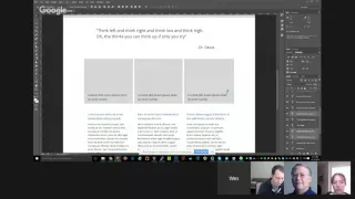
anyway,
this
is
kind
of
wireframe
e
I
know
it's
in
Photoshop
it
looks
design
ii
but
yeah
I'm,
trying
to
just
think
about
general
structure
and
content
more
and
layout,
more
than
like
specific
colors,
fonts
sizes
wrap
size
a
little
bit,
but
anyway,
so
having
kind
of
your
menu.
B
That
has
things
that
I
think
would
appear
on
almost
any
site
and
also
display
the
features
of
backdrops
0
articles
would
have
a
view.
I
have
maybe
me
a
couple
sample
articles
in
it.
That
could
be
actually
help
kind
of
stuff
like
getting
started.
Kind
of
stuff
about
would
be
whatever
and
contact
would
be
an
example
form,
and
then
you
know,
social
links
is
something
I
thought
of
that
like
pretty
much.
Every
site
has
now
and
having
an
easy
way
to
put
denim
and
then
so.
B
The
hero
is
kind
of
a
call
to
action
for
what
we
want
them
to
do
now.
They've
just
installed
backdrop.
So
now
I
just
thought
of
a
couple
things
off
top
my
head.
There
could
be
more,
but
I'd
want
to
keep
it
simple.
Obviously,
so
it
could
be
like
if
we
have
a
list
of
end
up
having
a
list
of
20
things
that
they
could
do
to
kind
of
level
up
and
backdrop
very
quickly
and
get
their
site
working.
B
B
Opinionated
I
guess,
and
then
you
know
some
some
visual
called
actress
alize
might
be
images
with
like
some
text
on
them
or
something
they
could
they
could.
I
was
thinking
right
before
the
call
that
could
be
like
links
to
these
three
pages
or
something,
and
then
you
know
something
more
simple
and
then
the
power
bi
backdrop
block
in
the
footer
just
to
kind
of
give
it
a
very
simple
thing,
and
so
I
was
thinking.
This
would
be
very
image.
B
Oriented,
so
there'd
be
a
fluid
and
anything
that's
this
gray
I
was
thinking
is
an
image,
essentially
this
middle
gray.
So
that
would
mean
that
we
would
launch
with
sample
like
content.
Content,
like
you
know,
images
and
stuff,
so
we'd
have
to
think
about.
That's
like
make
it
easy
to
update
change,
make
their
own.
B
But
thinking
of
this
theme
as
kind
of
a
picture
frame-
okay,
you
know,
like
the
theme
itself,
isn't
really
what's
going
to
sell
it.
It's
going
to
be
the
imagery
and
verbiage,
and
just
making
that
look,
nice
and
clean
so
trying
not
to
go
crazy
with
the
design
but
I
as
a
designer
I
tend
to
be
a
little
basic.
So
I
don't
know
if
having
someone,
that's
like
really
good
at
gloss
like
Darius.
Something
might
might
also
benefit
if,
if
we
like
destruction
or
what
or
whatever
so
I
think.
A
C
Right
I
mean
twitter,
twitter,
let
you
do
just
a
minor
amount
of
color
palette
as
well,
but
about
having
hero
images.
Is
it
great,
like
a
user,
can
customize
the
hero
image
really
easily
and
change
the
total
feel
of
their
site
with
an
image
and
I
think
that
that's
a
good,
a
good
thing
for
swapping
out
I,
mentioned
in
a
couple
of
issues,
I'd
really
like
to
have
a
hero
like
customizable
image
block
in
like
a
dollar
box
or
or
or
some
kind
of
block
for
just
saying
this.
C
C
A
We
awesome.
We
also
need
to
like
these
things
that
people
are
going
to
be
changing,
needs
you
I
right,
so
we
need
to
figure
out
whether
the
UI,
for
that
is,
like
a
block.
Do
you
edit
the
blockers
that
a
theme
setting
where
you
upload
a
new
banner
image,
or
do
you
create
an
node
that
has
an
I
don't
know
like
there's
just
so
many
different
ways
to
skin
this
cat
yep.
A
C
A
I
think
like
having
the
more
the
less
glosses
on
it,
the
more
versatile
it
is,
the
more
adult,
quite
different
kinds
of
things:
I
love
the
idea
of
just
sticking
with,
like
you
know,
black
white
grey
right
with
the
dark,
corners
and
dark
header
work
for
anyone,
and
then,
if
we
do
want
to
do
color
module
integration,
you
could
like
change.
The
header
photo
color,
something
we
could
keep
it
super
simple,
which
I
think
it
makes
me
less
hesitant
like,
depending
on
how
crazy
it
was
going
to
be.
I
was
like
no.
B
D
A
I
also
really,
like
the
idea
of
you,
know
pairing
this
with
all
the
sample
content
like
dr.
Seuss
quotes,
or
whatever
we
want
to
throw
in
there
to
start
will
give
people
a
much
better
idea
of
like
oh.
This
is
what
my
website
will
look
like
and
then
let
me
just
edit
it
and
I
think
I
think
that
you
know
having
the
three
items
in
the
middle.
The
link
to
the
three
pages
is
also
good,
because
people
wouldn't
know
how
to
do
that
necessarily
remem.
C
C
So
one
thing
about
the
checklist
is
that
we
used
to
have
really
in
back
in
the
olden
days
like
Drupal
6
or
something
like
that.
We
had
a
really
elaborate
homepage.
If
you
hadn't
yet
created
any
content
is
like
here's
things
you
can
do
on
your
site
and
it
was
theme
settings
and
you
can
create
content.
You
can
set
up
vocabularies
and
it
was
like
all
of
these
things
and
in
usability
testing
we
found
that
most
of
the
time
it
was
ignored
because
it
was
too
much
text.
C
But
if
it
wasn't
ignored,
people
would
read
the
entire
thing
and
they'd
be
like
okay.
I
want
to
do
some
of
those
things
and
one
of
the
things
was
like
add
content,
and
as
soon
as
you
added
content,
then
the
checklist
disappeared
of
like
things
you
could
do,
and
there
were
like
that
information.
You
know
so
that
that's
something
we
need
to
think
about
that.
Putting
stuff
like
this
on
the
homepage
like
how
does
the
user
get
rid
of
it?
And
if
we
do
it
automatic.
C
A
You
can
give
sy
Becker
feedback
on
any
site
using
this.
This
thing
it's
like
the
universal
like
I,
want
to
tell
you
your
website's
broken
thing.
Wouldn't
we
had
something
like
that
that
just
like
sat
on
the
sidebar
that,
like
Hubbard
and
all
of
your
page,
that
was
like
checklist
or
something
that
wasn't
on
a
page
that
wasn't
like
in
your
navigation
but
was
always
there
so
that
you
could
like
slide
it
out,
be
like
here's.
What
we
wants
than
that
I,
don't
know,
you'd
be
able
to
find
it.
A
B
C
Yeah,
if
we
did
that
the
I
mean
that's,
it's
actually
good,
it's
a
good
idea,
but
if
we
did
that,
then
it
would
no
longer
that
the
checklist
would
no
longer
be
relevant
to
the
design.
We
could
just
remove
the
checklist
entirely,
but
then
we
need
I
mean.
Obviously
we
need
to
figure
out
something
else
that
goes
up
there
at
the
top,
which
you
probably
want
anyway.
You
know
like
a
site
title
or
call
to
action,
or
you
know
the
classic
design
for
a
website
these
days.
C
Actually
even
like
backdrop,
CMS
dork
does
this
that
the
there's
the
header
image
or
the
header
hero,
and
then
you
know,
there's
the
single
button,
or
maybe
two
buttons
in
the
middle.
That
actually
say
you
know
like
the
call
to
action,
download
or
more
info
or
contact,
or
something
like
that.
You
know
I.
B
Think
I
think
we
could
repeat
the
checklist
as
long
as
it's
clear
that
they
are
the
same
thing
so
like
it
could
be
that
this
says
get
started.
Checklist
and
there's
a
tab
says
gets
our
checklist
and
if
you,
you
know,
click
the
call
to
action,
it
just
opens
it
or
something:
I,
don't
think
it
yeah.
If
we
put
it
somewhere
else,
I,
don't
think
it
necessarily
means
we
have
to
remove
it.
If
we
think
of
something
better,
it
totally
scrapped
that
or.
A
B
C
C
C
A
B
A
A
B
A
A
C
C
B
A
C
A
C
Is
the
the
premises
is
good,
though
it's
like
you
know
it's
simple:
it's
it's
kind
of
a
one-column,
you
know,
but
I
guess
done,
I
mean
if
we
want
to
have
three
columns
at
the
bottom
yeah.
We
need
to
make
a
new
layout,
possibly
I'm.
Not
sure
I
mean.
Am
I
doing
I
not
sure
that
I
would
we
could
do
this
with
the
Bartok
layout?
If
we
wanted
to,
you
know
the
one
that's
crazy,
because
it
has
a
triptych
down.
A
C
C
C
B
And
one
thing
you
can
do
that
I've
done,
you
can
there's
a
way
to
count
in
CSS.
So
I
can
say
if
there
are
three
things
in
this
div
make
them
each
thirty-three
percent
its
kind
of
CSS,
wizardry
and
like
it
is
a
compatibility,
goes
back
pretty
far
it.
You
need
end
child
essentially
so
yeah
we
could,
it
could
be
one
column,
and
but
this
would
have
to
be
a
different
region.
I,
don't
know,
I
mean
if
we,
if
this
is
if
this
goes
hands
at
hand
with
like
more
layouts
in
co,
earth
and
yeah.
A
C
Or
you
know
if
we
have
the
sample
content,
that
our
sample
content
and
sample
like
if
this
is
a
view
that
is
pre-configured
with
the
standard
profile,
we
could
do
something
like
a
you
know.
We
can
have
a
CSS
component
in
this
miss
max
sense
of
things
that
is,
like
you
know,
sample
content,
CSS
kind
of
thing
where
it's
like.
C
It
includes,
like
the
view,
that's
out
of
the
box,
and
you
know
that
the
any
styling
on
default
content
that
we
want
out
of
the
box,
because
one
of
the
things
that
we'd
mentioned
in
what
we
want
in
the
new
core
theme
is
we
want
it
to
be.
Also
sibley,
like
you
know,
useful
as
a
base
theme.
So
it's
like
if
you,
if
you
were
to
copy
and
paste
this
theme
or
if
you
were
to
extend
this
theme
as
a
as
a
child
theme,
then
it
would
be
useful
to
you.
C
B
A
A
A
C
You're
right
that,
like
in
interpolate,
they
actually
literally
made
a
separate
component
CSS
file
for
like
every
single
block
and
for
every
single,
whatever
I.
Don't
think.
That's
a
good
idea
unless
you're
using
SAS,
like
that's
just
way
too
many
CSS
files,
so
yeah
I'm,
but
in
this
special
case,
like
I,
think
that
we
need
to
separate
it
out
so
that
it
could
be
excluded.
Ok,
like
all
of
that
default
stuff,
yeah.
A
C
B
D
A
B
A
C
I
do
also
like,
like
we
mentioned,
you
know
where
there's
an
issue
for
having
a
front
page
view
without
Bobby's
a
front
page
layout
out
of
the
box.
I
would
obviously
be
part
of
this,
and
I
do
think
that
if
we
can
stick
to
using
a
single
column
for
the
front
page
that'll
be
the
most
universally
useful.
A
C
That
three
column
down
at
the
bottom,
I,
like
that
being
a
view
that
it
is
just
happens
to
be
themed
as
a
grid
or
styled
as
a
grid,
right
rather
it
being
part
of
layout.
So
it
that
way,
a
person
removes
it
and
add
something
else.
There
you
get
a
single
column
overall,
which
I
think
is
the
best
way
to
go
most
likely
to
be
useful
to
more
people.
C
A
B
Right,
yeah
and
something
fun
if
we're
gonna
do
that
it'd
be
cool
to
have
to
gamify
this
a
little
bit
like
the
you
know,
linkedin
that
it's
like
you're,
this
much
complete
and
like
just
if
a
checkbox
checklist
checkboxlist
is
one
thing
you
can
get
a
percent
pretty
easily
and
yeah.
I
can
animate
something
fun
and
be
like
you're,
almost
complete.
C
A
Well,
that
looks
great,
I'm
feeling
very
optimistic
about
the
new
theme
for
1.4
other
things.
Going
on
on
back
top
CMS
org
we
have
the
user
page
app,
which
is
fantastic.
Wes
I
tried
to
install
the
edit
form
but
I
think
I.
Did
it
wrong,
like
I
merged
the
branch
and
then
I
broke
everything
and
I
was
like
oh
I
shouldn't
just
merge.
Maybe
I
should
figure
out
like
Justin
before
I
emerge
when
I
unmerged
and
I
tried
to
test
and
I
couldn't
quite
get
I.
Couldn't.
B
B
A
D
A
B
Don't
remember,
there
was
oh
yeah
they're
worse.
The
logging
in
is
really
weird
on
my
local,
for
some
reason
like
reset
links
or
being
weird
and
like
I,
can't
change,
passwords
and
I.
Don't
like
I,
probably
don't
have
an
Apache
module,
enabled
or
something
stupid
if
I
know
what,
but
or
maybe
it's
hiding.
D
A
Inc
I
think
it
looks
fantastic
and
I
would
love
to
get
what
you've
done
like
on
the
site.
I
just
couldn't
I
thought
I
was
like
missing
something
it
might
have
been.
That
config,
like
maybe
I,
should
just
start
with
a
fresh
copy
and
make
sure
that
when
I
called
the
branch
ever
I
run
the
update,
I,
don't
know
what
I
what
I
had
going
on
in
my
own
config,
but
it
could
have
been.
There
was
some
kind
of
issue
and
I.
B
B
B
A
Then
other
stuff
we
have
the
blog
news
section,
which
is
fine
for
now,
with
Darius
is
going
to
do
a
design
review,
I
think
after
sand
camp.
So
in
two
weeks
or
so,
we
should
get
updates
on
that
and
then
I
created
an
issue
today
for
the
showcase
section
of
the
site,
which
is
something
that
we're
going
to
need.
These
people
are
starting
to
ask
for
examples
of
sites,
earning
back
job
and
so
I
went
through
and
found
a
list
of
four
showcase
sites.
A
B
D
A
A
To
add
that
to
that
issue
and
we'll
take
a
look,
it's
issue
number
176
and
just
trying
to
figure
out
like
what
kind
of
information
we
should
be
collecting
and
how
we
should
be
displaying
it
and
then
once
we
have
that
list,
we
can
either
go
into
a
design
phase.
If
we
have
resources
for
that
or
we
could
just
try
and
build
something
and
then
design
it
later,
which
works
depending
on
how
crazy
the
thing
is
we're
trying
to
build.
If
it's
something
like
a
blog
section,
we
can
build
a
person
design
it
later.
A
The
showcase
might
need
to
have
like
well
thought
out
design
before
we
build
it,
but
we'll
see
what
kind
of
information
we
start
trying
to
collect
and
then
other
things
that
we're
not
working
on
actively
but
have
a
plan
to
is
an
event
listing
which
will
probably
build
first
to
design
later
and
a
service
provider
listing,
which
will
probably
be
the
same
sort
of
thing.
We'll
need
content
buckets
for
that
to
try
and
figure
out
what
information
we
want
to
collect
about.
A
All
these
services
I'm
going
to
try
and
categorize
them
if
they
want
to
try
and
self
categorize
themselves,
we
need
to
just
kind
of
love
that
leave
them
a
free
from
way
to
provide
what
they
do.
Stuff
like
that
and
then,
since
our
last
design
meeting,
also
tried
to
make
a
little
progress
on
some
of
this
stuff
for
backdrop,
CMS
to
ord
wood
that
was
blocked
on
development
added,
a
views
handler
for
project
module
to
pull
out
some
of
the
information
we
needed
for
project
pages.
A
I
started
trying
to
clean
up
a
little
bit
based
on
feedback
how
people
were
interacting
with
us.
We
obviously
have
a
lot
more
work
to
do
there.
We
need
to
go
through
a
whole
design,
implementation
for
themes
which
haven't
been
done
yet,
but
there
were
a
lot
of
technical
things
that
needed
to
get
sorted
out.
So
I
figured
spending
some
time
in
the
weeds
on
those
might
be
a
good
place
to
get
started.
So
I'll
probably
continue
on
that
too
I'm
getting
more
project
module
integration,
I
think,
is
top
of
that
list.
A
Alright,
we
have
other
things
going
on
as
well.
That
are
not
backdrop
CMS
org
related.
We
a
set
of
slides
that
are
beautiful
and
anyone
can
use
them
at
any
talk.
They
give
on
backdrop
once
you're
done.
If
you
have
your
own
slides,
either
modified
the
ones
that
are
there
added
them.
We
would
love
to
get
a
pull
request
back
on
those,
so
the
prep,
the
repository,
is,
in
the
backdrop,
ops
group
and
it's
called
slides,
and
we
also
have
a
couple
of
issues
in
the
backdrop
CMS
or
q,
that
are
tagged
with
marketing.
A
So
if
anyone
has
any
marketing
skiller
experience,
we
could
definitely
use
help
on
those
particularly
well
into
this
group.
Is
there's
one
that
is
helping
us
figure
out
our
online
identity
branding
wise?
So
we've
got
one
open
issue:
that's
like
we
can
use
a
banner
image
I'm
talking
about
banner
images
today,
anyway,
our
facebook,
twitter,
google+
profile
and
I
could
use
a
little
love.
A
I
know
that
someone
who's
been
working
on
that
lately,
but
if
anyone
else
has
any
feedback
or
wants
to
try
your
hand
at
making
pretty
pictures,
we
definitely
need
help
in
that
area.
We
also
have
a
human
interface
guidelines
document
that
we've
been
working
on
all
started
working
on
probably
more
than
a
year
ago,
but
hasn't
got
any
attention
in
a
while.
That's
a
place
where
we
can
document
user
experience,
elements,
people
think
parts
of
backdrop.
The
people
interact
with
why
you
should
use
them
when
you
should
use
them.
A
Mike
McCaffrey
brought
up
this
good
idea
recently
that
maybe
every
time
we
add
some
kind
of
element
like
that
into
backdrop
core,
we
should
have
part
of
our
process
be
to
document
how
to
use
interact
with
that
element
here,
so
that
it
would
be
like.
Okay,
we've
committed
this
issue:
here's
the
follow-up
that
needs
to
get
done.
A
That
would
document
the
thing
I'm,
not
sure
we're,
adding
a
lot
of
new
things,
but
I
think
that
is
a
good
idea
if
we
do
come
up
with
a
new
interface
pattern,
something
we
really
like
to
document
it
so
that
can
trip
Canton
can
know
how
to
use
it
in
their
projects
and
when
they
should
use
it
or
if
they
should
use
it.
So
I
think
that's
a
really
great
idea.
A
I
would
love
to
see
more
movement
on
the
human
interface
guidelines
document
anyway,
so
I
will
probably
start
trying
to
do
that
if
anyone
wants
to
study
interaction
patterns
and
opens
our
software
and
document
them
all.
For
us,
that
would
also
be
really
great,
but
yeah
all
right
now,
I
just
have
a
repository.