►
From YouTube: Paula Goyanes - The internet is for everyone - how to build for accessibility and inclusion
Description
The internet is for everyone - and your website can be too. Web accessibility refers to the design and creation of websites that can be used by anyone, regardless of situation or disability, and is a key component of a more inclusive web. In this session, you will learn best practices for building accessible products and how they can benefit your users and your company.
A
Hi
I'm
paola
aguianes
and
I
work
as
a
full-stack
software
engineer
at
launch
darkly
and
I'm
passionate
about
technology.
I'm
passionate
about
inclusion
and
accessibility
is
at
the
intersection
of
that.
So
I
want
to
give
you
this
talk
to
get
you
excited
about
accessibility
and
to
show
you
all
the
basics.
A
Let's
start
with
some
definitions
right.
What
is
accessibility,
so
web
accessibility?
It's
really
just
about
building
with
empathy
and
creating
websites
that
can
be
used
by
anyone
and
everyone,
regardless
of
limitations
or
disabilities,
and
inclusion
is
about
welcoming
all
people
and
your
product
is
inclusive
when
it
is
usable
by
the
widest
range
of
people
right
and
that's
included,
but
not
limited
to
people
with
disabilities.
So
this
is
a
key
component
in
a
more
inclusive
web.
But
who
is
this
for?
A
Definitely
the
15
of
the
world's
population
living
with
a
disability
that
is
one
billion
people
y'all
and
in
the
us
it's
26
percent
of
adults.
These
stats
actually
apply
often
to
long-term
disabilities
for
insurance
and
welfare
systems,
so
they
discount
other
limitations,
we're
also
looking
at
people
with
temporary
limitations.
You
went
to
the
eye
doctor.
You
got
your
pupils
dilated.
Maybe
you
broke
an
arm
people
with
situational
limitations
right
now,
I'm
in
florida.
A
It's
really
bright
here
and
there's
like
a
ton
of
glare
from
the
sun
on
my
screen,
or
maybe
you
you're,
holding
a
baby
in
one
arm.
But
who
else
does
this
benefit?
Okay?
Well,
english
is
my
second
language,
but
I
I
still
speak
it
fluently
and
yet,
when
I'm
watching
british
television,
I
have
to
have
subtitles
subtitles
voice
commands.
Those
are
all
accessibility
features
that
we
might
all
use
and
that's
the
first
big
takeaway
accessibility
benefits
everyone.
A
Let
me
show
you
an
example
of
this,
so
I
coded
up
this
site
for
wellmeaning.io.
Okay,
no
shade
this
year
is
tough
and
wellmeaning.io
is
trying
their
hardest
and
from
a
visual
standpoint,
the
site.
The
site
is
beautiful,
but
there
are
some
accessibility
issues.
I'm
going
to
show
you
how
to
spot
more
of
these
shortly,
but
for
now
you
might
already
be
perceiving
some
of
them.
For
example,
this
navigation
bar
at
the
top
is
difficult
to
read.
A
I
can
barely
read
that
sign
in
against
the
yellow
and
for
someone
sighted
this
might
be
annoying,
but
for
somebody
with
low
vision,
this
is
unusable,
and
this
may
look
familiar
because
I've
seen
this
exact
pattern
out
in
the
wild,
and
I
quoted
up
this
website
as
an
amalgamation
of
a
lot
of
tech
company
home
pages.
Only
30
of
websites
are
accessible,
there's
a
focus
on
visual
beauty,
so
these
mistakes
are
happening
they're
out
in
the
wild.
A
But
how
do
we
spot
all
of
the
issues
right
and
how
do
we
know
how
to
fix
them?
There's
a
document
for
this
wcag
web
content.
Accessibility
guidelines
are
the
standard.
They
cover
a
wide
range
of
recommendations
for
making
web
content
more
accessible
and
it's
better
to
follow
guidelines
when
we
fix
these
issues
so
that
we're
doing
so
consistently
with
established
patterns
and
users
know
what
to
expect.
I
won't
go
into
these
details,
but
it's
got
a
success.
A
Criteria
for
different
levels
of
conformance,
basically
there's
a
to
triple
a
and
the
more
a's,
the
more
strict,
so
here's
an
example
really
relevant
to
wellmeaning.io
for
a
success
criteria
to
make
sure
that
this
text
is
readable,
texts
must
have
a
contrast,
ratio
of
4.521
okay.
So
now
that
I
know
this,
let's
go
ahead
and
try
to
implement
this
on
well
meaning.
A
So
here
I
am
on
the
site
and
I
can
see
some
of
the
accessibility
issues,
maybe
not
all
of
them
spoiler
actually
most
of
this
text,
if
not
all
of
it
is
inaccessible,
but
I'm
going
to
use
an
automated
tool
to
help
me
catch
some
of
the
things
that
I
might
not
have
noticed
here.
I've
got
the
developer,
chrome
tools
open.
I
am
on
these.
This
lighthouse
tab
lighthouse
is
awesome.
It
lets
you
run
several
kinds
of
audits
and
reports.
I've
chosen
to
run
an
accessibility
report.
Now
this
isn't
going
to
catch
everything.
A
A
It's
even
going
to
highlight
the
element
which
is
really
helpful
and
it's
funny
because
this
isn't
necessarily
the
element
that
sighted
users
might
have
caught,
which
is
why
it's
so
good
to
manually
test
as
well
as
automated
tests.
Now
I
know
what
the
issue
is,
but
you
know
how
bad
is
it?
What
do
I
do?
A
I
recommend
this
awesome
tool
from
web
aim.
The
color
contrast
checker.
I
know
the
hex
code
of
this
button
background
color,
and
I
know
that
the
text
is
white.
I've
plugged
in
these
two
values
and
I've
been
told
now
what
the
contrast
ratio
is,
and
it
is
2.08
that's
worse
than
I
would
have
even
thought
and
we
are
failing
across
the
board.
Okay,
but
you
know
what,
if
this
is
kind
of
close
to
your
brand
color
like
what
do
you
do?
What
do
you?
What
do
you
use?
A
Instead,
there's
another
great
tool
for
this:
the
accessible
color
generator
and
now
all
of
these
are
free.
You
can
plug
in
a
hex
code
again
I'm
plugging
in
this
hex
code
for
my
background,
color
against
white,
and
it
will
recommend
to
you
the
nearest
color
that
will
be
accessible
awesome
so
now
that
I've
been
able
to
use
these
tools,
let's
go
ahead
and
improve
our
website
on
the
left.
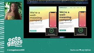
I've
got
wellmeaning.iob4
on
the
right.
I've
got
an
after
we've
gone
from
a
95
to
100,
accessibility
score
and
it
didn't
take
anything
away.
A
This
looks
just
as
good,
if
not
better
and
is
more
readable
regardless
of
disability,
and
this
is
another
key
takeaway
accessible
design
is
good
design.
A
design
won't
be
beautiful
to
someone
who
can't
perceive
it.
I
really
think
that
the
best
design
can
be
appreciated
by
all,
and
so
far
we've
been
focusing
on
perceiving
that
design
visually,
but
there
are
other
ways
people
perceive
content
on
the
web
and
oftentimes.
A
This
is
with
assistive
technology.
So
let
me
tell
you
a
little
bit
about
that.
Using
assistive
technology,
a
very
common
assistive
technology
is
screen
readers.
What
they
do
is
that
they
read
web
content
and
images
out
as
text
who's
using
them.
People
who
are
blind
who
have
literacy
limitations,
people
who,
like
british
people
reading
things
out
to
them,
accessibility,
is
for
everybody
and
if
you're,
using
a
mac
computer,
you
have
access
to
a
screen
reader.
A
I
really
urge
you
to
try
this
press
that
home
button
three
times
and
you
can
choose
to
enable
voiceover
and
use
that
screen
reader.
Now,
if
you're
on
a
different
os,
there
are
downloadable
solutions
like
jaws
or
go
old
school.
I
have
done
this.
Have
a
friend
read
the
html
and
text
out
to
you,
and
so
this
is
how
you
can
make
an
image
perceivable
to
a
screen
reader.
Here
I've
got
this
image
of
a
pig
and
in
this
code,
snippet
I've
coded
up
this
image
and
I've
added
an
alt
text.
A
Now,
if
you've
ever
heard
anything
about
accessibility,
chances
are
the
thing
that
you
heard
about
was
alt
text,
and
this
alt
text
is
what
is
going
to
be
read
out
by
the
screen
reader,
or
this
is
another
accessibility
issue
in
the
case
that
my
internet
collection
connection
is
too
slow
and
the
image
doesn't
load.
This
is
what
I'm
going
to
see
instead,
and
so
this
is
what
it
would
sound
like
when
the
screen
reader
reads.
It.
A
And
you've
heard
me
say,
hear
the
word
perceivable
a
lot
and
that's
actually
because
it
is
one
of
the
four
principles
of
accessibility
based
off
of
that
wcag
guideline
we've
got
perceivable.
The
information
has
to
be
discernible
operable.
Users
need
to
be
able
to
interact
with
your
content,
understandable.
They
need
to
understand
the
information
you're
trying
to
tell
them,
so
they
can
act
on
it
and
robust
make
sure
that
your
html
isn't
breaking
that.
Your
content
is
well
supported
across
user
agents.
A
So
let's
explore
these
other
principles
a
bit
more
starting
with
operable
okay.
So
here
I've
got
a
button
example.
Now
a
lot
of
us
right
are
working
in
tech
and
we
don't.
We
don't
want
to
use
our
mouse.
I
don't.
I
don't
want
to
leave
my
home
row.
I
don't
want
to
leave
my
keyboard
because
accessibility
is
for
everyone,
but
some
people
don't
even
have
the
option
to
use
a
mouse.
A
A
You
know
built
in
html.
Let
me
illustrate
we
have
these
two
buttons
on
the
left.
I've
got
a
real
button.
It
is
a
button
html
element
on
the
right.
I've
got
a
poser
button,
it
is
a
div,
and
so
I'm
missing
out
on
a
lot
of
the
cool
functionality
that
I
get
from
having
a
button,
there's
no
real
inherent
meaning
in
a
in
a
div.
So
let
me
show
you
everything
that
I
need
to
do
in
order
to
make
that
div
do
what
a
button
comes
with
for
free.
A
A
That's
very
unfortunate
because
otherwise
this
is
unreachable
to
me
via
the
keyboard
and
something
that
we
have
on
a
button
is
a
click
handler.
What
to
do
when
the
person
actually
clicks
on
the
button
now
automatically
that
that
click
handler
on
a
button
is
going
to
fire
when
you
press
an
enter
key
or
a
space
key,
unfortunately,
that
synthetic
click
activation,
which
is
what
it's
called,
doesn't
happen
for
a
div.
A
So
I
need
to
add
a
key
press
handler
as
well,
and
if
I
want
to
be
able
to
interact
with
it
via
my
keyboard
and
then
I
need
to
know
the
key
code
for
enter,
which
is
13
so
on
the
right
here.
I've
got
this
function
to
handle
that
key
press
things
have
gone
downhill
when
you're
when
you're.
Looking
at
that
key
code
now,
and
so
we
want
to
be
able
to
actually
leverage
all
of
these
great
built-ins,
and
this
is
not
a
contrived
example.
A
A
So
I'm
going
to
show
you
some
other,
really
cool
things
that
you
can
do
with
semantic
html
here
I
have
this
form:
that's
that's
a
semantic
input
and
similarly
I
get
a
lot
of
really
cool
functionality.
I
am
able
to
move
through
this
form
by
tabbing,
and
here
I
am
in
this
password
field.
Now,
if
we
look
over
to
the
left
in
the
code,
this
is
an
input
element
of
type
password.
That
gives
me
a
lot
of
cool
built-ins
like
when
I
type
into
it.
I
see
that
dot
dot.
That
is
obscuring
what
I'm
writing.
A
I
can
say
that
it
is
required.
I
can
give
a
minimum
length
and
because
of
that,
when
I
tab
away
from
this,
oh
I'm
getting
a
validation
error.
Now
I
didn't
have
to
code
any
of
this.
I
didn't
have
to
write
up
that
validation
text
myself.
This
was
the
validation
message,
property
of
this
html
element.
That's
giving
me
this
information.
A
You
can
also
use
the
validity
state
api
to
give
us
properties
on
the
validity
of
our
form
elements.
This
is
awesome.
It's
really
well
supported
for
them
for
the
most
part
internet
explorer,
and
it
gives
us
all
kinds
of
properties
on
the
validity
of
our
form
elements,
and
I
was
able
to
hook
into
these
features,
to
decide
when
and
how
to
surface
these
messages.
A
So
another
cool
input
here
is
this
number
input
now
this
is
really
awesome.
I
am
able
to
tell
this
number
input
the
minimum,
the
maximum
and
the
step
right.
That's
how
much
I
want
to
increment
in
decrement.
So
just
using
my
up
and
down
arrow
keys,
I
can
increase
this
by
two,
because
that's
what
I
said.
I
wanted
my
step
to
be
now
a
quick
easter
egg.
Okay,
when
I
get
that
error
message
up
here,
if
you
all
have
really
amazing
color
vision,
you
may
have
noticed
that
the
border
looks
a
a
bit
different.
A
Let
me
show
you
something
cool,
so
command
shift
p
in
my
developer.
Tools
is
gonna,
bring
up
this
menu
and
I'm
gonna
click
on
show.
Rendering
now
render
rendering
is
going
to.
Allow
me
to
do
a
lot
of
really
cool
stuff
with
emulation,
and
I
actually
develop
with
this
on
so
right
now.
I
am
emulating
vision,
deficiencies,
red
green
color,
like
complete
red,
green
color
blindness.
Let
me
go
ahead
and
turn
that
off.
A
Oh,
that
is
way
different.
Did
you
see
that
now
turn
red
yeah?
That's
because
that's
what
that
was
looking
like
for
somebody
with
red
green
color
blindness.
This
is
why
it
is
so
important
to
not
rely
on
color
to
relate
information
to
our
users.
We
want
to
make
sure
that
everything
is
understandable.
A
So
we've
seen
how
using
you
know,
the
web's
built-in
accessibility
features
can
benefit
us
as
developers.
I
like
to
say
that
the
web
is
accessible
by
default,
which
is
another
key
point
not
being
accessible
is
a
bug.
I
think
we
need
to
shift
have
a
paradigm
shift
from.
We
have
to
make
this
page
accessible
to,
let's
not
break
the
inherent
accessible
behavior,
while
building
this
site
accessibility
is
most
easily
done
early
on.
So,
let's
always
remember,
except
not
being
accessible.
That
is
a
bug.
A
So,
if
not
being
accessible
is
a
bug,
how
do
we
prevent
bugs
design?
Accessibility
begins
at
the
very
top
with
design
code.
Linters
can
help
you
catch
errors
before
they
happen.
If
you're
writing
jsx,
I
recommend
the
eslimp
plugin
automated
tools
like
the
chrome,
blight
house,
accessibility,
audit
or
pali
has
an
integration
with
cypress
for
end-to-end
testing
and
human
beings.
A
A
These
people
are
going
to
do
this
work
inevitably,
and
they
shouldn't
have
to
be
doing
it
for
free
right,
you're.
Designing
your
coding
for
humans,
but
really
to
prevent
bugs
we
need
to
remember.
Accessibility
is
everyone's
job.
I
think
we're
able
to
understand
this
pretty
well
with
security,
bugs
are
best
prevented
when
everybody
is
involved,
and
similarly
everyone
should
understand
the
ux
impacts
of
accessibility.
A
A
If
your
site
is
accessible,
you'll
have
more
users
right,
a
greater
number
number
of
people
can
use
your
products.
You'll
have
more
self-reliant
users.
This
there's
just
burden
on
support.
A
more
efficient
self-serve
funnel
happy
users
that
aren't
going
to
drag
you
on
twitter.
All
of
these
improvements.
They
seem
like
luxuries
until
someone
you
desperately
want
or
who
desperately
wants
to
be
successful
with
your
site
runs
into
trouble
and
that
person
could
be
an
investor
and
also
because
of
lawsuits.
The
number
of
accessibility
related
lawsuits
jumped
a
lot
from
2017
to
2018
177.
A
They
have
plateaued
since,
but
obviously
all
of
these
reasons
pale
in
comparison
to
the
really
the
major
reason
to
be
accessible.
Accessibility
is
the
right
thing
to
do.
It
is
a
kind
thing
to
do.
The
internet
is
the
way
that
so
many
people
interact
with
society
and
enabling
people
with
disabilities
is
a
social
responsibility
and
there's
a
ton
of
resources
to
be
able
to
do
this
out
there
for
free.