►
From YouTube: 2023-02-01 Product Analytics PM:UX Sync
Description
Weekly sync where we discuss the latest UX developments, questions and ideas in Product Analytics. In this week's call we discuss how to display the list of dashboards and available features on the dashboard listings page.
B
A
B
A
A
Yeah
I
I
thought
about
other
teams
as
well
like
and
the
only
one
I
could
really
think
of.
Is
insights
required
you
to
do
some
configuration
because
it's
a
custom,
dashboard,
a
custom
report
so
off
the
bat
from
an
optimized
perspective.
That
was
the
only
other
one.
I
could
think
of
immediately.
That
wouldn't
just
be
shown
as
it
were
once
they
get
that
in
the
listing
these
buttons.
They
could
all
say
the
same
thing
but
I
just
went
I
mean
not
the
Norman
culture
can
be
decided
upon.
A
The
problem
with
the
first
option
is
very
much
that
it
gets
complicated
when
you
want
to
start
doing
pagination.
So
if
we
start
getting
quite
a
few
dashboards
on
this
on
this,
especially
the
custom
dashboards,
once
you
get
to
say,
10
or
20
items
you'll
probably
want
to
start
paginating
the
usability
concerns,
and
then,
where
do
you
put
these?
Do
you
put
these
at
the
end
of
that
20
item
list
on
every
page,
or
do
you
put
it
at
the
end
of
the
end
of
the
end?
A
And
you
know,
and
if
you
start
doing
filtering
on
tags
or
whatever,
if
we
ever
have
tags,
it
can
get
difficult.
So,
although
it's
the
simplest
one
and
two
are
definitely
the
simplest
approach
right
now,
they
do
have
that
midterm
pitfall,
but
it
is
simple
and
straight
super
straightforward
and
keeps
the
features
both
of
them
keep
the
features
front
and
center.
So
users
know
exactly
what
features
they
could
set
up
and
the
same
thing
applies
to
this:
it's
just
this
is
separating
it
out.
So
you
do
start
to
you.
A
Don't
you
you
remove
the
concern
around
the
pagination
in
a
way,
because
you
can
have
that
20
item
pagination
here
without
affecting
the
features.
It
also
gives
you
a
description,
so
you
can
and
Link
ability
to
link
off
to
further
documentation,
so
it
makes
it
can
make
it
a
little
slightly
clearer
again.
The
normal
culture,
inactive
features,
no
idea.
If
that
makes
sense
from
a
product
point
of
view.
Sure
I
put
words
in
so
this
is
sort
of
improving
upon
it
and
again
it's
in
in
terms
of
implementation.
A
This
is
about
as
complicated
as
the
first
option,
because
we've
already
got
the
template,
and
all
of
these
would
just
be
statically
like
manually
added
by
us,
Engineers
toggled.
All
of
them
be
toggled
on
and
off
once
or
shown
or
hidden,
based
upon
whether
the
feature
is
enabled
or
not
or
set
up
each.
A
Yeah,
it
seems
like,
but
again
so
each
feature
would
be
a
each
feature
is
essentially
owned
by
one
group,
so
you
would
I've
just
noticed.
My
grades
are
two
different
Grace
obvious
the
it'd
be
up
to
each
group
to
signify
whether
something
is
inactive
or
not,
to
show
or
hide
it,
but
then
that
overall
would
then
lend
itself
towards
having
a
check
which
would
just
hide
it.
If
everything's
enabled
okay
yeah.
A
All
of
the
both
of
the
two
options,
though,
have
one
big
issue,
and
that
is
I,
don't
know,
I
might
be
able
to
phrases
better
than
me
because
he
would
really
did
persuade
me
quite
efficiently
yesterday
is
that
we
are
currently
the
listing
is
act
is
doing
double
duty.
We
are
treating
it
as
a
list
of
dashboards
as
well
as
a
way
of
of
of
raising
off
or
making
our
features
more
prominent
to
the
user.
We're
making
it
do
two
separate
tasks
more
or
less.
A
It's
not
in
a
way
and
could
get
quite
complicated,
as
other
groups
start
to
make
use
of
this
listing
if
they
don't
exactly
like
how
it's
laid
out
or
how
it's
structured,
because
they
don't.
We
also
have
a
more
broader
thing
around
this
whole
gas
that
custom
dashboard
system
that
we're
setting
up.
This
is
almost
like
a
template
on
what
others
can
follow,
especially
with
the
dashboard
working
group.
A
C
C
How
do
we
highlight
features
that
aren't
enabled
yet
versus
what
they
just
want
to
use
every
single
time
we
brainstormed
quite
a
lot
of
ideas
and
I
was
just
thinking
actually
like
one
thing
that
we
can
do
for
like
option.
One
to
maybe
make
it
easier
is
like
a
first
iteration
is
actually
just
always
have
the
inactive
stuff
at
the
top.
But
then
it's
also
like
the
issue
of
like
okay.
C
Exactly
so
that
that's
like
the
similar
line
of
thinking
that
robe
and
I
was
discussing
like
one
of
the
first
things
that
we
brought
up
like
okay,
maybe
it
should
be
like
setting
sections
that
you
can
hide
and
that's
where
the
second
option
like
that
idea
came
from
it's
like
okay.
This
is
something
that
could
be
toggled
on
and
off,
like
I
said,
like
also
when
everything
has
been
enabled.
C
The
same
way
that
if
they
set
up
insights,
for
example,
they
could
build
inside
visualizations
using
that
as
a
data
source,
and
you
could
mix
the
two
on
the
same
dashboard
and
because
a
data
source
is
tied
to
a
visualization.
It
is
not
tied
to
a
dashboard.
So
you
could
have
one
dashboard
querying
multiple
data
sources
you
could,
if
you
wanted
to,
you,
could
build
like
one
Mega
dashboard,
just
like
everything
that
you
wanted
to
get
an
app,
essentially,
not
sure
why
you
want
to.
C
But
you
know
we
that
is
something
open
to
our
power
users
and
that's
where
the
thinking
kind
of
came
from
off.
Like
then
it
kind
of
starts
becoming
like
a
could.
We
need
to
set
up
or
like
setting
up
a
group
or
a
project
using
templates,
and
this
gives
us
the
freedom
and
like
the
scalability.
It's
not
like
the
immediate,
the
most
obvious
thing,
but
I
think
that
should
be
something
that
was
supplemented
with
like
banners
highlighting
like
what
the
top
features
are,
that
we
want
to
like
push
the
users
and
show
like
hey.
C
B
B
In
that
case,
because,
especially
since
we're
going
to
be
providing
default
dashboards,
that
means
we
either
need
to
show
them,
but
they're,
not
functional
or
non-clickable,
in
some
way
to
hint
people
to
go
there
or
we
have
to
hope
people
go
to
data
sources,
configure
it
before
we
show
them,
and
at
that
point
they
won't
even
understand
like.
Oh,
there
was
something
here
all
along
I
could
have
done.
C
Yeah,
we
could
also
potentially
do
like
a
combination
of
like
all
three
where
our
primary
culture
action
is
always
the
add
forces
button,
and
then
we
can
have
deactivated
list
items
showing
like
hey.
These
are
features
that
could
be
available.
You
just
need
to
set
up
the
data
source
original,
configure
it
and
the
same
for
bringing
an
option
two
in
terms
of
like
highlighting
features
that
are
inactive
or
could
be,
but
this
could
be
done
in
a
different
way,
also
like
Banner.
B
C
Could
could
also
now
that
I'm
thinking
about
it,
we
could
make
like
the
top
two
or
three
list
items
the
missing
overall
feature,
instead
of
saying,
hey,
you're,
missing
the
audience
or
the
behavior
dashboard
we
could
say
like
this
could
be
a
product
analytics
dashboard
and
that
would
immediately
kind
of
make
users
think
oh,
what's
what's
product
analytics
once
they
click
on
it,
then
it
takes
them
through,
like
the
the
guy
to
be
like
hey.
This
is
product
and
it's
here's
how
you
can
set
it
up
so
yeah.
B
C
So
I'm
I'm
just
trying
to
think
about
like
how
to
solve
the
issue
of
if
we
and
insights
and
every
other
like
product
group
wants
to
add
to
this
listing
a
bunch
of
active
stuff.
Maybe
it's
better
to
like
group
it
on
the
feature.
Instead
of
saying
this
is
the
specific
dashboard
you
could
have.
We
could
just
say:
hey,
you
can
have
project
analytics
enabled,
and
that
is
the
great
item
instead
of
having
multiple
like
that
at
least
reduces
the
list
of
of
like
options
in
basically
number
one.
C
Yeah,
that
is
what
you're
doing
sorry,
but
I
I
do
think
that
this
is
something
that
we
could
like
push
through.
The
top
is
what
I
mean
like
as
long
as
we
keep
it
like
to
two
two
three
items
and
that's
something
that
potentially
will
cause
like
a
fight
against
like
who's
the
who's
allowed
to
to
be
in
that
list,
but
the
same
with
banners
like
we
have
limited
Banner
spaces
like
what
are
the
features
that
we
that
could
promote
there.
A
Right
yeah
I
mean
I
I
personally
thought
about
maybe
having
this
as
like
popular
features,
but
then,
as
Jan
said,
you
run
into
the
issue
of
politics,
group,
politics
and
group
priorities
clashing
causing
issues
because
everyone
wants
their
feature
to
be
growing
exponentially
as
much
as
they
possibly
can
and
hitting
as
many
people.
So
that
is
the
bit
that
would
having
something
like
that.
Having
a
popular
features
list
of
couple
of
items
would
probably
solve
that
and
keep
it
front
and
center,
and
we
can
always
change
it
around
if
needed.
B
B
We
should
think
about
that
today,
but
we
don't
necessarily
have
to
solve
it.
If
it
is
super
hard,
I
mean
we
know
we're
going
to
have
product
analytics
as
one
item
that
we
have
to
do.
Insights
I,
don't
know
if
they
actually
have
actual
configuration
that
will
be
done
or,
if
that's
all
baked
into
their
actual
dashboards.
A
I
said,
are
you?
Are
you
saying
that
you'd
put
the
grade
out
at
the
top
of
the
list,
rather
than
the
bottom
for
starters,
and
then
would
the
would
they,
rather
than
having
set
up
and
configure
or
config
and
figure
whatever
it
might
be,
it'd
say,
add
instead
and
take
you
to
the
data
source
page
or
would
it
just
take
you
off
to
your
onboarding
so.
B
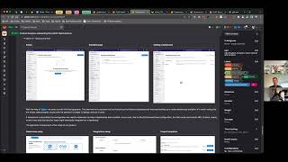
Put
all
that
over
here
have
the
data
source
button
over
here.
Can
you
all
see
The
annotation
on
the
screen
by
the
way?
Okay,
yes,
I
saw.
This
was
new
and
I
really
wanted
to
try
it
in
some
meeting,
and
this
feels
like
the
one
to
do
it
so
I
was
thinking.
Do
it
have
these
greater
items
at
the
top,
because
we're
going
to
be
limited
to
either
one
or
two
keep
the
button
here
or
with
the
row
items?
B
C
Yeah
I
I'm
personally,
for
it
I
think
it
makes
a
good
first
iteration
I
do
Wonder,
though,
if
we
then
need
the
primary
call
to
action,
if
our
number
of
black
actions
or
like
call
to
actions
that
we
have
on
the
on
the
page,
is
just
going
to
be
like
one
or
two
for
like
product
analytics
and
insights,
because
essentially,
what
like
this
page
then
does
become
that
hey
these
already
unconfigured
available
features
that
you
can
enable.
So
it
does.
A
C
C
A
I
want
to
say
we
have
like
a
Blue
Link
in
escalation
policies,
but
that
is
more
like
a
Dynamic
form
than
a
taking
off
to
a
completely
separate
path.
I
feel
like
most
of
the
time.
We
would
have
a
right
hand,
side
call
to
action.
Saying
add
dashboard
either
is
about
along
the
same
row
as
analytic,
dashboards
or
somehow
integrated
into
the
list.
Yeah
like
on.
C
Audit
event
headers,
it
makes
sense
to
have
a
like
a
bottom
row
that
you
can
quickly
add
because
you're
adding
multiple
list
items
in
like
a
form,
you're,
essentially
growing
the
form,
because
these
are
purely
list
items
I
feel
like.
Having
that
top
hand,
holder
action
would
be
the
more
expected
place.
C
B
Yeah
I
mean
that
I
think
that's
fine,
because
we're
this
is
super
early
days
for
us.
So
you
know
this
is
where
we
can
make
small
boring
iterations
that
we
know
are
not
necessarily
going
to
be
scalable
for
infinite
users
and
infinite
use
cases,
but
we
need
to
get
to
our
first
customer
before
we
start
solving
for
our
millionth
customer
right.
B
C
B
Okay,
well
so
I
took
screenshots
of
zoom
and
copied
them
in
our
document,
so
just
to
make
sure
I'm
following
so
that
the
blue
section
around
moving
those
to
the
top
we'll
do
that
in
one
issue
and
do
that
as
a
first
step
and
then
we'll
do
the
create
new
green
button.
We'll
do
that
in
a
follow-on
issue.
We're
not
proposing
to
do
that
right
now,
correct.
A
A
I,
don't
know
so,
at
least
for
the
confirm,
adding
new
dashboards
button.
I
do
that's
something
we
can't
really
tackle
yet,
but
we
know
we
need
to
which
is
actually
I
think
why
we
have
the
whole
dashboards
are
created
by
editing
the
project.
Defiles
learn
more
here
anyway,
to
help
explain,
what's
happening
so
hopefully
that's
enough
for
now,
but
all
right,
so
we're
going
to
go
with
option
one
for
now.
A
A
C
Yeah
thanks
for
bringing
up,
it's
really
helpful
to
like
have
a
I'm,
a
product
person
on
the
call,
because
yesterday,
Rob
and
I
were
just
like
talking
about
this.
As
you
know,
thinking
about
the
engineering
and
the
design,
but
we
had
a
lot
of
questions
about
black
okay,
what's
going
to
work
for
the
product
and
like
gitlab
as
a
whole.
So
thanks
for
adding
that
voice
and
guidance.