►
From YouTube: CI/CD UX Team Design Review | 11 February 2020
Description
- Mike Nichols | 02:30
Feature Flag Usability
A
My
card
you
yep
I'm,
still
trying
to
pull
it
out.
It's
amazing
how
like
once
something
falls
off
so
this
is.
This
got
moved
to
the
done,
so,
let's
think
in
the
act
of
drag
stop,
so
it's
almost
impossible
to
find
something
that
like
isn't
being
done
there
so
I'll
start
by
saying
like
this
is
this
would
be
kind
of
similar
to
the
last
time.
I
talked
about
something
where
this
really
isn't
that
great
of
a
topic,
but
it
might
be
right.
A
A
Oh
I,
wasn't
even
checking
for
that
right.
I
had
just
kind
of
glossed
over.
This
is
like
an
accepted
norm
that
you
know
is
just
a
pattern
and
get
lab
and
kind
of
went
with
it,
but
actually,
during
the
the
interviews,
multiple
people-
almost
everybody
kind
of
jumped
on
this.
So
that's
why
I
want
to
bring
this
up,
because
I
think
this
is
a
we
can
all
learn
from
this
type
of
moment.
A
So
let
me
share
my
screen
here.
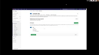
So
this
is
the
feature
Flags
kind
of
redesigned,
and
this
is
the
mock-up
that
I
had
made
prototype
that
people
were
able
to
test
on.
So
the
first
step
here
is
really
to
create
a
new
feature
flag.
So
you
you
go
to
this
page
here,
which
is
very
similar
to
how
we
do
this,
in
particular,
in
a
lot
of
places
in
CIC,
be
like
creating
environments
struggling
to
to
find
some
other
ones.
But
this
pattern.
A
I
went
with
this
because
this
seemed
to
be
like
kind
of
our
de
facto
standard
of
what
you
do
when
you
create
something.
So
you
come
to
this
kind
of
like
interstitial
page,
where
you
name
something
possibly
given
a
description.
So
unless
you
name
it
give
a
description,
then
you
hit
save
and
then
you're
dropped
onto
a
form
that
has
the
rest
of
the
details.
A
So
it
turns
out
that
was
the.
That
was
the
pattern
that
people
really
didn't
like
some
of
the
feedback
that
I
got
was
actually
like.
Yeah
I've,
never
seen
that
before
in
gitlab
or
like
I,
just
want
to
be
dropped
onto
the
forum
itself,
like
I,
don't
understand
why
there's
a
second
step,
one
person
did
understand
it.
The
only
person
that
didn't
dislike
it
took
it
as
like:
yeah
I
get
it
like.
A
It
was
a
developer
type
where
they're
like
I'm,
creating
a
placeholder,
so
that
makes
sense,
I
create
a
placeholder
and
then
I,
then
I
go
to
this.
So
really
that's!
The
crux
of
the
first
point
that
I
really
want
to
talk
about
is:
how
are
you
guys
handling
this
I?
Have
this
new
thing
that
I
need
to
create?
A
B
A
A
B
I
think
my
press
impression
while
seem
that
the
the
name
in
part
is
that
I
wasn't
sure.
What's
gonna,
what's
gonna
happen
after
that,
so
I
don't
mind
having
these
broken
down
into
two
steps,
because
that
actually
makes
sense
to
me.
You
know:
I
have
seen
this
pattern,
use
many
things
I
think
they
did.
B
The
only
thing
that
Carol
throws
me
off
a
little
bit
is
the
fact
that
when
you
heat
kinda
like
the
call
to
action
for
the
first
step,
you're
not
sure,
what's
gonna
happen,
you're,
you
don't
have
that
expectation
of
what's
the
functionality
what's
gonna
happen
after
the
fact
yeah
you
do
that
and
I
mean
I.
Don't
know.
That's
like
first
rough
talk
that
I
thought
about
that.
Yes,.
A
B
B
What's
gonna,
be
the
strategy
I'm,
not
exactly
sure
what
about
all
these
other
details
right,
the
environment
stuff,
but
it
makes
sense
to
me
that
I
can't
first
create
the
the
placeholder
the
object
that
it's
gonna
hold
all
that
configuration
and
they
then
come
back
later
and
said
this
hub.
You
know
so
that
logic
makes
sense
to
me,
because
basically,
there
are
either
you
two
already
have
something,
especially
with
something
like
a
feature:
you're
working
on
a
branch
you're
doing
things,
you're,
you're,
you're,
setting
up
things
back
and
forth.
B
A
You're
on
the
feature
flags
list
right
so
you've
navigated
to
operations
its
feature
flags.
You
have
a
list
here
that
may
be
populated
with
you
know:
X
number
of
feature
flags
so
up
here
in
the
upper
right
hand,
group
firm
right
hand,
corner
reading
group.
There
click
on
new
feature,
flag,
you're
dropped
on
this
kind
of
page.
That
has
a
description,
read
more
kind
of
situation,
name
the
description,
you'd
fill
those
out;
click,
Save
button
and
now
you're
dropped
on
the
floor.
Yeah.
D
A
C
A
You
know,
so
you
could
do
this
and
now
you're
dropped
into
the
issue.
So
we
do
have
this
kind
of
pattern
in
gitlab
of
like
you
go
here,
you
do
this
and
then
you're
dropped
into
this,
which
I
had
I
had
just
accepted
this
as
the
gitlab
pattern
and
didn't
really
think
about
it.
When
I
was
creating
the
feature
Flags
I,
just
kind
of
like
went
with
what
we
went
with,
but
I
was
very
surprised
to
see
the
users
were
like
I,
don't
understand.
Why
there's
this
extra
step,
yeah.
C
I
agree
with
you
on
I
think
it
what
what
it's
meeting
like
if
some
indication
of
the
that
exists,
the
progressive
disclosure
there
that
it's
a
stepper
right
because
you're
starting
with
the
step
one
and
then
when
you
save
you
go
to
step
two,
you
don't
go
back
to
see
the
item
you
just
created,
for
example
like
with
this
one.
So
have
you
experimented
with
the
you
know,
making
clear
to
users
that
this
is
step
one
and
you
have
to
three
or
four?
C
A
Actually,
a
great
point,
one
of
the
users
explicitly
said
exactly
that:
they're,
like
oh
I,
because
I
drove
into
that
after,
like
the
third
person
kind
of
brought
this
up,
you
know
I
was
aware
of
the
problem
with
it
when
they
brought
it
up.
I
kind
of
was
diving
a
little
deeper
on
it,
they're
like
yeah.
The
reason
why
I
don't
like
it
is
because
I
don't
know
what
that
button
is
going
to
do
on
in
this
step
here
right,
where
this
Save
button
right
what
they
wanted.
There
was
a
I
want
to
know.
C
Yeah
this
could
be,
for
example,
save
and
continue'
or
save,
and
next
one
right
do.
They
want
to
say
I.
Think
what's
missing
is
just
the
clues
into
what
this
flow
is
and
I
don't
know,
do
I
need
to
fill
in
everything
in
order
to
create
a
future
flag,
because
it
seems
like
the
second
step
is
not
mandatory,
but
to
go
back
to
the
previous
one.
Just
yeah
I
think
I
think
the
flow
is
a
bit
yeah
be
nice
to
get
more
more
context.
So.
A
B
Well,
I
think:
there's
there's
difference
between
creating
an
environment
or
a
like
and
creating
something
like
an
issue
or
a
merge
request,
and
the
big
difference
for
me
is
that
we
were
creating
an
issue
you're
creating
this
object
that
belongs
to
you.
Well,
it's
basically,
you
are
the
author
of
that
object
right.
B
You
are
regardless
if
it
changes
assignee
later
or
whatever
you
were,
the
one
who
originally
created
the
object,
so
there's
already
count
an
anchor
that
belongs
to
you,
and
so
that's
just
for
saying
that
I
think
there's
a
big
difference
between
creating
lose
objects
like
environment,
some
teacher
flags
and
creating
something
like
an
issue.
The
reason
why
I'm
saying
that
is
because
I
was
thinking
about.
Why
would
someone
want
to
create
a
feature
flag
just
with
the
name
description
and,
if
I'm
thinking
about
a
workflow,
a
random
workflow?
B
It
kind
of
makes
sense
that,
let's
say
I
am
the
manager
of
a
development
team
and
I
know
which
features
need
to
be
toggled
for
the
next
release.
Right,
so
I
might
go
into
the
feature.
Flux,
section
and
I
might
create
five
placeholders
feature
flag
for
comments,
feature
flag
for
showing
the
avatar
feature
flag
for
blah
blah
blah
right.
That
doesn't
mean
that
I'm
gonna
set
the
configuration
for
all
those
things.
It
just
means
that
I'm
creating
the
placeholders,
so
someone
else
can
come
and
fill
all
those
details.
C
B
B
But
that's
not.
That's,
definitely
not
a
strong
reason
to
believe
that
it
shouldn't
be
everything
in
just
a
single
I
think
that
works
too,
because
at
the
end
of
the
day,
they're
setting
up
the
strategy
and
all
that
stuff
is
optional
right.
It's
not
that
you
need
to
set
it
up
from
the
beginning.
So
if
that's
the
case.
A
New
description
save
but
then
dropped
onto
the
bigger
form.
Should
you
maybe
potentially
be
dropped
back
on
the
list
right
I
think
would
be.
The
other
interesting
thing
is,
if,
if
that
is
your
mode
of
just
I,
want
to
create
a
bunch
of
things
so
I'm
just
naming
them
giving
the
descriptions.
I'll
worry
about
the
details
later
I
could
almost
see
you
wanting
to
be
dropped
then
back
into
the
list.
So
you
can
repeat
that
process
as
opposed
to
being
dropped
into
the
details.
Well,.
A
Agree
and
I'm
trying
to
find
I
did
find
an
example
where
you
you
are
dropped.
We
do
have
one
I
can't
remember
off
the
top
of
my
head,
but
we
do
have
one
where,
like
you
are
literally
here's,
the
entire
form
that
you
are
dropped
in
today.
He
won
by
romantic
in
I.
Just
wanna,
see
like
what
you
sure
it's
a
new
environment
brings
you
to
this
page
name,
give
it
whatever
you
want.
I'm,
not
gonna,
give
an
external
URL
because
it
has
to
be
valid.
D
So
the
question
with
a
creation
of
them,
so
it
seems
that
we
have
these
two
steps
in
the
future:
flap
creation,
with
the
first
set
of
settings
that
your
that
the
user
is
providing
like
the
name
and
the
description
is
this
enough
to
have
a
feature
flag
or
you
have
to
in
order
for
it
to
work.
You
have
to
have
all
of
those
additional
settings
that
are
on
the
page
to
know.
A
A
A
B
Go
ahead,
I
was
thinking.
Something
else
is
like
the
fact
that
this
is
this
particular
view
is
both
read
and
write.
You
know
what
I'm
saying
it's
kind
of
like:
yes,
you're
reading
the
description
and
you're
reading
the
title
and
there's
like
an
eddy
there's,
an
edit
button
at
the
top,
but
then
in
the
strategies
you
can
go
and
start
messing
with
those
fields
and
then
Save
Changes
right,
which
makes
me
thing.
B
A
Yeah,
it
is
very
similar
to
issues
in
the
sense
that
you
have
now
a
name
in
the
description
that
is
kind
of
an
abuse
day.
Right
now,
and
really
you
at
this
point,
you're
operating
on
the
strategies
less
so
than
the
actual.
You
know
name
and
description.
This
edit
button
would
go
back
to
this
screen.
Essentially,
it
allows
you
to
edit
there,
oh
and
by
the
way
in
case,
it's
bothering
anybody.
Yes,
this
is
the
incorrect
button
style.
It
should
be
a
secondary
button.
I
have
to
fix
that.
C
C
Let's
see
so
I
got
here
through
operations,
metrics
right
on
this
page
and
I
do
have
an
environment
I'm,
not
sure.
If
I
have
a
concert,
probably
not
super
for
this
project,
but
then
I
have
an
item.
I,
don't
know
sure
why
it
doesn't
display
here.
But
then,
when
I
click
configure
exist,
installation,
then
it
take
me.
It
takes
me
to
this
view.
Where
I
can
you
know
just
play
around
with
it
and
it's
kind
of
a
mess?
It's
not
super
clear.
Why
need
to
configure?
C
But
it's
pretty
much
this
cluster,
so
yeah
I
created
my
cluster
I
linked
everything
and
I
can
configure
it
in
a
different
page,
but
I
also
wonder
how
this
would
look
like,
for
example,
if
you
had
I'm
not
sure
if
you're
and
try
this
Mike
but
having
the
forum
for
creating
the
feature
flag
but
I
don't
know
collapsing.
This
secondary
partner
is
not
mandatory.
You
know
and
allowing
people
to
just
navigate
in
one
single
form,
because
was
this
a
requirement
to
split
the
digital
course?
A
A
A
C
Been
Jura
see
there
is
that
this
is
not
the
way
it's
supposed
to
be
snippets,
for
example,
is
something
that
we
did
research
in
it
and
Laurie.
Maybe
you
can
you
have
more
context
on
it
that
people
are
not
really
using
snippets
and
this
was
built
ages
ago.
So,
if
they're
I
believe
that
this
page
does
not
comply
with
pajamas
or
with
design
guidelines
and
also
I,
think
it's
also
a
risk
to
look
at
it
for
as
a
reference
and.
A
For
further,
so
one
thing
I
did
was
intentional
in
my
design.
Here
was
I
hate.
This
idea
that
you
have
there
is
no
view
state
of
the
name
and
description
in
our
current
implementation
of
feature
flags
right.
This
is
always
an
edit
form.
There
is
no
world
where
I
can
like
view
the
name
and
description.
It's
always
going
to
be
in
a
form
like
that
which,
to
me,
is
very
unreadable.
A
Look
I
having
it
in
an
edit
state
like
this,
because
nine
times
out
of
ten,
when
you're
here
you're
consuming
this
possibly
doing
the
strategies,
you're
not
going
to
be
I,
don't
think
your
primary
action
is
to
go
here
and
rename
and
or
change
the
description
of
it.
You
are.
You
are
here
to
operate
on
the
strategies
portion
of
it.
So
I
don't
like
this
pattern.
This
is
what
I
was
kind
of
trying
to
get
away
from,
but
it
is
worth
so.
Our
current
feature
flag
as
it
works
today
is
this.
A
A
You
know,
maybe
kind
of
a
two-step
edit,
where
you
can
either
edit
strategies
or
edit,
that
that
I
struggle
with
that
a
little
bit,
though,
because
then
your
creation
and
your
editing
have
different
looking
forms
and
that's
extra
development
at
the
front
end
folks
are
gonna
need
to
do.
You
know
that.
B
Did
we
say
that
issues
is
different
from
this
pattern?
Issues
is
interesting
because
I
feel
issues
is
basically
this
exact
same
pattern
that
you're,
showing
with
the
difference
that
issues
has
like
more
things
to
set
up.
At
the
beginning.
From
configuration
description
perspective,
you
got
a
cell,
an
assignee,
a
milestone
label,
whatever
those
things
are
optional,
but
it's
not
like
you
can
create
a
comment
right
away
on
the
issue
from
the
beginning.
B
A
Didn't
get
love
of
that
and
I'm,
not
one
to
say
that
their
consistency
is
the
ultimate
goal
here,
I'm
a
big
believer
that,
if
you're
going
to
be
different,
it's
okay,
but
it
should
be
different
for
a
reason
right.
Your
your
differences
should
be
intentional
and
I.
Don't
necessarily
know
that
we
have
a
clear
like
we
do
it
this
way
in
this
place.
For
this
reason,
we
do
it
this
way
in
this
place.
For
this
reason,.
D
Yeah
I'm,
like
are
you
saying
it?
We
have
to
start
from
the
consistency
point
of
view,
but
we
every
flow
should
be
relevant
to
to
the
feature
into
the
case,
because
here
yeah,
it's
like
okay,
something
that
I
wanted
to
say
like
this
save
part,
and
it
makes
me
think
that
I
will
save
it
and
I
will
finish
with
the
process.
D
F
Wonder
if
there's
a
way
to
just
make
subtle
changes
to
the
second
page
in
the
form
and
just
change
it
to
the
detail,
view
of
the
feature
flag
so
that
we
kind
of
circumvent
the
issue
of
a
2-step
form.
The
first
form
is
just
creating
a
flag,
and
then
you
are
dropped
onto
its
detailed
view
where
you
can
edit
the
environments
or
whatever
the
details
are
from
there.
And
that
follows
the
pattern
we
have
with
issues,
and
that
seems
to
be
the
most
common
pattern.
F
C
Think
it
still
doesn't
solve
the
problem
of
people,
not
knowing
that
there's
more
coming
once
they
create
the
item.
You
know,
maybe
we
can
I
know
a
helper.
Something
in
the
UI
is
saying
that
yeah
after
creating
you
can
do
this.
Isn't
that
and
manage
it
in
a
different
view,
I
liked
Raposa,
but
I'm
worried
with
the
helping
users
figuring
out
what
to
do
next.
F
Easy
option
for
the
details:
it's
like
here's,
a
list
of
common
patterns
or
like
five
default
that
you
can
put
in
while
you're,
creating
it
and
then
we've
like
more
intricate
editing
for
that
secondary
view
to
kind
of
circumvent
the
issue
of
we
don't
know.
What's
coming
next,
we
provide
like
here's,
the
basics
we
assume
or
you
can
choose
none
of
them
and
just
go
to
the
details
anyway.
B
A
I
think
that's
I,
think
at
a
minimum
you
know,
I
think
the
big
variance
is
what
this
button
says
right
right
and
maybe
that's
why
the
flow
works
for
issues
and
doesn't
work
in
feature
flags.
Maybe
I
was
a
little
bit
over
or
something
that
when
people
didn't
like
it
in
feature
flags,
it's
because
they
didn't
like
the
pattern,
but
it
might
just
be
the
subtle
detail
of
the
text
of
the
of
the
thing
might
bring
it
back
into
the
fold
of
of
the
pattern
there.
So,
okay.
A
I'll
play
with
that
and
I'll
update
from
there
appreciate
the
feedback
and
I
think
we,
my
intent
here
was.
Hopefully
we
start
thinking
about,
like
these
patterns
a
little
bit
more
holistically
across
gitlab
and
I.
Think
it's
dangerous
right
with
us.
I
think
kion
has
been
here
the
longest,
but
we're
talking
two
years
right.
So
sometimes
you
inherit
these
patterns
and
it's
easy
to
to
say:
yeah,
that's
how
it
works
and
get
when
we
do
it
right
and
I
don't
and
that's
great
most
of
the
time.
C
Sure
don't
always
take
the
product
as
this
source
of
truth
right,
but
those
things
that
they
they
don't
look
ideal
right,
they're
not
polished
if
there's
so
much
legacy
in
the
product
and
that's
why
it's
difficult
to
look
at,
for
example,
pajamas
for
guidelines.
But
then
the
product
shows
something
completely
different.
So
my
take
on
this
is
when
in
doubt
try
to
reach
out
to
whoever
is
the
DRI
or
the
designer
responsible
for
a
specific
functionality
and
ask
what
are
the
planning
because
yeah
there's
a
lot
of
things
in
the
product
that
they
shouldn't
be?
C
A
A
People
found
that
to
be
visually
disconnected
from
this
list,
so
what
I've
done
to
fix
that
is
just
make
this
text
wrap
and
move
this
button
down,
so
it's
aligned
with
the
description
as
opposed
to
that,
but
it
does
bring
up
another
like
and
again.
This
is
the
incorrect
button.
There
should
be
a
secondary
button,
we'll
try
and
look
past.
That
is
the
idea
of
it's.
Always
it's
just
an
age
old,
UX
problem
of
like
lists
right.
Are
you
gonna,
put
the
add
button
at
the
top,
so
it's
always
in
the
same
place.
A
You're
gonna
put
the
Add
button
at
the
bottom
of
the
list,
because
really
that's
where
it's
gonna
show
up
right,
so
it
could
very
easily
be
here
or
there
or
both.
So
that
was
the
second
little
topic
if
we
want
to
dive
into
it
is
when
you
have
a
list
of
things.
Where
do
you
guys
like
to
put
the
Add
button
at
the
top
at
the
bottom
or
both,
and
should
that
vary
or
should
we
would
be
consistent
in
that
I.
C
Normally
put
on
tops
top
next
to
the
title
label
and
it
really
depends
because
if
it's
a
for
example,
if
it's
a
call
to
action
that
works
for
the
whole
page,
so,
for
example,
create
feature
flag
or
create
release.
Then
it's
green
like
what
you
using
here,
but
if
not
yeah,
it
should
be
a
a
secondary
button.
But
I
say
that
in
this
case
even
the
secondary
could
I
don't
know,
expand
and
the
edits
they're,
all
gonna
look
alike.
C
A
A
Anyways
the
currently
our
future
Flags
require
you.
You
can
create
a
bunch
of
strategies,
but
there
you
can
only
define
one
per
environment
which
doesn't
make
a
lot
of
sense
because
you
there's
absolutely
use
case
for
wanting
multiple
feature
flags
per
environment.
So
a
lot
of
this
change
was
around
kind
of
flipping.
That
idea
to
allow
you
to
create
strategies,
you
used
to
have
to
create
environments
and
add
strategies
to
them,
we're
flipping
it
on
its
head
and
allowing
you
to
create
strategies
and
add
environments
to
them.
A
A
B
I
was
asking
because
if
it
was
gonna
be
a
long
list
when
you
lose
visibility
of
that
bottom,
then
it
my
makes
some
sense
to
have
the
act
as
part
of
the
list
like
last
element.
So
you
can
create
anyone,
but
if
it's
not
gonna
be
if
it's
just
a
couple,
then
you're
always
gonna
have
this
ability
of
the
button
in
the
viewport.
So
it
makes
sense
that
it's
a
top
right.
A
So
this
was
the
updates
of
that
yeah
I
agree,
like
I,
think
I
think
that's
the
problem
I
think
in
and
it's
it's
one
of
the
tough
things
about
user
testing,
because
they're
like
no
I
want
at
the
bottom.
That's
where
it's
gonna
add
up,
but
they're,
not
thinking
about
like
the
edge
cases
of
like
what,
if
I
did
have
50
I
can't
see
the
button
anymore.
So
it's
one
of
those
like
you
have
to
take
it
with
a
grain
of
salt
kind
of
things.
A
I
think
that's
why
we
always
tend
to
put
them
up
at
the
top.
Because
of
that
reason
is
we.
We
have
to
account
for
both
cases
and
I
think
in
the
minimum
case
it
works
and
in
the
maximum
case
it
still
works,
whereas
if
we
put
them
at
the
bottom,
it
works
in
the
minimum
case,
but
in
the
maximum
case
it's
a
disaster.
D
D
A
We,
the
one
constraint
that
we
have
to
work
with
is
you
need
to
have
one
right.
So
if
you
notice
here,
you
can't
delete
this
first
one
because
you
have
to
have
at
least
one
strategy,
so
that
would
be
the
only
kind
of
weird
thing.
Is
it
I
think
as
an
MVC?
It
that's
tons
of
extra
code
when
I
was
talking
to
the
front-end
guys
about
adding
that
of
how
to
deal
with
that
right.
So
you
have
to
have
one.
So
it's
much
easier
for
them
to
code.
A
C
B
It's
also
probably
from
a
hierarchy
perspective.
It's
it's
likely
that
you
first
define
the
most
relevant
strategy
and
then
you
define
the
least
relevant
right.
So
there's
really
some
kind
of
hierarchy
here.
So
if
you
keep
adding
them
from
the
stack
from
the
top,
then
it's
gonna
look
weird
I
mean
at
least
for
me
the
way
that
I'm
thinking
about
it
is
gonna,
be
oh,
the
least
relevant
one
is
the
third
one,
and
the
most
important
strategy
is
the
last
one.
In
the
list.
B
Right,
we
go
panel
creates
a
little
bit
of
mind,
jumbling,
like
in
my
case.
It
felt
that,
like
you,
should
respect
the
hierarchy
of
creation,
oh
because
that's
how
I
will
think
about
adding
strategies
right,
I'm,
first
thinking
about
the
motion
program,
one
and
then
I
create
the
other
ones
as
they
happen.
Yeah.
A
And
the
upshot
this
did
test
well
in
the
usability
things
is
one
thing
I
was
concerned
about,
so
the
task
was
come
in
here
and
set
up
this
feature
flag
to
do
this
right
and
five
out
of
the
six
people.
Their
first
thought
was
to
modify
the
default
strategy
as
opposed
to
adding
in
an
additional
strategy
so
and
then
the
the
step
after
that
was
okay.
Well,
we
also
want
to
do
this
other
thing,
so
at
that
point
they
would
add
strategy,
so
the
mental
model
was
playing
out
well
of
I'm
coming
here.
A
I
want
to
set
up
my
main
strategy
to
do
this.
Users
will
were
tending
to
modify
this
default
strategy
to
be
the
settings
that
it
needed
to
be,
and
if
they
needed
to
do
something
else,
then
they
were
doing
this
ad
strategy,
which
does
make
it
you
know,
make
sense
like
you
were
saying
one
in
that
ones,
at
the
top,
it's
the
main
one
and
the
ones
below
that
are
kind
of
supplemental
to
that.
A
Like
why
make
it
why
right
it's
it's!
It's
visually,
less
impactful!
If
anything
I
would
want
to
do,
would
make
this
visually
more
impactful
and
I.
The
plus
button
would
be
a
smaller
one
now,
I
think
what
would
be
interesting
would
be.
Maybe
if
we
had
an
ad
strategy
button
at
the
top
and
maybe
a
plus
button
at
the
bottom,
that's
kind
of
a
secondary
like
that's
where
you
want
to
go
is
at
the
bottom
of
the
list.
Add
it
there
that
might
be
an
interesting
one
Slaton.
A
You
can
add
it
here
and
add
it
there,
but
up
here
I
think
it
would
get
lost
visually
a
little
bit
and
if
there's
anything
that
I
wanted,
although
I
don't
even
think
this
is
really
a
problem,
all
six
users
were
able
to
find
this
ad
strategy
button
with
almost
no
problem.
The
only
reason
I
brought
up
this
point
is
that
they
just
didn't
like.
A
Where
is
it?
They
didn't
like
this
pattern
right
where
it
was
lined
up
here,
and
this
went
like
this
like
visually.
They
felt
like
this
was
disconnected
from
that,
which
is
what
we
do
all
the
time
in
get
lab
like
we
always
align
buttons
to
headers
not
to,
and
we
don't
wrap
descriptions
like
that.
So
I
think
that
we
should
stop
doing
that.
A
A
Given
the
task
that
you
were
given
in
this
test,
you
want
percent
roll
out
here,
you
just
add
in
a
percent
and
then
the
next
task
was,
as
you
know,
about
environments,
so
click
on
the
plus
it
drops
down
there.
We
have
this
search
box
now
this
won't.
This
is
not
how
it
work
when
I
click.
This
two
of
these
things
are
going
to
add
up
just
because
the
branching
and
the
logic
of
the
prototype
was
too
hard.
But
how
would
work
in
real
life?
A
D
Can
I
add
a
few
comments
actually
here
so
looking
at
the
into
this
flow
I
would
just
like
thinking
out
loud
to
suggestions
so
that,
like
a
fool
for
me,
the
ad
strategy
body,
it
looks
a
bit
like
I
agree
with
probably
those
people.
It
looks
like
too
much
on
the
ride,
it's
kind
of
like
because
I'm
looking
at
at
this
side
and
then
is
on
that
side.
D
So
it's
kind
of
like
out
of
my
range,
if
that
would
be
I'm
curious
like
if
you
would
run
this
user
tests
on
me
and
the
bottom
would
be
secondary.
I
probably
would
totally
even
miss
that
in
the
beginning,
out
probably
have
to
search
for
that.
Of
course,
it's
like
right
now,
maybe
a
little
bit
by
since
they
did
run
this
task
without
discussions
anymore.
D
So
two
things
out
for
me.
This
button
asks
the
ad
strategy
button
asks
maybe
to
be
below
the
description
below
the
strategies.
Title
like
you
know
like
strategies,
titled
in
the
description
and
then
I
would
probably
add
it
there
aligned
to
the
left.
Just
brainstorming
and
I
would
probably
name
it
like
new
strategy
or
add
another
strategy,
because
at
strategy
and
then
I
realized
hey,
there
is
already
strategy
below
so
kind
of
like
this
is
my
a
little
bit
of
fresh
thinking.
A
That
one
was
interesting
being
on
the
left.
I
do
feel
like
that
is
there
that
is
get
lab
law
that
plus
buttons
are
always
on
the
right.
Our
action
buttons
are
almost
always
on
the
right,
I
I
agree.
It
might
be
interesting
putting
on
the
left,
but
I
do
feel
like
that
is
anti,
not
to
say
that
I
think
yeah.
A
A
C
Just
make
sure
you
feed
this
back
to
pajamas
Mike
if
it
becomes
a
pattern
because
yeah,
we
need
to
document
this
so
that
people
know
that
this
decision
was
based
on
I,
don't
know
user
insights
and
that
you
did
testing
they
can
find.
Where
does
your
permission
from
I'm
just
a
bit
like
when
I
look
at
it,
I'm
kind
of
lost
with
there's
so
many
different
ways
to
do
to
add
and
create
him
safe
because
of
all
the
buttons
and
other
positions
and
I
kind
of
agree
with
that
and
idea.
C
D
C
It's
the
icon,
but
add
strategy,
it's
in
text
and
edit,
it's
an
icon,
the
kind
of
things
that
we
see
also
in
the
in
the
current
product,
most
implementations
that
we
have
all
these
different
different
labels
and
just
just
to
understand
a
bit
better.
The
flow
I
think
in
general.
This
can
also
impact.
You
know
the
discoverability
of
those
actions.
If
people
look
at
it
and
they
have
to
read
and
get
familiar
with
all
these
different
button
types.
A
I
really
like
the
idea
of
add
new
strategy,
as
opposed
to
a
strategy
for
nothing
else.
It
makes
the
button
bigger
and
I.
Think
bigger
is
better
in
this
right,
like
if
anybody
is
struggling
for
its
now,
like
the
the
description
can
wrap.
It's
not
like
we're
in
a
space
crunch.
There
so
definitely
make
that
change.
Now,
I
can
play
with
it
being
other
places.
Although
again
I
will
say
this
six
out
of
six
of
like
yep
got
it
first.
Time
was
easy.