►
From YouTube: 2022-04-26 Code Review Weekly UX Sync
Description
No description was provided for this meeting.
If this is YOUR meeting, an easy way to fix this is to add a description to your video, wherever mtngs.io found it (probably YouTube).
A
Good
yeah,
so
the
tech
writing
team
had
an
interesting
week.
Last
week
we
are
now
three
people
down
help.
What
this
means
is
I'm
going
to
be
depending
heavily
on
the
rest
of
you
to
the
only
polite
way
to
say
it
is
yell.
If
I
have
dropped
something
I
will
do
my
best.
I
don't
know.
If
I'm
going
to
be
picking
up
new
groups,
I
think
I
might
be
until
we
can
get
three
new
people
hired.
A
This
is
fine,
so
help
just
feel
free
to
tap
me
on
the
shoulder
a
little
earlier
than
usual.
If,
if
I'm
not
responding
in
what
seems
like
a
normal
frame
of
time
for
me,
just
assume
that
my
brain
has
left
and
ping
me
because
I
don't,
I
don't
want
to
be
a
blocker
and
if
things
get
really
really
busy,
as
we
get
closer
to
15-0,
I
will
start
waving
stuff
through
to
production
and
and
tell
engineers
just
make
me
an
issue
for
a
follow-up,
because
I
don't
want
to
block
anything
yay.
A
B
C
C
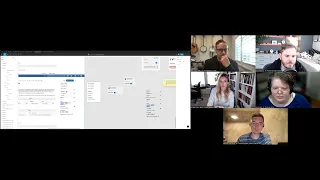
The
whole
header
shifts
because
it
doesn't
exist
on
those
tabs
anymore,
so
we've
been
playing
around
with
how
to
get
things
you
know.
Should
it
be
fixed
still,
should
it
be
below
the
the
header
section?
Should
we
remove
the
sidebar
entirely?
Can
we
stick
it
all
in
the
header
in
some
way,
so
marcel's
been
working
on
on
some
concepts
there
too,
but
I
just
want
to
show
you
kind
of
where
we
are
right
now.
This
will
all
go
behind
a
feature
flag,
because
I
know
it
has
not
been
prioritized
or
anything.
C
C
So
I
decreased
the
width
of
this
content
a
little
bit
not
as
much
as
it
would
seem,
and
now
this
is
just
a
little
section
only
on
on
the
overview
tab.
So
when
you
switch
between
these,
the
header
stays
exactly
where
it
is.
There's
no
shifting-
and
this
is
only
on
this
page-
some
of
the
things
have
been
removed
from
the
sidebar
entirely
lock.
Merge
request
can
go
in
this
little
ellipsis
menu,
because
when
the
merge
request
is
locked,
you
get
the
little
icon
up
here.
C
That
says
it's
locked,
so
it's
either
it's
binary
on
or
off
the
reference.
I
already
have
a
merge
request
to
remove
that
because
we
already
have
I'm
sorry.
Source
branch
has
been
removed
in
a
merge
request
because
we
already
have
that
information
elsewhere,
but
on
top
of
that,
I'd
like
to
move
it
up
to
the
top
so
that
it's
available
on
all
the
tabs.
So
if
you're
looking
at
your
changes-
and
you
want
to
copy
the
branch
check
out
the
changes
locally,
you
can
just
click
it
right
here.
C
So
at
the
top
the
badge
has
been
restyled
and
you've
got
all
the
branch
info
here
that
previously
was
located
right
here.
This
widget
I
would
like
to
remove
entirely
as
well,
so
the
branch
info
has
been
moved
to
the
top.
The
checkout
branch
items
have
been
moved
into.
This
drop
down
called
merge
request
and
you
can
see
you
can
review
the
changes
here
or
you
can
download
the
options
here.
So
that's
those
two
buttons
taken
care
of.
C
Oh,
that's,
all
the
buttons
taken
care
of
the
only
thing
missing
here
is
the:
how
far
behind
the
target
branch
we
are.
I
don't
know
where
that
could
go
yet,
and
so
still
thinking
about
that-
and
I
know
that
there's
been
a
proposal
to
add
a
rebase
button
in
cases
like
this,
so
I'll
have
to
think
about
that.
One
too
and
options
are
here.
Anything
else
that's
been
removed.
Oh,
I
think
the
reference
could
be
either
removed
or
placed
elsewhere.
I
don't
know
about
that
one.
C
Yet
time
tracking
we've
talked
about
now,
it's
probably
not
the
time
to
remove
that,
because
it's
being
worked
on
and
it
is
being
used
by
some
team
members,
it
just
it's.
It's
fine
to
stay
there
and
notifications
and
to-do's.
Those
are
the
two
that
I'm
still
unsure
about.
It
feels
they're
kind
of
personal
to
the
user.
They
feel
like
they
don't
belong
in
the
sidebar,
which
is
all
metadata
associated
with
the
specific
merge
request.
C
It
also
feels
a
little
weird
in
this
drop
down,
because
again,
this
is
specific
to
the
merge
requests
and
actions
that
you
can
take
to
review
the
code
so
unsure
where
that
could
go
yet.
But
this
is
sort
of
something
that
we've
been
working
on
and
I
just
wanted
everyone
to
to
see
it
and
if
you
have
any
questions
or
comments,
opinions
suggesting
anything.
That's
great.
A
I
have
one
this.
This
is.
This
is
something
that
is
so
it's
so
basic
and,
and
the
current
design
makes
me
fight
so
hard
for
it.
What's
the
pipeline
status
of
this
merch
request?
Is
it
green?
Is
it
red
it's
very
red,
and
it's
it's
like?
No,
no,
no,
no
meaning
an
any
merch
request
that
I'm
looking
at
the
only
way
that
I
can
tell
from
this
initial
page
is
to
look
at
the
fab
icon
and
oh.
C
A
D
C
D
Can
I
suggest
another
ping
I
like
that,
actually,
like
the
branches
moved
to
the
header,
but
when
you're
actually
merging
commercial
requests,
you
always
have
to
check
like
if
the
branch
is
correct.
So
what
do
you
think
of
like
adding
this
information
when
the
merge
status
is
like
ready
to
merge,
because
right
now
it
shows
only
a
plain
text
like
ready
to
merge
and
nothing
else
so
like
adding
ready
to
merge
this
into
this.
So
you
don't
have
to
scroll
to
the
top
and
canvas
right
away.
C
B
Like
you
mentioned
designs
here
not
rolled
out,
like
is
your
plan
to
to
actually
have
this
all
like
engineered
and
done
not
necessarily
turned
on,
but
engineering
done
and
behind
a
feature
flag
during
15,
or
are
you
thinking
like
taking
these
designs
and
we're
gonna,
run
some
testing
and
get
more
feedback
or
sort
of
what
I'm
and
I
don't
care
either
way?
I'm
just
curious
like
what
are
you
asking
for
from
us
here?
I
guess.
C
I'm
not
really
asking
for
anything
other
than
what
are
your
immediate
thoughts
and
you
know:
do
you
hate
it?
Do
you
think
it's
a
good
idea?
I
don't
know
what
that
will
affect
the
the
idea.
Is
I
ideally
completely
engineered
and
completely
finished,
and
I
would
love
it
to
be
behind
a
feature
flag
for
gitlab.org
so
that
we
can
test
it
and
and
get
some
internal
feedback,
and
I've
brought
this
up
with
marcel
a
little
bit
too.
I
wish
that
we
could.
C
I
don't
know
how
you
could
do
this,
but
I
wish
there
was
a
really
easy
way
for
us
to
do
way
more
testing
internally
and
and
just
start
feature
flagging,
so
much
so
that
we
could
get
more
internal
feedback
from
us.
The
power
users,
I
know
we're
biased
and
that
that's
not
a
perfect
research
method,
but
it
would
be
amazing
if
we
could
do
bigger
changes
like
this
internally
only
and
I
would
be
able
to
do
that
without
writing.
D
It
seems
like
very
hard
to
actually
implement
this
stuff,
because
you
have
three
dynamic
elements.
First,
one
is
nickname,
which
can
be
any
length
like
there's
eager
and
a
lot
of
w's.
That
is
like
insanely,
large
and
also
these
branches
also
can
be
like
very
large.
You
can
like
have
very
long
names.
D
I
guess
like
up
to
255
characters,
so
we'll
have
to
basically
shrink
down
three
three
elements
and
have
this
like
free
dots
after
them,
so
like
would
it
be
possible
to
just
move
the
branches
stuff
to
a
separate
line
so
so,
like
more
stuff
fits
into
this
place
because,
like
from
from
a
implementation
site,
this
doesn't
look
like
optimistic.
For
me
at
least.
C
Yeah
this
is,
these:
are
really
lovely
branch
names
so
right
now
we
truncate
it
pretty
aggressively
here's
the
current
implementation.
So
it's
it's
actually
worse
right
now
we
have
barely
any
room
and
we
just
start
truncating
really
quickly,
with
the
removal
of
the
sidebar
you'll
notice
that
this
header
has
gotten
enormous,
like
this
entire
area
is
now
available
for
the
header,
so
we'll
be
able
to
have
them
longer.
I
think
that
we
should
truncate
them
because
they
can
get
really
really
long
except
I'd.
C
Rather
this
just
started
to
wrap
actually
I'll
I'll
play
around
with
how
that
could
look,
but
I
I
would
prefer
to
rap
a
little
bit.
Username
too,
I
mean
I
know,
there's
that
one
user
with
a
billion
double
used.
I
don't
necessarily
want
to
start.
I
don't
want
to
save
users
from
themselves.
I
think
that
if
they're
going
to
make
a
crazy
long,
username
then
they're
just
gonna
have
to
deal
with
the
repercussions.
C
B
B
D
Okay,
I'm
not
sure
like
if
this
is
the
best
place
to
tell
it,
but
like
our
recent
change
to
automatically
assign
match
request,
authors
actually
broke
some
workflows
because
people
were
like
creating
merge,
requests
to
review
them
first
and
assigned
like
different
people
as
afters
and
ascend
themselves.
I
suspect
as
reviewers.
B
Yeah
I
commented
on
the
issue:
I'm
I'm
not
necessarily
concerned
with
handling
the
edge
case
of
someone's
workflow,
where
they
use
sort
of
a
field
when
we
have
a
dedicated
field
for
what
they're
trying
to
to
represent,
but
we
can
always
wait
and
see
what
they
come
back
with
and
say.
You
know
if
they've
got
some
reasons,
I
think
for
us.
B
It's
part
of
the
whole
create
merge,
request.
Workflow
is
sort
of
interesting
and
we've
seen
more
and
more
feedback
about
it
as
we
sort
of
manipulated
some
things
about
how
you
get
into
creating
a
merge
request
and
what
happens
once
you
create
a
merch
request,
and
so
I
think
it's
it's
good
feedback,
but
I
would
say
one
user
sort
of
is
what
it
is
and
we'll
continue
to
watch
it
and
see
what
other
improvements
we
can
make
and
see
what
they
come
back
with.
I
don't
I'm,
I'm
not
sure.