►
Description
Walk through of the merge request navigation and user flow research synthesis.
Issue: https://gitlab.com/gitlab-org/ux-research/-/issues/1534
A
Hi,
I'm
annabelle
gray
and
I'm
a
senior
product
designer
in
create
code
review
in
this
video,
I'm
going
to
walk
through
the
research
synthesis
that
we
wrapped
up
last
month.
That
covers
merge,
request,
navigation
and
user
flow
for
just
a
little
bit
of
background
when,
when
going
through
this,
what
we
did
was
going
through.
A
A
A
It
was
difficult
to
get
a
clear
picture
of
how
to
answer
this
and
how
to
take
action
on
this,
so
I'm
currently
actually
in
the
middle
of
conducting
further
research
on
the
merge
request
cycle
from
the
perspective
of
both
the
author
and
the
reviewer,
and
there's
a
link
here
to
check
out
that
research,
but
it's
still
ongoing.
So
it
should
be
interesting
when
that
wraps
up.
A
The
recommendations
that
came
out
of
this
are
mostly
well
actually
all
related
to
that
first
hypothesis.
So,
in
order
of
value
to
help
streamline
the
merge,
request,
ui
and
focus
user's
attention,
we
should
first
research,
the
user
journey
of
merge,
request,
authors
and
reviewers
to
inform
the
next
recommendations
and
that's
what
I'm
currently
in
the
middle
of
doing
two
reorganize.
Merge
request
metadata
to
emphasize
what
users
value
and
use
the
most
and
this
actually
links
to.
A
A
A
In
addition
to
that,
we
also
have
the
conversation
spanning
the
changes,
tab
and
the
overview
tab,
which
can
make
it
tricky
to
figure
out
what
happened
and
when,
without
kind
of
scrolling
up
and
down
and
switching
between
the
taps
and
last
research.
The
currently
fixed
ui
elements
to
remove
this
behavior,
this
fixed
behavior
whenever
possible.
A
This
is
just
a
general
kind
of
gitlab
ui
feature.
We
have
a
lot
of
fixed
elements
on
the
left
right
and
top
of
the
screen,
and
then
on
the
code
review
pages.
We
have
even
more
fixed
elements
and
it
can
kind
of
add
to
the
noise
and
clutter
and
and
sort
of
make
the
user's
eyes
darting.
It
makes
it
difficult
to
concentrate
on
the
code
review
process
when
you
have
so
many
things
grabbing
your
attention
to
look
at
a
few
examples.
This
is
the
overview
tab
and
this
is
a
quote
from
a
user.
A
This
is
an
example
of
a
merge
request
that
I
took
a
screenshot
of
the
last
month.
I
believe
so
some
questions
you
might
have
when
looking
at
this
is
how
many
lines
have
been
changed.
You
can
see
that
there
have
been
nine
changed
files,
but
you
don't
know
on
first
glance
how
many
lines
that
might
be.
A
Has
this
already
been
reviewed?
Has
it
already
been
approved?
I'm
not
sure
I
can
see
that
there's
a
reviewer
assigned,
but
I
don't
know
what
stage
we're
at
right
now
did
the
pipeline
pass.
I
can't
see
the
pipeline
status
without
scrolling
and
is
all
this
metadata
useful
to
me
and
as
I
linked
to
earlier,
probably
not
some
users.
A
Threads
break
the
chronology
of
the
events,
making
it
difficult
to
see
what
has
occurred
since
previously
viewing
the
merge
request-
and
this
can
come
into
play
when
multiple
reviews
of
a
merge
request
occur.
You
can
make
some
comments.
You
pass
it
back
to
the
author
and
that
author
makes
changes
and
comments
back
and
since
we
have
comments
spanning
two
tabs
and
some
of
them
are
threaded,
some
of
them
are
on
diffs.
It
can
be
hard
to
figure
out
what
happened
since
you
last
looked
at
it.
A
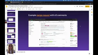
Right,
so
this
is
an
example
of
a
merge
request
with
63
comments,
and
I
just
scrolled
through
for
the
purpose
of
this
gif,
and
you
can
see
multiple
different
types
of
comments.
Some
are
on
outdated
divs.
Some
are
on
current
disks.
Some
are
resolved,
some
are
not
some
have
code
blocks,
some
are
at
the
bottom
at
the
top.
Some
are
threaded,
some
are
not
we.
We
have
many
different
types
of
comments.
A
A
You
can
see
that
this
top
one
is
a
thread
on
a
diff
that
was
not
updated
before
merge
and
that
all
the
rest
of
these
are
on
old
versions
of
the
diff,
so
something
like
that
might
be
well,
it
probably
is
very
useful
to
everyone
who's.
Looking
at
that
merge
request,
these
are
all
given
the
same
weight
all
given
the
same
styling,
but
this
piece
of
code
was
merged
and
none
of
these
were
so
it.
It
might
be
something
that
needs
to
be
looked
at
responses
in
these
collapse.
A
Threads
can
be
from
any
point
in
time.
They
are
not
necessarily
chronological
and
here's
another
example
of
the
chronology
you
can
see
this
was
merged
on
january
19th.
But
if
you
scroll
to
the
top
of
that
merge
request,
you
can
see
a
comment
on
the
very
first
thread
from
the
next
day
and
it
can
be
hard
to
figure
out
what
happened.
Basically,
since
that,
since
that
merge
request
was
merged.
A
A
Looking
at
all
of
these
pieces
of
all
these
system
notes,
you
can
see
that
it
was
mentioned
in
a
merge
request
mentioned
in
issues
resolved
mentioned
in
another
merge
request,
and
that
was
actually
merged
right
here
seven
months
ago.
Something
that
we
could
do
would
be
to
kind
of
improve
the
styling
or
call
out
more
important
system
notes.
A
A
A
A
couple
considerations
that
we
thought
of
were
that
there
seemed
to
be
some
conflicting
research,
conflicting
conclusions
or
quotes
from
users,
so
some
users
were
mentioning.
There
was
an
information
overload
on
these
pages,
but
at
the
same
time
they
wanted
to
see
more
information
on
first
glance,
for
example,
users
wanted
to
see
specific,
widget
information
right
away,
so
we
need
to
be
very
mindful
when
balancing
there's
too
much
information
presented
with,
I
need
to
see
all
of
this
information
right
away,
and
that
kind
of
concludes
this
presentation.