►
From YouTube: Validating the editing experience for typing #923
A
The
second
hypothesis
was
providing
ways
to
format
text
in
a
pop-up
menu
will
allow
users
to
access
actions
closer
to
the
highlighted
text
and
to
test
this.
We
wanted
to
introduce
a
pop-over
menu
with
options
focused
around
highlighting
so
that
users
can
select
the
right
actions
such
as
bold
and
finally,
the
last
hypothesis
was
one
where
we
wanted
to
explore
a
new
icon
pattern.
So
here
we
think
that
using
the
block
quote,
icon
will
help
updating
that
icon
will
help
users
find
the
block
code
easier.
A
It's
fully
interactable,
we
kind
of
mocked
up
a
issue
page
and
in
here
we
wanted
people
to
highlight
the
text,
so
some
of
the
actions
were
like
to
highlight
the
text
and
then
to
bold
it
or
to
create
a
new
h2
heading.
So
something
like
this
call
that,
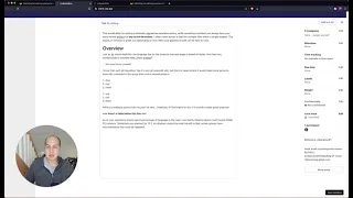
like
an
overview,
we
wanted
to
test
the
icon,
and
we
did
that
by
giving
asking
people
to
highlight
it
and
then
seeing
what
they
would
choose
for
quotes
here.
A
A
They
did
this
and
then
two
okay.
So
the
beauty
of
this
is
that
there
is
some
markup
already
inside
here.
So
another
way,
some
people
did.
This
was
looking
at
heading
and
we
also
wanted
to
see
if
people
understood
that
this
icon
was
tables
and
just
inserting
tables
like
this
and
people
were
generally
content.
With
this,
a
lot
of
people
were
looking
for
more
options
around
the
table,
such
as
adding
another
row
or
column.
A
These
features
are
available,
but
for
the
time
for
the
scope
of
this
solution,
validation,
we
just
wanted
to
keep
it
simple
and
we
tested
this
pattern.
Where
everything
was
generally
hidden
until
you
started
interacting
with
it,
and
the
other
pattern
we
went
with
to
test
was
looking
at
a
toolbar
at
the
top,
so
it's
always
visible
so
same
kind
of
actions.
A
So,
let's
jump
into
the
findings
in
more
detail,
so
providing
a
mechanism
to
insert
a
block
editor
will
allow
users
to
insert
elements
closer
to
where
they're
currently
positioned.
So,
like
I
showed
you
earlier,
this
is
when
you
add,
pressed
enter
and
there
was
a
new
kind
of
menu
that
pops
up
and
that
resonated
really
well.
A
A
So
this
works
fine
for
something
like
formatting,
but
if
it
existed
here,
people
also
expected
to
get
options
to
change
the
heading
sizes
with
this
menu
as
well.
So
this
idea
works,
but
there's
limitations
in
it
where,
if
you
don't
include
everything
that
the
user
expects,
then
it
will
be
a
negative
experience
as
well
as
in
the
people,
actually
preferred
the
variation
with
the
toolbars
at
the
top,
because
that
gives
them
a
better
understanding
of
what's
possible.
A
We
recognize
that
this
is
users
coming
into
this
experience,
with
some
experience
with
gitlab,
so
they're
used
to
having
a
toolbar
at
the
top,
so
that
may
bias
kind
of
that
feedback.
But
there
is
some
familiarity
of
like
okay.
This
is
what
I
might
be
able
to
do
when
you
see
the
options
available
versus
a
blank
slate.
So
that's
something
the
team
is
going
to
be
exploring
down
the
road
about.
A
Participants
struggle
to
find
the
block
quote
actions
only
two
out
of
nine
could
actually
immediately
use
the
block
quote
formatting
some
people
thought
the
word
block
quote,
meant
the
code
block
functionality,
so
we're
not
100
sure.
If
that's
a
misunderstanding
of
the
question
or
the
action
itself,
another
thing
was
in
the
prototype
itself.
A
When
you
hovered
over
the
menu
items,
it
didn't
have
a
tooltip
that
provided
information
on
what
the
action
was
going
to
be.
So
this
is
something
around
education
that
the
tooltips
provide
users
when
they're
trying
to
discover
functionality
in
the
application
kind
of
like
this,
like.
If
I
hover
over
this,
I
should
be
able
to
get
some
tooltips,
so
something
like
this
could
really
help.
People
understand
what
that
action
could
be.