►
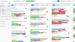
From YouTube: Create UX Update 13.0 - Knowledge
Description
Update on what the UX team in the Knowledge group is working on
A
I'm
working
on
as
far
as
design
goes
in
design
management.
We
want
comments
to
be
resolvable,
which
is
a
typical
feature
like
Zeppelin
or
envision.
We
want
to
make
the
designs
more
visible
in
the
issue
so
rather
than
the
design
tab,
which
is
pretty
hidden.
We
want
to
bring
that
out
and
make
it
more
apparent
that
there's
designs
and
in
the
wiki
the
sidebar
has
kind
of
an
odd
way
to
show
nesting
and
that's
something
that
we
want
to
fix
and
make
it
a
little
more
straightforward.
A
A
Basically,
the
browser
extension
allowed
you
to
overlay
a
design
on
top
of
a
web
page
have
a
bunch
of
fancy
grids
and
rulers
that
you
can
drag
out
to
make
sure
everything
is
aligned
at
the
pixel
level,
and
what
we
found
is
that,
at
least
with
our
sample
of
five
designers
designers,
a
gitlab
don't
really
check
designs
at
that
kind
of
fidelity.
There
seems
to
be
a
trust
with
the
developers
that
things
will
be
implemented
correctly
and
most
designers
will
eyeball
things
and
will
be
able
to
tell
if
something
is
way
off.
A
A
little
more
up
to
date,
with
other
current
applications
may
be,
like
slack,
there's
a
lot
of
kind
of
odd
UI
in
here.
Where
you
have
side,
tab
bars
within
side
bars,
and
you
know
the
room.
The
controls
for
the
room
are
in
kind
of
the
global
navigation
area
and
there's
multiple
hamburger
menus
in
the
bottom,
and
this
plus
button,
which
isn't
really
apparent
what
it
does.
A
Things
are
very
siloed,
for
example,
conversations
search
and
people
for
some
reason
have
their
own
tabs
and
are
completely
separate,
and
so
not
that
there's
any
outstanding
problems
with
this
that
users
are
complaining
about.
But
just
looking
at
this
more
from
a
heuristic
perspective
and
competitive
perspective,
how
can
we
maybe
overhaul
this
and
make
it
a
little
more
modern,
a
little
easier
to
use
and
have
things
make
a
little
more
sense
where
they're
located
and
just
be
cleaner
and
simpler?
A
The
room
controls
are
within
the
room
and
over
here
on
this
side
bar
there's
these
tabs.
These
are
tabs.
They
don't
look
like
tabs,
you
wouldn't
know
until
you
maybe
played
with
it
for
a
while
and
just
breaking
those
out
into
collapsible
sections
and
then
rather
than
having
all
this
show/hide.
So
this
one
would
show
hide
the
left
bar.
This
one
would
show
hide
the
right
bar.
A
The
left
bar
would
probably
collapse
based
on
CSS
rules
and
the
right
sidebar,
since
this
is
additional
info
about
the
room,
would
be
activated
potentially
by
an
icon
like
the
info
icon,
which
is
attached
to
the
room.
So
you
know
you're
getting
info
about
the
room,
so
if
this
is
highlighted,
the
room
info
is
open.
If
this
is
not
highlighted
or
if
you
click
the
X,
the
room
info
is
collapsed,
so
that
makes
the
navigation
a
little
more
global.
It
simplifies
the
left.