►
From YouTube: 2022-05-09 Dev: Manage/Plan/Ecosystem design review
Description
We discuss custom RBAC improvements.
B
B
For
example,
if
I
start
adding
like
a
search
bar
or
like
additional
roles
that
might
shuffle
this
content
down
and
a
concern
being
that,
if
organizations
have
you
know
tens
or
hundreds
of
custom
roles,
this
could
get
rather
unwieldy,
and
this
feels
like
not
a
good
use
of
the
space
this
table
or
this
content
could
presumably
change
based
off
of
whatever
you
have
selected
here.
So
this
would
be
the
permissions
table
that
has
been
defined
for
documentation
and
based
on
whatever
selection
you
have,
that
can
change.
B
B
C
B
Either
it's
additive
or
subtractive
permission.
So
that's
kind
of
where
the
the
id
of
this
container
came
from,
so
this
is
actually
like
the
secondary
screen.
This
would
be
the
the
screen
before
where
you
have
your
list
of
custom
roles
and
if
you
were
to
click
the
new
role,
it
would
take
you
over
to
this
to
this
builder.
C
So
I
guess
that's:
what,
for
me,
is
what
kind
of
popped
out
is
that
we're
on
the
other
page?
The
view
of
it
is
that
we're
combining
kind
of
a
left
side,
navigation
that
has
things
then
one
of
these
navigational
items
has
two
things:
roles
and
permissions,
and
then
we
have
tabs
and
then
vertical
stacking.
B
Yeah
that
I
would
agree
like
I'm
not
really
sure
if
this
is
the
best
way
to
implement
this,
like
I
said
we
did
show
this
to
clients
and
users
and
they
did
appreciate
it.
They
did
understand
the
interaction,
but
I
do
think
there
is
room
for
improvement
or
make
it
more
more
user-friendly
or
more
easy
to
use
and
that's
kind
of
where
I'm
trying
to
see
if
there's
another
solution
or
something
that
I
haven't
thought
of
to
execute
this
kind
of
flow.
C
Okay,
so
I
I
don't
know
that
I
I
feel
like
I
had
to
ask
that
question
of
of
how
these
two
sections
are
interplayed
together.
I
I
see
where
you're
driving
at
I
just
don't
know
that,
like
that's
necessarily
obvious,
maybe
play
with
that
idea
of
selecting
and
displaying
it
feels
like
that's
the
right
solution,
I'm
also
struggling
to
think
of
another
situation
in
gitlab,
where
we
have
kind
of
two
sections
where
one
affects
the
other
one
yeah.
B
D
Is
there
a
like
researcher
or
insight
that
you
have
that
kind
of
leads
you
to
think
that
once
somebody
starts
customizing
roles
that
the
default
like
knowing
that
something
is
the
default
is
important
to
them
or
or
like
a
system
reason?
Why,
like
the
distinction
between
like
defaults
and
non-defaults,
is
important.
D
No
more
after
the
fact,
like
you
know,
when
you're
looking
at
this
list
as
a
user
and
in
that
scenario
that
you've
described
where
they've
built,
you
know
a
significant
subset
of
customized
roles
like
do
I,
as
the
admin
care
that
something's
the
default
or
like.
Why
like,
why
is
that
distinction
important
to
me.
B
Generally,
the
idea
would
be
that
they
would
be
able
to
troubleshoot
so
for
any
reason
that
they
had
a
permission,
a
role
that
they
had
created.
There
was
a
custom
role
and
it
was
not
having
access
to
features
or
not
responding.
The
way
that
they
wanted
to
they'd
want
to
see
what
features
were
turned
on
or
off,
and
is
there
a
clean
or
pristine
state
that
they
can
revert
to
that
they
can
go
back
and
so
having
that
knowledge
like
okay?
B
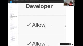
Well,
I
know
that
I
can
go
back
to
the
developer
role
as
a
default
and
then
look
at
that
and
see
where
the
difference.
Maybe
that
would
be
the
way
of
doing
it.
So
mostly
it's
like
a
troubleshooting
way
of
interacting
with
it
and
then
another
point
would
be
for
documentation
which
is
kind
of
not
necessarily
related
to
this,
but
we
were
talking
about
this
would
generate.
Excuse
me,
this
table
would
be
code
level,
obviously,
but
it
would
then
populate
the
documentation.
B
D
Yeah,
I
I
think
so
I
think
I
was
just
trying
to
figure
like
having
two
tabs
seems
to
give
it
a
lot
of
prominence.
I
think,
having
like
the
you
know,
if
you,
if
you
were
to
group
them
that
feels
a
little
bit
more
streamlined
and
then
maybe
like
even
a
level
further
could
be,
you
know,
even
just
like
a
label
or
something
like.
So
you
know,
if
you
have
custom
roles
like
you,
could
just
apply
like
a
label
to
the
five
defaults
that
says
you
know
owner
like
default
or
something
like
you
know.
D
Basically,
if
you
find
yourself
in
in
the
scenario
where,
like
there's
a
lot
of
these,
like
nested
sort
of
ui
components,
you
know
like
that
could
be
a
way
out
of
one
layer
of
organization,
but
the
group
approach
could
be
could
be
another
way
to
solve
that.
I
think
that
feels
a
little
bit
less
sort
of
heavy
than
the
the
tabular
picture
since
it
doesn't,
it
doesn't
seem
like
that's
like
something
that
they're
gonna
regularly
be
looking
at
to
see.
Like
you
know,
I
need
to
look
at
defaults
versus
custom.
B
Yeah-
and
I
think
that
makes
sense
now
that
you
described
it
in
that
way,
I
think
the
only
time
they'll
really
interact
with
it
is
for
looking
at
the
documentation
or
looking
at
it
for
documentation,
and
then
the
the
building
interaction
component
was
like.
I
need
to
know
which
template
to
build
off
of,
and
then
I
select
that
and
that's
what
I
would
interact
with
it,
and,
apart
from
that,
it
would
kind
of
be
relevant.
D
B
Yeah,
so
I
haven't
done
the
visual
for
that
just
yet.
My
initial
idea
would
be
it
would
just
go
back
to
the
the
builder
screen,
so
you
can
go
and
toggle
things
on
and
off.
I'm
wondering,
though,
if
there
is
like
a
concern
for
editing,
rather
than
just
deleting
and
starting
over
in
terms
of
like
to
maintain
security,
or
you
know
safety,
so
that's
something
to
definitely
investigate.
D
Okay,
I'm
thinking
about,
like
you
know,
with
the
patterns
like
if
you're
clicking
and
it's
opening
sort
of
a
like
a
preview
pattern
almost
like
like
here.
You
have
kind
of
a
vertical
stack
master
detail
pattern,
and
I
think
your
other
approach
was
was
basically
the
horizontal
approach
like
I
guess
you
could
just
have
like
an
edit
button
or
something
from
that
that
sort
of
preview
panel,
or
does
the
preview
panel
itself
become
the
edit
state.
B
B
B
E
B
B
I
set
it
to
only
five
and
then
do
pagination
here
in
the
middle
of
the
page,
which
seems
weird:
do
I
leave
it
infinite
scroll
and
get
rid
of
this
whole
table,
and
that's
where
the
idea
of
like
okay?
Well,
maybe
this
double
column
might
actually
keep
help,
because
then
I
can
keep
the
content
separate
and
that
way
I
can
infinite
scroll
on
both
and
so
that's
kind
of
where
I'm
thinking
like.
I'm
not
sure
this
is
the
correct
solution.
B
That's
kind
of
what
I'm
thinking
like.
Is
there
a
better
way
of
doing
this,
because
even
if
I
do
get
rid
of
the
tab,
behavior
and
just
categorize
things
by
groups
or
labels?
What's
the
what's
the
limit?
What
happens
when
I
hit
like
a
theoretical
change
or
a
threshold?
Where
I
don't
want
us
to
continue
to
be
pushing
the
content
down,
but
I
also
feel
weird
paginating
in
the
middle
of
a
page,
and
I
don't
know
if
there's
any
other
examples
of
that
elsewhere
in
the
environment.
E
Thanks
yeah,
it
wasn't
clear
to
me
that
permissions
and
below
is
actually
outside
of
the
tab
group,
so
maybe
something
there's
a
way
of
making
clearer
where
the
end
of
the
tab
sections
is.
I
guess
something
that's
similar
to
that
is
is
a
new
role,
always
a
custom
role,
and
if
it
is,
should
it
be
within
the
custom
role
like
within
the
custom
role
section
somehow
at
the
minute
it's
outside
of
it.
B
Yeah,
so
every
new
role
will
always
be
a
custom
because
we
will
not
allow
any
changes
to
the
default
as
a
means
of
troubleshooting,
so
that's
kind
of
where
I'm
thinking
like
is
this
really
necessary?
If
it's
just
going
to
be
always
ending
up
over
here
in
this
section
in
the
custom
section,
maybe
the
label
system
is
the
better
solution
there.
Since
we
already
have
that
implemented,
it
would
reduce
the
the
content
being
taken
up
on
the
page.
A
Cool
go
ahead,
I'm
gonna
jump
in
here,
and
this
is
not
solutioning,
don't
just
think
of
it.
This
is
just
a
possible
option,
but
the
way
that
I'm
thinking
of
our
default
default
roles
is
they're
permanent
they're,
not
changing
their
contents
and
so
they're
in
my
mind.
Maybe
they
don't
need
to
take
up
like
a
whole
section
of
the
page
and
you
divide
it
custom
versus
default
by
tabs.
A
A
And
there's
a
button
that
says:
apply
these
permissions
or
something
like
that,
something
where
we
like
again,
because
they
don't
change,
we
don't
it's
a
permanent
list,
something
that
we
can
sort
of
hide
away
or
reduce
in
actual
screen
size.
Because
really,
the
focus
here
is
the
custom
rolls
and
the
default
roles
are
really
only
used
to
either
start
from
or
go
back.
B
To
yeah,
I
I
think
that's
also
something
to
help,
because
if
the
default
roles
are
immutable,
then
there's
no
point
in
having
them
here,
apart
from
just
clicking
on
it
and
looking
at
the
permissions
that
are
defined
here
in
this
table,
which
would
functionally
serve
as
documentation.
But
do
we
want
to
take
up
a
whole
page
in
the
platform
for
documentation?
B
So
I
think
that
kind
of
makes
sense
to
just
not
even
have
them
that
leads
to
default
ones.
And
you
only
have
the
custom
roles
here
and
if
they
wanted
to
go
look
at
them,
they
could
look
at
them
elsewhere,
but
the
default
would
still
occur
in
the
drop
down
in
the
builder,
where
they
would
be
seeing
them
side
by
side
which
one
would
be
toggled
on
and
off
compared
based
off
of
the
the
template
role
that
you've
chosen
of
those
five.
A
Yeah-
and
you
could
even
keep
that
bottom
section
because
they
changed
depending
on
which
default
role
you
select
as
sort
of
an
educator
of
what
those
things
are.
But
you
could
I
don't
know
this
is
not
the
way
to
go,
but
have
the
default
roles
as
being
radio
button,
with
labels
up
horizontally
across
the
screen.
So
it's
not
taking
up
all
that
space
and-
and
it's
also
sort
of
a
way
for
the
user
to
actually
explore
what
all
the
rules
are
and
what
they
do,
how
they
change.
Something
like
that.
B
B
B
A
B
So
is
that
right,
anything
you
were
to
click
here
would
change
the
content
here
sure
because
it
would
be
based
off
of
you'd,
want
to
see
what
permissions
were
assigned
to
that
role,
because
you,
the
only
other
way
of
doing
it,
that
I'm
thinking
now
would
have
to
go
and
edit,
which
feels
dangerous.
If
you
miss
click
and
do
something,
if
you
just
want
to
look
at
it,
real
quick,
I'm
clicking
on
it
here
and
you'll
be
able
to
see
it
within
this
table.
B
E
C
B
D
Outside
of
I
guess,
the
boards
we've
kind
of
does
this,
but
are
there
other
places
in
the
tool
that
are
using
like
a
list
view
combined
with
a
drawer
pattern
for
for,
like
a
master
detail
pattern,
because
that
would
it
that
would
be
sort
of
it's
similar
to
your
your
horizontal
approach
and
like
the
boards,
you
kind
of?
Does
it
it's
like
a
small,
the
small
drawer,
but
are
there
other
places
that
are
using
a
similar
pattern?.
B
Yeah
yeah,
like
the
side,
the
the
right
hand
drawer.
I
think
I
think
that
was
kind
of
like
our
first
idea,
but
the
problem
that
I
had
there
was
that,
because
this
is
such
a
documentation,
heavy
or
a
text,
heavy
object,
I
felt
you
might
have
gotten
stuck
by
having
weird
long
chunks
of
content
and
the
side
bar
would
just
scroll
and
scroll
and
scroll.
B
It
could
be
better
done
by
reducing
the
text
and
leading
it
off
to
documentation
and
just
having,
like
you
know,
of
mine,
small
blurbs,
like
you
have
here
right,
but
yeah,
that's
something
that
I
definitely
wanted
to
explore.
Having
the
the
idea
of
the
sidebar
or
the
sidenav
pop
out
and
help,
I
think
the
the
aversion
to
that
was
that,
because
we're
using
this
as
kind
of
like
the
the
builder
screen,
also
that
we
could
minimize
the
amount
of
different
components
being
used.
B
F
That's
I
was
kind
of
thinking.
Similarly,
I
think
that
it
sounds
like
that.
Was
you
want
to
reduce
scrolling?
Could
it
be,
I
guess
either
like
a
modal?
If
you
had
to
do
that,
or
can
it
be
an
accordion
which
then
brings
in
a
lot
of
scrolling,
like
I
click
into
the
role
or
like
what,
if
he
had
the
drawer,
but
it
had
like
a
secondary
drawer
within
the
drawer
like
I
clicked
in
permissions,
and
it
just
the
drawer
becomes
all
about
permissions,
and
I
can
go
back
or
something
like
that.
B
B
B
So
this
is
what
we
were
trying
to
look
at
as
our
model
to
build
off
of,
and
so
this
is
just
the
entire
permissions
just
for
projects.
So
this
was
the
other
one
was
for
groups.
This
is
for
projects,
jobs,
permissions
and
it
just
goes
on
and
on
and
on,
and
so
these
we
actually
had
to
spend
time
and
go
and
categorize
all
of
this
stuff
and
put
them
in
these
containers.
B
And
that's
where
the
those
five
topics
were
in
the
prototype
like
namespace
repository
product
management,
because
this
table
is
just
too
much
right.
But
that's
what
the
end
game
is
supposed
to
be
is
that
every
one
of
these
little
check
boxes
should
be
toggleable
to
allow
an
admin
to
add
or
remove
that
permission
from
the
role
that
they're
building
off
of
these.
F
E
Yeah
I
we
when
it
was
when
I
found
we
were
when
we
were
talking
about
it.
I
was
thinking
I
wonder
how
we
do
it
in
value
stream
management,
where
it's
just
weird
you've
got
to
make
a
custom
thing,
and
sometimes
you
want
to
edit
it.
Sometimes
you
want
to
review
it
to
debug
it,
and
so
I
went
to
see
what
we
do
and
it's
all
through
the
magic
of
the
models
for
creating
it
and
for
to
review
it.
You've
got
to
edit
it,
but.
E
E
B
B
It
goes
back
to
the
to
the
builder
screen,
so
this
screen
right
here
and
it
would
have
save
or
cancel,
and
I
think
that
was
is
this
going
to
be
a
sticky
thing,
because
if
they
scroll
down,
you
know
through
countless
pages
we
saw
previously.
That
might
be
problematic
right.
Let
me
just
scroll
through
this.
You
have
to
go
all
the
way
back
to
the
top.
C
B
B
B
B
C
D
Yeah,
I
did.
I
worked
on
something
really
similar
to
this
for
a
platform
fairly
recently,
and
they
ran
into
that
where,
like
because
what
people
were
doing
they
found
was
they
were
creating
a
bunch
of
roles
that
were
like
99,
identical
and
so,
like
literally
they're,
saying
they're
like
okay.
Is
it
this
role
that
has
like
one
slightly
different
permission
in
the
name?
D
That's
almost
the
same
or
the
next
one
that
my
colleague
created
with
basically
the
same
name
and
a
two
next
to
it
and
like
yeah
having
to
go
like
back
and
forth
trying
to
figure
out
like
which
of
these
is
the
one.
Oh,
this
one
only
has
one
user,
and
this
one
has
a
thousand
users
like
yeah.
You
had.
You
know
it's
easy
to
create
garbage
in
some
of
these,
and
then
you
know
try
to
maintain
that.
C
C
B
B
B
A
Yeah
great
discussion,
thanks
for
everybody,
for
chiming,
in
thanks
daniel,
for
presenting
this
and
and
talking
it
through
with
all
of
us,
just
an
update
on
the
first
thing
in
the
agenda.
I
did
push
the
time
30
minutes
later,
so
hopefully
we'll
be
seeing
libor
and
a
bit
more
and
yeah
feel
free
to
keep
chiming
in
on
the
agenda
here
for
being
able
to
sort
of
go
over
for
this
r
back.