►
From YouTube: Competition Page Design Review
Description
No description was provided for this meeting.
If this is YOUR meeting, an easy way to fix this is to add a description to your video, wherever mtngs.io found it (probably YouTube).
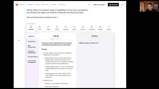
A
Okay,
so
on
to
iteration,
eight
of
the
devops
maturity
comparison
chart
thanks
again
for
sharing
the
notes
from
the
meeting
last
week
we
heard
a
lot
of
great
direct
and
indirect
feedback,
and
also
looking
at
the
post
hog
site
kind
of
gave
us
a
little
bit
more
of
a
view
into
what
you're,
after
we
put
together
this
version,
because
we
believe
it
serves
the
purpose
you're
trying
to
achieve
better.
We
have
all
the
other
versions
you
asked
for,
but
we're
feeling
really
strong
about
this
so
iteration
eight.
A
Again,
there's
four,
you
know
25
it's
the
same
as
the
Harvey
balls,
it's
just
kind
of
a
better
use
of
space,
easier
to
scan,
and
then,
when
you're,
looking
at
the
devops
stages,
we
can
see
who
we're
competing
against
overview,
and
then
you
can
scroll
down
into
the
stage
specifics.
So
we
like
this
a
lot,
so
you
can
click
here
back
into
manage
when
you're
down
here
you
can
click
subgroup,
pops
open
a
modal.
We
can
see
the
specifics
of
that
that
feature
effectively
with
a
little
overview
and
close.
A
We
really
like
how
this
exposes
reduces
the
interaction,
but
also
makes
it
easy
to
consume
the
information
and
then
either
here
clicking
GitHub
or
directly
from
up
here.
That'll.
Take
us
right
into
the
competition
page
gitlab
versus
GitHub,
with
the
aggregate
View
and
then
the
features
broken
down
per
stage,
specifically
of
that
one
competitor,
and
then
we
can
easily
get
back
to
this
screen.
A
Going
backwards
now,
iteration
seven.
This
is
the
first
idea
that
led
to
the
one
we
just
showed
you
but
I
just
wanted
to
share
it
to
show
a
different
color
scheme
we
could
use
for
the
progress
bars,
it's
kind
of
fun.
It's
on
brand
might
be
a
little
loud,
less
scannable,
but
the
key
difference
here
is
instead
of
displaying
the
information
below
it's
hidden
behind
the
details
button
we,
like
the
version
I
just
showed
you
iteration,
eight
better,
but
just
wanted
to
share
how
we
got
there.
A
A
It's
going
into
iteration
six,
so
this
is
kind
of
going
back
in
time
of
how
we
got
to
our
recommended
version.
This
is
the
big
overview
with
everything
using
progress
bars,
so
you
can
kind
of
scan
everything
we
can
see
how
this
is
useful,
maybe
a
little
overwhelming
or
hard
to
hold
in
your
mind,
but
we
wanted
to
work
through
it.
So
again,
we've
got
the
subgroups.
We've
got
the
modal.
All
of
that
works
the
same
you
can
click
into
GitHub
go
to
the
versus
page.
A
So
a
lot
of
this
looks
the
same
as
we've
already
walked
through.
We
can
click
back
now
go
into
iteration
five.
This
is
the
version
using
the
logos
as
Harvey
balls,
exactly
how
we
just
saw.
So
you
can
click
on
feature.
There's
the
modal.
You
can.
Click
on
the
logo
specifically
goes
to
the
versus
page.
A
Everything
else
holds
same
holds
true
and
then
finally
iteration
four.
This
is
the
same
that
we
just
saw,
but
using
Harvey
balls
instead
of
the
logos
as
Harvey
balls,
so
a
little
bit
more
scannable
in
a
text
format,
but
a
lot
definitely
see
a
lot
more
noise
and
again
same
functionality.
Subgroups
model
overlay
click
on
GitHub
go
to
the
versus
page.
A
So
again
that
brings
us
back
to
this
iteration,
which
we
just
think
solves
all
of
the
problems
you're
trying
to
get
after
to
talk
with
the
product
team,
put
an
r
d
strategy
together,
where
you
can
go
through
kind
of
a
top
track
of
in,
say
we're
in
create
we'd,
be
behind
GitHub,
so
in
create
we're
behind
GitHub.
We
look
at
the
features.
This
is
exactly
where
we
are
behind
here's
a
little
bit
more
detail
or
let's
jump
right
into
our
GitHub
comparison.