►
Description
Learn about DevOps metrics in GitLab and why it is useful to track them. We will cover an overview of DORA metrics, Value Stream Analytics, and Insight dashboards, and what it looks like in Gitlab.
A
A
A
So
for
our
agenda
today,
we'll
start
by
discovering
door
metrics
what
it
is
why
it's
important
then
we'll
go
through
value
stream,
Analytics
inside
dashboards,
where
you
can
find
them
in
gitlab
and
then
round
up
with
additional
metrics
available
on
gitlab.
If
any
questions
come
up
throughout
the
session
today,
you
could
drop
them
in
Q
a
and
one
of
my
often
colleagues
will
get
you
we'll
get
you
an
answer
as
soon
as
possible.
All
right
so
start
metrics.
A
After
eight
years
of
data
collection,
research,
doors,
accelerate
state
of
devops
research
program
has
developed
validated
by
four
metrics
of
software
delivery
performance
and
a
fifth
metric
reliability
in
the
session.
We'll
cover
the
first
four
drawer
metrics,
which
are
deployment
frequency
lead
time
for
changes,
mean
time
to
recover
and
change
failure
rate.
A
A
So
they
want
to
know
what
they're
getting
in
return.
So
these
metrics
can
help
improve
the
Ops
efficiency
and
communicate
performance
to
business
stakeholders
which
can
accelerate
business
results.
After
all,
so
let's
talk
about
the
the
metrics
themselves,
so
deployment
frequency
is
the
average
deployment
frequency
to
production
lead
time
for
changes
is
the
immediate
time
it
takes
for
a
merge
request
to
get
merged
into
production
from
Master
branch
change.
A
A
A
In
the
chat
shown,
there
is
an
example
of
how
deployment
frequency
is
visualized.
We
have
the
option
to
view
data
within
the
last
week
month,
90
days,
so
this
red
line
across
a
chart
indicates
our
average
next.
We
can
find
lead
time
for
changes
under
the
same
analytics
Page
by
toggling,
The
Next
Step.
A
Here
we're
looking
for
the
time
it
takes
for
committed
code
to
successfully
run
in
production.
This
reflects
the
efficiency
of
cintd
Pipelines
and
lead
time
for
changes
calculates
the
median
time
it
takes
for
merge,
request
to
get
merge
into
production,
and
this
is
measured
from
code
committed
to
code
successfully
running
in
production.
A
We
are
adding
the
coding
time
into
the
calculation,
so
we're
calculating
a
median
instead
of
average,
since
there
are
times
that
no
deployment
or
production
happens,
for
example
over
the
weekend,
and
we
wanted
to
give
a
true
sense
of
what
the
lead
time
for
change
really
is
over
time.
This
metric
should
decrease
while
your
team
performance
should
increase.
Ideally,
this
metric
is
support
at
the
group
level
and
project
level
in
the
chart
shown
the
greater
lines
show
no
merge
requests
would
deployed
during
that
period.
A
Similarly,
change
request
rate
can
be
found
under
the
CISD
analytics
page
on
the
next
step,
and
this
is
available
at
both
the
group
and
project
level.
The
change
failure
rate
chart
shows
information
about
the
percentage
of
deployments
that
cause
an
incident
in
a
production
environment,
for
example.
This
can
be
a
deployment
failure,
an
incident,
a
rollback
or
remedy.
A
This
is
a
measured
as
a
number
of
incidents
divided
by
the
number
of
deployments
to
a
production
environment
in
a
given
time
period,
but
in
this
case
you
must
use
gitlab
incidents
for
incidents
to
be
captured.
So
that's
the
only
caveat
for
that
and
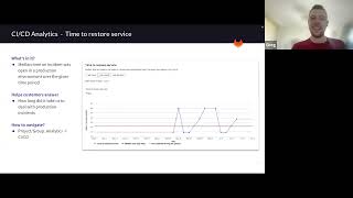
for
the
four-store
metric
time
to
restore
service
can
also
be
found
on
the
CISD
analytics
page.
A
This
shows
information
about
how
long
it
takes
an
organization
to
recover
from
a
failure
in
production.
It
will
give
us
a
better
understanding
of
our
software
stability
and
reliability
Trends
over
time.
I
get
lab
measures
just
as
an
average
time
required
to
close
the
incidence
in
a
given
time
period.
A
A
So
we
took
a
quick
look
at
the
cic
analytics
and
the
door
there.
I
know
there's
quite
a
lot
and
this
is
confusing
and
we
have
extensive
documentation
to
go
through
it.
It
took
me
quite
a
while
to
get
a
custom
silver,
so
don't
be
alarmed
if
you
can't
remember
it
if
you
can
and
you're
already
an
expert
brilliant.
A
A
A
You
can
also
measure
the
velocity
of
a
given
project
and
bottlenecks
in
a
development
process.
Again
what
stages
taking
longer
to
complete
and
when
we
combine
both
door
and
value
stream
analytics
store,
will
help
you
Benchmark
against
industry
standards
and
the
values
Humanity
will
help
you
identify,
improve
and
better
those
Dura
Matrix.
A
A
A
A
One
thing
to
note
is
lead
time
for
changes
is
not
the
same
as
the
lead
time
in
the
value
stream
lead
time
measures
the
time
it
takes
for
work
on
an
issue
to
move
from
the
moment.
It's
created
to
the
moment.
It's
delivered
issue
clauses,
so
let
me
say
that
again,
so
lead
time
for
changes
is
not
the
same
as
lead
time,
so
animal
stream
lead
time
measures
the
time
it
takes
for
work
on
an
issue
to
move
from
the
moment
it
is
created
at
the
moment
it
is
delivered.
A
You
should
close
us
so
here.
In
this
example,
we
show
you
how
you
can
use
value
stream
analytics
to
find
bottlenecks
in
workflows
now
for
each
stage
a
table
list
displays
a
workflow,
an
items
filtered
in
context
of
that
particular
stage.
The
demo
provides
a
deep
dive
into
the
stages
performance,
and
here
we're
looking
at
a
staging
stage
and
Below.
We
have
a
merger,
Quest
last
event,
duration,
column
from
here.
A
More
metrics
so
insights,
they
give
you
the
option
to
configure
a
custom
report
for
insights
into
good
processes,
such
as
an
amount
of
issues
bugs
merge
requests
per
month.
You
can
configure
insights
to
export
data
by
your
groups,
activity
such
as
trash
hygiene
issues
created
or
close
in
a
given
period.
A
A
So
this
is
an
example
of
an
insights
configuration
file.
It's
showing
a
single
definition
that
displays
one
report
with
one
chart
in
the
file
the
configuration
parameters
Define
the
chart
Behavior
each
report
has
a
unique
key
and
a
collection
of
charts
to
fetch
and
display,
and
each
chart
definition
is
made
of
a
hash
composed
of
key
value
pairs.
A
A
A
A
So
this
new
dashboard
provides
strategic
insights
into
the
metrics
that
help
decision
makers
identify
Trends
and
patterns
optimize
software
delivery.
So
the
first
iteration
of
gitlab
value
stream
dashboards
is
pretty
much
focused
on
enabling
teams
to
continue
to
improve
software
daily
workflows
and
benchmarking
value
stream.
Life
cycle
to
wireless
stream
analytics
do
our
metrics
and
vulnerability
metrics,
which
is
new,
and
you
can
use
the
value
machine
dashboard
to
track.
A
Compare
this
metrics
over
a
period
of
time,
identify
Downstream,
Trends,
early,
understand
security,
exposure
and
and
drill
down
into
individual
projects
and
metrics,
and
take
action
for
improvements.
So
this
is
fairly
new.
One
in
our
initial
case
here
is
focused
on
providing
the
ability
to
compare
software
delivery.
Metrics,
so
this
comparison
can
help
decision
makers
and
get
an
idea
where
projects
and
groups
are
improving
or
not.
A
Dashboard
includes
star
metrics
value
stream,
metrics
kind
of
flow
Matrix
and
valuability
vulnerabilities
metrics,
which
I'm
also
going
to
cover
in
a
second
and
device
streams.
Kind
of
dashboard
also
allows
you
to
aggregate
data
across
many
different
apis
track
software
performance
door
info
of
value
across
your
whole
organization.
So
it's
a
great
dashboard
now
that
there's
more
metrics,
let's,
let's
take
a
look
at
them
as
well
that
devops
adoption.
A
So,
for
example,
in
red
you
can
see
development
category
with
approvals
code
owners
issues
and
merge
requests
as
the
features
below
it,
a
feature
shown
as
adopted
when
a
group
has
used
the
feature
in
a
project
during
that
period.
This
includes
projects
in
a
subgroup
of
the
group
as
well.
For
example,
if
an
issue
was
created
in
a
project
in
a
group,
the
group
has
adopted
issues
in
that
time.
A
A
You
can
also
find
subgroups
that
have
adopted
certain
features
and
provided
guidance
to
other
subgroup.
You
know
on
how
to
use
those
features,
essentially
something
we
do
with
gitlab
anyways,
but
internally.
It's
also
important
to
keep
an
eye
and
you
can
also
use
devops.
You
know
adoption
25
if
you're
getting
the
return
investment
you
expected.
So
that's.
It's
always
helpful
to
keep
an
eye
now.
A
Using
the
code
review
feature
in
merge
requests,
you
can,
if
you
look
at
the
time
it
takes
for
a
merger
quest
to
open
to
the
time
it's
merged.
You
can
find
this
information
on
the
code
View
analytics
to
see
the
longest
running,
reviews
in
open,
merge
requests
and
take
action
on
the
individual,
merge
requests.
So,
for
example,
a
high
number
of
comments
or
commits
May
indicate
the
code
is
too
complex
or
maybe
authors
require
my
training
along
with.
A
You
may
indicate
types
of
work
that
move
slower
than
other
types
or
opportunities
to
accelerate
your
development
life
cycle,
fewer
comments
and
approvements
may
indicates
Staffing
requirements
and
this
kind
of
helps
reduce
overall
cycle
time
in
I.
Hope
you
give
insights
and
make
improvements
within
you
know.
The
teams
and
code
reviews
analytics
can
be
found
at
the
project
level.
A
A
A
So
repository
Analytics,
it
shows
you
how
you,
how
you
use
and
how
many
programming
languages
are
used
in
the
repository
and
additional
git
repositories.
Information
such
as
code
coverage
history
from
the
last
two
months,
for
example.
In
addition
to
seeing
the
programming
languages
used,
you
also
find
average
commits
there's
an
option
for
you
to
download
code
coverage
statistics.
Road
data
in
CSE
and
the
screenshot
shown
here
is
actually
of
our
gitlab
repository
in
since
solar
or
back-end
code
is
in
Ruby.
It
makes
sense
that
the
biggest
junk
isn't
Ruby,
as
shown.
A
So
operations,
dashboard
and
users
can
create
their
own
individual
operations,
dashboard
where
they
can
monitor
many
different
projects.
The
operations
dashboard
shows
a
summary
of
each
Project's
operational
help,
including
Pipeline
and
alert
status.
This
could
be
great
for
team
leads
or
even
group
leads
at
a
glance.
A
If
you
see
if
the
pipeline
succeeds
or
if
it's
cool
it's
going
to
failing
or
running,
and
you
can
also
take
a
look
at
when
the
last
commit
was
that
particular
group.
So
when
clicking
on
one
of
the
cards,
you'll
check
you
the
specific
project,
which
is
helpful
to
keep
an
eye
on
now
the
environments,
the
environment
dashboard,
provides
a
cross
project
environments
based
steel.
That
lets.
A
You
see
the
big
picture
of
what
what's
going
on
in
these
environments
from
a
single
location,
you
can
track
progress,
such
as
changes
flow
from
development
to
staging
and
then
to
production
or
to
any
series
of
custom
environments.
Flows.
Cube
will
set
up
yourself:
the
environment,
the
operations
and
environments,
dashboards,
share
the
same
list
of
projects,
adding
removing
projects
from
One
ads
or
removes
a
project
from
the
other.
A
These
are
this
dashboard
can
be
helpful
because
at
a
glance
you
can
do
multiple
projects
you
can
instantly
see
which
way
Appliance
is
green
and
with
the
red.
Then
it
can
allow
you
to
diagnose
if
there's
a
block
at
a
particular
point-
and
it
is
more
systematic
problem-
you'll
need
to
investigate
to
get
this
in
environments.
Dashboard
you'll
need
to
navigate
to
main
menu
environments
from
there.
A
You
can
begin
adding
your
your
projects
and,
last
but
not
least,
a
couple
more
points
about
security,
insights,
such
security
reports,
so
the
security
depth
model
you
will
using
that.
You
will
see
the
trends
about
vulnerabilities
detected
by
the
security
scanners
and
these
Trends
are
shown
in
projects
oops
and
also
the
security
Center
that
we
have
recently
added.
A
So
when
it
comes
to
security,
insights,
people
Liberty
report
provides
information
about
vulnerabilities
from
scans
of
the
default
branch
and
you'll
see
results
of
all
successful
jobs,
regardless
of
whether
the
pipeline
was
successful
or
not.
The
report
is
available
at
the
group
and
the
project
level.
A
On
that
report
you
can
filter,
set
status
and
drill
to
see
details
of
each
vulnerability.
You
also
have
the
option
to
export
details
of
the
vulnerabilities
listed
in
the
vulnerability
report
itself.
The
format
will
exported
is
CC
if
needed.
Each
vulnerability
in
the
project
has
a
Mobility
page.
So,
for
example,
on
the
report-
and
we
see
here-
I
will
click
into
vulnerability
and
it
will
take
us
to
openability
page
where
we
can
secret
more
details
about
that
particular
vulnerability
on
validity.
Page
again,
you
can
take
an
action
and
change
the
status
result.
A
Vulnerability
if
solution
is
available
view
security,
training
specific
to
that
detect,
availability
create
an
issue
yeah
after
you
create
an
issue.
You
can
track
actions
against
it,
resolve
it
capitigate
it
by
default.
You
can
create
a
GitHub
issue.
If
you
have
a
June
integration
setup,
you
can
create
a
Geo
issue
as
well.
That's
not
a
problem,
so
compliance
report,
it
gives
you
the
ability
to
see
groups,
merge,
requests
activity.
It
provides
a
high
level
view
of
all
projects
in
a
group.
So
you'll
use
a
report
to
get
a
list
of
compliance.
A
A
Why
is
this
compliance?
Oh,
that
one's
my
favorite?
If
using
gitlabsia
NCG,
you
can
use
license
compliance
to
search
your
projects
dependencies
for
the
licenses,
and
you
can
then
decide
whether
to
allow
or
deny
the
use
of
each
license.
For
example,
if
your
application
uses
an
external
open
source,
Library
quiz
license,
is
it
compatible
with
yours?
Then
you
can
deny
the
use
of
that
license.
A
You
can
select
licenses
to
see
to
see
additional
licenses
when
gitlab
detects
a
denied
license.
You
can
view
it
in
the
license
tests
page
so
on
the
policies
tab.
You
can
view
and
modify
this
licenses
as
well,
so
coming
towards
kind
of
the
end
here
and
we
have
big
dependency
list.
So
it's
kind
of
big
hot
topic.
You
can
use
dependence
at
least
to
review
your
project
dependencies
and
new
additional
details
about
those
dependencies.
So
this
includes
their
known
vulnerabilities.
A
A
So
GitHub
dependency,
scanning
or
container
scanning
job
must
be
configured
in
your
product
for
you
to
see
the
project
dependencies,
so
your
project
also
has
to
use
at
least
one
of
the
languages
and
packages.
Managers
supported
by
the
amazing,
which
is
our
scanner
and
dependency
list,
shows
the
path
between
dependency
and
the
top
level
dependency
is
connected
to.
If
there's
any,
there
are
many
possible
paths,
but
the
user
interface
shows
the
one
that
is,
that
is
the
shortest.
Essentially,
you
also
have
the
option
to
download
your
projects
focused
dependencies
details
and
Json
format.