►
From YouTube: Digital Experience Team Release Video - June 17, 2021
Description
Sprint Release Doc:
https://docs.google.com/document/d/1kMNiUF2UDuSrMDuzLyRi8OEhVxry_MJoYi38RmmWafY/edit?usp=sharing
Digital Experience handbook page: https://about.gitlab.com/handbook/marketing/inbound-marketing/digital-experience/
Inbound Marketing handbook page: https://about.gitlab.com/handbook/marketing/inbound-marketing/
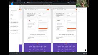
B
First
thanks.
So
the
first
item
here
is
the
comparison
infographic
I
completed
a
first
iteration
for
the
design
of
the
platform
comparison
using
gitlab
versus
github
as
the
first
use
case
there
maybe
may
or
may
not
be
some
iterations
on
it
before
we
actually
and
vc
it
for
reals
we're
doing
some
user
testing
on
it.
So
we'll
see
what
that
reveals.
B
B
I
also
had
some
time
to
which
wasn't
in
the
original
sprint
planning
to
work
on
the
product
footer.
So
I
have
a
couple
designs
out
for
that
that
are
still
under
review
internally
and
the
last
item
is
yeah
hosted
a
our
first
session
of
design
101.
So
there's
a
video
there.
I'll
probably
add
it
to
the
handbook
when
I
find
the
time
to
do
that.
Javi
you're
next.
C
C
C
I
also
worked
on
creating
a
data
schema
for
our
comparison,
page
work
that
tina
showed
some
mock-ups
for
and
essentially
what
I
did
is
I
tied
those
data
files
to
an
lfi
cms.
So
if
you
log
into
the
lfi
cms
admin,
you
can
edit
the
data
that's
in
there,
which
is
great
right
now,
they're
not
like
tied
to
any
like
output
or
any
page,
but
that
moves
us
very
nicely
so
that
we
can
start
to
use
that
data
across
different
pages
and
yeah.
That's
it
for
me
up
next
is
nathan.
D
D
D
So
I
noticed
that
this
was
an
issue
throughout
the
site
where
we're
trying
to
link
to
something
that's
hidden
on
the
page,
so
it
could
be
a
tab,
it
could
be
faq,
and
so
I
noticed
we've
been
kind
of
doing
one-off
solutions
for
each.
So
I've
just
been
working
on
a
library
that
no
matter
where
it
is
on
the
site.
You
can
open
a
hidden
element
so
hoping
to
get
that
done.
Maybe
by
the
end
of
tomorrow
we'll
see
and
then
the
next
thing
is
on
the
events
page.
D
There's
a
request
to
add
the
region
filter
so
right
now
we
have
location
and
I
think
type,
and
so,
if
you
scroll
down,
there
should
be
a
third
yeah,
a
third
one
to
apply
region,
so
that'll
be
good
going
forward
and
there's
also
another
ask
for
this
page
to
kind
of
pre-filter.
So
in
the
url
bar
to
choose
what
filter
you
want
to
have
applied.
I'm
working
on
that
right
now
and
hoping
to
get
that
done
today
and
then
there's
also
an
issue
to
deprecate
the
training
page.
D
So
now
it
redirects
the
learning
page
and
then
ripped
out
all
those
assets
and
all
that
the
old
code
and
then
there's
one
last
thing,
and
that
is
the
references
all
over
the
site
to
the
2020
devops
survey.
So
just
updating
that
to
2021
it's
done.
I
just
need
a
little
blur
from
one
of
the
content
teams.
So
once
I
get
that
it's
good
to
go,
but
that's
pretty
much
it
for
me.
Lauren.
E
All
right
did
a
lot
of
commit
template
work.
This
iteration
so
finished,
step
five
where
tied
it
all
into
netlify
cms.
I
I
really
underestimated
the
amount
of
time
that
would
take,
but
got
it
done,
moved
on
to
step
six
where
actually
build
the
data
file
that
generates
the
commit
page
so
making
sure
the
content's
there,
and
that
is
in
review
of
the
content
team
right
now.
So
we're
in
the
home
stretch.
E
There's
our
review
app
page
and
I
think
you
scroll
the
top
there
you
go.
There's
the
nav
perfect,
but
yeah,
that's
the
thing.
The
whole
our
whole
team's
been
working
on
for
gosh
over
a
month,
and
it's
really
excited
to
see
it
there.
It's
all
coming
in
fruition,
and
I
also
finished
most
of
step
6.1,
which
was
a
issue
that
me
and
tina
worked
in
to
gather
all
the
ux
fixes.
E
So
when
we
put
the
template
together,
there
are
some
things
that
are
off
here
there
and
we've
tackled
most
of
them.
There's
a
couple
ones
that
we're
still
going
to
work
on,
I'm
hoping
to
wrap
those
up
this
week
and
the
dcp
partner,
page
nope
we're
still
looking
at
the
there
we
go,
gcp
partner
page
is
live,
and
that
is
exciting
and
we're
going
to
be
wrapping
up
most
of
the
feature
partner
pages
pretty
soon
here,
so
that
uses
the
new
template
super
cool.
E
A
A
I
guess
was
confusing
some
users
and
it
just
adds
a
little
bit
of
context
so
yeah
and
yeah
that's
as
somebody's
showing,
if
you
type
in
self-manage
it
brings
you
to
the
self-managed
form
versus
if
you
just
join
the
or
go
to
the
free
trial
page,
it
brings
you
to
the
sas
form.
So
yeah
people
have
that
link,
bookmarked
it'll,
still
work
and
then
finished
up
a
free
trial
banner
built
in
slippers.
So
this
is
just
in
storybook
right
now.
A
None
of
the
functionality
like
trying
to
close
this
banner
is
not
gonna
work,
but
it
will
once
it's
imported
into
the
www
repo,
so
it's
there
in
mobile
and
desktop,
and
so
that
will
will
slowly
start.
I
have
an
issue
to
slowly
start
propagating
that
on
various
pages,
probably
our
top
15
pages-
that
we
want
to
increase,
clicks
to
free
trial
and
then.
A
A
It's
mostly
a
reskin,
some
updated
copy.
The
one
big
change
is
the
customer
case
study
section
and
if
javi,
if
you
go
up
to
the
left,
sidebar
and
hit
customer
case
studies,
you
can
see
all
of
them.
It's
kind
of
like
a
thing.
You
can
click
through
and
see
the
various
quotes
that
we
pulled
straight
from
our
case
studies,
so
the
user
can
see
not
just
the
people
that
are
using
this.
A
But
what
they're
saying
about
us
too,
and
then
the
next
thing
is
the
demo
similar
it's
an
mvc
one,
mostly
a
ui
scan
with
slippers
again
some
updated
copy,
because
we
have
an
updated
video
as
well.
Three
minute
vimeo
video
is
going
to
be
launching
with
this,
and
so
we
just
had
to
update
the
copy
and
then
a
little
bit
more
about
instead
of
a
dead
end.
A
F
Competitive
is
a
new
word
for
you
within
figma,
so
and
just
looking
at
some
different
features
pages
on
software
companies
and
just
older
companies
as
well
just
to
get
an
idea
and
connected
with
brie
on
the
content
team
to
reevaluate
the
content
and
the
strategy
on
the
features
page.
And
if
anyone
there's
an
issue
there,
it's
just
the
features
issue,
but
had
a
good
meeting
with
horror
so
to
decide
on
the
direction.
F
On
that
there's
a
lot
of
content
on
that
page
that
seems
very
old
and
out
of
date,
I'm
trying
to
figure
out
what's
the
best
way
to
change
that,
so
that
we
can
manage
it
going
forward
depending
on
what
the
strategy
is
and
moved
into
low
fidelity
mocks
as
well.
So
you
kind
of
skipped
wires
and
just
jumped
straight
into
that
and
started
messing
around
in
sigma
brought
nathan
up
to
speed
on
the
issue
due
to
brandon's
departure.
F
So
nathan
has
taken
over
that
work,
just
bringing
up
speed
on
the
decisions
that
we've
made
thus
far
making
sure
there's
a
seamless
shift
into
these
things.
Myself
and
they've
had
a
couple
of
meetings
discussing
this.
What
we
want
to
tackle
are
six
pages
from
our
okr
and
and
there's
also
an
issue
submitted
for
some
data
analysis
for
the
features
page
itself
with
noyle.