►
From YouTube: Recap sprint 1 marketing design system
Description
Related OKR: https://gitlab.com/groups/gitlab-com/marketing/inbound-marketing/-/epics/92
Inbound Marketing handbook page: https://about.gitlab.com/handbook/marketing/inbound-marketing/
B
It
hi:
what's
up
everybody,
we
have
the
digital
experience
team
here
talking
about
our
sprints
release
for
the
design
system.
Our
sprint
name
for
this
release
is
never
drive.
The
winter
till
the
snow
is
on
the
blanket
another
irish
proverb
and
we're
going
to
be
starting
off
with
jess
who's,
going
to
be
talking
about
some
home
page
changes
in
regards
to
a
mark
marketing
campaign.
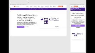
C
We're
also
utilizing
the
illustration
kind
of
spot.
We
had
normally
have
on
our
homepage
for
this
campaign,
we're
going
to
have
a
new
illustration
coming
up
soon,
but
in
the
meantime,
you'll
see
this
ci
cd,
seen
as
believing
kind
of
spot.
Instead
and
again,
the
idea
is
to
kind
of
utilize
components
that
eventually
we'll
be
able
to
use
for
other
announcements.
Other
events
ebooks
things
like
that
down
the
line,
making
sure
that
you'll
be
able
to
see
it.
D
D
The
sticky
bar
is
sticking
to
the
top
when
the
user
navigates
down
until
they
close
it
out
and
the
buttons
and
everything
is
linking
to
the
right
place,
and
we
ensure
that
the
mobile
mushroom
is
also
well
optimized
for
mobile,
so
that
it
looks
very
beautiful
and
nice
and
shout
out
to
jessica
for
designing
this
wonderful,
beautiful
piece.
It
looks
really
awesome.
So
that
is
what
we've
done
for
this
week
and
we'll
be
releasing
on
december
4th
so
that
we
can
start
showing
our
users.
D
A
A
Yes,
okay,
so
we've
made
it
it's
very
simple
update
to
the
color
of
our
type,
so
we've
edged
away
from
using
extreme
black,
which
was
looking
very
harsh
on
the
screen.
So
we've
lightened
it
up
to
just
a
very
dark
gray,
nothing
drastic
and
we've
added
our
grid
to
our
shared
library
as
well,
so
that
other
designers
can
pull
this
directly
into
their
artboards.
So
they
don't
need
to
ask
about
what
the
settings
are
and
figure
that
out.
That's
all
shared.
Now
within
the
library
we've
made
some
quick
updates
to
our
colors.
A
These
are
all
very
preliminary
and
they're
subject
to
change
as
we
go
through
the
experimental
phases,
with
some
of
the
pages
that
we're
designing
in
the
next
few
sprints.
So
this
this
is
just
for
the
time
being,
so
we
can
work
towards
making
adjustments
based
off
accessibility
and
usage
criteria
and
then,
last
but
not
least,
we've
added
our
spacing,
which
is
this
one
here.
So
we
have
two
separate
sections
for
spacing.
A
We
have
component
spacing
which
is
within
components,
and
then
we
have
layout
spacing,
which
is
on
the
layout
of
the
page,
and
these
are
all
in
our
shared
library
as
well.
They're
color
coded
that
you
can
drag
and
drop
them
in
or
you
can
just
reference
them
in
your
solid
panel
within
figma,
so
that
there's
no
back
and
forth
of
kind
of
referencing,
something
that's
hard
to
get
her
to
reach.
A
And
yet
all
of
these
things
are
informing
our
foundations
package,
which
is
the
the
the
task
of
the
last
couple
of
sprints,
which
is
to
try
and
get
our
foundations
looking
very
solid
and
stable,
so
that
we
can
begin
to
feed
them
into
the
next
iteration,
which
will
be
on
some
buttons
and
some
future
components
that
we'll
we'll
have
in
our
library
as
well.
And
that's
it.
Thank
you.
B
Cool
thanks
steven
for
talking
about
the
figma
right.
Now,
I'm
going
to
be
sharing
my
screen
really
quickly
and
talking
about
storybook,
which
is
essentially
just
like
a
ui
packager,
where
we
can
keep
our
components
in
a
documented
state,
and
this
ensures
that
people
can
have
documentation
as
well
as
working
functioning
code,
and
the
benefit
of
this
is
that
we
start
to
keep
track
of
what
is
being
used.
And
why-
and
we
can
start
having
a
place
to
document
all
these
places.
B
So
right
now
we
have
an
example
of
what
a
button
looks
like,
and
this
is
using
foundation,
and
so
right
now
what's
happening
is
that
the
code
is
being
pulled
into
this
storybook
repo
that
exists
within
the
dub
dub
dub
as
a
separate
site
and
with
storybook.
You
can
do
awesome
things
like
configure
certain
things.
So
if
you
want
to
see
what
a
button
would
look
like
with
certain
colors
or
different
tones,
you
can
do
that.
B
You
can
check
out
what
buttons
look
like
in
different
states.
So
this
is
what
a
secondary
large
small.
This
is
all
wonderful
and
all,
but
this
doesn't
demo
what
is
actually
live
code
that
we're
using
on
our
kit
website.
So
an
example
of
that
would
be
over
here.
If
you
go
to
get
that
button.
This
is
a
example
of
our
button.
D
B
A
design
component
in
figma,
so
yeah,
that's
all
of
the
work
that
we've
been
working
on
for
this
sprint,
the
storybook
local
dev
will
be
released
on
december
3rd,
which
is
going
to
be
the
day
after
and
all
of
this
work
is
working
towards
making
sure
that
we
have
a
design
system
in
place
and
iterating
towards
that
goal
and
yeah
thanks.
So
much
for
listening
be
sure
to
catch
us
on
slack.
If
you
have
any
other
questions.