►
From YouTube: Vulnerabilities over time - Demo
Description
This video demos the vulnerabilities over time chart which is going to be re-added in 13.1.
A
My
name
is
Sasha
Fedora
and
I'm
part
of
the
de
Fantine
in
this
video
I'm,
going
to
walk
you
through
the
vulnerable
users
over
time
chart
which
can
be
located
in
the
group
level,
security,
dashboard
or
instance,
level.
Security,
dashboard
currently
we're
in
the
group
level,
security,
dashboard
and
the
group
is
called
de
Fantine
test
and
we
have
multiple
projects
in
this
group
and
we're
seeing
the
vulnerabilities
that
belong
to
these
projects.
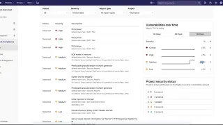
A
On
the
right
side,
we
display
a
chart
that
displays
the
vulnerabilities
found
over
time
in
the
last
30
days
by
default,
but
we
can
switch
it
to
60
days
or
90
days.
We
group
these
vulnerabilities
by
their
severity.
We
have
critical
high,
medium
and
low
level
and
each
severity
has
a
corresponding
line
which
displays
the
number
of
vulnerabilities
found
at
that
date.
A
So,
for
instance,
if
I
scroll
over
the,
if
I
hover
over
the
chart
over
the
line
chart,
I
will
see
that
in
30
of
April
we
had
only
one
one
ability
that
was
medium
level
severe.
On
the
right
side
of
the
line
chart.
We
will
see
the
corresponding
change
in
percentage,
so,
for
instance,
the
last
90
days,
medium
level,
vulnerabilities
have
changed,
have
increased
by
400%
and
in
total
we
had
five
vulnerabilities
that
were
medium
level.
A
This
chart
was
here
a
couple
of
milestones
ago,
but
we
had
a
migration
process.
We
my
way
that
the
security
dashboards
to
grad
kill
to
make
it
more
performant
and
in
13.1
we're
adding
this
back
and
the
data
is
also
backed
by
graph
QL.
So
it
should
be
much
more
performant
than
it
was
before.
Thank
you
for
watching
and
have
a
great
day.