►
Description
Design: https://gitlab.com/gitlab-org/gitlab/-/issues/290010
Epic: https://gitlab.com/groups/gitlab-org/-/epics/4507
A
Hi
everyone
we're
walking
through
the
latest
design
of
feature
flags
which
is
super
exciting
and
I'm
here
with
lori
quick
recap
here
is
the
feature
flag
list
view
we
did
some
polishing
from
where
we
were
last
time.
So
it
matches
the
mr
view,
which
is
a
little
bit
nicer.
We've
gotten
these
tabs.
So
we
have
active
feature
flags,
which
means
at
least
one
of
the
strategies
is
turned
on,
and
the
issue
is
not
closed.
A
A
A
So
I'm
hoping
that
will
resonate
with
our
users.
I
did
move
the
view
user
list
out
of
the
tabs.
So
now,
when
you
click
on
this,
it'll
have
its
own
ui.
That
ui
should
be
a
really
small
amount
of
work,
because
it
should
just
mirror
what
it
is
right
now
on
its
own
page
and
then
later
on.
We
can
have
our
own
issue
and
epic
and
discussion
around
if
we
want
to
do
anything
with
user
list
to
make
them
better.
So
I'm
not
proposing
that
work
just
kind
of
moving
how
to
get
there.
B
B
You
have
the
person
that's
assigned,
which
may
be
more
than
one
rate,
and
then
we
have
the
the
strategies,
and
now
that
I'm
looking
at
it,
the
icon
for
strategies
is
a
little
bit
confusing
for
me,
and
maybe
we
should
rethink
it
because
it
looks
to
me
like
a
toggle.
So
I
would
expect
like
this
is
on
for,
like
three
environments
out
of
seven.
Like
I
don't
know
it's
a
little
bit
confusing
for
me
in
terms
of
the
icon
selected,
but
it's
not
like
the
end
of
the
world.
A
For
sure,
assuming
we're
all
good
moving
at
the
end
of
this
design
phase,
my
plan
is
to
open
up
a
unique
issue
with
the
foundations
team
to
create
an
icon
for
strategies.
This
is
actually
a
progress
bar
because
I
was
thinking
of
rolling
out
and
it
looks
like
a
toggle
you're
totally
right.
So
this
isn't
the
right
icon
I'll
open
up
that
issue
for
the
testing.
I
will
probably
set
up
the
prototype.
A
B
B
A
One
change
I
did
make
is
our
previous
design.
We
had
the
toggle
first
here
I
put
it
last
because
gitlab
pattern
is,
we
have
actions
on
the
right
and
from
a
ux
standpoint,
users
read
from
left
to
right,
most
of
the
time
so
they're
going
to
understand
what
it
is
they're
interacting
with
and
then
be
able
to
interact
with
it
that's
kind
of
the
flow.
So
that's
the
only
reason
we
moved
it
over
here.
It's
still
nice
and
bold
and
large.
A
B
A
Speaking
of
these
cool
pills,
what
I
was
thinking,
we
removed
the
strategy
details,
and
so,
if
I
click
on
one
we'll
get
a
nice
little
modal,
which
I
will
polish
up
a
little
bit,
which
basically
contains
all
of
the
strategies
for
the
feature
flag
related
to
that
environment.
So
for
production
for
the
feature
flag
named
feature
flag
name.
There
are
two
strategies:
there's
an
active
user
list
and
you
can
see
the
details
here.
What
other
environments
this
strategy
is
impacting.
So
that's
one
strategy
and
then
there's
also
one
that's
turned
off.
A
B
A
Awesome,
so
that's
the
list
view
kind
of
clean
it
up
polish
it
you
can
see.
This
closed
status
is
kind
of
cool
now
over
here
we're
looking
at
the
detail
view
which
my
screen
isn't
big
enough,
and
so
most
of
this
stayed
the
same.
I
was
working
with
the
team
on
create,
as
well
as
amelia
who
was
working
on
incidents.
We
used
the
same
hotbar
that
incidents
uses
for
our
metadata
instead
of
having
it
underneath
here.
That
was
an
alignment
change
that
we
made
it's
the
same
information
using.
A
The
hotbar,
though,
gave
us
a
little
bit
more
freedom,
so
we
can
actually
say
strategies,
10,
total,
eight
active
to
kind
of
give
more
of
those
cues
to
users
and
then
the
number
of
environments.
We
show
the
number
and
then
show
the
related
environments,
which
is
the
detail
we
see
from
the
list
view,
so
that
adds
some
continuity
for
users
as
well.
A
A
A
A
Yep
and
in
the
notes
of
the
breakdown
I
have
a
little
bit
later
in
our
meeting,
I
was
talking
about
this.
This
design
for
strategies
can
be
put
into
its
own
sub
epic,
I'm
using
the
design
that
dimitri
the
previous
designer
put
together,
and
it's
just
there
as
a
stepping
stone
for
us
to
be
able
to
polish
the
strategies
from
where
they
are
now.
A
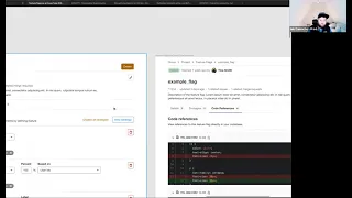
So
yeah
there's
a
strategy
tab,
the
code,
reference
tab
that
also
nothing
changed
there.
I
think
we've
looked
at
it
before
where
it
just
shows
here's
the
number
of
times
it
shows
up
in
your
code,
which
is
awesome.
I
think
the
only
thing
I
really
wanted
to
review
in
terms
of
flow
was
talking
through
this
close
feature
flag.
A
So
because
this
is
an
issue
and
can
exist
in
a
backlog,
it
has
to
be
able
to
be
open
or
closed
and
that
is
different
than
enabled
or
disabled.
Sorry,
active
or
inactive.
Probably
the
better
term
where
the
issue
can
be
open
and
have
no
active
strategies.
The
issue
can
be
open
and
have
active
strategies.
The
issue
can
be
closed
with
active
strategies.
The
issue
can
be
open
or
sorry.
It
can
be
closed
with
inactive
strategies.
A
A
B
So
this
is
a
little
bit
complicated.
So
on
the
one
hand,
I
like
the
fact
that
you're
closing
this
close
everything
that's
associated
to
it
kind
of
approach.
On
the
other
hand,
there
are
different
types
of
feature,
flags
and
different
things
that
I'm
interested
in.
So
when
we
think
about
feature
flags,
a
lot
of
people
are
thinking
about
experimentation
and
like
trying
out
a
new
feature
and
then
saying:
okay,
this
looks
good.
Now,
I'm
going
to
remove
all
the
conditions
and
and
leave
this
on
for
everyone.
B
But
in
fact
there
are
different
kinds
of
feature.
Flags
too,
that
come
in
mind
that
are
not
necessarily
going
to
be
removed,
so
one
of
them
is
a
configuration
flag
and
the
other
one
is
like
imagine
that
you
want
to
use
feature
flags
by
just
for
segmenting
users.
So
you
decide
that
there's
a
feature
that
you're
going
to
enable
to
premium
users
and
only
them
or
you're,
going
to
segment
your
users
by
first
time
users
by
anyone
that
has
been
in
my
system
for
under
three
months.
B
A
B
So
there's
like
these
permanent
features
that
stay
in
the
system
you
create
them
once
so.
If
I
were
to
create
them
in
the
code,
I
would
create
it
in
the
code
have
associated
mr
whatever
and
then,
when
I
closed
the
the
the
feature
that
needed
to
be,
you
know
created
in
order
to
this
feature
flag.
I
finished
it,
but
the
flag
is
still
going
to
be
active
forever.
A
What
we
could
do
as
like
a
middle
ground
as
we
start
to
establish
the
idea
that
future
flights
can
be
of
multiple
types.
We
can
add
a
little
checkbox
here.
That
just
says
don't
remind
me
again
yeah,
so
if
they
are
users
who
regularly
create
feature
flags
roll
it
out
like
it
and
then
leave
it
active
as
per
their
configuration
but
close
the
issue,
because
it's
done
there's
nothing
else
to
do
with
this
feature
flag.
A
B
It
does
it
makes
sense
to
me-
and
I
do
want
to
just
repeat
one
thing
about
the
feature
flag.
Behavior
is
at
the
moment.
Future
flags
are
project
level,
we're
probably
going
to
bring
them
to
the
group
level
at
some
point.
But
having
said
that,
if
you're
doing
this
dismissive
message,
is
it
going
to
be
only
on
the
project
like
or
is
it
going
to
be
dismissive
in
the
instance.
A
Yeah,
that
is
a
really
good
question.
My
first
reaction
is
to
say
we
should
do
it
per
project
because
that's
safer,
we're
reminding
them
more
often,
and
then,
if
we
get
data
that
this
is
really
annoying
to
those
users
who
regularly
do
permanent
future
flags,
then
we
can
address
it.
That
would
be
my
first
reaction
to
that
kind
of
situation
remind
them
regularly.
If
we
find
out
that
we're
annoying,
we
can
always
change
it.
B
A
Okay,
then
I'll
add
that
checkbox
to
be
able
to
say,
like
don't
remind
me
of
this
again
and
then
just
as
the
this
is
tangential
to
that
aspect
on
the
list
view,
does
it
make
sense
how
I
broke
up
the
tabs
where
there's
active
and
inactive
and
then
closed?
Is
this
universal,
whether
it's
it
has
active
strategies
or
not?
The
issue
is
closed
and
that's
what
this
list
is.
A
Perfect
yeah,
there
is
one
weird
thing
that
I
want
to
call
out,
and
that
is
if
an
issue
excuse
me
if
this
future
flag,
if
I
were
to
disable
all
the
strategies
with
this
kill
switch,
and
I
was
on
the
active
tab.
Technically,
it
wouldn't
belong
anymore
and
in
theory
it
would
just
disappear.
I'm
not
a
fan
of
that.
A
My
proposal
is
that
similar
to
to
do's,
if
I
hit
done,
they
fade
out
and
I
have
the
option
to
undo
it
without
refreshing
the
page
and
then
when
I
refresh
it
changes
I'd
suggest
we
do
something
similar
where,
if
it
turns
off
it
kind
of
grays
out,
I
still
have
the
user
have
the
option
to
turn
it
back
on,
but
the
next
time
I
load
this
page
that
now
inactive
feature
flag
wouldn't
show
in
the
active
list.
Does
that
also
make
sense?
A
B
There's
one
thing
that
I'm
in
a
dilemma
about
and
that's
the
feature
flag
id
it
kind
of
has
a
really
nice
location,
prime
location
on
the
page,
and
I
don't
know
like
if,
like
at
least
in
the
list
view,
maybe
we
should
ignore
it
and
leave
it
in
the
details.
Page.
That's
like
one
dilemma
that
I
have,
because
you
can't
really
do
anything
about
it
right.
A
A
B
A
Present,
that
is
a
really
good
comment.
It's
not
very
useful,
and
so
it
doesn't
deserve
this
place,
except
it
looks
good
there
I'll
be
100
frank.
It
matches
the
way
that
merge
requests,
work
where
there's
some
text
and
then
it
moves
into
the
pills
just
like
issues.
So
it's
familiar
feeling
and
we
show
the
id
now
so
if
it
disappeared,
some
user
somewhere
who
uses
them
might
be
upset
but
yeah.
The
primary
reason
is,
it
looks
better
I'll,
be
real
frank.
That's
why
I
put
it
there.
A
B
A
So
I
would
like
to
confirm,
but
I
think
it's
the
same
as
mrs,
where
the
title
definitely
will
do
it
and
I
think
if
I
click
anywhere
in
the
space
that
isn't
in
an
interaction
by
itself,
I
will
also
so
if
I,
like
click
in
this
blank
space
where
my
mouse
is
now.
I
would
also
take
me
I'm
not
sure
but
I'll
confirm,
but
definitely
the
name
we'll
do
it.
B
Okay,
cool,
and
can
you
go
into
the
detail
page
for
a
minute,
of
course,
so
also
and
something
that
we
discussed
about
was
that
we
removed
the
option
to
delete
feature
flags
that
needs
to
be
available
and
put
it
under
like
the
convention
that
we
have
today
in
the
issue.
So
we
we
put
the
destructive
active
the
destruction
destructive
action
that
you
actually
like
need
to
work.
In
order
to
do
that,
and
it's
not
like
simple
clicks.
A
A
I'd
like
to
do
some
during
the
solution,
validation
test
to
see,
if
I
ask
a
user
to
do
that,
and
they
don't
see
that
just
remove
all
strategies
if
they'll
look
at
this
button
or
if
they'll
click
on
strategies
and
expect
it
there
and
how
they
feel
about
it.
That's
one
of
the
things
I
do
want
to
test.
B
Button
I
can
similar
to
issues
either
change
the
title
of
the
flag
or
go
into
the
descriptions
section
where
we
of
course,
also
support
markdown
and
then
underneath
it
we'll
have
the
related
links
and
issues
related,
merge
requests.
I
see
that
in
this
specific
mockup
you
didn't
put
related
feature
flags,
but
that's
also
something
that
we
discussed,
that
maybe
flags
will
have
some
association
to
other
flags.
A
The
reason
I
didn't
include
it
was
the
relationships
between
feature
flags,
I
think,
deserve
some
full
design
attention
because
of
the
many
ways
they
can
interact
with
each
other
to
make
sure
that
we're
building
something
really
smooth
in
that
section.
So
that's
why
I
didn't
include
it
is
I'm
kind
of
expecting
it
as
its
own
separate
piece
of
work.
B
Okay,
but
just
fyi:
this
is
the
flags
today
already
have
linked
issues
and
in
the
next
milestone,
or
this
one
we're
adding
feature
flags
already
to
the
issues
today.
So
that's
like
it's
going
to
be
existing
very,
very
and
then
underneath
we
have
all
the
discussion
area
where
we
discuss
like
in
any
issue
and
we
kind
of
log
everything
that's
changed
and
if
someone
change
the
description
or
someone
changed
anything
right.