►
From YouTube: Secure UX iteration review: user awareness when solutions are available in merge request
Description
Reviewing the latest UX iteration for this issue: https://gitlab.com/gitlab-org/gitlab/issues/196533
Related: recent auto-remediation MVC walkthrough https://www.youtube.com/watch?v=pbRhf0LHgq8&list=PL05JrBw4t0KrFCe5BgUkzFrZifjforQOz&index=13
A
A
This
one's
more
geared
towards
the
merge
request
experience
so
the
intended
users
being
the
developers
versus
the
security
team
and
yeah
well
go
ahead
and
just
walk
through
what
what
the
problem
is
and
I'll
just
jump
over
to
a
test
project
that
we
have
in
and
now
we're
looking
at
a
merge
request.
So
here
we
have
some
security
reports
and
I'm
gonna
go
ahead
and
expand
those
and
it's
broken
out
by
the
different
scanners
and
the
user
would
need
to
go
and
open
these
one-by-one
and
learn
more
about
them.
A
This
way
by
opening
this
modal,
but
there
are
cases
in
some
of
these
findings
where
there
are
actually
solutions
available.
Let's
see
if
I
can
find
one
yeah
well.
This
case
actually
has
a
solution,
a
recommendation
to
improve
this
vulnerability,
but
in
some
cases
there's
actually
also
a
patch
that's
available
by
way
of
the
gymnasium
database,
I
believe
but
yeah
in
this
case
it's
just
showing
an
upgrade,
but
there's
a
few
others
in
here,
and
we
can
click
through
to
try
to
find
them.
But
this
is
what
is
the
issue?
A
Is
that
we're
not
clearly
showing
when
these
solutions
are
available,
and
these
are
solutions
that
could
improve
the
security
of
the
this
merch
request?
So
we
want
to
make
this
more
clear
to
the
user
instead
of
relying
and
putting
the
burden
on
them
to
actually
have
to
click
through
these
and
to
do
it
themselves
a
little
bit
more
background.
Is
that
we're
hoping
to
it?
A
So
that
would
look
a
little
bit
like
this.
This
is
just
a
little
bit
outdated
because
the
tabs
are
now
moved
up,
but
they're
still
explains
the
the
general
idea
is
that
there's
a
sort
of
the
widget
has
a
an
executive
summary
of
the
newly
detected
vulnerabilities
and
when
they
click
view
findings,
it
will
open
up
the
tab.
So
it's
clear
viewing
of
what
vulnerabilities
exist,
and
this
is
just
building
and
and
some
of
the
solutions
we'll
look
at
it's
really
just
kind
of
building
on
this,
but
I
would
consider
this.
A
The
foundation
of
improving
the
merge
request,
experience
where's
right
now,
we're
kind
of
throwing
a
lot
of
vulnerabilities
at
them.
An
experience
of
opening
and
closing
these
is
not
so
great,
nor
is
the
visual
cues
that
we're
using
such
as
these
icons
and
so
on.
Where's,
the
other
one
actually
aligns
it
more.
Where
the
pipeline
the
vulnerability
list,
the
group
security
dashboard,
it
all
looks
and
interacts
in
a
familiar
manner.
A
A
That's
what
we're
hoping
to
surface
and
and
show
to
the
user
that
they
can
improve
the
security
by
committing
these
these
upgrades
or
patches
that
were
suggesting
that
they
and
they
themselves
introduced
instead
of
it
being
introduced
in
having
to
be
dealt
with
down
the
road
from
the
vulnerability
list.
Once
it's
already
introduced
into
the
system.
This.
This
is
a
way
of
bringing
awareness
before
it
ever
reaches
the
default
branch.
A
So
we
did
some
early
iterations
to
kind
of
like
tease
this
out
and
to
get
some
feedback
in
in
the
first
review
we
did
was
is
with
the
SCA
group
and
the
feedback
there.
Was
that
really
it
the
solutions
that
are
available
when
it
pertains
the
dependency
scanning
would
need
to
be
done
in
a
separate,
merge
request.
But
it's
great
that
we
show
that
the
download
patches
that
the
if
downloads
are
available
locally
or
there
are
suggestions,
but
this
feedback
was
based
on
the
idea
that
perhaps
you
could
commit
the
solutions
directly
into
this.
A
A
So
we're
in
the
third
iteration
and
working
in
all
that
feedback
and
also
feedback
from
the
secure
and
defend
UX
team
after
that,
as
well
one
minimal
solution
that
we
could
take
a
look
at
and
now
this
particular
design
is
incorporating
that
that
MVC,
that
we
took
a
look
at
where
the
security
tab
that
showed
the
vulnerability
list
and
the
widget
was
now
more
of
giving
the
summary
of
new
vulnerabilities
introduced.
It's
it's
incorporating
that
that
has
already
been
done.
So
in
this
case
it
would
have
been
a
prerequisite
for
what
we're
looking
at
now.
A
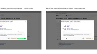
So
here
are
the
findings
that
were
reporting
back
in
the
merge
request,
and
then
in
this
row
we're
saying
hey.
There
are
solutions
available
to
three
vulnerabilities
again.
These
are
newly
introduced
vulnerabilities
from
this
from
the
commits
in
this
merge
request.
If
the
user
was
to
expand
that
it
would
call
them
out
and
that
familiar
pattern
we
saw
again,
this
is
trying
to
do
the
minimal
change
possible,
just
aggregating
them
together.
A
Utilizing
the
front
end
UI
that
we
have
in
the
collapsible
sections
here
with
the
addition
of
specifying
hey.
These
are
from
dependency
scanning
or
content
scanning,
using
the
headers
to
do
that.
If
the
user
then
clicked
open
to
take
a
look
more,
they
would
either
see
that
a
solution
is
available
there
and
they
could
download
the
patch
available
or
they
could
create
a
separate,
merge,
request
or
separate
issue
to
take
a
look
at
it
further
or
if
it's
just
a
recommendation,
they
could
at
least
the
recommendation
has
been
surfaced
to
them.
A
A
To
continue
to
improve
this
or
to
show
it
in
a
slightly
different
way,
it's
the
same
as
we
saw
here.
They
could
expand
the
the
section
that
has
vulnerabilities
detected
with
solutions
available
and
we
could
have
a
subtext
here
that
outlines
what
the
recommendation
is,
and
we
also
see
here
when
there's
a
an
available
patch
to
download
locally,
that
that
is
displayed
here
directly
in
the
UI,
so
maybe
without
having
to
click
back
and
forth,
they
could
do.
A
A
Now
there
is
another
approach
there
that
could
be
taken,
and
that
is
and
the
reason
the
upside
of
this
is
it
kind
of
cleans
up
the
merge
requests
even
more
without
having
those
additional
sections,
and
it's
giving
the
user
here
scanning
report
that
24
had
that.
The
summary
based
on
the
MVC
is
showing
the
results
to
critical,
Phi
PI
and
then
three
solutions
and
the
button
here
changes
from
view
findings,
since
there
are
solutions
to
view
available
solutions
and
that
lands
the
user
on
the
security
page.
A
So
the
point
is:
is
that
this
page,
that
has
the
familiar
vulnerability
list
would
align
for
consistency?
So
more
to
come
on
that,
but
that's
how
it
would
look
in
that
case
if
we
were
to
take
a
look
at
incorporating
this
sort
of
aggregation
of
when
solutions
are
available
in
our
current
UX
and
our
current
user
interface.
This
is
how
that
would
or
could
look
is
so
we
see
here
security
scanning
detected.
This
is
when
you
expand
it.
You
see
the
familiar
sectioned
out
results.
A
We
could
also
have
either
a
separate
section
in
there
or
a
separate
section
here
that
just
surfaces,
hate
three
solutions
are
available.
The
case
for
surfacing
them
right
here
is
that
these
are
actions
that
the
developer
can
take
right
here
to
improve
this
security
of
this
merge
request.
So
that's
the
case
of
not
hiding
it
in
in
this
expandable
section.
That's
the
idea
at
least,
and
of
course
this
would
be
that
familiar
aggregate
summary
of
what
those
solutions
are.