►
From YouTube: Grafana UX Feedback Session 2021-09-15
Description
In this section we looked at folder management and the dashboard app restructure. Feel free to get in touch and leave us a comment below. :)
A
So
to
start
everyone's
going
to
get
a
slight
preview
of
what
I'll
actually
be
presenting
at
the
community
call
tomorrow,
because
I'm
bringing
the
same
topic
up
with
a
slightly
different
spin,
but
what
I'm
really
looking
at
is
how
we
manage
folders.
So
this
is
part
of
the
navigation
project
and
it's
a
little
bit
of
what
lukas
refers
to
as
a
satellite
project,
where
it's
not
about
sort
of
the
primary
navigation.
A
But
it
is
definitely
an
area
where
the
navigation
is
a
little
bit
problematic.
So
one
of
the
things
that
I
want
to
address
is
that
currently
from
the
sort
of
top
level
of
you
know,
when
you
go
to
manage,
and
then
you
see
your
sort
of
list
of
folders
and
or
dashboards,
you
know
from
that
top
level.
You
can
delete
a
folder,
but
you
can't
take
any
other
action
on
it.
A
Is
it
for
seeing
things,
and
this
will
actually
only
become
more
problematic,
as
we
add
more
types
of
user
generated
content,
things
like
library,
variables
or
any
other
kind
of
like
reusable
chunks
of
content,
basically,
is
the
word.
I
keep
using
to
store
things,
so
the
you
know
really.
What
I'm
trying
to
do
here
is
to
streamline
the
navigation
and
reduce
clicks
to
take
these
actions.
A
Make
sure
that
these
types
of
content
are
treated
consistently
so
that
it's
really
clear
what
you
can
do
to
each
thing
and
you
can
build
a
mental
model
rather
than
kind
of
just
like
memorizing,
where
stuff
goes
and
then
making
room
for
you
know
adding
these
new
types
of
things.
So
before
I
go
into
the
design,
that's
the
problem
set.
I
want
to
just
pause
and
see
if
anyone
has
questions
about
sort
of
the
intent
here
or
the
scope
that
I'm
looking
at.
A
Okay
and
then
also
just
a
friendly
reminder
reminder
that
in
ux
feedback
session
we
do
ask
everybody
to
help
out
on
taking
notes,
please,
because,
when
you're
presenting
it's
very
difficult
to
do
so,
and
then
that
way,
we
don't
just
have
one
person
insured
of
taking
notes.
So
the
nodes
are
linked
to
the
meeting
requests.
So
if
you
all
want
to
chip
in
on
that,
that
would
be
very
helpful.
A
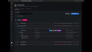
What
we're
showing
here
is
that
I
have
these
collapsed
folders
and
a
listing
of
what
is
in
each
folder
from
a
type
and
account.
I
could
go
either
way
on
whether
we
just
do
a
count
or
also
include
the
type
I
find
the
type
helpful,
but
you
know
there.
I
understand
there
might
be
some
sort
of
technical
questions
around
that
when
we
open
the
folder.
A
We
then
have
all
of
our
content
that
is
associated
with
that
folder
listed
in
one
place.
So
remember
today
you
have
to
navigate
to
different
tabs,
see
different
pieces
of
content,
and
so
here
I've
put
it
all
together
in
one
place.
We
have
a
type
column
in
this
table
that
lets.
You
know
what
you're
looking
at.
B
One
minor
feedback
amy
regarding
the
color
coding
of
those
four
items:
one
library
panel,
two
library
variables
blah
blah
blah
on
the
folder
kind
of
row.
I
I
guess
this
is
not
fleshed
out,
but
the
color
for
library
panels
is
kind
of
is,
is
bringing
me
shivers.
I
think
I
I
don't
think
it
should
be
red.
I
guess
it's
red
right
it.
It
kind
of
indicates
to
me
that
something's
wrong
with
something
whatever
that
other
than
I
really
like
the
type
column.
B
C
Okay,
one
thing
that
I'm
clearly
I'm
thinking
is
at
the
top.
There
is
a
lot
of
actions
happening,
so
you
have
three
different
rows
with
buttons
and
I'm
thinking
like.
Where
will
the
user
attention
go
because
you
have
so
one
action,
the
new
dashboard
it's
primary
button,
and
then
you
have
the
delete,
which
kind
of
takes
a
lot
of
attention
being
read
by
default
and
then
the
filtering
side
and
just
here's
if
we
could
put
it
maybe
think
of
yeah
information
architecture
in
that
case
and
how
we
group
things
together.
A
A
Like
a
keyboard
navigation
point
of
view,
it
was
turning
into
sort
of
a
nightmare
where
every
single
row
that
you
would
want
to
navigate.
You
would
have
to
get
through
all
of
those
icons
before
you
could
get
to
the
next
row.
So
that
was
why
I
did
come
back
here,
but
I
will
look
at
a
way
of
maybe
kind
of
like
defining
a
little
bit
more
of
a
hierarchy
here.
A
D
Catch
up
one
one
question
in
terms
of
like
when
we
are
showing
all
these
different
different
entity
types
in
one,
so
a
folder
can
contain
library
panels
about
variables,
dashboards
alerts
it
it
becomes
a
bit
problematic
from
an
information
architecture
when,
where
would
this
page
live?
This
page
is
almost
doesn't
live
with
dashboards
alerts
anywhere
because
it
will
show
it's
like
the
top
of
the
folder
viewer
yeah.
D
A
So,
for
the
time
being,
because
alerts
are
managed
in
like
a
completely
different
place,
what
I
had
envisioned-
and
I'm
actually
glad
you
asked
that-
because
I
forgot
to
make
this
point-
was
that
the
alerts
and
again
this
is
like
a
really
rough
prototype.
So
nothing
really
works,
but
the
alerts
would
actually
be
a
link
that
would
open
a
new
tab
and
take
you
to
unified,
alerting
so
we're
not
showing
them
today
in
any
way.
A
In
the
current
folder
view,
which
I
think
is
a
little
bit
misleading,
because
you
can,
you
can
delete
a
folder
that
contains
alerts,
and
while
we
warn
you
that
you
may
be
deleting
alerts,
you
don't
know
what
alerts
are
there
and
you
don't
know
what
you
have
done
and
we
also
currently
do
not
provide
an
easy
way
to
go.
See
that,
like
you,
actually
have
to
like
leave.
A
That
view
go
to
alerts
and
then
go
sort
of
like
see
like
what
folder
is
that
in
so
I
had
been
thinking
that
these
blue
ones
would
actually
be
a
link.
They
would
get
sort
of
the
link
treatment
on
hover.
Excuse
me,
and
we
would
pop
open
that
new
tab,
but
definitely
did
not
look
at
data
sources
and
folders
I'll.
Take
a
look
at
that
as
well.
We.
D
A
Okay,
so
so
that's
sort
of
general
layout.
Let's
take
a
look
at,
as
I
mentioned,
I
wanted
to
talk
about
sort
of
the
folder
actions,
so
I
have
two
options
here:
one
is
sort
of
modal
base
and
one
is
sort
of
more
of
an
accordion
based
and
I'm
going
to
show
them
both
and
then
we
can
talk
and
then
we'll
talk
about
my
third
topic.
So
you
know
now
that
we're
in
this
expanded
view
we
want
to
do
something
to
the
folder.
A
We
want
to
be
able
to
delete
it,
rename
it
or
set
the
permissions
on
it
and
again.
This
is
something
that
today,
you
do
by
navigating
to
different
tabs.
So
this
is
where
I
have
these
action
icons
in
here,
and
so
the
first
sort
of
thought
that
I
had
was
like.
Let's
use
modals
for
this
right.
You
know,
like
we've,
already
got
a
lot
going
on
here.
A
So
if
we
want
to
set
permissions,
we
click
the
lock,
and
then
we
have
this
sort
of
like
very
hacked
together
modal
that
I
put
together.
Please
ignore
all
of
the
shadows
and
things
because
it's
just
a
screenshot
dropped
in
there,
but
you
know
we
have
the
ability
to
set
permissions
and
when
you're
done
with
that,
you
know
you
leave
that's
fine.
If
you
want
to
rename
it
same
thing:
here's
another
modal
and
then,
if
you
want
to
delete
this
is
basically
the
same
as
today.
A
Only
the
one
thing
I
really
wanted
to
do
was
also
kind
of
list
out
you
know
today
we
say
you
want
to
delete
this
folder
and
it
says
like
including
all
dashboards,
library,
panels
and
alerts,
but
that
doesn't
give
me
a
lot
of
context.
So
I'd
like
to
kind
of
provide
that
list
again.
So
that's
the
modal
option
for
doing
this,
and
I'm
going
to
show
the
next
one
and
tell
you
all
what
my
opinion
is.
But
I'd
like
to
hear
your
opinions
as
well.
A
So
in
this
one
you
know
for
delete,
I
still
want
a
modal
and-
and
the
reason
I
still
want
a
modal
is
that
deleting
a
folder
is
an
incredibly
destructive
action.
So
I
want
people
to
stop
and
think
before
they
do
anything,
but
for
the
other
actions,
they're
not
really
super
destructive,
and
I
think
it
could
be
really
helpful
to
have
the
context
of
what's
happening.
A
We
have
the
same
kind
of
thing.
So
personally,
I
I
kind
of
lean
towards
this
option,
but
definitely
interested
in
people's
feedback.
If
they
think
that
you
know,
are
we
getting
kind
of
too
crazy
with
the
scroll
if
the
folder
really
does
have
like
100
dashboards
in
it?
Is
it
just
like
way
too
much
so
looking
for
feedback
on
that
as
well.
A
E
F
B
A
G
D
Yeah,
don't
have
a
super
strong
preference
on
the
icons
on
on
the
modal
versus
the
I
mean
for
for
for
some
of
the
actions
like
like
in
context.
I
model
is
like
a
last
resort.
Most
of
the
time
I
feel
like,
or
it's
better
to
have
like
things
changing
in
context.
Instead
of
being
this
window,
that
overlays
content
content,
I
feel
like
model
is
usually
like
a
last
resort
but
yeah.
A
I
will
take
a
look
at
that
like
how
we
might
get
here
from
search.
That's
something
that
I
haven't
looked
into
so
I'll.
Take
a
look
at
that
as
well.
It
might
be
that
we-
maybe
we
can
land
here,
but
it's
expanded
I'll.
Take
a
look
at
what
that
might
look
like,
because
that's
something
I
hadn't
considered.
A
A
A
A
A
I
mean
I
like
it
as
a
pattern.
Personally,
I
think
it's
fast
and
I
I
think
luke
suggested
that
also
so
yeah
I'll
take
a
look
at
that
and
see
if
it
muddies
things
at
all,
because
if
that's
the
case
then
all
I
have
left
is
permissions
and
delete
and
maybe
there's
a
better
solution
here.
So
bond
had
his
hand
up,
but
did
he
go?
Oh
there
you
are
okay,
I
lost
you
on
the
screen.
Hi.
H
H
I
I
would
ask
another
question
vaughn.
I
think
it
is
a
good
question.
I
there
are
many
customers
that
use
hundreds
of
library
like
hundreds
of
panels,
you
know,
or
dashboards
or
alerts
there
could
be
many,
many
and
so
at
what
point
at
what
abstraction
level
or
what
abstraction
level
is
helpful
to
the
customer.
Here
would
be
my
my
return
question.
I'm
not
sure
the
names
would
be
helpful.
H
Okay,
yeah,
so
maybe
that
let
me
share
the
thinking
behind
the
question.
I
was
wondering
if
making
it
so
easy
to
delete
something
that-
and
I
don't
know
if
there's
a
way
to
roll
back
and
undelete
it
like
under
it,
but
make
it
so
easy
to
delete
something
without
really
seeing
exactly
what
it
is
that
you're
deleting.
H
Making
it
easy
for
people
to
make
mistakes
again,
I'm
still
getting
used
to
who
the
users
are
and
how
they
work
and
think-
and
you
know
how
this
what
the
system
patterns
are
are
like,
but
I'm
just
imagine
over
here.
It's
obviously
easy
to
see.
There's
like
one
thing
or
two
thing,
but
as
you're
saying
in
a
case
where
there's
like
hundreds,
you
know
what
would
be
the
solution
to
even
see
if
there's
something
there
that
that
you
would
need
to
see
and
not
delete
but
yeah.
A
Yeah,
I
mean
so
a
system
that
I
worked
on
in
the
past,
where
we
had
very
destructive
delete
actions.
We
actually
included
a
checkbox
that
would
not
enable
the
delete
button
until
it
was
selected
and
the
checkbox
label
said
I
understand
this.
Action
cannot
be
undone,
and
so
it
made
the
user
sort
of
like
whoa
stop.
This
is
not
undoable
or,
like
you
know,
like
the
whatever
sort
of
like
the
really
bad
thing
would
be.
We
would
list
that
and
make
them
select
that
checkbox
and
then
say
that
they
would
delete.
A
I
You
and
I
had
talked
about
amy
when
we
looked
at
this
together
last
week,
and
this
is
perhaps
neither
here
nor
there,
but
I'll
share
it
with
the
team.
Is
that
the
as
code
working
group
is
developing
a
method
to
archive
or
backup
a
lot
of
these
objects
in
grafana
into
git,
for
example,
and
so
there's
there's
a
possible
future
where
there
is
exactly
a
checkbox
and
its
secondary
function,
or
something
to
that
effect
is
that
all
these
objects
are
archived
in
vcs,
before
they're
removed
from
grafana
as
a
sort
of
security
blanket.
A
Okay,
so
I
know
that
there
are
more
comments
and
I
see
your
hands
raised
and
I'm
glad
everyone's
chiming
in,
but
we
I
do
have
one
more
thing
I
need
to
show
before
my
30
minutes
is
up.
So
if
you
can,
please
drop
it
into
the
notes
or
just
follow
up
with
me
on
slack.
I
would
love
to
continue
the
conversation
that
way.
So
the
last
thing
I
want
to
show
is
sort
of
my
options
for
filtering.
So
again,
I
have
kind
of
like
two
options.
A
A
So
just
pretend
like
this
content
is
being
filtered
and
again
like
I'm
trying
to
keep
this
with
not
like
a
thousand
elements
up
here
because
of
the
fact
that,
from
my
keyboard
navigation
point
of
view,
it
gets
really
ugly
if
you
have
to
to
even
get
to
your
folders
get
through.
You
know
like
10
years
worth
of
tabbing,
or
you
know
arrow
buttons,
so
here
we're
going
to
show
the
filter
options
and
again
we
have
this
sort
of
accordion
option.
A
A
So
in
the
example
that
I
have
shown
here,
we
are
showing
all
dashboards
that
are
not
starred
and
users
can
either
you
know
clear
them
or
they
can
add
another
row,
and
so
you
can
kind
of
build
this
more
complex
filter
as
you
go,
and
then
you
can
remove
rows
once
they've
been
added,
so
that's
option.
One
is
accordion
option:
two
is
using
a
right
hand
drawer.
C
A
Yeah
I
mean
right
now
at
most
we
could
have
three
rows
here.
I
just
wanted
to
show
what
it
would
look
like
with
two,
but
I
I
could
show
them
all
one
of
the
problems
I
was
having
you
know
I
would
go
with
a
more
horizontal
layout
than
I'm
showing
in
the
drawer
right
now,
and
I
just
personally
wasn't
loving
how
it
was
looking
laid
out,
but
I
can
take
another
look
if
I
think
I
need
to.
C
I
mean
I
like
this
option.
They,
if
it
had
like
less
clicks,
because
I'm
I've
seen
this
pattern
more
often
where
the
filters
kind
of
open,
above
whatever
you
are
filtering
and
being
able
to
see
them
all
at
once
and
not
having
to
click
to
see
like
what's,
adding
neurals
can
work
fast,
even
if
they
are
more
vertical.
But
in
a
way
we
can
reapply
this
in
other
places
as
well.
A
Yeah
I
mean
so
today
we
show
them
all
of
the
time
so
all
well.
Actually
there
are
only
two
filters
today
because
you
cannot
filter
by
type,
because
the
way
that
you
see
by
type
is
that
you
navigate
to
different
tabs,
and
so
you
know
from
from
my
perspective,
adding
one
more
probably
isn't
that
bad.
But
then,
when
we
add
another
type
of
content,
we're
gonna
have
another
one.
A
A
A
We
went
pretty
in
in-depth
today,
but
I'm
going
to
give
an
overview
during
the
community
call
tomorrow,
where
I
will
be
asking
people
to
take
time
to
meet
with
me
to
do
some
more
sort
of
in-depth
like
how
do
you
use
folders
today?
Do
you
filter?
Do
you
search
how
you
know
what
what
are
you
you
know?
E
So
it
makes
sense
that
features
related
to
dashboards
were
also
sprinkled
across
navigation,
but
because
we
are
growing
and
there
are
more
features
and
more
apps
and
more
things
on
the
navigation
it.
It
starts
to
be
confusing
and
we
are
also
discussing
introducing
the
new
home
page
template,
which
also
affects
how
the
homepage
will
look
like
and
right
now.
The
homepage,
as
you
probably
know,
is
nothing
more
than
the
special
type
of
the
of
the
dashboard.
So
what
I
definitely
want
to
want?
E
You
to
think
about
when,
like
watching
what
I
will
be
showing
is
to
spot
any
risks
that
you
see
with
with
the
changes
that
I
will
talk
about
and
to
note
down
or
raise
any
things
that
we
that
we
missed
or
haven't
considered
with
that.
So
what
and
the
changes
are
not
impacting
the
interface
they're
mainly
impact
what
what
elements
we
show
and
where
so
there
are
no
new
components,
no
or
no
new
ui
elements
there
at
least
yet.
So
there
are
like
a
few
changes
proposed.
E
So
first
one
is
the
home
dashboard
and
the
name
of
the
home
dashboard,
because
right
now
it
is
called
like
a
home
under
the
general
tab.
So
the
first
proposition
is
to
basically
call
the
home
page
home
and
to
express
that
with
an
icon
as
well,
especially
that
the
whole
home
dashboard,
although
it
is
shown
as
belonging
to
general
folder,
actually
is
not
present
in
the
general
folder
when
you
navigate
to
to
general
folder.
Basically,
so
it
is
not
exposed
there.
So
it
doesn't
make
sense
to
to
show
it
here.
E
E
The
second
thing
is
renaming
the
the
dashboard
dashboarding
up
homepage,
which
is
right
now
called
manage,
as
you
already
know,
also
from
the
presentation
of
amy.
So
the
suggestion
is
to
change
this
to
browse,
because
most
users,
who
are
not
editors
or
admins,
either
way
use
that
list
in
a
browsing
mode
because
they
cannot
manage
folders
or
or
dashboards.
So
changing
that
to
browse
will
first
of
all
refer
reflect
more.
E
So
so
it
makes
no
sense
for
people,
and
the
second
thing
related
to
that
is
then,
when
you
hover
over
dashboard
icon,
that
page
will
be
called
called
browse
and
not
manage,
and
this
makes
more
sense
for
people,
because
when
they
hover
over
dartboard
icon,
they
want
to
understand
how
to
see
the
list
of
dashboards
and
how
to
browse
them.
And
today
we
don't
have
any
like
a
keyword
that
expresses
that
intention,
because
here
we
have
manage
so
changing
that
to
browse
is
a
is
a
second
thing.
E
The
third
thing
that
is
definitely
more,
maybe
more
more
risky,
but
would
align
with
with
the
information
architecture
that
we
actually
have
is
to
remove
the
home
element
from
the
dashboards
menu.
So
right
now
before
browse,
we
have
a
home
and
the
home
actually
redirects
you
to
the
home
page,
but
that
is
not
a
home
page
of
the
dashboarding
app.
That's
the
homepage
of
the
whole
grafana.
E
So
people,
often
when
they
see
the
home
under
the
dashboard
icon
they
they
think
that
when
they
click
home,
they
will
be
moved
to
the
home
of
the
dashboard
app
which
in
their
heads,
is
actually
the
browse
page
and
the
the
home
is
already
the
icon,
the
grafana
icon.
Here
that
said,
that
can
be
challenging
or
because
people
might
might
be
used
to
that.
E
It
only
allows
you
to
add
a
new
folder,
add
a
new
dashboard
or
basically
import
dashboard.
So
those
are
actions
related
and
connected
to
the
to
the
dashboards
and
connected
also
to
the
management
of
the
dashboards,
and
they
are
like
available
here
or
as
with
the
amy's
concept,
they
will
still
be
available
when
you
enter
the
dashboard
up.
So
that's
the
one
one
direction
to
remove
the
odd
button
from
the
nav
bar
completely
the
second
option.
E
If
someone
is
a
enterprise
customer
and
because
this
will
be
also
more
aligned
with
the
mental
model
of
people
that
in
the
nav
bar
than
the
the
plus
represents
adding
resources
to
the
grafana
as
a
whole,
and
not
only
to
adding
things
related
to
the
to
the
dashboard
themselves.
So
those
are
all
the
changes
they
are
tricky
and
we
definitely
need
to
learn
more
especially
about
what
happens
when
there
is
no
home
link
apart
from
the
grafana
logo
and
how
people
are
attached
to
the
plus
icon
on
the
on
the
nav
bar.
E
A
So,
just
one
quick
comment
from
me
that
I
did
a
really
sort
of
like
quick
internal
observe
people
navigating
grafana
when
I
first
joined,
and
one
of
the
things
that
I
found
pretty
interesting,
was
that
almost
nobody
used
the
grafana
logo
as
a
way
to
return
home
people
tended
to
either
use
the
back
button
or
just
sort
of
like
manage
their
way
back
to
where
they
were
going.
But
very
few
people
seemed
to
understand
that
that's
that
functionality
was
there.
A
E
E
E
We
removed
that
and
people
were
very
confused
with
that,
because
that's
in
their
muscle
memory,
so
sticking
to
that
pattern
that
the
that
the
name
here
launches
search
is
definitely
something
that
we
can
keep
keep,
because
basically
it
is
just
like
removing
the
general
and
changing
the
icon
in
the
end,
so
we
don't
have
to
change
how
that
element
behaves.
It
is
more
about
to
like
reflect
what
is
actually
happening.
F
F
Secondly,
I
think
the
issue
that
amy
brought
up
with
the
grafana
icon
not
being
used
as
a
home
button
is
that
over
time
it
was
just
as
a
way
to
hide
and
show
things.
So,
basically
it
was.
It
didn't
function
as
a
home
button
for
quite
some
time,
but
since
that
was
a
weird
behavior,
we
changed
it
to
the
home.
F
D
So
some
some
comments
with
the
manage
and
browse
this
just
kind
of
the
this
is
the
original
intent
of
of
this
view
was
an
admin
view.
Basically,
so
that's
why
it's
called
manage
was
to
throw
for
users
to
move
folders
around
move
dashboards
around
through
folders
access
permissions
and
and
manage
dashboards
so
and
and
for
browsing
search
is
like
the
thing
that
I
think
through.
A
D
E
Yeah
but
but
the
the
the
darbur
up
will
be
still
there
and
people
click
on
the
dashboard
and
they
don't
know
how
to
get
the
list
of
the
dashboards,
especially
if
they're
infrequent
users
of
guru
hana
so
and
like.
I
totally
get
that,
and
I
also
have
like
this
conflict
in
my
head-
that
it
will
be
named
like
a
browse,
but
it
will
be
for
for
managing.
E
But
I
I
think
that
that's
a
like
a
step
on
the
path
and
the
first
one
that
we
are
making,
because
like
right
now,
there's
also
like
a
the
other
situation
where
the
list
view
is
basically
called
or
the
browser
view
is
basically
called
manage.
So
I
guess
we
are
all
at
grafana
using
grafana's
in
administrative
mode,
let's
say,
but
in
many
companies
most
users
are
using
that
in
a
as
viewers.
E
So
it
means
that
what
is
obvious
for
us
and
what
is
the
default
state
for
us-
is
not
a
default
state
for
most
of
the
of
the
users.
So
thus,
I
would
say,
like
the
smaller
group
of
people
who
should
deal
with
a
bit
of
inconsistency
in
the
naming
of
the
top,
then
than
the
the
bigger
group,
but
it's
not
a
perfect
solution.
Definitely.
D
I
I
agree,
but
it's
just,
I
think
in
general
yeah
we
should
look
at
search
sort
of
for
for,
like
being
the
the
browse
exp
for
being
and
because
well,
it
feels
it
almost
feels
like
we're
doing
universal,
unified
search
in
almost
two
ways
by
like
with
the
thing
that
amy
addressed
with
like
making
mixing
all
different
types.
In
this
view,
it's
sort
of
a
unified
search
in
a
way,
or
we
will
basically
have
to
solve
some
of
the
unified
search
problems,
because
this
view
uses
search.
D
D
Need
to
start
somewhere
there's
definitely
a
lot
of
overlap
between
this
view
and
search.
I
mean
they
use
the
same
component
right
now,
yeah
with
the
with
the
home.
The
only
the
biggest
problem
is
that
people
will
be
very
accustomed
to
clicking
on
the
home
on
the
dashboard
icon
to
get
to
their
home
home
dashboard.
A
D
E
Yeah,
I
I
agree,
and
definitely
that's
also
like
a
step
toward
that,
but
we
don't
have
a
homepage
as
a
standalone
thing
feature
page
page
yet
so
we
are
dealing
with
the
current
situation,
but
but
yeah,
but
I
guess,
like
the
send
the
overall
sentiment
from
most
of
you
is
basically
to
have
a
home
icon
on
the
navbar
as
a
additional
icon.
There.