►
From YouTube: PWA Studio Community Meeting 27 March, 2020
Description
UX research for My Account, Shipping Method component (Checkout), Shipping Information component (Checkout), Checkout demo from Experius
A
I'll
mute
myself
here
in
a
second
happy
Friday,
everybody
welcome
to
another
PETA
video
community
sync.
We
have
some
pretty
light
content
here,
a
few
well
some
good
content
here
on
our
side
that
we
kind
of
previewed
in
the
slack
channel
earlier
so
rather
than
me,
waste
of
time
talking
we'll
just
get
right
into
it.
Katherine
if
you
want
to
start
us
off
first
with
the
research
into
my
account,
that
would
be
fantastic.
B
Okay,
can
everybody
see
the
keynote
in
full-screen
mode,
yep,
alright?
So,
as
Andrew
said,
we've
got
our
second
share
out
for
some
of
the
design
research
we've
been
doing
for
vineya,
and
this
one
focuses
on
my
account.
I
think
you
know
we
did
this
last
time.
You
all
know
so
me
and
Scott
for
anybody
who
wasn't
here
then
I'm,
Katherine,
I'm
researcher,
here
magento
and
I've,
been
helping
them
out
doing
some
of
this
design
research.
B
C
B
Is
there's
an
intermittent
bag
with
keynote
that
we
didn't
discussed
quite
a
bit
I'll
just
present
from
this
view,
then?
Can
you
all
see
the
goal
slide
now?
Yeah
thanks
perfect
thanks
for
telling
me
Scott,
and
so
then
we
are
also
hoping
to
identify
the
primary
use
cases
for
accounts
like
what
kinds
of
actions
are
really
crucial
and
then
finally,
we
wanted
to
take
a
look.
You
know,
there's
many
many
account
keepers
Uman.
B
We
wanted
to
understand
which
of
that
kind
of
palette
of
possible
actions
were
most
important
for
shopper
experience
and
which
may
be
optional
for
some
merchants.
So
what
we
did.
This
was
again
interviews
with
internal
participants.
Studies
are
mentioned
to
employees,
so
all
the
usual
caveats
with
that
they
are
shoppers
and
are
totally
capable
of
speaking
to
the
shopper
experience,
but
maybe
a
little
more
web
savvy
and
and
demographically
a
little
more
constricted.
You
know
not
super
young,
not
super
old,
thanks
to
bear
in
mind
when
thinking
through
the
findings
and
with
them.
B
We
did
tour
guide
interviews.
So
we
wanted
to
hear
about
how
people
interacted,
with
their
real
accounts
that
they
actually
use
in
their
lives.
So
we
asked
folks
to
think
about
a
website
that
they
shop
on
frequently
where
they
have
an
account
that
was
not
Amazon
and
to
tourists
around
in
it
to
show
us
what
that
account
had,
and
we
that
way
we
could
see.
You
know
what
did
they
use
frequently?
B
B
B
So
once
an
account
was
created,
we
found
that
that
didn't
totally
get
rid
of
the
annoyance
that
people
would
have
would
check
out,
because
participants
had
a
lot
of
trouble
signing
in.
So
again,
we
were
asking
people
to
show
us
accounts
where
they
shop
frequently,
and
what
we
found
out
was
that,
even
at
these
sites,
participants
had
a
lot
of
trouble,
rendering
their
password
most
had
systems
remembering
their
passwords.
They
had
them
written
down
somewhere
or
they
had
some
sort
of
algorithm.
B
They
used
to
generate
passwords
for
different
sites,
but
it
was
still
a
struggle
so
because
of
that
participants
typically
did
not
sign
it
until
they
absolutely
had
to,
and
so
this
was
checkout,
and
so
this
is
important
because
it
means
that
even
for
participants
and
presumably
shoppers
with
an
account
they
may
not
be
signed
in
during
the
shopping
experience,
they
may
not
sign
it
until
they're
actually
checking
out,
and
so
this
obviously
has
some
interesting
implications
for
personalization
so
getting
into
what
people
actually
used
in
their
account.
What
mattered
most
was
order
history.
B
This
was
by
far
and
away
the
biggest
use
case
that
people
had
for
accessing
their
account,
and
this
was
typically
to
return,
an
item
no
surprise
there,
but
also
to
find
a
particular
item
they
had
ordered
in
the
past,
and
this
was
a
little
more
surprising
to
us
that
that
was
such
a
common
thing.
We
heard
about
locating
a
particular
item
wanting
to
see
the
details
of
it
potentially
wanting
to
reorder
it
was.
It
was
a
frequent
comment
from
participants
when
it
came
to
actually
using
their
account.
B
I
show
you
Niccolo,
because
this
is
one
that
we
saw
a
couple
of
times
in
the
research.
It
was
a
popular
account,
but
it
is
not
a
good
experience.
It's
missing
several.
These
key
features
that
made
account
usable.
The
first
was
product
images
being
able
to
look
through
your
order,
history
and
see
the
actual
items
you
ordered
made
it
much
much
easier
to
locate
whatever
you
were
looking
for.
The
second
was
the
ability
to
click
into
PDP
again
for
participants
wanted
to
locate
that
particular
item.
B
That
was
a
really
important
feature,
often
missing
for
kind
of
obvious
reasons.
You
know
PDP's
expire
they're
available
anymore,
but
something
that
was
tired
and
then
finally,
we
were
really
curious.
How
far
back
does
this
need
to
go?
How
you
know
how
like
one
year,
two
years,
three
years
forever?
These
are
the
things
we
wanted
to
care
about,
and
what
we
found
was
that
one
year
was
kind
of
a
minimum
they're
really
order
history.
It
really
needs
to
show
at
least
a
year
and
from
several
participants.
B
We
heard
that
it
would
they'd
like
it
to
go
back
farther
either
their
whole
order,
history
or
two
years,
so
that
was
kind
of
deranged
we
heard,
and
that
gives
us
a
good
sense
of
what
the
minimum
is.
And
then
the
final
note
here
so
order.
History
is
the
most
commonly
used
places
account
by
far,
but
what
we
found
was
that
most
participants
said
that
they
would
not
access
it
by
signing
into
their
account
and
go
into
order
history.
B
So
next
we'll
get
into
some
of
the
less
used
parts
of
accounts.
So
here
we
have
this
category
of
things
that
participants
definitely
expected,
but
that
were
used
less
than
order
history
and
so
for
payments
and
addresses.
These
are
things
that
participants
that
you
know
typically
I
would
update
these
and
check
out.
But
yes,
it's
important
to
me
to
be
able
to
go
on
updated
here.
If
you
know,
I
get
a
new
credit
card
and
I
just
want
to
update
it
across
all
my
sites,
for
example,
where
I've
moved
for
wish
lists.
B
This
was
less
used
and
again
this
is
one
of
those
areas
where
thinking
about
who
our
participants,
where
is
really
important,
knowing
that
these
aren't
super
young
people
and
they
may
have
younger
folks,
may
have
different
uses
for
wish
list,
and
they
may
use
it
more,
but
many
people
we
spoke
to
they
didn't
use,
wish
list
that
much.
They
had
used
them.
B
The
only
four
really
high
consideration
items
or
for
comparing
items
across
different
stores,
so
not
using
the
store
with
wish
list
functionality
that
actually
comparing
items
via
third-party
applicable
key,
and
so
that
was
kind
of
a
new
behavior
to
us
as
well,
and
then
finally,
gifts
cards
and
store
credit
participants
expected
to
apply
these
and
use
these
and
check
out.
That
was
the
behavior
that
they
really
you
know
expected
to
see,
but
they
wanted
something
more
and
that
was
to
be
able
to
access
their
gift
cards
better
store
credits
in
their
account
check
it.
B
There
maybe
be
able
to
upload
a
gift
card
there
and
be
able
to
kind
of
monitor
it
that
way
and
keep
and
hold
on
to
these
things
that
way,
so
that
was
a
desired
functionality,
but
not
something
that
expected
stores
to
offer
and
then
finally,
we
have
these
things
that
really
did
not
seem
to
be
used
in
the
vast
majority
of
these
cases,
and
that
was
downloaded
subscriptions
interviews.
So
we
had
people
show
us
through
their
account
right
and
just
show
us
everything
they
use
everything
they
would
maybe
use.
B
And
then,
when
we
got
to
the
end
of
that
exercise,
we
typically
still
had
not
heard
about
any
of
these
three
things,
so
we
would
ask
about
them
explicitly
and
we'd
say
you
know,
do
you?
Do
you
manage
downloads
or
subscriptions
in
mcallen?
Can
you
think
of
an
example
where
you
do
that
any
sites
and
many
participants
struggle
to
think
of
an
example
and
when
they
did,
it
was
typically
a
download
or
subscription
only
site.
B
So
here,
I'm
showing
my
classpass
account
where
you
know
subscription,
is
the
entire
business
model,
and
so
we
saw
that
these
features
were
important,
but
only
in
these
really
kind
of
narrow
use
cases
where
that
was
the
primary
business
model
of
the
merchant
for
standard
e-commerce
merchants.
It
seemed
like
these
were
not
really
expected
or
used
for
the
most
part.
The
second
was
for
reviews
and
I.
Think
about
a
third
of
our
participants.
You
know,
did
write,
reviews
or
had
written
reviews
frequently
in
the
past
they
were
review
users
but
of
those
people.
B
None
of
them
expected
to
be
able
to
access
their
reviews
an
account
they
expected
to
see
them
on
the
PDP,
maybe
be
able
to
edit
them
on
the
PDP.
If
that
was
a
feature
they
were
looking
for,
but
not
an
account.
So
these
are
all
things
that
seemed
in
a
potentially
less
important
for
the
standard
merchant
use
case
out
of
the
box.
B
So
that
is
it
so
me
and
Scott
are
on
the
line
to
discuss
any
questions
about
any
of
this
stuff,
and
you
know,
as
usual,
our
usual
call-to-action
is,
if
you
have
anything
that
you
think
it'd
be
useful
to
look
into.
Let
us
know
some
of
the
upcoming
studies
that
we
have
slated
to
potentially
tackle
our
product
types
and
configuration
off
offline,
behavior
and
messages
and
product
detail
page.
So
that's
it
thanks.
C
A
E
B
B
E
Actually,
really
interesting
to
me,
especially
considering
that
these
are
some
the
most
complex
workflows
that
your
kind
of
lay
user
goes
through
and
usually
when
you're
trying
to
make
a
nice
mobile
experience
and
a
nice
desktop
experience.
You
end
up
having
to
diverge
in
the
input
methods
you're
using
somewhat.
You
know
in
the
mobile
device,
there's
more
touch
and
in
the
desktop.
E
Potentially,
you
could
use
hover
as
an
interaction,
and
so
since
you're
diverging
and
there's
like
more
ground
to
cover
in
terms
of
UX
like
one
or
the
other
of
them
could
end
up
being
confusing
or
you
know
inferior
to
the
other
without
realizing
it.
And
even
though
it
sounds
like
that,
didn't
really
show
up
here.
I
just
want
to
generally
understand
again
from
you
were
samya
or
Scott
like
when
or
if
that
shows
up
and
how
you
account
for
it.
And
studies
like
these
I.
B
We
weren't
really
looking
at
rating
the
quality
of
these
experiences,
so
we
weren't
interested
in
like
does
this
store,
have
a
really
good
implementation.
Does
this
store
have
a
poor
implementation?
Is
this
mobile
experience
good,
as
this
desktop
experience
good
we
weren't
looking
at
at
that
level,
we're
really
looking
at
what
kind
of
functionality
is
needed
and
then
some
really
really
just
like
high
level
usability
stuff,
so
kind
of
the
most
important
things
like
can
I
see
the
image
of
the
item.
I'm
looking
for
stood
out,
I
think
we
just
weren't.
B
E
Yeah
I
guess
I'm
not
really
asking
about
quality.
So
much
is
about
like
any
measurable
difference
in
the
tested
variable,
whether
it's
quality
or
confusion
or
whatever
else,
but
okay,
thank
you
in
the
in
the
future.
Yeah.
That's
like
other
questions.
I'll
always
be
asking
when
I
look
at
results
like
this
well.
Thank
you
all.
A
Right,
if
there
are
no
other
questions,
we
will
keep
moving
along
the
agenda
as
a
reminder,
Katherine
saamiya
Scott
are
all
in
this
community
slack
channel.
So
if
you
have
feedback
for
them
or
have
additional
questions
on
one
of
the
UX
research,
that's
happening
right
now
feel
free
to
reach
out
and
we'll
move
on
to
you,
Andy
I
believe
he's
on
the
call
yep.
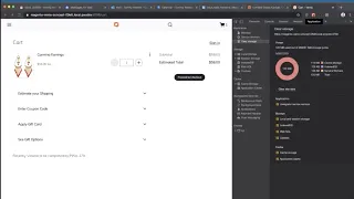
F
Okay,
so
this
is
some
of
the
first
work
in
the
check
that
were
in
progress
on
I
specifically
worked
on
the
shipping
method.
So
I've
got
an
item
in
my
cart
already
shipping
information.
Actually,
we
may
have
wanted
to
Tommy
to
go
first,
but
he's
gonna
show
that
one
next,
but
for
now,
I'm
just
gonna
skip
over
that
one.
F
And
oh
you
get
this
error
message
when
you
don't
have
any
shipping
information,
because
the
methods
are
based
on
the
address
and
your
shipping
information
like
I
said
this
is
kind
of
like
sequential,
so
you
should
probably
never
actually
get
into
this
state.
But
just
in
case
you
do
there's
a
little
error
message
there
for
you.
I
can
add
some
shipping
information
via
our
handy
mini
cart,
our
checkout
experience
of
old
v1
checkout.
If
you
will
so
there's
an
address,
it
would
be
cool
if
this
thing
updated
immediately.
F
It
doesn't
have
to
refresh
and
then
based
on
the
address
that
I
put
in
there
I
got
there'll,
be
a
whole
list
of
shipping
methods,
I,
actually
accidentally
put
in
a
fake
address.
So
it
just
gives
me
like
some
mock
date
or
whatever,
but
then
you
can
go
to
payment
information
after
that,
and
then
these
kind
of
cards
show
up
when
you're
done
and
you
can
come
back
in
here
and
edit
things.
This
isn't
exactly
the
update
screen.
You
can
see
this
other
tab.
F
G
I've
discovered
that
my
Wi-Fi
drops
whenever
my
AC
turns
on
so
I
got
like
two
minutes
here:
all
right,
calm
down
everybody,
calm
down
all
right.
Can
everybody
see
my
screen?
Yes,
yeah
cool,
so
yeah,
as
Andy
mentioned,
we
are
grinding
away
on
the
checkout
experience,
I
kind
of
wanted
to
show
kind
of
how
you
maybe
would
get
there.
So
this
is
the
cart.
Cart
is
inaccessible,
but
you
can
manually
navigate
there
right
now.
Now,
I
have
one
item
in
my
cart.
G
When
you
proceed
to
the
checkout,
you
should
see
a
screen
like
this
and
Andy
probably
would
have
loved
to
see
a
screen
like
this
to
help
with
his
demo,
but
both
of
these
are
not
yet
merged.
So
pretty
simple
I
mean
it's
very
similar
to
the
mini
cart
checkout,
except
for
we
have
a
lot
of
additional
fields
that
we
want
to
display
here
so
kind
of
a
highlight
of
this
and
the
scope
of
this
of
this
feature.
There
were
two
kind
of
components
that
came
out
of
this,
so
we
extracted
country.
G
So
this
is
a
drop-down
with
data
sourced
from
Magento,
so
I
mean
the
country
drop
debt
found
data.
So
if
you
update
that
in
Magento,
it'll
update
it
in
your
PWA
storefront
also,
the
state
region
field
is
also
completely
dynamic,
so
you'll
see
if
I
I
don't
know,
go
to
the
Ukraine.
There
are
no
regions
in
Magento
for
the
Ukraine,
so
it
turns
to
a
select
field.
G
If
I
go
to
France,
we
we
move
on
stage
you'll,
see
that
the
options
change
to
regions
in
France
we,
our
storefront,
is
very
American,
so
it
still
says
estate,
but
obviously
that
would
be
something
pretty
easy
that
you
could
change
all
right.
So,
let's
go
back
to
the
United
States
you'll
see
that
it
updated
back
to
you
the
great
States
of
America
and
then
the
the
process
here
is
pretty
simple.
You
fill
in
data
after
you
submit
the
data.
It
goes
to
like
this
card
view.
G
I
think
we're
gonna
try
to
turn
this
into
like
a
reusable
component
as
well.
So
you'll
see
that
all
the
data
you
entered
there
shows
up
in
this
card
view.
We
don't
persist
that
edit
mode,
so
it
kind
of
takes
up
a
lot
less
space.
This
is
where
you
would
be
in
kind
of
this
I'm
in
edit
mode,
but
this
is
where
Andy's
component
would
show
up.
It
would
automatically
pop
you
in
here.
G
If
you
had
selected
a
shipping
method
from
the
cart
page,
it
would
automatically
just
skip
that
step
and
step
through
to
payment
information.
But
since
I
didn't
do
that
and
that's
there
and
then
the
really
neat
thing
is
that
we
are
focusing
a
lot
more
on
desktop
now,
so
I
think
for
kind
of
a
lot
of
interactions.
We
relied
on
this
drawer
for
kind
of
everything,
so
like
filter,
modal's
everything's
in
a
drawer.
This
is
the
first
time
where
we
get
something
that
kind
of
makes
more
use
of
the
screen
real
estate.
G
So
now
we
have
this
modal.
This
has
not
been
UX
reviewed,
so
please
it
might
change
a
little
bit,
but
let
me
get
a
thumbs
up
from
the
UX
looks
good.
So
now
we
get
like
this
modal
view
and
desktop
go
ahead
and
use
as
much
real
estate
as
you
want.
We
switch
to
a
kind
of
mobile
view
here,
zoom
in
a
little
bit
more
and
edit.
We
go
back
to
our
drawer
view,
so
kind
of
a
responsive
view.
G
G
It's
kind
of
we're
chugging
along
through
this,
and
hopefully
there's
not
too
many
stories
and
can
move
on
to
my
account
but
kind
of
a
lot
of
neat
stuff
in
here
trying
to
make
things
as
reusable
as
possible.
So
if
there's
anything
and
kind
of
our
very
opinionated
view
that
you
don't
like,
you
can
easily
just
go
in
and
reuse
these
components
yourself
and
kind
of
build
the
view
that
is
tailored
to
your
storefront.
D
Tell
me
before
you
jump
on
that
I
had
a
question
excellent
work
by
the
way
it's
starting
to
really
shape
up.
We're
really
happy
to
see
all
the
other
changes
and
new
work
on
the
shipping
address
form
that
you
first
showed
when
they
I
was
just
wondering
if
the
stays
in
city
country
feels
it
cetera.
Also,
people
can
type
in
it
like
an
autocomplete
or
is
it
only
a
draw
select.
G
G
D
D
G
G
But
no
that's
very
good
feedback.
We
should
definitely
make
it
as
easy
as
possible.
I
know
another
like
stretch
goal
of
this
was
also
like
it'd
be
cool
if
I
started
typing
my
address
that
it
could
like
autocomplete.
The
whole
thing,
I
think
that's
a
pretty
common
thing,
but
that
would
require
like
a
Google,
Maps
API
key
or
something
like
that.
It
would
make
it
a
lot,
a
lot
more
difficult
to
get
things
up
and
running,
but
I
think
we
could.
We
can
definitely
do
like
some.
G
Some
neat
features
here
to
make
it
a
lot
easier
to
enter
your
address,
but
I
think
you
nailed
it.
The
like
99%
of
people
are
gonna,
come
in
here
and
select
something
that
they
have
saved
in
their
browser.
So
hopefully
that's
not
it's
more
of
an
edge
case
than
the
common
case,
but
yeah
open
to
any
feedback
that
makes
this
more
usable.
E
G
E
G
Yeah
and
I'm
it's
kind
of
hard
to
see
here,
because
the
the
modal
itself
changes,
but
there's
also,
there
was
a
responsive
thing
where,
like
first
last
name
are
the
only
two
fields.
That
kind
of
display
side
by
side
in
the
register
kind
of
flush
here
makes
more
sense
on
like
a
more
compact
mobile
device,
but
those
are
also
responsive
to
that.
First
form
that
you
saw
also
would
be
spread
out
like
this.
This
is
actually
the
same
form
so
like
I
reuse,
this
component
in
the
initial
entry
and
in
the
edit
mode.
G
A
H
Yeah
so
basically
there's
my
microphone,
muted,
okay,
so
basically
we
don't
really
have
any
topics
for
the
community
corner,
but
there
are
some
good
issues
and
community
backlog,
for
example,
push
notifications.
If
you
want
to
pick
them
up,
please
let
me
know
we'd
love
to
see
some
people
working
on
these.
These
open
issues,
that's
about
it
for
a
community
corner.
We're
talking
about
checkouts,
if
you
guys,
like
I,
could
show
you
to
check
out
our
build
for
our
next
customer.
H
H
So
it
is
it
our
to
check
out
it's
pretty
close
to
the
the
one
Tommy
showed
and
we've
got
some
feels
like
a
company
field.
If
that
feel
so,
if
I
just
type
something
in
here,
it
says
total
valid
fact:
number
four
NL
and
if
I
were
to
say
clean
us
out,
I'm
gonna
send
to
Germany
type
that
number
oh
yeah.
H
H
H
H
And
the
girls,
if
I,
go
and
add
a
alright
to
it
first,
so
now
it
says
shipping
and
billing
address
if
I
edit
this
and
I
change
it
is
now.
It
actually
says
like
this.
Is
your
shipping
address,
and
this
is
your
billing
address,
so
yeah,
that's
basically
to
check
out
after
that
looks
a
lot
like
the
one
from
venya,
and
this
is
all
built
on
version
5.0,
5.1,
yeah,
I,
guess
that's.
A
A
All
right,
the
birds
are
super
chatty,
but
they
sure
are
ok.
Well,
hey
I!
Think
that's
I,
think
that's
it
I
think
it's
all
that
we
have
today.
So
everybody
have
a
great
weekend
stay
safe
out
there.
The
recording
has
stopped
onwards
and
upwards
I've
completely
blanked
on
everything
else.
Don't
forget
to
smash
like
and
subscribe
subscribe.