Description
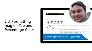
In this 8-minute developer focused demo, André Lage delivers simple examples of formatting we can implement on a SharePoint page today. Create tabs with associated content. The tabs sample allows you to add an icon or url to image displayed on each Tab. The percentage chart sample displays formatted chart row based on icon/emoji/svg and associated calculated numbers. Add new items to list in Property Pane on page. Edit dates and values alternatively on page or in list. This PnP Community demo is taken from the Microsoft 365 & Power Platform Development Community call recorded on June 23, 2022.
Demo Presenter
• André Lage (Datalynx AG) | @aaclage
Supporting materials
• Repo - SharePoint List Formatting Samples | https://github.com/pnp/List-Formatting
• Feedback - Microsoft Lists | aka.ms/Feedback/Lists
• Repo - tabs format | https://github.com/pnp/List-Formatting/tree/master/view-samples/tabs
• Repo - Percent chart format | https://github.com/pnp/List-Formatting/tree/master/view-samples/percent-chart-format
Learn more
• Microsoft 365 Unified Sample gallery - https://aka.ms/m365/samples
• Microsoft 365 Platform Community in YouTube - https://aka.ms/m365/videos
• Microsoft 365 Platform Community - http://aka.ms/m365/community