►
From YouTube: 2023 Ocean Model WWG- Day 1 AM Session
Description
No description was provided for this meeting.
If this is YOUR meeting, an easy way to fix this is to add a description to your video, wherever mtngs.io found it (probably YouTube).
A
Yeah,
so
we've
virtual
for
some
years
now,
the
back
hybrid,
which
there's
a
few
kinks
in
the
technology
we'll
see
if
we
survive
that
yeah,
so
the
same
rules
of
the
road
clock
from
the
virtual
meetings.
Please
keep
your
microphone
muted
during
the
presentations
and
people
in
the
room.
Please
keep
your
microphones
muted,
all
the
time,
because
there's
a
quite
sensitive
room
mic.
A
So,
if
you're
whispering
in
the
back
corner
of
the
room,
they'll
probably
be
able
to
hear
you
online
and
if
you
haven't
sent
us
your
slides
ahead
of
time.
Please
do
so
at
some
point
today.
I
think
we
had
most
of
today's
slides
in
hand
so
that
we
can
present
from
from
here.
If
there's
a
problem
with
screen
share-
and
you
know
we
have
a
cgd
code
of
conduct.
Basically,
you
know
be
nice
to
each
other,
be
constructive.
A
We're
looking
forward
to
a
collegial
collaborative
working
environment
here,
I
think
that
is
the
logistical
stuff.
We
have
a
pretty
full
schedule,
I'm
very
pleased
about
a
number
of
contributed
talks.
We
have,
and
then
I
just
wanted
to
use
my
co-chairs
prerogative
to
congratulate
Kirk
Bryan,
one
of
the
founders
of
our
field
on
being
awarded
the
Alexander
Agassi
medal
a
couple
weeks
ago
by
the
National
Academy
of
Sciences.
A
A
It's
named
for
the
19th
century
scientists
and
engineer
Alexander
Agassi,
who,
among
other
accomplishments,
was
a
member
of
the
scientific
party
of
the
Challenger
Expedition,
which
is
sort
of
widely
recognized
as
the
beginning
of
modern
oceanography,
I
think
appropriately
Kirk's
work.
We
can
consider
the
beginning
of
modern
numerical
ocean
modeling.
A
So
you
know
the
science
will
be
discussing
in
the
next
two
days
literally
stands
on
the
foundation
of
Kirk's
word
50
years
ago.
So
I'm
really
pleased
that
has
received
this
award
and
is
deservingly
joining
a
list
of
past
medalists
with
names
like
Ekman
spare
drip
broker,
stimul
monk,
so
true
I
recognize
so
cheers
to
curse,
I
hope.
Maybe
we
could
raise
a
beer
this
afternoon.
A
C
Okay,
so
I
hope
you
see
my
slides
and
hear
me
well
good
morning
to
everybody.
I'm
I'm,
Nuno,
Serra,
I'm
from
the
University
of
Hamburg
and
I
would
like
to
talk
about
a
work.
I
have
been
developing
with
Frank
Brian
and
that
latch
Nama
on
the
frequency
depends
of
ocean
kinetic
energy.
The
whole
work
is
motivated
by
several
findings
that
were
kind
of
recently
published.
C
There's
this
continuous
measurements
of
altimetry
by
altimetry,
apart
satellites
and
people
have
seen
in
in
later
years
that
there's
an
increasing
trend
of
the
Yeti
kinetic
energy
I,
bring
here
a
paper
by
by
Martinez
Moreno,
where
they
saw
that
in
almost
all
basins
of
the
world,
and
also
in
all
almost
all
dynamical
regions
of
the
world,
there's
an
increasing
Trend
in
the
edokinetic
energy.
So
we
would
like
to
to
see
if
this
is
a
robust
signal
that
we
can
also
find
in
our
high
resolution
long
numerical
simulation.
C
Another
piece
of
motivation
was
put
up
out
there
by
the
Almond
and
all
and
also
other
works
that
are
important,
but
I
just
picked
one
here.
For
the
sake
of
time.
It's
a
study
where
climate
modes
have
been
brought
in
relation
to
the
temporal
variation
of
Eddy
kinetic
energy.
In
this
case
the
pdos
or
the
Pacific
Pacific,
decadal
oscillation,
and
also
the
yenzo
in
terms
of
the
Nino
3.4
index,
were
correlated
with
the
ADI
kinetic
energy
in
one
part
of
the
Indian
Ocean.
C
In
this
case,
the
southeast
subtropical
region
and
the
authors
have
found
a
very
strong
negative
correlation
between
those
signals.
That
also
motivates
my
study
because
I'd
like
to
see
if
this
also
holds
throughout
the
the
whole
globe,
are
there
other
climate
modes
that
can
explain
any
kinetic
energy?
C
One
last
piece
of
motivation
comes
from
the
fact
that
all
of
these
measurements
and
all
these
correlations
with
climate
modes
have
been
done
over
the
automatic
period.
So
the
question,
if
one
can
see
indeed
the
interior
ocean,
so
can
we
say
something
about
the
interior
ocean,
kinetic
energy
by
looking
at
Sea
surface
height?
Only,
and
just
as
here
as
a
brief
go
on
this
on
this
subject,
I
just
bring
a
correlation
between
what
in
the
model
is,
is
done
and
I
I
just
simply
correlated
here.
C
The
kinetic
energy
that
comes
from
using
the
geostropic
approximation,
that
means
using
C
Surface
height
with
the
actual
total
kinetic
energy,
and
you
see
indeed,
that
the
altimetric
data
might
be
saying
something
about
the
upper
100,
maybe
meters
of
the
water
column.
Indeed,
the
correlation
is
pretty
high.
So
that
means
really
all
this.
The
variability
can
be
captured
indeed
by
C
Surface
height.
C
However,
if
you
look
deeper
in
the
water
column,
if
you'll
go
to
1000
meters
or
even
deeper,
you
see
that
actually
only
or
mostly
the
Southern
Ocean
has
high
correlations
because
of
the
barotropic
conditions
that
that
take
place
in
there.
So
that
leads
to
my
questions.
My
questions
are
now:
let's
look
at
how
is
the
ocean
kinetic
energy
distributed
in
depth
and
also
by
frequency,
and
what
are
the
really
relevant
processes
that
set
the
patterns
that
we
we
found
in
this
frequency
distribution?
C
Also,
a
second
point
or
second
question
would
be
how
this:
how
did
this
frequency
distribution
change
over
the
past
36
years
or
in
the
period
1983
to
2018.?
And
in
particular,
can
we
correlate
this
temporal
variability
with
other
climate
modes
that
have
not
been
probably
thought
of
in
in
the
past
I
use,
or
we
use
the
pop2
simulations
at
10
kilometer
resolution
and
the
version
where
the
the
model
is
forced
by
bulk
formula
and
the
three
hourly
Japanese
V
analysis.
I
will
not
go
into
details.
C
There's
there's
a
list
here
of
references
that
give
the
details
of
this
configuration.
Important
is
for
this
work
was
to
see
that
there
were
four
repetitions
of
the
forcing
so
four
cycling
of
of
the
forcing
which
allowed
the
model
to
achieve
a
very
good
level
of
of
spin
up.
In
particular,
there
are
Cycles
one
and
three
that
have
five
day
output,
which
also
is
very
important
for
the
study
and
all
the
second
moments
have
been
accumulated
online
in
in
our
case,
the
the
squares
of
the
Velocity
are
of
importance.
C
For
the
rest
of
the
analysis,
the
frequency
decomposition
is
very
simple,
so
we
do
a
simple
averaging
approach
where
we
make
a
long-term
averages
of
the
squares
quantities
to
to
get
the
to
the
total,
and
we
do
the
the
long
term
average
of
the
Velocity
to
get
to
the
mean
kinetic
energy
and
then
by
subtracting
we
get
to
the
so-called
ADI
kinetic
energy.
We
prefer
actually
to
call
it
transient,
kinetic
energy
and
then
what's
what
would
would
be
the
the
core
of
this?
C
C
So
let's
say:
if
you
do
three
months
averages
of
the
velocity
and
then
build
from
their
kinetic
energy,
you
end
up
having
a
total
compartment,
a
compartment
of
total
energy
that
goes
from
the
length
of
the
time
series
until
the
averaging
period
and
by
doing
that
for
different
averaging
periods.
You
could
also,
then,
by
doing
by
doing
the
difference
between
compartments
you
can
get
to
the
energy
that
is
contained
in
this
interval
that
we
are
probably
targeting.
C
C
I
will
not
spend
too
much
time
on
the
total
and
mean
because
that's
that's
well
known,
that's
the
usual
intensification
along
boundary
currents,
ACC,
equatorial
waveguide,
important
here
or
curious,
is
actually
to
see
that
in
in
deeper
depth.
So
here
in
the
layer,
one
thousand
three
thousand
or
three
thousand
to
the
bottom-
you
still
see
considerably
a
considerable
amount
of
energy,
most
of
it
actually
contained
on
the
western
side
of
topographic
ridges.
C
So
indeed,
there
seems
to
be
a
tendency
towards
a
topography
to
block
to
block
and
retain
this
energy
on
the
western
side.
You
also
see
very
clearly
that
the
question
boundary
current
in
the
Atlantic
and
most
of
the
features
are
kind
of
well
known.
It's
only
I
think
important
that
the
the
interior
ocean
is
is
not
so
quiet,
as
one
might
think,
although
there's
maybe
one
or
two
orders
of
magnitude
here
decrease
in
in
the
energy.
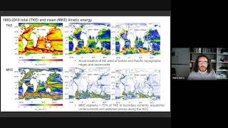
C
I.
Think
more
interesting
is
now
to
look
at
the
the
patterns
that
came
up
from
the
decomposition
on
the
top
row.
You
see
the
top
to
bottom
integrated
energy
content
on
that
particular
frequency
here
for
intranial
variability
and
then
the
other
three
for
intra-annual
frequencies,
the
first
being
from
six
months
to
three
months,
the
second
being
sub
monthly
and
the
last
one
really
high
frequency
so
frequencies
below
one
over
five
days.
C
C
C
So
there's
also
room
here
for
discussion
of
the
nature
of
many
of
these
signals
and
how
they
evolved.
I
will
not
spend
because
of
time
constraints
explaining
all
these
signals.
I
will
just
simply
explain
one
of
them.
So
I'm
jumping
here
two
slides
this
signal
that
one
sees
in
the
equator
in
the
Atlantic,
which
is
really
really
well
pronounced.
C
C
It's
all
here
well
explained
actually
in
this
paper
by
Kerner
at
all,
and
they
come
by
analyzing
the
original
velocity
at
the
equator.
They
realize
that
there's
a
intensification
of
of
energy
in
certain
places
and
by
Ray
tracing
they
could
come
up
with
one
Ray.
That's
that's
the
one
here
in
in
white,
which
actually
fits
pretty
well
to
what
the
model
seems
to
be
doing
so.
C
At
the
end,
this
maximum
of
energy
seems
to
be
yanai
wave
beam,
which
then,
with
the
wine
yanai
waves
being
generated
here
in
this
region,
where
the
nostril
current
in
the
equatorial
undercurrent
kind
of
interact,
and
so
that's
something
that
I'm
currently
also
looking
forward
to
continue.
Analyzing
I
would
like
now
to
make
a
summary
of
the
frequency
distribution,
so
you
have
here
for
all
the
three
oceans
and
also
then
integrated
by
latitudinal
bands.
Also
Polo
subtropical
tropical
Etc.
C
How
is
the
energy
distributed
so
to
say
in
frequency
where
frequency
would
be
now?
These
compartments
that
I'm
I
have
defined
so
interesting
would
be
to
realize
that
actually,
the
seasonal
and
soup
monthly
time
scales
are
the
ones
that
have
are
more
energetic
and
that
they
are
in
certain
cases
as
energetic
as
the
mean
kinetic
energy
can
be.
C
Okay.
So
that's
what
I
had
for
the
frequency
distribution,
but
now
I
think
interesting
would
be
to
see
how
these
compartments
evolve
in
time
and
that's
what
I
bring
now
here.
First
as
a
multi-decade
multi-decatal
trend.
So
let's
take
that
36
years
that
we
have
available
and
from
this
decomposition
you
could
do.
You
can
do,
of
course
redefine
the
time
average
in
in
chunks
of
10
years
and
actually
build
a
time,
a
temporal
evolution
of
all
these
compartments
and
all
of
these
frequency
frequency
decomposition.
C
If
you
take
the
the
difference
between
the
last
period
and
the
first,
you
come
up
with
this
multi-decadable
Trends,
where
actually
you
see
very
interesting
features
very
generally.
What
seems
to
be
the
case
here
is
that
the
Atlantic
is
decreasing
in
total,
kinetic
energy
there's,
maybe
a
shift
here
in
the
in
the
in
the
North
Atlantic
from
more
Eddie
Rich
regions
in
the
in
the
west,
to
something
that
seems
to
be
a
shift
towards
the
east.
C
But
the
general
thing
that
I
think
to
be
seems
to
be
to
come
out
of
this
multi-decadable
trend
is
that
the
the
Atlantic
seems
to
be
decreasing
that
actually
correlates
fairly
well
with
the
the
decrease
of
the
overturning
circulation
since
the
80s
or
since
the
the
the
the
the
beginning
of
the
90s.
Until
the
present
you
see,
indeed,
that
the
mean
currents
also
decrease
along
the
boundary
and
that
mostly,
but
mostly
the
total
kinetic
energy
can
be
explained
by
the
sub
monthly
time
scales.
C
It's
not
just
the
the
the
North
Atlantic
that
it
seems
to
have
a
decrease
also
in
the
South
Atlantic,
and
mostly
the
the
the
the
Atlantic
sector
of
the
ACC
seems
to
be
also
decreasing
in
strength.
So
in
this
case,
actually
seems
to
be
a
different
Behavior
between
the
Atlantic
sector
of
the
ACC
and
the
indo-pacific
sector
of
the
SEC.
C
C
If
you
look
indeed
in
the
in
the
Atlanta
in
the
equatorial
ocean
and
you
look
at
Trends
in
there,
you
see
that
the
Pacific,
for
instance,
is,
has
a
strong
increase
in
kinetic
energy
in
at
Mid
depths
and
that
this
can
be
explained
either
by
the
periods
between
three
to
six
months.
So
that's,
let's
say
seasonal
mostly,
but
this
also,
it
is
counter
balanced
by
a
decrease
in
the
kinetic
energy
at
intranial
time
scales.
C
C
So
by
redefining
that
the
long-term
mean
into
a
10
years
average
and
then
sliding
that
10-year
average,
you
could
actually
come
up
with
some
time
evolution
of
each
of
the
compartments.
So
you
see
here
total
kinetic
energy
and
then
all
the
the
compartments
that
make
up
to
this
to
to
the
total
and
let's
focus
first
or
only
actually
on
the
blue
lines.
C
Here.
I
brought
also
the
Nao
into
into
a
perspective,
I
superimposed,
the
Nao
with
a
two-year
time
lag
over
the
mean
kinetic
energy,
and
indeed
it
seems
to
correlate
quite
well.
At
least
it's
consistent,
there's,
not
many
degrees
of
freedom
here,
but
it
at
least
it's
consistent
and
the
idea.
What
could
be
here
so
the
this
this,
the
atmospheric
forcing
will
make
impart
some
variability
on
the
mean
flow
and
then
by
bioclinic
instability,
biotropic
power,
Clinic,
instability
generating
more
or
less
Eddies.
C
So
in
the
Atlantic
in
the
polar
North
Atlantic,
it
seems
to
be
correlated
with
the
Nao
in
the
South
Pacific.
That
increase
that
we
have
seen
is
here
correlated
with
the
Saturn
Southern,
Southern
annular
mode,
and
indeed
there's
a
good
correlation
again
between
the
the
climate
mode
and
the
mean,
but
also
with
the
highest
frequencies.
C
So
that
is
now
here
just
to
be
suggestive,
that
the
changes
that
we
are
seeing
in
the
multi-decatal
trends
are
probably
still
part
of
either
low
frequency
variability
that
we
see
in
the
in
the
in
the
Nao,
for
instance,
or
part
of
a
more
sustained
long-term
Trend
that
we
observe
on
the
salmon
okay.
So
that
leads
to
my
conclusions.
I'm,
sorry
for
taking
here
a
little
bit
more
time.
I
stopped
now
and
thank
you.
Laura.
E
Go
ahead.
Thank
you.
I
really
appreciate,
in
particular,
your
identification
of
the
an
eye
wave
as
a
non-eddy,
a
linear
wave
or
a
Doppler
shift
in
linear
wave
feature
in
the
phenomena
in
your
your
Diagnostics
I,
wonder
whether
it
would
be
worth
exploring
the
degree
to
which
many
of
the
other,
in
particular
Abyssal
signals,
are
not
in
fact
kind
of
non-linear
geostrophic
turbulence,
but
could
be
better
described
in
terms
of
linear
wave
Dynamics
topographic
waves,
for
instance
that
may
be
excited
by
the
yetis,
but
because
they're
linear
waves.
E
We
actually
know
an
awful
lot
more
about
how
they
propagate
how
they
would
change
with
changes
in
stratification
and
so
on
in,
in
a
way
that
that
just
kind
of
throwing
everything
into
the
geostrophic
turbulent
soup
kind
of
loses
that
that
extra
information
and
understanding
that
we
already
have.
Thank
you.
C
E
Well,
I
think
this
opens
up
kind
of
a
broader
conversation
about
the
role
of
of
waves
in
describing
these
relatively
low
frequency
dynamics.
That
I
think
might
be
an
interesting
thing
to
discuss
much
further,
but
I
really
do
appreciate
you're,
really
highlighting
the
importance
of
of
the
wave
Dynamics
in
one
part
of
it.
So
I
think
this
is
topic
for
maybe
a
broader
conversation
later.
Thank.
C
Actually
not
completely
at
the
global
at
the
global
scale.
If
you
do
the
global,
if
you're
interested
in
the
global
number,
there's
actually
a
decrease
and
not
an
increase
in
the
model,
especially
also
in
the
global
scale,
you
are
mixing
too
much
too
many
signals,
so
the
mean
is
increasing
in
the
Southern
Ocean,
but
then
most
of
the
Atlantic
is
decreasing
and
there's
actually
a
balancing
between
these
signals
so
that
in
the
global
scale,
actually
you
don't
see
anything
significant,
so
I
in
in
the
in
the
Southern
Ocean.
B
D
A
I
F
J
And
I'm
not
going
to
focus
on
these
sub
Antarctic
Zone
and
my
co-workers
are
done
with
from
NASA
range
now
Ivana,
chair
of
Becky,
mad
much
love
and
ping
Chang,
and
some
of
this
funded
by
NASA's
salinity
project,
and
it's
also
collaboration
with
Texas
a
you
know
and
just
to
get
some
background.
The
introduction
this
is
the
area
I'll
be
looking
at.
J
J
For
example,
the
boarding
plots
from
other
student
here
is
paper
showing
the
deepening
of
the
mix
layer
that,
through
the
season,
the
the
Left
Right
April
through
September,
which
is
Australia
and
the
top
panel
is,
is
a
Time
average
before
the
winter,
apparently
narrow
band
update
mixing.
But
this
area
is
also
of
interest
for
climate
for
heat
uptake
and
and
see
CO2
exchange
and
October.
It's
been
able
to
work
on
that
recently.
J
I
think
there's
a
run
out
of
time.
This
is
a
preview
of
the
conclusions,
yeah
and
I'll.
Let
you
just
look
at
that
for
a
few
seconds,
hopefully
I'll
be
able
to
talk
through
it
at
the
end
and
a
bit
more
background
about
watermaster
formation,
and
it
will
be
explained
very
well
in
the
papers
listed
at
the
bottom
of
the
term,
but
it's
relating
the
AC
plexus
of
density.
J
K
J
Let's
see
as
the
surface
exchange
here
there's
also
interior
dipignal
mixing
is
also
affecting
this
and
the
if
you
prefer
the
equation.
The
what
I'll
be
showing
relates
to
this
surface
order,
Mass
formation
that,
due
to
the
AC
fluxes,
it's
here
function
of
the
AC
density
plugs
and
then
there's
a
you
can
compute
the
actual
formation
of
water,
in
particular
density
classes.
J
Csm
simulations
and
I'll
show
you
why,
in
the
following
slides
and
these
have
been
accumulated
over
the
last
decade,
high
resolution
notion
of
0.1
degree
and
0.25
query
atmosphere
is
the
common
to
what
I'll
be
using
there'll,
be
some
com,
some
equivalent
low
resolution,
and
these
came
from
experiments
done
at
encount
on
Yellowstone
and
also
from
the
eye,
has
simulations
that
will
come
up
later
in
in
the
day
done
on
it
some
way
and
also
Frontier
computers,
basically
following
the
Siemens
six
deck.
First
of
all,
all
right.
Okay,
so.
J
Is
we
want
to
explain
the
formation
of
the
mixed
layers
in
this
region
in
terms
so
the
top
panelists
of,
although
and
it's
poorly
represented
in
the
low
resolution?
That's
the
middle
panel,
it's
much
better
represented
in
the
high
resolution
tripod
and
panel.
This
is
a
justification
to
use
a
high
resolution
model
to
look
at
this
topic
and
papers
by
Aleister,
video
Adele
and
also
a
particularly
people
contributed
to
the
small
get
out
paper
and
climate
Dynamics.
J
We
found
that
the
Ocean
meme
geostropic
circulation
was
very
important,
as
was
the
solentice
direct
condition
in
governing
where
these
people
first
born
and,
as
a
consequence,
the
southern
targeted
mode
order
is
better
represented
at
high
resolution,
and
it's
shown
here
the
top
10
organic
Camargo.
This
very
thick
band
of
mold
water
is
defined
as
shown
on
the
right
here.
You
know
sudden
density
range
and
low
TV
or
low
specification.
J
J
Another
motivation
for
the
labor
work
is
how
people
view
things
in
TS
space,
and
this
is
a
typical
kind
of
way
of
putting
things.
A
very
traditional
thing
going
back
a
long
time,
and
these
are
some
results
from
other
downwind,
knowing
how
the
the
volume
of
water,
in
certain
classes,
TS
classes.
This
is
the
volume
census
at
least
splitted
out
into
a
total,
sometimes
the
low
mix
there
in
the
week-
and
this
is
fraction
that
makes
no.
J
G
J
This
is
the
SST
Journey
from
the
20th
century
to
the
end
of
21st
century
and
what
you
see
is
a
very
different
story
in
high
resolution.
At
the
top
and
low
resolution.
Note
the
non-symmetric
caliber,
so
most
of
it
is
warming,
but
there's
a
reduction
in
the
warming
and
the
high
resolution,
particularly.
H
J
So
individual
units
are
spur
drugs
because
we're
doing
in
each
area
it's
photops
per
meter,
squared
and
the
so.
The
colors
on
the
bottom
panel
are
the
formation.
The
Contours
are
the
winter
mix
later
these
black
Contours,
and
what
you
can
see
is
there's
a
lot
of
formation
where
the
next
layer
is
deep,
for
example,
in
the
Indian
Ocean
here,
and
also
a
west
of
great
Passage.
J
J
So
you
have
to
choose
that's
what
these
sectors
are
here.
You
choose
densities,
where
you
know
from
looking
at
the
data
that
the
water
is
formed
in
those
densities,
in
other
words,
the
density
of
sub-antotic
mode
water
is
changing
as
you
go
eastwards,
it's
getting
denser,
so
that's
what's
been
used
here
and
that
Dan
works
and
myself
are
there
kind
of
interested
to
know
whether
you
can
learn
something
about
the
process
that
makes
their
deepening
using
these
Maps
and
I.
J
Just
want
to
point
out
here
very
briefly,
if
you
just
compared
with
the
results
from
heat,
flux,
alert
and
surface
heat
flux
alone,
with
no
fresh
water,
it's
a
very
similar
result.
So
it's
pointing
that
this
is
sort
of
c
fluxes
are
driving
this
formation.
This
is
an
only
mean
result.
You
can
do
things
with
seasons
and
so
on.
If
you
do
this
a
lot
more
but
won't
show.
J
You
can
also
look
at
Water
Mass
formation
in
TS
space
again
there's
some
paper
listed
here,
there's
some
motivation
from
Ben
Johnson
on
this
topic,
and
we
want
to
compare
this
with
the
volume
census
which
I
showed
earlier.
So
this
an
example.
This
is
transformation
and
Water
Mass
formation
in
TS
space.
It's
a
letter
to
panels
and
on
the
right,
the
the
colors
are
the
volume
census
as
a
function
of
temperature
and
salinity
and
that's
very
hard
to
see.
J
But
the
colors
are
the
sensors
and
there's
some
black
Contours
here,
which
are
the
formation
from
the
middle
panel
put
on
the
the
right
panel
and
they
actually
ovalid
very
well.
So
it's
showing
that
yes,
what
we
hoped
for
the
the
water
is
accumulating
in
the
TS
classes,
where
you
see
the
Water
Mass
formation
from
the
classic
Theory.
So
it's
a
nice
comparison
and.
L
J
Well
in
theory,
then,
have
infection,
effective
processes,
top
metal,
the
interior,
mixing
top
right,
and
you
see
they've
all
play
a
role
in
certain
parts
of
TS
space.
There's
no,
the
same
role
in
each
part
of
TS
basis.
Kind
of
interesting
to
do
this
and
I
was
very
impressive
on
this
residual,
which
is
very
small.
J
So
this
is
the
kind
of
thing
you
can
do
would
be.
The
2D
and
I
want
to
wrap
up
with
the
climate
change
of
SST.
This
is
also
something
we've
just
started.
Looking
out
with
the
eye
has
depth
experiments
and
a
show
that
previously
how
the
high
resolution
was
different
to
low
resolution,
it
could
just
focus
on
the
high
resolution
has
been
doing
a
heat
budget
for
the
upper
ocean
this
after
200
meters.
J
The
budget
equation
is
shown
there
and
what
we
find
is
a
lot
of
the
changes
in
temperature
actually
driven
by
production
in
many
parts
they
often
dumped
by
the
services
qnet,
but
the
the
vertical
mixing
and
the
diffusion
also
plays
a
role
in
it.
As
you
can
see,
it's
in
the
region
of
the
deep
mixed
layers,
so
the
original
my
original
motivation
was
see.
Does
the
different
stratification
and
high
resolution
effect
how
the
temperature
changes
through
time
when
that's
what
we're
trying
to
get
at
it?
So
that's
our
purpose
there.
J
These
are
conclusions
that
water,
Mass
formation
was
useful
tool.
You
can
use
spatial
mats
and
also
the
TS
space.
The
ventral
aim
is
to
look
at
a
volume
budget
in
these
spaces
to
learn
more
about
the
the
mode
water
and
for
the
climate
change.
We
can
combined
effects
of
ocean
advection
and
vertical
mixing
work,
mainly
group
driving
differences
between
the
high
resolution
and.
I
You
thank
you.
It's
really
impressed
to
see
under
high
resolution.
I
know
biology.
Chemistry
is
not
turned
on
I
wish.
It
were
because
we
have
the
genetic
carbon
would
be
very
much
influenced
by
this.
Do
you
have
any
parents
named
tracers
in
these
high
residuals
like
succeeds
and
things,
whereas
you
could
look
at
how
their
distribution
was
impairs.
M
B
What
that
means
that,
like
upwinding
and
or
we
know,
or
whatever
it
gets,
lumped
into
adjection
when
really
it
you
might
want
to
have
it
in
diffusion.
Do
you
have
any
thoughts
about
different
takes
about
trying
to
separate
out
the
numerical
impacts,
separate
from
the
assumed
physical
formulation
con
comments
that
much
on
that
particularly
I
haven't
used
effortless
purposes.
J
J
J
Not
it's
not
it's!
It's
it's
improved,
but
yeah
and
it's
different,
like
you
tend
to
look
at
these
things.
I
know
a
typical
thing.
If
you
look
at
the
high
resolution
model,
it'd
be
much
improved
near
the
boundary
currents
and
the
ACC
and
the
ability
to
turn
current,
but
maybe
higher
more
more
pole
word.
Maybe
it
might
be
not
as
good
as
low
resolution
for
other
reasons.
J
J
F
This
is
a
video
from
the
gravity,
recovery
and
kind
of
experiment.
Satellites
on
the
left
is
a
Time
series
from
2002
to
2016
that
is
showing
the
mass
balance
of
the
ice
sheet,
and
so,
as
that's
going
down
over
time,
the
Ice
Cube
is
losing
mass
over
this
period
and
on
the
right
is
a
map
of
this
Mass.
Last
video
stopped
okay,
and
there
is
a
map.
F
Was
this
yeah
of
this
Mass
change
over
the
continent
with
areas
in
red,
indicating
Mass
loss
errors
in
blue,
indicating
Mass
gain,
and
so
at
the
end
of
this
sort
of
12
15
year?
Long
observational
period,
we
see
that
a
lot
of
our
Mass
loss
is
actually
located
in
one
very
specific
region,
as
opposed
to
being
like
homogeneous
around
the
entire
continent.
F
F
That,
like
is
empathetic
for
a
lot
of
you
in
this
room,
but
unfortunately,
this
mass
is
really
difficult
to
capture
and
climate
models
and
that
really
limits
our
understanding
of
the
way.
This
ice
sheet
interacts
with
the
Southern
Ocean
around
it,
and
so
that
kind
of
brings
me
to
this
sort
of
overarching
research
question,
which
is
what
happens
if
we
rewrite
our
model
forcing
to
match
our
real
world
observations
and
so
to
get
at
that.
I
used,
obviously
cesm
to
nobody's
surprise
in
this
room.
F
A
constant
line
from
1970
to
20,
2100
and
I
also
created
a
second
simulation
called
an
Envy
simulation.
The
ice
sheet
mask
that
was
in
a
comparison,
experiment
that
is
going
to
be
increasing
from
1992
through
the
end
of
the
century.
It's
based
on
satellite
observations
from
1992
to
2020
that
were
all
mounted
related
by
this,
maybe
team,
hence
the
name,
and
then
it's
based
on
model
output
for
the
sort
of
future.
F
So
before
I
actually
get
into
some
results,
I
kind
of
need
to
walk
you
through
this
thing
really
quickly,
so
just
take
for
a
second
think
about
sea
ice
sea
ice
has
several
drivers.
This
is
a
non-exhaustive
list,
temperature
salinity,
precipitation
Mount,
all
of
those
have
their
own
drivers
again.
This
is
a
non-exhaustive
list,
those
have
their
own
drivers.
Many
of
them
are
feeding
back
into
each
other.
Those
have
Arrow
drivers.
F
So
I'm
going
to
start
by
looking
at
stratification,
so
I'm,
looking
at
Delta,
rho
Delta
Z
over
the
top
200
meters
of
the
Southern
Ocean,
there's
a
brief
schematic,
so
I'm
taking
the
surface
density
and
I'm
I'm
taking
excuse
me
the
density
at
depth,
subtracting
the
surface,
and
so,
if
it's
less
than
zero,
it's
going
to
be
unstable.
If
it's
positive,
it's
going
to
be
more
stable,
more
positive,
stronger
stratification.
F
In
addition,
oh
yeah,
sorry
so
in
the
1991,
so
before
I've
actually
branched
off
the
second
experiment.
This
is
what
the
Maine
State
looked
like
in
1991,
so
typical
ranges
are
anywhere
between
zero
and
one
kilograms
per
meter.
Cube
I'm
also
going
to
look
at
ideal
age.
So
this
is
the
last
time
water
parcel
was
in
contact
with
the
atmosphere
so
again
a
schematic
with
south
over
towards
the
left
North
over
towards
the
right.
F
As
you
go
around
the
circle,
your
water
is
going
to
get
older
and
older
all
right,
so
zero
for
spot
one
and
then,
by
the
time
you
make
it
around
to
number
four.
You
can
get
up
to
sort
of
a
thousand
years
old,
so
I'm
gonna,
look
at
ideal
age,
I'm,
also
going
to
look
at
a
temperature
profile
and
so
I'm
going
to
basically
take
the
average
rail
in
the
Southern.
F
In
addition
to
temperature
profile,
I'm
also
going
to
look
at
Sea
ice,
both
extent
as
well
as
thickness
and
then
lastly,
I'm
going
to
look
at
heat
flux.
I'm
going
to
look
at
this
is
going
to
be
sensible
and
latent
heat
flux
and
positive
hairs
out
of
the
ocean,
and
so
again
this
is
the
1981
mean
state,
so
pretty
much
positive
throughout
the
entire
seven
ocean.
F
So
what
I'm
plotting
here,
I'm
going
to
show
you
the
sort
of
final
State
minus
the
initial
States?
This
is
the
change
over
the
course
of
the
century.
I've
averaged
15
years.
For
each
of
these
states,
the
top
has
to
be
Indie
simulation
here
at
the
top
again
more
positives
to
other
stratification.
More
negative
is
going
to
be
weaker
stratification.
F
So
we've
also
looked
at
ideal
age,
so
we-
this
is
the
top
thousand
meters
here
that
I'm,
showing
you
so
positive,
means
that
it's
older.
So
again,
this
is
finalized
initial.
So
our
seven
ocean
is
getting
a
bit
older
in
this
Indie
simulation
a
little
bit
of
change
in
the
control,
but,
generally
speaking
this
is
this
really
really
strong
signal
up
in
the
very
high
latitude
very
near
the
surface
ocean?
That's
increasing
the
ideal
age
of
this
other
Southern
Ocean
by
about
14,
so
really
significant
change
there.
F
So
this
is
MB
minus
control,
so
I've
subtracted
these
two
columns
and
so
places
where
it's
Bluer
is
going
to
be
where
the
Indie
simulation
is
cooler
than
the
control
rotary
is
going
to
be
warmer
and
so
towards
the
end
of
the
century.
We
see
a
much
cooler
surface
and
Southern
cooler
and
upper
ocean
signal
with
a
lot
of
heat
being
tracked
at
depth.
F
This
is
pretty
consistent
around
Vio
sheet
below
a
thousand
meters,
but
you
can
start
to
see
really
really
strong
signals,
even
at
just
100
meters
really
really
close
into
the
IP
here
next
series
and
thickness
again
I'm
plotting
the
difference
here
over
time.
So
as
oh
gosh
as
these
lines
type
upgrade
you're
going
to
have
to
believe
me
if
you're
in
the
room
as
these
lines
turn
upward.
F
F
Lastly,
keep
Flex.
So
this
is
a
Time
series
of
total
Southern
Ocean
heat
flux,
but
light
blue
line
is
our
Envy
simulation,
the
dark
blue
eyes,
the
control?
There
are
lighter
lines,
Behind,
These,
sort
of
folded
lines.
The
lighter
sort
of
thinner
lines
are
the
annual
average.
The
darker
lines
are
Italian
and
moving
mean,
and
so
both
in
relation
see
an
increase
or
excuse
me
yeah.
So
both
simulations
see
this
going
up,
but
oh
gosh,
oh,
this
is
I'm.
So
sorry,
I
was
confusing
myself
from
the
atmosphere.
F
Perspective
versus
the
ocean
perspective.
Forget
that
first
half
of
that
sentence.
The
thing
that
you're
supposed
to
take
away
from
this
slide
is
that
more
heat
is
being
taken
up
by
the
ocean
in
the
Envy
simulation
again.
So
positive
is
out
of
the
ocean.
Apologies.
My
science
contention
is
not
it's
not
great.
This
is
what
I've
tried
to
change
right
before.
F
F
We've
created
two
simulations,
one
that
is
constant
and
one
that
is
spatio
temporally
heterogeneous,
which
is
really
really
important,
both
in
that
it's
increasing
with
time
which
we
know
to
be
true,
but
it's
also
spatially
robust,
which
is
sort
of
something
that
differentiates
this
project
from
similar
ones
that
have
been
done
in
the
past,
where
a
lot
of
times
opposing
experiments
are
done
with
a
sort
of
heterogeneous,
fresh
water
signal
around
the
ice
sheet.
This
is
supposed
to
be
slightly
more
realistic
and
sort
of
keep
that
spatial
signal.
F
F
All
of
this
is
to
say
that
including
active
or
realistic,
IHG
components
and
Global
client
models
is
imperative
for
being
able
to
predict
centuries-long
changes
to
our
reclining
system,
particularly
with
really
high
latitude
oceans,
so
I'll
stop
it
there.
Hopefully
that
was
sufficiently
sustained
and
then
I'll.
Take
your
questions.
Thank
you.
G
F
F
L
F
F
D
F
O
N
F
Really
really
good
question:
it's
a
a
little
difficult
right,
so
just
because
these
things
act
on
such
slow
time
scales,
but
we
are
starting
to
see
it
now.
So
I
would
advise
that
we
don't
start
our
simulations
until
1992.,
but
we
I
think
all
pretty.
Much
are
well
aware
that
the
continent
has
been
losing
that
as
well
before
then.
So,
while
these
signals
might
not
be
realized
for
several
decades,
they
might
be
being
realized
now
already,
but
I
would
expect,
for
instance,
like
sea
ice
would
be
like.
F
The
first
thing
that
comes
to
mind
is
there's
been
this
really
like
obvious
different
difference
between
observed,
CIS
and
model
CIS
for
a
long
long
time
are.
Our
observations
are
not
going
down,
but
our
models
are
obviously
like
losing
sea
ice
ad
nauseam,
and
so
this
result
indicates
to
me
that
perhaps
including
this
freshwater
walks
in
a
more
realistic
manner
would
help
sort
of
offset
that
difference.
That
bias
there
and
perhaps
don't
perhaps
start
to
help
explain
some
of
the
differences
that
we
are
starting
to
see
with,
like.
F
E
I
E
Is
this
is
a
nice
study,
but
one
of
the
notable
things
about
Antarctica
is
that
more
than
half
of
the
mass
that's
lost
appears
to
be
going
into
the
calving
of
icebergs,
which
don't
actually
melt
right
next
to
Antarctica.
They
can
drift
away
quite
a
ways
and
even
among
the
the
part
that
melts
a
lot
of
it
might
happen
at
the
base
of
ice
shelves.
Instead
of
going
right
into
the
surface,
have
you
considered
extending
your
study
to
look
at
other
distributions
of
your
freshwater
input
to
assess
the
robustness
of
your
various
results.
F
Yeah,
that's
an
excellent
question
yeah.
So
this
is
something
that
my
advisor
at
the
time
limits.
We
talked
about
this
at
length
and
we
ended
up
settling
on
this
because
it
was
relatively
straightforward
and
relatively
simple
and
we
just
kind
of
wanted
a
proof
of
concept,
but
you're
totally
right
in
that.
So
we
the
way
that
we
have
constructed
this.
Our
freshwater
forcing
is
a
roughly
even
split
between
basal
melt
and
calving
or
solidize,
and
liquid
ice
as
it's.
F
In
cesm-
and
it's
all
put
in
the
coast,
you're
totally
right
in
that
a
lot
of
this
calving
does
not
in
fact
affect
our
immediate
Coastal
grid
cells.
It
goes
out
further
in
CSM
I,
believe
that's
treated
as
like
a
gaussian
function
away
from
the
coast,
and
that
would
be
like
a
really
really
fantastic
sort
of
future
Avenue
to
pursue
I
think
like
loading
in
the
sort
of
pre-existing
gaussian
distribution
would
be
fine
for
the
iceberg
melt
and
then
for
ice
shelves.
F
You're
comment
about
ice
shelves,
so
ice
shelves
can
get
to
several
hundreds
of
meters
up
to
a
thousand
meters
thick
for
anyone,
who's
not
familiar,
and
so
introducing
this
at
the
service
is
a
little
bit
fictitious
in
that
I'd
ride.
This
basal
melt
should
actually
be
realized
at
depth,
but
we
were
running
into
issues
with
introducing
spurious
velocities.
If
I
recall
correctly,
Gustavo
might
be
able
to
speak
to
this.
A
little
bit.
I
know
that
yeah.
So
this
is
they
were.
They
were
things
that
we
definitely
considered.
F
B
O
B
O
The
source
of
skill
in
naturp
is
Westward,
raspberry
way,
propagation
of
initialization
State
Guided
by
the
sharp
cave
front
and
I
think
this
is
interesting.
The
Western
propagation
is
not
clear
in
low-rise
simulation
I'm
going
to
show
that,
so
this
presentation
is
based
on
a
manuscript
in
religion.
I
just
got
a
review.
O
O
Extension
is
an
extension
of
a
western
western
boundary
current
or
subtropical
Gyro
in
the
Pacific
Croatia
currents.
So
satellite
observation
shows
there's
strong
Decatur
variability
in
crochet
extension,
for
example,
bochu
at
all
constructed
a
Time
series
using
many
information
like
strengths,
Crush
extension
strands
past
lengths
latitude
and
position
and
found
strong,
Decatur
variability,
which
is
shown
on
the
left
top
left
panel.
O
So
if
you
compute
the
regress
SSH
ssh
regression
using
this
time
series,
you
get
this
special
pattern
with
the
strongest
loading
in
the
downstream
K
near
Japan.
So
usually
people
use
this
Regional
average
near
this
Japan
SSH
as
a
crochet
extension
index
and
as
you
can
see,
you
can
basically
reconstruct
the
the
yeah,
the
previous
time
series
and
we'll
use
the
same
similar
definition
for
crucial
extension
index
later
because
of
this
Quest
quasi
also
oscillating
feature.
O
There
has
been
a
few
attempt
to
predict
this
crucial
extension
variability.
So
this
the
right
plot
is
from
Joe
Arrow,
showing
basically
correlation
skill
from
two
study
as
a
function
of
leg
leadier.
The
green
line
is
from
same
study,
book
Shoe
at
all
2014
using
linear,
verticity
equation,
and
the
black
and
dark
green
line
is
from
jfkl
prediction
system
spear.
O
The
bottom
line
is
both
models
shows
kind
of
a
skillful
prediction
of
crochet
extension
on
multi-year
time
scale
up
to
three
to
four
years
ahead
and
yeah
I
forgot
to
mention
so
the
and
yeah.
It
is
well
known
that
this,
this
Decatur
variability
of
crush
extension,
is
driven
by
raspberry
propagation
from
from
Central
Pacific
region
induced
by
wind,
forcing
and
resulting
ecuma
pumping
and
and
yeah.
O
O
Indeed,
the
study
by
sasakiero
kind
of
showed
that
the
the
K
front
serve
as
wave
guy
for
raspberry
wave
propagation.
It's
the
right,
Plus
shows
the
regression
of
SSH
from
cellulite
observation
and
their
reconstruction
onto
each
grocery
extension
index
box
average
near
Japan,
showing
that
the
the
initial
anomaly
in
the
Central
Pacific
is
Meridian.
Only
wide
but
as
it
moved
Westward
it's
kind
of
converging
into
this
sharp
crochet
extension
front.
O
O
O
So
we
make
use
of
recently
completed.
Decatur
prediction
simulation
at
high
resolution,
as
a
part
of
that's
just
Justin
mentioned,
is
a
project
and
we're
going
to
compare
the
skill
from
world
resolution.
Decatur
prediction:
dple
I'm
not
going
to
go
through
this.
All
the
details
of
the
model,
configuration
and
initialization,
but
I
just
want
to
highlight
that
the
yeah,
both
hrtp
and
dple,
we're
initialized
with
ocean
initial
condition.
Ocean
and
sea
is
initial
condition
from
poor
social
simulation
at
the
same
resolution.
O
Forced
constraint
at
the
surface
by
the
real
analysis,
products
and
hidp
is
initialized
only
every
second
year
and
for
shorter
time
scale
and
ran
for
five
years
compared
to
every
year,
a
longer
time
period,
time,
train
and
longer
run
lines
in
dple.
So
analysis
is
restricted
by
these
shorter
and
less
frequent
hrdp
and
also
the
example.
Size
is
smaller
than
versus
40..
O
So,
let's
first
Define
a
crochet
extension
index
because
the
crochet
extension
is
biased.
Nurse
were
in
course,
resolution
stimulation.
We
cannot
use
kind
of
common
Regional
bugs
so
we
first
Define
The
crucial
extension
index
from
observation
where
the
decade
of
availability
is
strongest,
then
compute
the
correlation
using
models,
SSC
HSA
SSH
field
and
then
take
the
area
average
where
the
correlation
is
highest
and
top
left.
O
So
then
we
compute
the
anomaly
correlation
coefficient
between
fussy
and
Decatur
prediction.
Basically,
black
between
black
and
red
and
the
red
line
here
is
the
ACC
score
from
high
resolution.
Hrdp
and
blue
line
is
from
Road
resolution.
As
you
can
see,
we
find
exceptionally
High
scale
from
hrdp
greater
than
0.7
of
the
video
three
and
about
0.6
to
Lydia
4,
which
is
statistically
significant.
O
The
blue
shading
here
show
the
the
range
of
randomly
10
member
sample
ACC
from
dple,
because
the
Ensemble
size
is
different
and
you
can
see
that
the
the
hrdp
is
always
higher
than
the
this
randomly
sample
time.
Member
dple,
we
can
do
the
same
for
against
the
observation.
Again,
you
can
find
exceptionally
High
scale
from
hrdp
it's
even
higher
than
the
the
above.
It's
a
kind
of
always
around
point
eight
up
to
lead
year.
O
O
So
less
than
source
of
scale,
so
this
Plus
shows
the
hormonal
type
correlation
SSH
correlation
along
discussion.
Extension
latitude,
as
you
can
see
that
in
both
observation
and
plus
CH,
which
there's
indication
of
Westward
propagation
of
signal
on
time
scale
of
three
to
four
years.
In
contrast,
the
westward
propagation
in
fossil
L
is
too
fast.
It's
it's
getting
to
the
west
of
boundary
western
boundary
or
within
the
year
or
so
so
I,
don't
think
yeah.
O
O
And
this
is
special
pattern:
SSH
correlation
on
each
the
plastic,
crochet
extension.
No,
no,
each
crochet
extension
index.
You
can
see
the
the
initially
wide
the
anomaly
in
the
Central
Pacific
is
converging
into
crochet
extension
latitude
as
as
it
propagates
westward
in
both
Plus
Age
and
observation
consistent
with
sasakiero.
O
We
can.
We
can
generate
a
similar
lack
correlation
from
hrdp
across
lead
years.
So
because
there's
the
skill,
Ki
skill
is
a
reasonably
High
Lydia
3
we
compute
first
simultaneous
correlation
between
vasi
Ki,
not
not
the
Ki
from
tequila
prediction
itself,
then
compute
the
lead
regression
across
lead
years.
This
is
the
results
as,
as
you
can
see
you
can
the
hrtp
basically
reproduce
the
propagation
pattern
in
plastic
h
so
suggesting
that
it
is
really
the
raspberry
way.
O
Propagation
is
the
source
of
the
skill.
But
if
you
look
at
the
Royal
resolution,
simulation,
there's
no
clear,
Westward
propagation
signal,
inbox,
plus
the
IL
and
dple,
and
there's
no
convergence
of
SSH
not
only
into
Crush
extension,
crochet,
crochet
up
front,
of
course,
and
if
you
just
focus
on
this
blue
box
here,
which
is
the
the
crush
extension
index
region,
then
you
don't?
It's
hard
to
say
whether
the
signal
is
coming
from
the
central
capacity
or
from
the
cells,
and
then
we
also
trace
the
individual
individual
crochet
extension.
O
O
O
The
temperature
here
is
average
over
generally
average
over
the
crochet
extension
index
region.
In
both
observation
and
bus
CH
you
can
see.
Center
of
action
is
in
the
subsurface
at
the
core
of
K
at
around
35
North,
so
indicating
this
is
related
to
thermocolitis
displacement
associated
with
respiratory
propagation,
but
it
contrasts
in
real
life.
Classy
l.
The
center
of
action
is
located
near
the
surface
and
kind
of
north
of
crochet
extension
core.
O
So
in
this
simulation
the
course
question
relation
simulation,
there's
no
distinct
separation
between
crucial
extension
and
or
actually
your
current
currents.
So
I
think
this
might
be
related
to
the
any
fluctuation
between
these
two
gyre
can
generate
this
temperature
variability
and
oh
yeah,
okay,
yeah,
sorry,
yeah,
I,
guess,
time's
up
and
I
had
to
stop
here.
M
J
O
P
I
I
So
I
think
my
first
question
is
I.
Don't
know
if
you
saw
a
Sam's
talk
yesterday,
predictability
of
IG
chemistry,
please
look
at
the
carusio
current
large
Marine
ecosystem
and
showed
that
it
was
actually
a
very
low
predictability,
both
for
temperature
and
logical
properties.
There
in
csm's
mile,
which
is
of
course
resolution
version.
I
O
H
B
I
Greeting
you're
thinking
it
would
be
hard
to
predict
anything
at
all
there
and
then
the
other
thing
that
we
thought
well.
First
Sam's
work
was
the
Eastern
Pacific
is
the
predictability
and
eastern
Pennsylvania
is
linked
to
in
filming.
You
know
honor,
and
so,
whereas
the
grocery
is
not
as
hard
as
that,
but
there
are
other
mechanisms
of
predictability,
presumably,
okay,
so
then
in
other
regions
also
improved
pretty
good
skill
in.
O
B
I
A
N
So
good
morning,
everyone
I'm
Melissa
walshep
I'm
from
the
University
of
Sao,
Paulo,
Brazil
and
I'm.
Also
a
Fulbright
scholar
visiting
any
car
in
the
past
six
months,
so
I'm
going
to
show
you
the
work
that
we
have
been
doing
here
and
the
title
is
Southampton
hit
balance
in
the
morning
climate,
but
first
of
all,
I
would
like
to
thank
all
my
collaborators
and
also
my
supervisors.
So
I
hope
you
enjoyed
this
presentation
and
let's
go
well,
you
we
computed.
N
N
Imagine
if
you
have
a
cube
of
water
in
the
Cartesian
coordinates,
and
this
Cube
cannot
exchange
heat
with
the
bottom
just
with
the
surface
and
with
this
side
counters.
So
the
first
term
that
we
consider
is
the
total
surface
heat
flux
which
can
be
split
into
latent
heat
flux
since
4
heat
flux,
long
wave,
heat
flows
and
short
wave
heat
flux,
and,
in
our
case,
in
the
total
surface
heat
flux,
has
a
positive
sign
from
the
atmosphere
to
the
ocean.
N
The
next
third
is
the
horizontal
heat
transport
and
I
mean
the
integral
between
the
the
surface
and
the
bottom,
and
the
horizontal
heat
transport
has
the
zonal
component,
which
is
not
important
for
us,
because
we
have
continents
in
its
own
Direction
and
which
is
important
for
us
is
the
original
component
in
the
next.
So
the
balance
between
these
terms
give
us
the
heat
storage,
which
also
can
keep
can
be
computed
by
the
integral
of
temperature
from
the
surface
to
the
bottom.
N
N
Here
in
this
map
from
Rogers
at
all
2021,
we
have
that
in
the
future
climate
we
have
an
increase
in
the
heat
storage
and,
as
I
mentioned
before,
the
heat
storage
is
related
to
important
climax
process
and
also
important
for
a
lot
of
climate
systems
like
the
intertropical
Convergence
Zone
in
the
South
Atlantic
convergence.
Only
learning
in
atmospheric
equates,
and
also
for
tropical
storms
and
hurricanes.
For
example,
in
the
present
climate,
we
don't
have
hurricanes
in
the
soccer
Planet,
but
we
don't
know
about
the
future.
N
So
we
use
it
in
this
world.
The
community
herbs,
System
model
version,
2
large
Ensemble,
Community
project.
They
had
a
lot
of
information
about
this
data
set
in
Rogers
at
all
2021,
but
I
will
bring
you.
Some
I
will
bring
you
some
of
them.
The
largest
number
is
based
on
polycarpet
simulations,
and
the
ocean
component
has
a
more
or
less
one
degree
for
spatial
resolution.
N
Also.
It
has
two
basically
two
scenarios:
the
historical
period
and
the
person
scenario,
which
follows
the
semi-6
SSP
370,
also
the
largest
sample,
has
100
members
with
micro
and
macro
perturbations,
and
if
these
simulations
were
designed
to
represent
different
bases
of
the
appliance
commercialization
or
a
block.
N
It
has
the
similarities
in
the
previous
one,
but
here's
our
first
idea
of
some
changes
in
terms
of
the
amount
the
Blue
Line
represents
the
mark
in
the
present
climate
and
the
red
line
represents
the
mod
for
the
future
climate
and,
as
you
know,
when
there
are
a
lot
of
words,
the
mod
will
weaken
in
the
future
climate.
But
one
thing
caught
our
attention,
which
was
the
inflection
points,
become
shallower.
N
N
Finally,
we
have
the
heat
balance
for
the
software
plant
and
in
this
first
image,
I
show
you
the
the
red
line,
the
emerging
of
its
transport
g-frames
and
North.
Minus
South
was
our
reference
and
the
blue
line
is
the
total
surface
heat
flux
again
the
sign
the
positive
sign
from
the
atmosphere
to
the
ocean
and,
as
you
can
see,
they
were
in
balance
before
training,
15
or
yeah
2015,
but
in
the
crime
in
the
future
they
they
are
not
in
balance.
N
N
Finally,
so
far,
we
know
that
the
original
energy
transport
is
important
for
the
heat
storage.
But
what
about?
Inter?
What
about?
In
terms
of
the
variability?
So
we
computed
correlations
between
each
term
just
to
see
which
one
were
more
important
or
not
for
the
variability
of
the
heat
storage,
and
this
is
for
the
historical
period
And.
N
Yeah
now,
as
a
concluded
remarks,
we
have
the
the
links
to
suggest
that
this
upper
planet,
we
were
mainly
due
to
the
weakening
of
northward
heat
transport
and
these
warmer
cures
in
the
urban
ocean
and
not
the
original
transport
is
the
main
driver
for
the
variability
of
the
heat
storage
in
the
future.
But
in
the
past,
what
the
surface
heat
flux
and
as
a
next
step,
we
intend
to
calculate
each
component
of
the
margin
of
transport
to
the
Germany,
which
term
is
responsible
for
the
increase
in
the
heat
storage.
N
I
would
like
to
thank
CSM
election
Community
project
and
the
IBC
IBS
Center
for
coming
to
visit
in
the
South,
Korea
or
Computing
and
making
links
to
available,
and
we
also
building
a
repository
on
GitHub.
So
you
can
find
all
our
codes
and
notebooks
there.
If
you
are
interested
so
yeah,
let
you
have
any
questions,
comments
or
feedback.
A
J
Right
so
it's
a
very
nice
talk
very
clear
and
I
had
some
a
couple
of
quick
questions.
One
was
there's
some
observations
of
34,
South
I
think
have
we
got
it
whether
by
those
and
the
second
thing
was
when
you
look
how
the
processes
change
with
climate
change
emerging
on
the
heat
transport
is
more
important
to
understand.
N
Future,
it
kind
of
raises
questions
and
the
first
question
we
used
the
theme
of
theater
set
in
34
34.
dot
pi,
but
this
data
set
has
a
high
variability,
so
in
even
the
realizes
models
or
light.
Ensemble
cannot
represent
this
variability.
So
that's
why
I
didn't
show
here
and
there
there
are
a
lot
of
papers
who
said
that
say
that
it's
quite
hard,
it's
pretty
hard
to
to
compare
involved
with
different
data
sets,
because
it
can
have
like
some
Aviation
of
five
different
groups,
which
is
five
feet
and
how
much
are
second.
A
A
quick
one
I'm
not
sure
he
said
this,
but
maybe,
if
I'm
understanding
the
slides
correctly.
The
change
in
the
Divergence
of
the
heat
transport
over
the
21st
century
looked
like
it
was
mostly
a
result
of
the
the
equatorial
section
rather
than
the
forward
section.
Yeah
is
that
okay
yeah
you've
been
right.
Okay,.
A
A
G
G
M
G
F
F
G
D
G
G
L
G
H
G
G
G
G
G
I
G
D
G
D
I
G
O
K
Q
Q
Q
Okay,
thanks
so
yeah
I'm
here
today.
Talking
about
my
insights
in
developing
a
course
resolution
configuration
of
mod
6.
before
I
begin.
I
will
say
that
most
of
this
work
was
done
while
working
for
Stefan
armstroff
in
the
Palmer
project
here
in
Germany
and
along
with
a
significant
technical
help
from
Stefan
Petey,
our
in-house
computer
scientist.
Q
Q
Q
Earth
system,
which
would
include
things
like
a
coupled
ice
sheets
and
a
solid
earth
model
components
as
far
as
the
ocean
is
concerned,
that
meant
the
we
had
certain
requirements,
and
that
includes
Dynamic
sea
level
change.
So
if
we
want
to
stimulate
glacial
Cycles,
we
need
to
simulate
changes
in
sea
level
of
up
to
including
120.
T
Q
Secondly-
and
this
is
perhaps
a
bigger
problem-
our
model
is
very
prone
to
forming
not
specific,
deep
water,
even
in
pre-industrial
boundary
conditions,
and
that
is
both
in
the
coupled
setup
and
in
a
standalone
notion
in
cs70
configuration
and
finally,
the
model
actually
has
significant
temperature
biases
at
the
Antarctic
margin.
So
what
if
you're
interested?
You
can
look
at
the
paper
I've
cited
below
here?
Q
M
Q
Now
there
are
some
changes
made
to
the
lateral
grid,
we're
still
using
nominally
three
degrees
where
it
varies,
with
latitude
to
a
more
fine
0.6
degrees
of
the
Equator
I
extended
it
all
the
way
to
the
South
Pole,
because,
of
course,
if
we
run
simulations
where
parts
of
Antarctica
melt,
we
want
to
be
able
to
extend
the
ocean
grid
further
south
much
like
the
original
configuration
we
have
28
vertical
levels.
I
will
just
say
ahead
of
time.
R
Q
There
are
other
much
smaller
changes
to
many
here
to
list
different,
differing
from
one
five,
such
as
changing
bathymetry
and
in
places
like
the
Mediterranean
outflow
and
lower
North
Atlantic
still
between
green
and
Iceland
I
had
to
open
all
these
channels,
which
are
treated
differently
in
mom
six.
If
you
have
any
questions
there,
you
can
ask
me
at
the
end.
Q
Similarly,
there
were
new
runoff
Fields
generated
for
the
river
runoff.
This
is
partially
due
to
the
fact
that
you
know
during
the
tuning
I
had
problems
getting
a
good
ocean
statement.
I
thought
this
might
have
been
due
to
the
the
buoyancy
forcing
long
story
short,
the
runoff
Fields,
don't
seem
to
make
that
much
of
a
difference,
probably
in
part,
because
we
have
salinity
restoring
active,
but
in
any
case
we
are
using
these
new
fields
in
this
run.
Q
And,
finally,
this
is
something
I've
done.
Just
in
the
last
year,
I've
I've
gone
into
mom
six
and
actually
introduced
some
custom
routines
that
allow
for
the
introduction
of
basal
Melt
from
floating
eye
shelf,
so
essentially
fluxes
that
we
get
from
pism
Pico,
and
this
just
allows
us
to
put
masks
and
energy
fluxes
into
mom
6
at
the
appropriate
depths
from
each
ice
shelf.
Again,
if
you
have
any
more
questions
about
that,
you
can
ask
at
the
end,
but
I
will
for
the
purposes
of
the
results
presented
here.
Q
A
disclaimer
before
I
go
any
further
due
to
the
long
integration
times
of
each
tuning
scenario.
The
limited
computational
resources
I
had
at
my
disposal
here
and
simply
because
I
didn't
really
have
the
time
to
to
do
this
forever.
What
I
can't
show
you
here
is
a
is
a
comprehensive
testing
of
the
parameter
space
model.
Q
Amok,
while
dealing
with
any
problems
and
biases
that
popped
up
along
the
way,
what
I
can
tell
you
is
which
parameters
have
the
biggest
impact
on
the
on
the
configuration
and
on
the
things
I
was
interested
in.
But
what
I
can't
tell
you
if
this
is
necessarily
true
in
some
other
combination
of
configuration
settings
that
I
haven't
tested,
obviously
and
finally,
I-
consider
this
work
to
be
incomplete.
I
simply
ran
out
of
time,
and
I
am
very
certain
that
there's
room
for
improvement
here
so
just
quickly
on
the
screen.
Q
Q
Q
Thank
you
so,
starting
off
with
a
few
basically
technical
issues
as
you
might
have
been
able
to
see
if
it's
considerably
slower
than
on
five,
so
our
configuration
one
five
achieves
about
1
000
model
years
per
day.
We
do
a
bit
less
than
a
third
of
that
in
mom
six.
The
exact
reason
for
this
is
still
unclear.
Q
One
thing
I
can
say
is
that
the
we
are
limited
in
what
we
can
choose
as
a
baroclinic
Time
step,
so
as
Bob
Holberg
very
helpfully
explained
on
on
the
GitHub,
which
I've
linked
to
on
this
slide.
This
has
to
do
with
the
implementation
of
the
Coriolis
parameter
on
the
model's
secret.
So
if
you
take
a
Time
step,
that's
any
longer
than
this,
you
can
see
in
the
on
the
figure
on
the
left.
Q
Here,
your
high
latitude
regions
begin
to
connect
excessively,
which
of
course
we
do
not
want
so
I
pointed
out
that
my
my
main
aim
was
to
get
a
reasonable
amok
and
you
know
I
guess
the
highlight
of
the
the
main
takeaway
message
of
the
talk
is
just
that
it's
incredibly
difficult
to
do,
and
this
is
the
best
that
I
managed.
So
you
can
see
it
at
about
26
North
you're,
achieving
about
11's,
fair
drop.
Q
Q
Q
Here,
I've
just
got
two
figures.
Looking
at
daily
SST
data
and
overlaid
I
have
models
mixed
layer
depth,
but
only
for
values.
Divas
on
500
meters.
You
can
see
that
convection
dewater
formation
is
occurring
typically
in
the
regions.
You
would
expect
in
a
a
coarser
resolution
model,
particularly
if
we
look
at
Antarctica-
and
you
see
this
kind
of
big
whittlesea
polinia
opening
up
and
it's
essentially
mixing
all
the
way
down
to
the
ocean
floor,
which
I
suspect
is
a
a
price
I've
had
to
pay
for
the
even.
Q
Q
Q
Smaller
cell
media,
equator
and
I
suspect
that's
due
to
the
increase
in
latitudinal
resolution
in
that
area
and
the
fact
that
the,
unless
you
take
for
some
of
these
parameters,
unless
you
take
a
a
kind
of
background,
uniform
value,
the
scalar,
where
options
for
these
parameters
do
not
work
well
at
this
resolution.
So
I
think
this
is
causing
problems
here,
and
you
can
see
that
for
some
reason
this
is
localized
mostly
in
the
in
the
Pacific
Ocean.
Q
So
in
terms
of
the
parameter
it
was
causing
the
most
problems,
I
think
I
can
safely
say
that
it
was
almost
certainly
the
thickness
diffusion
in
the
model
and
for
anyone
who
has
read
the
model
description
paper
for
om4
we'll
have
seen
this.
In
the
example
of
the
half
a
degree
model,
we
think
this
diffusion
turned
on
and
off
I
see
very
similar
results
in
my
Three
Degree
configuration.
L
N
Q
Turn
off
things
diffusion
in
a
three
degree,
configuration
and
you'll
see
on
the
right.
These
two
panels,
where
this
kind
of
thinks
of
fusion
slope
coefficient
is
either
kind
of
I
would
say
a
reasonable
value
of
0.25
or
a
much
smaller
value
which
I've
employed
of
0.01,
and
that
has
a
very
big
impact
on
the
strength
of
the
aimog
foreign
If.
Q
Q
If
we
then
look
at
the
impact
this
has
on
our
convection
sites,
I
think
it's
it's
pretty
clear
that
if
we
do
not
have
that
thickness,
diffusion,
active
you're,
not
getting
a
restratification
and
as
a
result,
you
have
these
enormous
convection
sites,
in
particular
in
the
Southern
Ocean
I.
Think
one
of
the
issues
is
that
we
see
less
deep
water
formed
here
in
the
labrador
sea,
south
of
Greenland
and
I
think
consistent
to
many
course
resolution
models.
Q
We
are
not
getting
enough
of
this
deep
water
coming
over
the
Sill
into
the
into
the
North
Atlantic,
which
could
be
contributing
to
that
we're
getting
mock
again.
This
is,
if
you've
read
the
description
paper.
This
is
very
similar
to
what
you
will
see
there.
This
is
the
temperature
in
salinity
fields
in
the
what
I'll
see
virtually
no
vertical
structure.
Looking
at
the
temperature
cross-section
of
the
North
Atlantic
and
comparing
this
to
the
world
ocean
Atlas
data,
our
ocean
column
is
consistently
too
cold.
Q
Usually,
you
know
between
half
and
one
degree
throughout
the
entire
water
column
in
the
Southern
Ocean,
it's
a
bit
more
mixed
elsewhere.
One
of
the
more
notable
issues
I
came
up
against
was
that,
aside
from
the
excessive
cooling
of
most
of
the
global
ocean,
due
to
this
Antarctic
bottom
water
formation,
the
Arctic
was
consistently
too
worn.
Q
Q
Just
finally,
I
thought
this
would
be
of
some
interest.
We
have
a
water,
Mass
age,
Tracer
I
think
it's
just
telling
the
same
story
in
a
different
way.
Luckily,
we
can
see
that
this
model
and
one
of
the
Silver
Linings
we're
not
forming
any
North
Pacific
deep
water
as
we
are
in
on
five.
But
once
again
you
can
see
that
the
excessive
ventilation
in
the
in
the
Ross
and
what
else
sees
means
you
have.
Q
L
Q
Antarctic
bottom
water
cell
is
consistently
too
strong.
It
appears
to
me
from
my
testing
that
the
thickness
diffusion
is
primarily
responsible
for
this
and
that
so
far,
producing
a
reasonable
amok
has
come
with
a
host
of
compromises
and
biases.
It's
possible
that
different
approach
is
needed.
Three
degrees
might
simply
be
too
coarse.
Q
During
this
process,
I
spoke
to
another
PhD
student,
who
had
a
idealized,
albeit
two
degree
configuration
and
where
the
amoc
was
too
strong,
but
I'm
not
sure,
and
it's
also
possible
that
varying
resolution
towards
the
equator
is
more
trouble
than
it's
worth
and
finally,
I
thought
this
was
a
joke
chat.
Gpt
were
in
service
either.
So
AI
gave
me
such
helpful
suggestions,
as
you
know,
try
tuning
the
model
and
maybe
just
use
a
higher
resolution,
yeah
very
helpful.
Q
Just
at
the
end
here,
I'd
like
to
thank
the
mom
sex
development
team.
They
were
a
great
help
when
I
first
began
this
process
and
in
particular,
as
someone
who's
working
in
a
department,
as
the
only
kind
of
ECR
oceanographer
I,
had
some
very
helpful
conversations
with
Michael
EBY,
Andy,
Hogg
and
Sarah
Reagan
all
externally,
who
were
very
insightful
in
hoping
to
drive
the
direction
of
this
of
this
training
process.
Q
R
Q
R
Q
Yeah
I
mean
the
feeling
with
Mom
six,
so
much
of
it
is
that,
with
this
resolution,
some
things
simply
don't
hold
true,
but
I
would
also
say
that,
because
there
was
no
standard,
High
come
coordinate
available
in
28
layers,
for
example,
it
was
one
that
I
hand
crafted
myself.
Perhaps
I've
done
something
wrong.
It
could
be
better
fine-tuned.
R
J
R
Q
Short
answer
is
yes,
I
mean
this.
The
funding
that
actually
allowed
me
to
do
this
work
was
actually
as
part
of
a
project
where
we
begin
to
do
this,
coupling
with
the
ice
sheet
model
and
simply
run
coupled
ocean
ice
heat
experiments,
which
then
don't
really
rely
on
a
completely
accurate
amok
and
they
don't
necessitate.
You
know
that
the
Pacific
Ocean
is
not
overly
ventilated,
for
example.
Q
So,
for
my
purposes
at
the
moment,
all
I
care
about
is
that
the
the
hydrography
around
Antarctica
is
reasonably
good,
that
we
don't
have
these
enormous
temperature
biases
and
that
I
can
do
some
interesting
work.
You
know
a
couple
of
experiments
with
the
ice
sheet.
For
example,
you
know
sea
level
rise
experiments
seeing
how
that
affects
the
stability
of
the
Antarctic
ice
sheet
over
thousands
of
years.
Q
P
E
Q
E
Yeah
but
a
separate
question
as
you
go
to
course
resolution.
There
are
two
things
that
are
happening:
one
you're
not
resolving
the
phenomenon
so
well.
The
other
one
is
that
the
topography
is
represented
very
coarsely,
and
so
you
have
to
make
traditionally
you've
had
to
make
choices.
Do
you
have
a
deep
and
wide
Gap
allowing,
for
instance,
water
to
flow
through
the
manufacture
zone,
or
do
you
have
no
Gap
at
all?
E
And
and
so
there
are
a
lot
of
compromises,
one
of
the
things
that
that
has
recently
within
the
last
year
or
so
been
added
to
Mom
six
and
seems
to
work
pretty
well
in
some
other
contexts
is
alistair's
porous
barrier
ideas.
In
other
words,
you
can
take
a
higher
resolution.
Topography
and
self-consistently
create
information
about
how
what
fraction
of
the
cell
widths
are
actually
open
at,
say.
Q
Yeah,
that's
very
possible,
I
mean
I.
I
did
a
few
different
tests
looking
at
things
exactly
like
that
playing
with
the
Strait
of
Gibraltar,
because
we
we
saw
that
our
salinity
anomalies
at
a
thousand
meters
were
you
know
things
looked
a
bit
too
fresh.
You
didn't
see
that
saline
plume
coming
out
of
the
Mediterranean
and
as
I'm
alluded
to
earlier,
that
you
know
this.
Perhaps
not
enough
of
this
water
coming
from
the
Norwegian
Seas
out
of
the
sill
into
the
North
Atlantic.
Q
K
K
U
Okay,
okay,
thank
you,
yeah,
so
hi
I'm,
Akash,
Sani
I'm,
a
postdoc
at
Michigan,
University
and
I'm,
going
to
describe
the
work
I've
been
doing
with
Brandon
Reichel
Alistair
adcroft
and
Laura
Zanna
to
improve
an
existing
vertical
mixing
scheme
for
the
ocean
surface
boundary
layer.
This
project
is
part
of
the
bigger
project,
M
Square
lines,
which
has
a
broader
goal
of
improving
climate
models
using
machine
learning.
U
The
highlights
of
my
talk
are
that
I
have
used
neural
networks
within
an
existing
energetics
based
physics
framework
to
enhance
the
vertical
diffusivity
profile.
This
modification
to
the
scheme
has
been
implemented
in
mom6
it.
It
agrees
well
with
the
the
truth.
Cases
in
idolized,
single
column,
model
tests
and
I
also
performed
some
gra4
simulations,
and
we
see
some
results
in
terms
of
bias
reduction
in
Shallow
mix
layer
depth,
as
well
as
some
improvements
in
the
operational
stratification.
So
this
is
this
is
an
image.
U
I
will
explain
it
later,
but
this
is
a
summertime
mix.
Layer
bias,
the
the
bias
is
High
near
the
equator,
which
reduces
when
we
enhance
the
scheme
using
neural
network.
So
this
is
one
key
result
to
briefly
describe
boundary
layer.
Parameterizations
I
want
to
point
to
this
sketch,
which
shows
the
cost
of
parameterizations
versus
the
complexity
towards
the
left.
We
see
some
simpler
models
of
vertical
mixing
which
are
cheap
in
terms
of
cost
and
have
and
have
a
simple
physics.
For
example.
U
L
U
Currently
the
ocean
models
fall
somewhere
around
here,
which
use
first
order
schemes
for
vertical
mixing
using
using
higher
order
schemes
from
some
from
somewhere
here
would
be
beneficial,
but
it
is
not
practical
to
use
the
second
home
enclosure
because
the
cost
arises
due
to
finer
temporal
resolution
requirements
as
in
we
require
some
small
values
of
time.
Stepping
in
order
to
use
these
schemes
first
order
schemes
can
be
made
to
work
with
larger
time
steps
and
enables
us
to
perform
Ensemble
simulations
for
larger
time
periods.
U
So
so,
in
general,
the
goal
is
to
improve
vertical
mixing
schemes
over
here
by
adding
complexity
from
higher
order
schemes.
So
that
is
a
general
goal,
and
by
vertical
mixing,
I
mean
the
first
equation,
which
shows
an
evolution
of
a
tracer
as
per
some
stress
startups
on
the
right
and
this
double
Prime
five
Prime
averaged
cannot
be
resolved,
but
is
modeled
using
an
ID
diffusion
model
to
get
mixing
right,
you
need
to
have
a
have
a
Kappa
which
accurately
represents
missing
processes.
This.
U
This
Kappa
has
units
of
kinematic
viscosity
and
is
given
by
some
length
into
some
velocity,
and
there
is
also
a
straight
function
involved
over
here,
which
sets
the
variation
from
the
C
Surface
to
the
base
of
the
boundary
layer.
There
are
different
schemes
which
have
different
assumptions
of
Kappa,
but
the
problem
is
they
lead
to
disagreements.
So
this
is
one
figure
from
the
ATL
2019
and
the
the
key
point
is
that,
from
a
reference
model
output
of
mixed
layer
depth,
there
are
different.
U
So
so
this
is
a
physics
based
scheme
and
the
the
goal
of
this
equation
is
to
get
a
proper
boundary
layer
depth
and
once
you
have
a
proper
bound
letter,
depth
H,
you
can
set
a
you.
Can
you
can
get
Kappa
by
constructing
a
length
scale
and
a
velocity
scale,
and
this
this
length
scale
can
be
found
out
using
this.
U
The
simple
equation
given
by
Z
into
H
minus
Z
by
H,
edges
the
boundary
layer
depth
and
this
gamma
is
a-
is
an
exponent
which
is
which
is
ad
hoc,
which
is
found
it
is
found
by
tuning,
and
now
there
is
some
sensory
sensitivity
to
gamma
and
just
to
get
that
I
performed.
Some
simulations
by
setting
gamma
is
equal
to
one
and
Gamma
is
equal
to
three,
so
this
is
a
gra4
simulation
and
one
one.
U
The
other
is
wrong,
but
I
just
want
to
highlight
that
when
we
change
gamma,
the
output
is
output
changes
and
there
is
some
sensitivity
and
one
reason
why
this
is
occurring
is
because
the
this
shape
function
in
the
in
the
current
physics
based
mixing
scheme
epbl
is,
is
constant
shown
here
in
this
solid
line.
But
if
you
look
at
the
this,
this
diffusivity
profiles
from
a
second
movement
closure,
you
can
see
there
are
variations
right.
U
U
The
inputs
are,
the
correlates
parameter,
the
surface,
Direction
velocity,
the
surface
bonds,
flux
and
the
boundary
layer,
depth
and
the
and
the
output
is
the
non-dimensional
shift
function
at
some
fixed
Sigma
points
in
the
boundary
layer,
and
the
second
neural
network
has
inputs
as
f?
U
star
and
b0,
and
the
output
is
a
scalar
which
is
the
velocity
to
generate
a
trained
data.
I
have
used
the
same
second
moment
closure.
U
The
Capstone
model
in
Gotham,
which
stands
for
General,
Ocean
turbulence,
modeling
model,
and
we
have
used
capsilon
because
first
of
all,
the
original
scheme
was
tuned
on
capsilon
and
it
is
very
cheap
to
generate
this
training
data.
So
you
so
I
did
a
sweep
through
these
forcing
parameters
and
about
200
000
profiles
were
created
within
within
a
few
hours,
and
those
profiles
were
used
for
training
from
each
profile.
The
diffusivity
was
normalized
by
its
max
value
to
get
the
G
Sigma.
U
For
that
case,
and
and
the
max
value
of
this
diffusivity
was
divided
by
the
boundary
depth
to
get
V.
So
that's
how
I
separated
the
shape
function
and
the
velocity
and
the
neural
networks
predict
these
two
quantities
and
H
is
obtained
through
the
original
apbl
scheme.
So
that's
how
we
can
recover
back
our
diffusivity.
M
U
The
second
moment
closure,
so
some
some
details
about
training
and
implementation.
I
have
used
pytorch
to
train
the
network,
so
this
happens
in
Python.
The
networks
are
small
and
ultimately
they
just
consist
of
weights
and
biases
and
because
it
involves
Matrix
multiplications,
so
they
are
saved
in
net
city
of
files
and
Mom.
U
So
these
are
results
for
a
single
column
model.
This
show
time
series
Evolution
for
for
idealized,
constant
surface,
forcing
the
top
row
shows
diffusivity.
This
first
one
is
the
original
epbl
scheme.
The
second
plot
is
the
same
scheme,
enhanced
with
neural
network
and
the
third
one
is
the
capsilon,
which
is
which
are
our,
which
are
our
two
profiles,
and
we
can
see
that
the
diffusivity
is
closer
to
capsilon
than
for
epbl,
and
the
second
row
shows
the
temperature
stratification
again.
The
the
original
scheme
was
underpredicting.
U
There
is
a
difference
in
factorification
near
the
base
of
the
mix
boundary
layer
and
this
this.
This
is
not
there
in
the
second
one
enclosure,
but
we
see
some
agreement.
We
see
a
closer
agreement
when
we
use
neural
networks,
so
these
are
results
for
single
column
model
and
and
then
I
also
performed
some
some
jazz
Force
simulations
for
quarter,
degree,
mom,
6
and
so
Jr
Force
means
the
atmospheric
is,
is
fixed.
U
The
ocean
evolves
as
per
the
atmosphere,
and
the
image
shows
the
summertime
mix,
layer,
depth
bias
and
by
Summer
Mix
layer
depth.
What
I
mean
is
at
each
grid
Point,
the
minimum
of
the
monthly
average
mix
layer
depth
is,
is
selected,
so
that's
the
summertime
mix
layer
depth
and
this
one
shows
the
absolute
values
of
the
mixed
layer
depth
for
the
original
scheme.
This
shows
epbl
neural
network
minus
epdl,
so
neural
network
ish
is
performing
something
different
from
the
original
scheme,
which
is
good.
U
The
third.
The
third
plot
shows
the
bias
of
the
original
physics
based
scheme
with
respect
to
Argo,
and
the
fourth
plot
shows
the
neural
network.
Where
bias
for
the
neural
network,
we
expect
to
Argo,
and
there
are
some
improvements
in
the
in
the
near
equatorial
regions,
which
is
which
is
great,
which
seems
to
be
promising
then
moving
forward.
These
These
are
the
results
for
temperature
stratification
at
equator
along
a
vertical
transact,
and
these
are
average
for
from
2003
2017..
U
What
we
can
see
here
is
that
the
in
the
in
the
upper
ocean
about
about
upper
50
meters,
the
this
that
is
there-
is
this
blue
patch,
which
is
not
present
in
the
Argo
data.
So
the
stratification
is
underpredicted
or
a
lower
certification
is
predicted
and
that
blue
patch
goes
away
for
the
neural
network.
So
there
are
some
signs
of
improvement,
and
also
there
is
some
improvement
in
the
in
the
thermocline
over
here
yeah.
U
So
to
conclude,
a
neural
network
framework
has
been
developed,
which
uses
second
moment
closure
for
training
and
gives
output
of
diffusivity.
It
shows
good
skill
in
predicting
the
shape
function,
as
well
as
the
velocity.
So
a
good
shows
High
skill
in
predicting
that
fusivity
scheme
has
been
implemented
in
gfdl's
mom
6
within
the
existing
epbl
physics
parameterization,
and
only
only
the
ad
hoc
portions
of
the
scheme
are
replaced
with
machine
learning,
so
we
are
not
violating
the
energy
constraints
of
the
original
scheme
with
machine
learning.
U
What
we
are
achieving
is
that
epbl
can
use
diffusivity
from
a
second
moment
closure,
with
the
same
course
temporal
resolution
as
compared
to
directly
using
a
second
moment
closure,
which
requires
fine
time
step
time.
Stepping,
and
this
might
be
the
reason
why
we
see
improvements
in
those
JRE
Force
runs
So
yeah.
Thank
you.
D
A
U
B
M
M
Q
R
U
So
yeah,
so
these
are
predictions
for
the
shape
function.
The
the
dotted
line
shows
the
Gotham
output
for
the
Caps
along,
which
is
the
truth,
and
the
the
solid
line
is
the
prediction
from
the
neural
network
enhance
vpvl,
and
this
brown
color
is
for
latitude
one
degree,
and
this
green
color
over
here
is
for
latitude
40
degree,
and
this
Dash
dotted
black
line
is
the
epbl
which
which
has
a
constant
shape
function.
This
case,
on
the
left
hand,
side
is
for
surface
heat,
surface
heating
case,
and
this
is
surface
cooling
case.
U
L
U
H
U
G
Neural
network
question
you've,
set
it
up
and
and
I
understand
what
you've
done.
But
what
does
this
system
do?
If
you
don't
have
the
right
functional
form
in
the
first
place?
Let's
suppose
your
your
test
case
got
infinite
diffusivities,
which
is
often
observed.
What
would
the
neural
network
do?
Would
it
just
plow
through
and
give
you
an
answer
anyway,
or
would
it
really
be
sophisticated
enough
to
say
hey,
you've
got
the
wrong
functional
form,
but
I
mean
I.
G
G
U
The
thing
is
the
straining
data
we
generate
and
there
is
a
lot
of
pre-processing
in
which
we
have
to
manually
check
most
of
the
stuff,
so
there
I
make
sure
that
we
are
not
getting
some
weird
profiles
and
if,
let's
say
if
I,
if
I
include
a
very
high
shear
stress
right,
let's
say
5
Newton
per
meter
square
and
I
get
a
very
high
diffusivity
profile.
Then
I
just
need
to
remove
those
cases
from
the
from
this
training
data.
Okay,.
U
So
what
will
happen?
Is
you
pre-process
is
the
answer
yeah,
but
when
implementing
there
can
be
some
capping
and
what
I
found
out
was
that
for
high
shear
stress
the
shape
function
doesn't
change
much.
So
if
the
shear
stress
sorry,
if
the
wind
surface
section
velocity
or
the
surface
wind
stress
is
let's
say,
five
I
can
use
the
same
shape
function
for
1.2,
so
we
can
have
some
capping
and
some
approximation
and
it
works
fine.
E
So
thanks
Akash
I.
This
is
really
nice
work
and,
and
some
folks
might
recognize
the
shape
function
we
used.
Originally
it's
it's
exactly
the
same
one
from
from
large
at
all
94,
because
we
we
didn't
really
know
how
to
handle
it.
This
is
for
the
length
scale,
but
when
you
also
turn
it
into
a
diffusivity,
there's
right,
you
get
that
cubic
equation
yeah,
but
one
of
the
things
that
I
really
I
like
about
this
is
because
it's
built
around
a
framework
with
the
energetics,
the
sort
of
case
that
that
bill
just
noted
what?
E
If
he,
if
you
take
the
ratio
of
a
flux
to
a
gradient,
doesn't
that
give
you
an
infinite
diffusivity,
I?
Think
you're,
inheriting
a
lot
of
the
the
properties
that,
as
long
as
you
have
a
shape
function
that
stays
you
know
kind
of
finite
itself
and
goes
to
zero
at
the
top
and
the
bottom.
It's
it's
really
hard
to
get
into
too
much
trouble.
The
only
way
that
you
could
get
infinite
diffusivity.
M
K
T
A
T
So,
but
once
one,
if
one
focuses
on
just
the
global
mean
numbers,
one
can
kind
of
see
that
moving
from
first
moving
from
same
F5,
where
we
have
3.25
it
reduced
to
2.78
and
Sim
F6
and
roughly
half
a
degree
Improvement.
And
if
you
look
at
the
number
from
the
high
res
map,
it
goes
further
down
to
1.78,
so
perhaps
in
a
multi-model
sense,
what
we
are
seeing
here
is
improvements
in
model
structure
because
of
going
higher
resolution.
T
Similarly,
if
One
Compares
it
to
the
ocean
model
into
comparison,
we
can
see
that
the
number
is
further
reduced
to
roughly
a
degree.
The
reduction
in
this
case
is
primarily
because
the
cross-competent
biases
are
muted
in
this
configuration,
and
one
could
kind
of
then
attribute
most
of
it
to
coming
from
the
ocean
model
errors
and
so
and
so
forth,
and
that
is
that
is
something
what
we
are
after
now.
I,
don't
need
to
remind
this
audience
that
the
biases
are
important.
T
T
The
top
panel
is
for
the
control
simulation
and
the
bottom
panel
is
for
the
flux,
adjusted
simulation.
So
in
the
control
panel
one
could
see
there
are
large
sea
surface
temperature
biases
in
the
sector
and
there's
a
very
good
resemblance
between
the
bias
and
the
tropical
Cyclone
potential
intensity,
which
is
a
metric
for
How
likely.
The
tropical
Cyclone
activity
is,
and
one
looks
at
the
bottom.
The
flux
in
its
flux
suggested
correct
configuration
where
the
sea
surface
temperature
biases
are
artificially
removed.
T
All
right
so
so
the
bias
is
usually
defined
as
a
long
time
mean
of
a
little
error
and
most
of
these
bias
stem
from
Fast
physics
errors.
So
here
is
a
nice
schematic
on
the
left,
where
it
shows
that
there
is
this
numerical
grid
on
top
of
a
globe,
and
each
Grid
in
the
ocean,
as
well
as
in
the
atmosphere,
represents
a
lot
of
subgrade
scale
processes
that
we
need
to
represent
in
order
to
simulate
correctly.
T
So
in
this
study,
what
we
are
proposing
is
that
we
can
machine,
learn
some
of
these
portion
model
Corrections
on
these
fine
spine
scales,
using
data
simulation
increments.
Let
me
take
a
step
back
and
kind
of
say
that
this
approach
is
slightly
different
from
what
Akash
was
talking
about
in
the
previous
talk.
T
L
T
You
can
see
in
the
bottom
picture
all
right
so
to
formally
put
it
in
a
neural
network
framework.
What
we
are
trying
to
do
in
this
case
is
we
are
using
a
neural
network
to
learn
non-linear
mapping
from
model
state
to
Da
increments,
which
we
can
then
use
to
correct
correct
for
errors
in
in
the
ocean
model
simulation.
T
The
inputs
to
the
neural
network
could
be
basically
State
local
state,
so
it
could
be
daily
temperature
profile,
the
gradients,
the
the
vertical
gradients
horizontal
gradients
are
some
fluxes
and
the
outputs
the
way
the
outputs
could
be.
There
are
two
kinds
of
output
we
could
use.
We
could
use
a
climatology
of
increments
or
we
could
also
use
the
draw
daily
increments
that
is
coming
out
of
the
data
simulation
system.
T
The
architectures
are
also
pretty
straightforward:
their
dense
networks,
which
goes
from
two
hidden
layers,
32
nodes,
each
to
five
hidden
layers
to
56
nodes.
That's
that's
what
I
have
basically
tried
and
see
checked
the
performance
and
I
will
only
show
a
result
from
just
one
intermediate
architecture.
T
The
data
is
generated
by
focusing
only
going
from
60
South
to
59
North,
and
just
because
the
training
is
quite
computationally
expensive,
we
reduced
our
data,
set
computationally
and
memory
intensive.
We
reduced
our
data
set
by
sub
sampling
every
two
degrees
in
horizontal
and
also
coarsening
the
vertical
grid,
from
75
levels,
to
19
levels
and
and
and
pick
every
third
day.
Rather
than
every
day.
The
strategy,
training
and
testing
is
pretty
straightforward.
T
The
14
years
of
data
going
from
2008
to
2021
is
used
in
which
the
last
three
years
is
used
for
testing
and
the
first
11
years
used
for
training.
Okay,
so
before
I
before
I
show
some
more
results.
Let
me
also
tell
that
the
data
simulation
by
inherent
is
very
noisy
and
the
noise
comes
because
the
because
of
the
non-linear
dynamics
of
the
system,
as
well
as
the
design
of
the
observation
Network,
which
also
adds
noise
to
the
DA
increments.
T
So
what
you're
seeing
here
is
a
Time
series
of
raw
daily
increments
in
a
dash
black
line
at
some
random
location
in
the
South
Atlantic,
and
the
red
line
is
a
main
time.
Series
associated
with
blue
line
is
a
repeat
climatology
for
that,
and
the
histograms
for
these
three
cases
you
can
kind
of
see,
is
shown
here.
T
All
right,
so
what
you're
seeing
here
is
a
learning
curve,
which
is
a
typical
way
of
visualizing
how
the
network
is
trained,
so
the
x-axis
is,
is
basically
demonstrate,
as
the
network
is
being
optimized
or
or
how
the
network
is
learning
weights
and
biases.
How
is
the
mean
square
error
changing
with
each
epoch
and
what
you're
seeing
here
is
different
networks
which
have
the
same
size.
T
It
has
three
hidden
layers
and
128
nodes,
but
there
are
different
predictors
being
used
so
for
the
for
the
lighting
case
I'm
only
using
the
local
temperature
profile
for
the
dark
in
case
I'm,
using
a
temperature,
gradient
and
so
on
and
so
forth,
and
what
this
curse
basically
tells
is
that
that
the
network
is
being
optimized
and
that's
what
a
mean
squared
error
over
the
test.
Data
set
is
decreasing
and
using
a
different
combination
of
predictors
actually
gives
you
a
different
performance.
T
So
in
this
case,
when
I
used
all
when
I
used
both
the
thermal
stratification
as
well
as
the
shear
in
zonal
and
Meridian
and
wind,
along
with
along
with
using
a
surface
forcing
heat
flux,
I
got
the
best
results.
And
most
of
this
performance,
if
you
look
at
in
the
vertical
structure
of
it
it
most
of
this
performance
is
coming
over
the
upper
2000
meters
or
so,
and
that's
up
to
which
the
algo
data
is
available
and
the
biggest
perform
performance
is
coming
in
the
upper
20,
30
meters
or
so
so
and
so
forth.
T
T
All
right,
so
that
was
learning
the
climatology
increments
from
raw
daily
State
variables.
So
that
is
just
one
network,
but
we
could
also
try
to
learn
directly
the
raw
daily
temperature
increments
and
when
we
do
that,
the
learning
curve
that
we
get
it
looks
like
this.
So
again
a
mean
square
error
on
the
y-axis.
T
The
the
training
on
and
the
training
Epoch
is
on
the
x-axis
and
one
can
see
that
by
using
different
combination
of
predictors
one
can
the
network
can
still
optimize
and
the
dashed
line
here
is
a
benchmark
which
is
based
on
daily
climatology
of
temperature
increments
and
a
mean
square
error
below
that
Dash
black
line
means
that
we
are
able
to
learn
something
more
than
just
learning
the
climatological
temperature
increments.
Just
based
on
the
local
state
foreign
expand
it
in
a
vertical
space.
T
What
we
can
see
is
that
with
respect
to
the
Benchmark,
which
is
the
dashed
line
here-
that
most
of
the
improvements
are
pretty
much
happening
in
the
upper
30
meters
below
that,
then
basically
falls
back
to
learning
the
climatology
of
temperature
increments.
In
this
case,
just
for
the
numbers,
one
can
see
that
the
R
square
value
in
the
upper
30
meters
for
The
Benchmark
is
around
12
and
by
using
an
architecture
that
uses
the
four
vertical
gradients
it
it.
There
is
almost
a
a
hundred
percent
Improvement
on
that.
T
T
So
what
you're
seeing
here
is
the
top
panel
is
what
my
truth
should
be,
and
what
you're
seeing
here
is
the
three-year
main
truths
and
prediction,
and
the
bottom
panel
is
what
the
neural
network
predicts.
The
left
column
is
where
the
network
is
trying
to
learn
fast
or
high
frequency
da
increments,
whereas
the
the
right
most
the
right
column
tells
the
right
column
is
trying
to
really
learn
climatology
of
increments
and
by
visually.
T
Looking
at
it,
you
can
see
that,
in
the
mean
sense,
both
the
networks
are
actually
doing
very
well
and
and
all
the
all,
the
all
the
learning
daily
temperature.
All
the
learning
daily
temperature
increments
seems
to
provide
a
little
bit
more
special
noise.
So
that
is
at
four
meters,
and
this
is
at
100
meters
and
and
again
a
similar
thing
and.
L
T
In
this
case,
at
100
meters,
most
of
the
connections
are
happening
in
the
tropical
belt
and,
as
you
can
see,
that
the
network,
which
is
which
is
local,
can
actually
learn.
Some
of
these
large,
coherent
spatial
features
from
this
temperature
increments.
So
that's
the
main
truth
and
prediction
and
to
kind
of
end
with
the,
let
me
show
what
just
one
snapshot
of
what
these
predictions
look
like
for
any
given
day.
So
what
I'm
showing
here
is
for
the
first
of
January
2019
again.
T
The
top
panel
shows
the
truth,
and
the
bottom
panel
shows
what
the
network
predicts.
The
left
column
is
when
the
network
is
trained
to
learn
the
high
frequency
daily
temperature
increments,
and
the
next
column
shows
when
the
network
is
trying
to
only
learn
the
climatology
of
increments
at
four
meters
and
100
meters.
T
What's
ongoing
is
expanding
it
to
a
global
domain
and
removing
some
sampling
also
also
including
salinity
increments,
as
one
of
the
predictions
and
and
then
trying
to
connect
it
back
to
the
model
structure,
improvements
that
we
are
after
and
then
this
is
just
an
offline
proof
of
concept.
We
added
added
in
a
mom
sex
to
see
if
we
are
all
some
of
these
improvements
that
we
see,
does
it
also
translate
in
a
in
an
online
sense
and
I
would
stop
there
foreign.
K
L
Curse
all
right,
Duran
I'm,
very
happy
to
see
this
work.
I
just
wanted
to
point
out,
though,
that
in
a
sense
it's
ongoing
and
that,
as
we
improve,
the
atmospheric
model,
improves
boundary
layer
clouds,
for
example.
It
would
need
to
be
done
at
the
again,
and
so
it
is
an
iterative
process,
as
both
both
components
improve,
but
very
important
thing
to
do.
Thank
you.
T
S
Thanks
Jordan
for
a
really
nice
talk,
it's
see
it's
interesting
to
see
the
imprint
of
the
observational
Network
bias,
particularly
in
the
you
know.
The
Ergo
depth
limitation
of
where
you
see
these
increments,
so
I
was
wondering
I
know.
Will
Chapman
has
seen
similar
things
in
looking
at
atmospheric
reanalyzes.
I
was
wondering
in
terms
of
translating
these
into.
You
know,
parameter
changing
representations
of
fast
physics
how
you
might
deal
with
that
observational
bias.
T
That
that's
a
good
question,
so
you
know
I
think
it's
it's
a
little
bit
different
from
what
what
what
happens.
What
goes
on
in
the
atmosphere,
so
we,
although,
although
we
see
that
that
you
know
below
below
100
below
30
meters
or
so
you
know
we
there
is
there-
is
this
scarcity
of
observation
and
reflects
and
what
we
can
learn.
But
what
what
we
notice
is
that
the
network,
somehow
in
the
ocean
is
at
least
in
those
cases
still
able
to
learn.
Just
the
main
picture
mean
increments.
T
It's
actually
not
giving
something
totally
out
of
the
box,
but
then
it's
just
falling
back
to
learning
some
sort
of
a
mean
structure
in
it,
so
that
that
is
a
good
sign
and
I
think
I
think.
The
reason
being
is
because
our
network
is
pretty
small
and
it's
very
local.
It's
very
local
and
I.
Think
it's
also
to
do
with
just
how
the
ocean
ocean
Dynamics
is
is
different
from
atmospheric
Dynamics.