►
From YouTube: Using Deck gl for environment analysis and exploration
Description
The Open Visualization Collaborator Summit was held in September 2022, at CARTO's offices in the center of the beautiful city of Madrid, Spain - on the iconic Gran Vía street. The summit brought together an international audience of geospatial minds to discuss how they are using deck.gl to build apps, foster more contribution and envisage the future of the leading open source mapping library. It'll be face-to-face and also streamed online.
To learn more about critical open source JavaScript projects like Appium, Dojo, jQuery, Node.js, and webpack, and 27 more checkout The OpenJS Foundation: https://openjsf.org/
A
Morning,
everyone
nice
to
meet
you
all:
okay,
I,
introduced
myself,
I
am
from
the
developer
in
visuality.
Also,
my
college
and
my
friends
here:
Miguel
barronachia,
we
both
are
front-end
developers,
okay,
a
part
of
JavaScript
CSS
and
react.
We
also
work
with
web
mapping
and
also
doing
visualizations,
maybe
for
10
14
years,
so
we
have
so
much
business
yet
so
yeah.
A
Let's
talk
about
a
bit
about
our
company,
because
maybe
you
don't
know
about
that
yeah!
It's
a
child
driving
design
and
Technology
agency.
In
Somali.
We
make
digital
tools
and
visualization
for
companies,
organizations,
ngos
that
I
align
with
biodiversity
conservations
and
also
with
we
try
to
make
the
blend
a
bit
better.
Hopefully,
okay,
okay,
in
this
talk,
what
we
will
like
is
to
to
show
you
why
and
how
we
use
textile
and
also
my
my
college
Miguel-
will
will
tell
you
two
solutions
that
we
have
working
with
in
our
project.
A
The
first
one,
the
code
I
trusted,
is
something
that
we
already
are
have
to
implementing
some
of
our
projects,
then
the
next
animated
Rafters.
That
is
something
that
we
developed
some
weeks
ago.
So
it's
very
fresh,
but
we
will
be
implementing
our
projects
in
the
next
months.
Okay,
and
also
to
finalize.
We
will
talk
about
I,
pretty
sure
that
it's
about
our
pronunciation,
but
it's
in
Madagascar.
A
So
we
will
see
a
visualization
that
we
have
and
telling
a
history
is
something
that
we
believe
in
it:
okay,
so
in
visuality
we
mainly
have
two
main
types
of
data
sets:
vectors
and
rasters.
Okay
with
vectors
I
think
we
really
love
vectors
because
it's
pretty
easy
to
work
with
also,
and
we
have
several
options.
The
speaker
previously
showed
you
some,
for
example,
that
we
can
have
what
is
very
powerful.
We
have
also.
A
A
We
can
have
also
a
interactivity,
so
it
is
very
powerful
and
also
in
case
of
rasters
We
call
we
we
can
make
vectors
from
the
this
raster,
so
we
can
have
also
polygons
and
use
all
the
power
that
the
vector
provides
to
us
just
to
tell
you
with
vectors
in
visuality,
we
work
with
MacBooks,
sometimes
with
map
Libre,
also
other
platforms,
but
only
a
few
cases.
Our
rgis
open
layers,
something
like
this,
but
mainly
a
mapbox
and
and
yeah
with
these
vectors.
A
It's
very
powerful
with
map,
as
you
know,
and
also
yeah,
you
will
have
more
data
particles
points
or
something
like
this.
We
are
using
deck
GL
for
that,
but
if
you
don't
mind,
I
would
like
to
talk
more
about
the
rasters,
because
this
is
apparent.
Also,
we
have
okay
and
with
the
rasters
we
have
a
few
options.
A
To
be
honest,
most
of
our
Solutions
is
to
make
a
static
time
server,
so
in
in
the
front
with
the
web
mapping
libraries,
what
we
do
is
just
to
take
the
entire
early
and
show
we
need
a
map,
but
there
are
some
other
cases
where
these
images
have
data
stored
inside
every
time.
So
what
we
are
doing
is
to
storing
in
every
pixel
data.
Okay.
This
is
something
that
Miguel
will
tell
you
more
indeed.
A
The
other
program
that
we
have
is
in
some
of
the
cases
we
want
animations,
so
something
that
we
are
experimenting
is
with
satellite
photo
and
what
we'll
try
this
to
with
the
history
is
to
show
you
how
we
can
make
an
animation
or
how
we
can
improve
the
the
impact
and
also
the
visualization
that
we
can
do
and,
of
course,
it's
based
on
the
XL
also
Okay.
So.
B
So
yep,
thank
you
David
for
your
introduction.
Now
we
are
going
to
focus
on
some
raster
layers.
At
the
end,
we
are
going
to
vote
for
one
one
layer
that
is
called
the
gold
raster
layer.
The
other
one
is
the
Time
season,
raster
layer
after
that,
David
will
present
you
a
use
case
where
we
can
see
both
layers
work
working
together
and
you
can
see
the
power
of
using
both
together
so
yeah.
B
Let's
start
with
the
first
one,
we
call
it
the
cold
rasterizer,
because
it's
just
a
simple
raster
dye
layer
where
a
moment
of
creation
we
are
going
to
encode
some
data
on
each
pixel.
So
at
the
moment
of
the
with
the
code
that
pixel,
we
can
set
the
color
based
on
a
formula
how
we
are
going
to
encode
this
data
inside
of
each
friction
using
the
color
bands.
So,
as
we
are
using
images
yeah,
we
will
have
from
three
to
four
bands
to
to
set
a
number
between
0
and
255,
so
yeah
yeah.
B
B
So
for
illustrating
this,
we
are
going
to
use
an
example
and
this
layer,
the
tree
cover
loss,
was
developed
by
the
University
of
Maryland
NASA
Google,
the
recover
loss
detects
any
change
on
the
tree
cover
defining
to
recover
as
all
vegetation
greater
than
five
meters
hot
height,
and
this
change
could
be
caused
by
many
different
things
like
human
activities
for
forestry
practices.
Timber
harvesting
natural
causes
such
as
disease
or
storm
damage
or
fires
is
another
kind
of
cause
of
this
loss,
so
the
frequency
of
this
layer
is
annual.
B
It
has
a
resolution
of
30
meter
Square,
the
maximum
is
12
and
the
date
of
content
goes
from
2001
to
2021.
So
the
thing
here
is
the
the
most
important
thing
that
you
need
to
know
is
that
we
are
going
to
store
a
loss
alert
at
some
moment
of
time
between
these
two
digits
of
content
inside
of
each
pixel.
B
B
Let's
start
with
the
blue
one
yeah,
we
are
going
to
store
a
number
between
0
and
20,
representing
the
the
moment
of
of
that
alert
happened
in
time
in
the
green
band.
In
this
case,
we
are
not
destroying
anything,
but
we
will
start,
maybe
the
cost
as
a
number.
So
we
can,
we
could
store
our
category
there
and
in
the
red
one.
B
Where
is
the
alert
we
are
going
to
show
the
concentration
of
values,
so
we
will
create
like
a
shading,
if
you,
if
you
take
a
look
to
this
image,
the
darker
darker
shading
will
represent
High
conversations,
High
condition,
concentration
of
alerts
and
the
lighter
shading
will
just
the
opposite
will
represent
just
the
opposite.
So
if
we
compare
a
sometimes
between
the
zoom
13
and
when
you
get
the
full
resolution
here,
you
will
see
that
we
are
not
applying
any
shading
colors.
B
B
Of
course,
when
you
zoom
in
zoom
out,
you
will
be
loading
more
tiles
and
they
will
be
Parts.
How
are
we
parsing
this
or
how
are
we
creating
the
animations
for
animating
this,
this
kind
of
layers,
as
we
are
using
Tech
GL?
We
are
using
the
tile
layer,
we
are
using
the
bitmap
layer
and
right
now
we
are
using
distensions.
B
We
work
in
the
canvas
reading
the
image,
data
and
reading
a
really
big
loop
through
all
the
pixels
of
that
image.
So
you
can
imagine
that
our
Maps
were
really
poor
performance.
As
soon
as
you
try
to
move
in
assuming
zoom
out
yeah,
it
was
a
little
pain.
Yes,
so
then
we
moved
to
Tech
GL,
but
was
a
moment
where
we
didn't
have
the
tile
layer
and
the
bitmap
layer.
B
The
pros
and
cons
of
this
layer
is,
it
has
a
good
performance
because
at
the
end
you
are
only
losing
16
tires
on
average
on
a
full
width
map
and
there
is
no
data
size
limit,
so
you
can
store
in
this
case
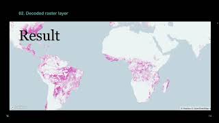
the
loss.
Layer.
I
think
that
we
have
like
three
million
points,
but
as
they
are
encoded
in
images,
the
problem
will
be
for
the
guys
that
generate
those
images
not
for
at
the
moment
of
rendering,
but
the
country
yeah.
B
And
yes,
you
cannot
have
access
to
additional
data
by
picking
by
hovering
my
clicking
on
on
that
player.
It's
true
that
you
can
make
a
fetch
to
another
endpoint
and
you
will
find
the
data
that
you
want
yeah
about
the
examples
we
have
a
lot
of
layers
using
this
technique.
Not
not
all
of
them
are
animated,
but
yeah
Lateralus
is
a
daily.
B
It's
a
daily.
They
called
raster
layer.
Biomass
density
is
not
animated,
but
yeah.
We
can
use
this
technique
very
widely.
So
now
we
are
going
to
move
to
the
to
the
next
one.
In
this
case
it
was
not
about
encoding
data
on
the
images
it
was
about
changing
those
images
through
yeah
through
time.
So
we
thought
about
many
ways
of
doing
this.
B
Loading,
multiple
images
using
videos,
remember
that
we
are
on
a
tile
layer,
so
we
are
going
to
load
as
many
layers
as
many
videos
as
the
viewport
as
as
the
ties
of
the
people.
So
we
try
different
ways,
so
we
are
going
to
work
one
by
one
and
check
what
went
well
and
why
we
discarded
some
of
them.
So
we
started
with
them.
Why
not?
We
load
multiple
images.
B
We
try
to
okay
for
each
type,
we
will
load
all
the
information
related
to
that
type
yeah.
If
we
imagine
full
width
map
of
256
square
tiles.
At
the
end,
we
will
be
loading
an
average
of
16
times,
14
more
or
less.
So
if
we
try
to
load,
imagine
40
Years
of
data.
We
will
be
loading
at
once
only
per
viewport,
640
images,
so
yeah.
Of
course,
this
was
discarded
immediately,
so
we
started
to
think.
Maybe
what
we
need
is
to
pack
those
images
somehow,
so
why
don't
we
use
videos?
B
The
problem
with
videos
is
that
there
is
no
sync
mechanism
in
the
browser
right
now
to
allow
that
allows
perfect
synchronization.
So
we
try
to
use
the
current
time.
That
is
a
property
that
has
the
video
to
force
that
synchronization,
but
at
the
end
we
end
up
having
really
bad
performance
issues,
so
we
discarded
not
at
all,
because
at
the
end,
if
we
compare
all
the
sizes
of
the
files,
the
videos
is
the
best
one.
If
you
want
to
compress
the
the
images.
B
B
At
the
end,
we
are
using
a
Thai
layer
with
a
bitmap
player
and
we
are
using
the
get
Thai
later
to
to
get
the
the
the
image.
So
at
this
moment
we
are
parsing
that
image
extracting
the
frames
and
returning,
instead
of
only
one
image,
we
would
return
an
array
of
images
to
the
real
map
layer,
then,
with
a
simple
variable
we
can
set,
which
frame
I
I
want
to
I
want
to
see,
but
all
the
images
will
be
loaded
at
once.
B
Our
best
solution
was
a
PNG
and
I
I
want
to
tell
you
why
apng
supports
Alpha
transparency.
Why
give
does
not
it's
true
that
give
can
support
Alpha
transparency,
but
at
the
end
you
will
have
jacked
edges
and
okay.
Apng
supports
24-bit
images
while
given
is
about
8-bit
images.
Yeah,
the
visualizations
will
be
way
better
with
a
PNG.
Apng
is
lossless,
while
beef
is
lossy.
That
means
that
AP
and
you
can
compress
apngs
and
they
want
to
lose
quality
while
will,
while
doing
that,
will
give.
It
will
happen.
B
The
opposite
and,
of
course,
APG
is
smaller
than
the
gift.
That
was
the
main
reason
to
to
go
for
a
PNG.
If
we
compare
PNG
with
webp,
all
the
attributes
I
mentioned
before
are
the
models
are
the
same,
but
by
General
webp
is
better
optimized
and
it
will
be
smaller.
The
only
problem
that
we
have
with
right
now
in
our
site
is
that
I
didn't
find
a
way
of
extracting
the
frames.
B
So
maybe,
if
we
explore
this
further
in
the
future,
we
will
we
will
find
a
way
of
extracting
to
send
back
to
the
business
layer
the
pros
and
cons
yeah.
It
has
a
really
good
animating
performance
because
you
are
already
loaded.
You
have
a
very
low
with
all
the
images,
and
this
is
another
Pro
that
you
load.
B
Instead
of
640
images,
you
will
load
16
tiles
that
will
have
all
the
data
that
you
want
to
show,
but
on
the
contrary,
we
need
to
be
careful,
because
if
you
try
to
load,
let's
imagine
one
year
of
data,
you
will
be
loading
360
images
in
one
in
one
apng,
so
the
size
of
the
of
those
images
will
be
really
really
really
really
big,
so
yeah.
No,
that
was
just
going
to
present.
You
thank.
A
You
thank
you
yeah.
This
is
the
last
part,
so
I'm
going
to
try
to
tell
you,
okay,
I'm,
going
to
show
you
a
visualization
on
the
history.
Okay,
so
the
this
is
happening
in
Madagascar.
Okay,
this
is
an
area.
Let
me
open.
The
browser
and
I
can
show
you.
Okay
is
there?
Okay,
this
is
an
area
in
the
north
of
Madagascar.
There
is
a
a
place
called
salatanana,
something
like
this
and
yeah.
You
can
see
here
in
this
Zone.
A
We
have
some
protected
areas:
okay,
primary
Forest
primary,
for
this
is
a
forest
that
is
not
touched
by
the
human
and
also
as
you
you
can
see
that
happening,
something
like
a
free
cover
loss.
This
is
the
the
layer
that
Miguel
was
mentioned
before
is,
as
you
can
see
in
animation.
This
is
that
they
call
raster
working
with
HDL,
of
course,
and
is
you
can
see
what
was
the
the
laws
of
the
green
areas?
Okay,
so
yes,
something
that
yeah.
A
Something
that
is
happening
here
in
this
area
is
seems
like.
There
is
some
some
deforestation
in
in
this
reserve,
and
it
seems
like
it's
due
to
five
Network
five.
Of
course,
it
happens
in
the
dry
seasons,
but
also
because
the
human
impact-
okay,
because
you
know
there
are
some
interesting
there-
relationship
related
with
some
crops
like
vanilla,
rice
and
also
marijuana,
okay.
A
So
how
we
can
see
this,
because
this
is
something
that
this
is
separated,
that
we
are
working
and
right
now.
So
we
think
that
okay,
let's
take
this
visualization
and
we
can
improve
it.
If
we
can
see
why
not,
if
you
can
see
what
is
the
result
of
the
deforestation
in
in
this
area,
so
something
that
we
can
do
is
something
that
this
is
what
I'm
going
to
share
show
you
is.
This
is
the
area
of
salatanana?
A
Okay,
and
this
is
the
satellite
base
map,
but
this
is
the
certificate
in
one
in
one
specific
year,
but
you
can
see
here.
This
is
a
overlaid,
but
this
is
a
time,
and
we
only
generate
for
this
demo
a
phone
okay,
but
we
can
complete
the
entire
world.
Okay
and
okay,
and
this
is
dadio
salatanana
and
you
can
see,
for
example,
on
you
the
other
play.
A
Okay,
and
the
other
thing,
as
has
mentioned
before,
was
the
you
can
constant
information.
You
can
see.
The
Wi-Fi
is
a
bit
low
slow,
but
you
can
see,
for
example,
hold
the
Lost
layer
is
in
the
areas
where
we
have
this
green
or
three
cover
loss
right
is,
is
the
impact,
the
technical
in
this
area
so
and,
as
you
can
see,
you
can
see
the
effectively
to
this
and
that's-
and
this
is
how
we
think
we
can
improve
this
visualization.