►
From YouTube: 7 - Gráfico de Tarta o Pie en DevExpress Dashboard
Description
Click Here to Subscribe: http://xaf.life/35
Websites:
https://xafmarin.com/
https://www.xafers.training/
http://xafersweekly.com/
Facebook Group
http://xaf.life/4g
A
A
A
Well
then,
before
presenting
how
the
pie
or
pie
chart
works
and
We
are
going
to
see
this
graph
this
this
image
in
this
image,
it
is
shown
which,
in
the
graph
that
should
be
used
depending
on
the
purpose
that
you
have
in
the
case
of
the
bar
graph
or
pie,
pie
or
circular,
is
between
the
graphs
of
the
compass
of
composition,.
That
is,
note
that
here
is
the
comparison,,
the
distribution
and
composition,
relationship
of
all
this
composition,
meeting,,
and
there
are
those
of
static
composition,
that
is,
some
that
change
over
time,.
What
do
I
know,?
A
Therefore,
depending
on
the
amount
of
that
the
value
occupies,,
it
will
occupy
a
7
amount
of
degree
within
the
circle.
Wikipedia
also
defines
here
the
circular
or
pie
or
pie
chart
min
index
in
pie,
pie,
pie,
chart
360,
etcetera,
etcetera.
It
says
here
the
same,
be
corroborates.
It
is
a
static
resource
that
is
used
to
represent
percentages
and
proportion.
The
side
of
using
provida
is
executed.
This
represents
the
majority
here
us
represents
the
majority
of
what
is
being
analyzed
true,
be
quickly
with
the
size
of
the
piece
of
the
pie,
13.
A
A
A
In
those
cases
where
it
is
interesting,
not
only
to
show
the
number
of
times
a
characteristic
or
tribute
is
given
in
a
tabular
way,,
but
rather
in
a
graphic
way
in
such
a
way
that
it
is
possible
to
better
visualize
the
proportion
in
which
that
characteristic
appears
from
your
to
the
total..
We
agree,
that
is,
how
much
occupies
what
I
am
analyzing
against
total
is
what
he
basically
wants
to
demonstrate
in
your
body.
Let's
go
to
action.
A
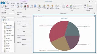
Our
pie
chart
these
two
little
ones
in
everything
that
are
here
came
from
a
previous
one,
but
don't
worry
For
this
reason,,
we
add
our
pie,
chart.
Note,
that
it
is
added..
I
am
going
to
put
it
here
on
top.
I
am
going
to
put
these
two
smaller
ones
to
have
space,
and
then
note
that
the
pie
chart
has
a
value,,
an
argument,
and
a
series
of
the
previous
videos.
Count
that
the
value
is
what
we
analyze
the
money,
the
number
of
units,
the
occasions
that
an
event
occurs
and
sixth,
the
argument.
A
What
how
much?
How
much
percent
each
element
within
it
represents
notice
that
it
is
a
spectacular
graph
and
immediately
you
realize
how
much
each
one
occupies,
what
value
it
has
excellent
for
presentation.
Well
then
seeing
this
we
already
have
argument
and
value.
Now,
if
we
add
something
to
the
series,
for
example
the
employees
how
they
sold
here,
then
I
come
and
add
to
the
series
note
that
for
each
employee,
I
get
a
different
graph.
A
I
understood
the
series,
the
series,
basically
me,
Divide
the
characteristics
or
categories.
Sorry
I
had
there
into
more
detailed
elements,
but
right
now
we
are
going
to
remove
the
fundi.
We
are
going
to
see
it
here
only
if
I
also
added
other
values,
analyzed,
because
another
graph
would
be
created
for
me
here.
2003
is
added,.
What
will
happen
Same
with
the
two
years,
that
is,
it
is
going
to
analyze
the
same
categories,.
They
are
going
to
the
same
territory,,
but
it
is
going
to
create
two
different
years
for
me,.
A
2004
is
added,
another
one
is
also
going
to
be
added,.
Look
at
the
play
that
is
interesting,,
so
there
I
am
analyzing
the
three
years
three
years
of
value
in
different
graphs,
showing
me
what
represented
each
one
in
that
particular
year.
If
you
look
at
this
year,
software
was
24
percent,
but
here
software
was
22
in
the
year
2003
and
in
the
year
2004
melted
and
new,
the
they
went
up,
etc.
I.
A
A
Circular
pie,
chart
or
35,
as
it
says,
frequency
that
we
can
always
give
a
right
click
here.
We
can
edit
the
filters
we
can
edit
the
names.
That
is
the
names
we
can.
For
example,
we
can
put
graphics,
360,
graphics,
I,
like
to
remove
the
zuma
part,
something
else
we
can
do
here
that
you
always
mentioned
the
filters.
A
For
example,
I
can
say:
ok,
I
want
him
to
show
me
everything,
but
that
the
territory
is
different
from
that
of
Canada,,
which
does
not
include
Canada
for
example,
since
I
apply
it,
and
he
says
that
nothing
comes
out
of
the
equation
anymore
and
I
am
analyzing.
The
rest
without
including
Canada
I
can
always
come
when
I
am
happy
and
I
can
see
here
that
it
is
a
different
territory
from
home..
A
A
A
This
is
all
this
is
to
see
where
the
one
is
going
to
come
out
if
the
one
is
going
to
come
out
or
inside
by
interior
station.
Note
that
I
try
to
put
it
inside
each
one
and
the
suggestion.
The
suggestion
is
only
when
you
pass
over
it
means
and
presents
value
argument.
If,
in
that
suggestion,
I
only
wanted
the
value
that
the
percentage
sorry,
the
percentage
that
is
here
and
notice
that
there
it
would
present
me
only
the
percentage.
So
you
can
play
with
this.
You
can
also
dictate
the
colors
to
say.