►
From YouTube: Punta Gorda City Council 9-2-2015 Part 4
Description
Description
B
B
D
D
It
makes
us
sound
like
our
access
is
unsafe,
so
I,
don't
I
mean
I,
don't
really
like
it
used
in
that
way,
because
our
outlets
are
safe.
We
don't
have
a.
You
know
we're
not
having
a
major
safety
issue.
Yes,
we
want
additional.
You
know,
there's
ground
swell,
to
have
an
additional
outlet.
Well,
why
don't
we
say
rather
than
safe.
E
B
F
F
Really
wanting
that
to
to
blossom
and
and
I
guess,
I
was
really
hopeful
that
we
would
get
more,
that
we
would
have
more
information
or
more
would
be
happening
there,
that
it
would
be
really
really
apparent
what
we
needed
for
an
activity
center,
but
I,
don't
really
feel
that
I,
don't
you
know
the
sailing
program
is
kind
of
there.
It's
not
very
big.
F
You
know
the
boat
club's
there.
It's
just
kind
of
there,
I
don't
feel
like
a
great
need.
Is
there
to
be
filled?
Let's
put
it
that
way,
because
I
think
it's
just
kind
of
happening.
So
as
an
action
item
I
mean
maybe
working
with
team
punta
gorda,
you
know
mariners,
group
or
boaters
alliance
or
something
so
that
then
maybe
they
can
define
what
they
feel
their
needs
are
because
they
seem
to
be
the
ones
behind
really
having
that
activity
center.
This.
G
G
A
What
we've
allocated
the
seventy
five
thousand
dollars
for
was
actually
to
design
it,
but
I
agree
with
him:
we
don't
even
know
what
it
is.
We
don't
even
know
what
the
need
is.
We
don't
know
how
would
fund
itself.
We
don't
even
know
how
to
make
it
work.
Who
would
run
it
so
my
suggestion
at
that
time
was-
and
I
think
would
be
to
really
do
strategic
planning
around
it.
That
would
include
a
business
case
so
that
and
I'm
sure
that
team
punta
gorda
would
be
really.
A
A
A
B
A
B
A
A
E
E
A
D
C
D
My
problem
with
that
is
the
benches
are
fine.
If
we
have
money
for
the
reworking,
I,
don't
know.
If
that's
been
looked
at
the
trash,
receptacles
I,
don't
see
a
problem
and
the
more
we
put
out
there,
the
more
we
have
to
maintain
the
more
we
have
to
have
people
out
there
going
to
you
know
empty
them.
If
we
don't
have
a
real
problem,
I
wouldn't
just
want
to
put
random
trash
receptacles
around
that
now
we,
you
know
we
have
to
spend
money.
Maintaining
we.
C
A
Is
it
I
think
we
need
to
I
mean
Carolyn
phone
keeps
bringing
it
up
to
me.
It's
Taylor
the
tailor
street
gets
a
lot
of
activity
of
people
walking
from
the
event
center
down
to
the
restaurants,
down
into
the
more
central
business
district
and
that's
an
area.
That's
still
the
old
red
pay,
not
they're,
not
even
pavers.
What
are
they
like.
F
D
A
B
B
D
D
G
C
A
Me
tell
you
what
this
is
like.
I've
talked
to
the
people
in
that
Doris
I
can
feel
you
in
this
is
there.
Cra
has
an
issue
where
people
have
moved
their
shops
in
two
different
side,
streets
and
people
couldn't
find
the
shops,
so
the
CRA
put
in
15
what
would
be
sign
poles
and
they
develop
these
sign
placards
that
are
probably
they
look
like
they're
about
like
this.
This
big
and
they're
blank
signs
and
then
for
$75,
a
business
buys
a
sign
takes
it.
A
It
can
go,
have
whatever
they
want
put
on
it
as
far
as
their
business
name,
their
logo
and
it's
kind
of
like
directional
signs
where
you'd
say
punta
gorda.
Is
this
way
Tampa's
that
direction?
Well?
This
is
the
same
thing
only
it's
wish
for
shops.
A
particular
business
is
only
allowed
to
have
one
sign,
and
there
are
only
so
many
signs
that
can
be
allowed
on
a
pole
or
post
and
does.
A
C
F
B
D
B
E
D
B
Would
be
a
big
girl?
I
would
like
for
us
to
keep
this
probably
for
not
necessary
to
locate
it
in
2016,
but
I
would
really
think
that
we
should
explore
that
as
an
opportunity
for
whatever
funding,
whatever
opportunities
that
might
come
in
the
future
I.
We
I
really
do
believe.
We
need
our
own
performing
arts
center
and
it
could
be
a
combination,
a
lot
of
things
well,.
E
D
E
B
E
B
B
B
E
B
Like
the
idea,
I
think
we
need
more
shade
downtown
people
don't
shop
downtown
because
it's
too
hot
and
they're
not
going
to
be
on
our
sidewalks,
because
it's
too
hot.
So
if
shade
trees
are
a
possibility
or
perhaps
awnings
or
something
else
that
we
could
encourage
our
businesses
to
do.
I
would.
I
would
really
support
that.
So.
A
Yeah
that
is
I
was,
you
know
immediately.
I
read
it
I
went
to.
I
was
on
the
city's
Beautification
Committee
when
we
had
one
and
we
used
to
have
a
budget
that
would
allow
for
a
homeowner
to
put
two
trees
in
the
front
of
their
house
a
to
whether
it
would
be
a
palm
or
an
actual
tree,
and
you
could
say.
B
One,
let's
keep
when
we
see
that
in
there
he
might
be
able
to
do
some
kind
of
a
new
match
like
that,
establish
initiatives
to
engage
our
communities
use
to
work
together
to
ensure
a
safe
drug,
free
environment.
I
recommended
this
because
we
keep
talking
about
our
you,
keep
trying
to
maintain
the
safety
in
our
community
and
I.
It's
nowhere
in
our
plan
and
I
just
thought.
We
should
at
least
incorporate
it
into
our
plan
and
we.
F
E
So
I
was
wondering
how
you
all
feel
about
putting
it
in
a
on
the
ballot
in
2016.
Have
they
had
the
city
vote
on
it?
Of
course
it
would
be
a
non-binding
referendum,
but
it
might
make
a
statement
to
the
to
the
county
commissioners.
That
is
something
we've
been
on
facebook
with
it.
We've
had
a
lot
of
feedback
from
the
folks
on
Facebook
that
they
don't
want
it
to
go
away.
E
E
B
D
G
B
G
I
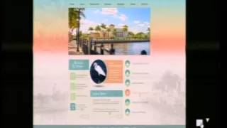
Brad
shooty
IT
manager-
it's
my
pleasure
to
be
here
before
you
today
to
present
the
results
of
the
design
phase
of
our
website
redesign
project.
It's
been
a
steady
road,
as
was
mentioned
in
citizens
comment
earlier.
It's
been
a
good
group
of
people,
we've
we've
worked
really
well
together
and,
and
it's
been
a
lot
of
hard
work,
but
I
think
the
results
are
you're
going
to
see,
show
that
that
hard
work
is
paid
off
our
website,
redesign
team
I
just
wanted
to
say
my
own.
I
To
this
point,
just
a
real,
quick
I
wanted
to
touch
on
the
process
that
we've
been
going
through.
If
you
look
at
this
slide,
the
bottom
left,
it
says
where
organizations
spend
most
of
their
time
is
looking
at
the
visual
and
the
technology
elements.
And
realistically
this
was
a
slide.
We
showed
very
early
on
in
our
process.
I
What
they
should
be
looking
at
are
the
communications
and
content
strategy
and
the
information
architecture,
and
so
we
made
it
a
point
that
the
design
of
this
site
was
coming
from
that
direction,
so
it
it's
the
functionality
of
it.
The
the
how
we
expect
it
to
build
out
is
very
much
based
on
the
service
it
provides
to
the
citizens
of
the
community.
I
We
want
a
website,
that's
going
to
give
them
access
to
the
things
that
we
can
provide
for
them
online,
not
just
a
showcase
for
the
departments
of
the
city,
the
words
they
have
to
dig
through
information
to
find
what
it
is
that
they're
going
to
find
useful.
So
that's
been
part
of
what's
driven
us
through
this
process.
What
you're
going
to
see
today
is
just
the
the
concept
of
the
what
we
call
the
landing
page
or
the
homepage.
It's
a
it's
a
two-dimensional.
I
We
don't
have
anything
built
behind
it,
yet
we're
still
working
on
that
content.
That's
the
piece
that
we're
working
on
now,
as
you
can
see
in
this
timeline
that
puts
us
about
halfway
through
the
whole
process
of
building
the
site
that
the
strategizing,
the
planning
and
the
the
design
of
the
the
main
page
really
sets
the
tone
for
everything
else.
But
but
it's
very
important
that
landing
page
had
to
capture
a
lot
of
information
in
working
with
one
community.
I
One
message
we
did
want
it
to
be
something
that
incorporated
the
various
aspects
that
they
wanted
to
hold
up,
while
at
the
same
time
we
wanted
to
make
it
clear
that
this
is
a
government
website.
This
is
not
a
tourism
website;
it
is
not
an
economic
development
site,
but
there's
aspects
of
it
that
are
going
to
play
in
all
of
those
areas,
but
at
the
same
time
we
want
people
when
they
see
this
site
to
go.
I
I
You
know
non
pretty
241
of
a
better
description.
We
can.
We
can
use
that
in
the
site
in
this
landing
page.
The
pages
behind
will
be
more
functional
than
pretty,
but
this
landing
page
is
what's
going
to
make
the
first
impression
and
going
to
leave
them
with
the
lasting
impression
that
they
take
away
from
the
website
are
straight.
Are
the
strategy
that
we
used
I've
already
discussed
that
just
that
we
want
to
be
able
to
to
strengthen
the
web
presence
and
services
we
provide?
We
want
to
show
that
punta
gorda
is
a
vibrant
community.
I
That
has
a
lot
to
offer
that
we
are
a
progressive
government
that
does
a
lot
of
that
gives
our
citizens
the
ability
to
do
a
lot
of
interaction
with
us,
wherever
you
are
on
whatever
device
you're
using.
That
was
something
that
was
very
important
to
us,
that
we
want
everything
to
be
organized
well,
so
that
people
can
easily
find
things
and,
as
I
said,
we
want
it
to
be
service-oriented.
I
I
I
I
So
what
I'm
going
to
show
you
next
are
three
conceptual
designs
that
were
presented
to
us
by
a
vision
internet.
There
are
many
elements
in
these
designs
that
are
interchangeable,
so
it's
not
that
the
first
design
is
stuck
that
way.
The
second
design
is
stuck
that
way.
If
you
like,
the
way
that
the
Punta
Gorda
is
presented
on
one,
but
like
some
other
aspects
of
the
third
one,
we
can
interchange
those
parts.
The
main
thing
that
we
want
to
do
is
make
sure
that
this
page
meets
your
requirements
and
meets
what
you
hope.
I
Our
website
is
going
to
look
like
so
I'm
going
to
go
all
through
all
three
of
them
before
we
comment
and
then
I
at
the
last
site
has
all
three
on
it
and
we'll
be
able
to
then
drive
comments
from
there
and
I
can
backwards.
If
you
want
to
look
at
them
in
more
detail,
the
first
concept
and
another
thing
that
I
will
say
they
look
that
the
site
looks
slightly
different
on
any
of
monitors
versus
projectors
versus
tablets.
I
Sometimes
the
graphics
comes
into
play,
but
in
it,
but
in
the
overall
we
wanted
a
site
that
was
going
to
be
going
to
carry
itself
across
all
of
those
different
forms
of
presentation
to
where
it
looked
as
close
on
one
as
another,
and
this
was
another
factor
that
went
into
the
the
design
that
we
picked
here
this
design.
If
you
notice
the
top
left
corner,
it
uses
a
Punta
Gorda,
a
block
text
punta
gorda
logo,
like
is
found
on
one
community.
One
message
brochure
that
can
be
again,
things
can
be
made.
I
Thicker
things
can
have
some
shadow
put
behind
it
to
make
it
stand
out
a
little
more.
Those
are
the
kinds
of
comments
that
will
want
to
collect
as
well.
This
one
uses
pictures
on
the
bottom
left
side
of
the
left
and
right
side.
What
you
see
here
is
how
this,
what
website
will
appear
on
a
large
monitor
that
something
that
gives
you
some
area
on
the
sides
on
a
smaller,
monitor,
you're,
going
to
see
more
of
that
center
block
of
information.
I
The
left
sides
are
going
to
aren't
going
to
be
as
visible,
but
we
didn't
want
it
to
just
be
dead
space
if
you
go
back
to
our
site,
if
you
look
at
our
site
on
a
big
monitor,
there's
a
lot
of
dead
space
that
that
green,
that's
all
the
way
around
the
edges.
We
wanted
that
to
be
filled
with
something
that
would
be
a
photograph
or
a
picture
or
some
kind
of
a
representation.
That's
going
to
promote
the
the
the
more
pictorial
elements
that
we
wanted,
people
to
get
a
message
from
on
the
site.
I
So
in
this
one
we
used
two
different
photographs
that
had
been
turned
into
like
sketches.
We
don't
want
them
to
be
overbearing.
We
want
them
just
to
be
subtle
background,
but
something
to
fill
that
space.
On
the
second
design,
we
used
the
the
it's
happening
on
the
harbor
logo,
with
the
the
swoop
over
the
top
to
present.
I
If
you
look
on
the
left
and
right
side,
we
use
at
larger
silhouettes
of
sailboats
and
a
tarpon
jumping
out
of
the
water
to
fill
that
space
on
either
side.
In
all
of
these,
there's
that
footer
on
the
bottom
that's
going
to
contain
just
the
basic
contact
information,
that's
constant
through
each
one,
all
three
of
the
different
sites,
then.
Finally,
the
third
design.
I
Instead
of
the
the
black
text,
we
use
the
the
white
text
with
the
Punta
Gorda
and
we
went
with
a
silhouette
that
basically
fills
the
whole
bottom
part
of
the
of
the
page,
and
it
represents
all
of
the
different
elements
that
we
discussed
as
we
as
we
were
talking
about.
How
do
we
represent
the
the
entertainment
and
the
the
recreational
side
of
Punta
Gorda,
while
still
keeping
it
as
a
government
site?
And
we
like
this
because
it
has
the
bicyclist
it
has
a
representation
of
our
parks.
It
has
the
fishing
it
has
the
boating
it.
I
It
kind
of
captures
all
of
those
elements
into
this,
this
nice
little
pictograph
at
the
bottom.
So
that's
the
third
design
now
in
any
design
that
we
pick
the
big
picture
in
the
center
is
going
to
be
a
rotating
set
of
five
pictures.
Then
it's
going
to
in
every
15
seconds.
We
haven't
decided
exactly
what
the
the
measure
will
be.
It
will
be
either
every
time,
the
page
loads
or
every
time
that
you
come
back
to
it.
The
picture
would
change.
We
can
also
set
it
so
that
every
15
to
20
seconds
that
picture
rotates.
I
There
will
also
be
little
arrows
that
you
can
barely
see
that
will
allow
you
to
change
those
pictures
yourself
if
you
want
to
click
the
arrow
and
pay
n
page
through
the
different
pictures.
So
underneath
the
picture
again,
these
elements
stayed
the
same
on
all
three
designs.
We
have
the
calendar,
basically,
the
right
smaller,
so
I
have
to
pull
my
glasses
off
the
meetings
and
events,
which
is
our
calendar.
I
On
the
left
hand,
side
the
center
with
the
round
picture
is
an
in
the
spotlight
that
picture
we
can
change
to
be
whatever
we
want
it
to
be.
That's
what
ever
the
city
is
highlighting
at
any
point
in
time,
something
that
we
want
to
really
focus
people
on.
That's
what
we
can
put
in
that
in
the
spotlight
section,
underneath
it
is
our
latest
news.
That's
what's
going
to
give
them!
What
are
the
headlines?
What
are
the
things
that
are
happening?
I
They'll,
be
able
to
click
on
that,
of
course,
and
go
to
a
page
that
has
many
more
headlines
on
it.
Where
will
be
limited
because
of
space
as
to
what
can
go
on
the
main
page,
but
again,
the
main
page
isn't
where
you
want
them
getting
information.
The
main
page
is
where
you
want
them
branching
into
whatever
it
is
that
they're
looking
for
on
the
site?
So
it's
not
so
bad
that
it
doesn't
have
a
huge
amount
of
information
and
then
that
right-hand
column,
that's
our
services.
I
The
things
that
they're
going
to
immediately
want
to
get
to
those
services
are
going
to
be
listed
on
that
right
side,
we've
taken
a
stab
at
establishing
the
first
six,
but
that's
going
to
be
something
that
we
can
change
as
we
realize
that
maybe
there
are
other
things
that
should
be
highlighted
there,
instead
of
what's
there,
so
those
elements
will
start
out
with
whatever
we
finalize
on,
but
they'll
be
editable
as
well.
You
notice
the
one
that's
orange.
I
What
that
does
is
it
looks
that
shows
you
when
people
scroll
through
the
list
with
their
mouths
when
they
touch
one.
It's
going
to
change
to
that
orange
color.
They
indicate
that
you're
on
this
choice
and
you
can
click
on
it
and
then
it'll
take
you
into
into
that
item.
So
that's
just
in
the
same.
On
the
left
hand,
side
with
the
the
the
meetings
and
events
as
you
touch
those
different
with
your
mouse,
the
it'll
change
from
the
green
to
the
blue.
That
just
gives
you
an
idea
that
that's
the
one
that
you're
touching.
I
Across
the
top,
the
menus
again
stay
the
same
on
each
and
we
came
up
with
just
the
home,
which
is
going
to
take
you
home
about
which
will
give
you
historical
demographic,
other
information
about
hundred
a
government
which
will
give
us
a
block
and,
as
you
hover
each
over
each
of
these,
that
picture
is
going
to
be
replaced
by
what
we
call
a
mega
menu.
That's
the
the
technical
term
for
it,
but
it's
going
to
be
a
big
list
that
shows
up
in
that
square
where
the
picture
is
that
lists.
I
What
all
of
your
choices
are
and
allows
you
again
to
be
able
to
say
to
be
very
specific
about
where
you
want
to
go.
Our
goal
is
that
people
will
never
have
to
click
more
than
two
or
three
times
to
get
to
exactly
the
place
in
the
website
that
they
want
to
get
to
to
do
whatever
it
is
that
they
want
to
do
so.
Those
bigger
menus
at
the
top
will
be.
It
will
allow
us
to
be
very
specific
about
where
they
can
go
from
this
main
page.
I
In
one
click,
they'll
be
able
to
deal
with
those
services.
Residents
will
be
information.
The
residents
need
to
know
trash
pickup
will
be
starting
as
we
as
we
develop
interactive
mapping
and
other
things
other
ways
to
give
them
information
about.
What's
going
on
in
the
city,
that's
going
to
affect
them.
That's
where
they'll
go
to
get
that
information,
and
likewise
the
next
one
for
visitors
is
just
that
it
will
allow
them.
It'll
provide
information
on
festivals
and
other
items,
things
high
that
we
want
to
highlight
for
visitors
to
our
site.
I
What
are
things
did
to
that
are
going
on
within
punta
gorda,
that
might
that
they
might
want
to
come
down
and
visit
or
come
down
and
take
part
in
it'll
also
be
a
place
that
developers
or
other
people
from
other
parts
of
the
country
can
go
to
to
see.
What
is
it
that
makes
up
punta
gorda?
What
are
the
types
of
things
that
that
would
make
them
want
to
bring
their
business
or
their
development
here
to
the
city?
I
I
We
want
it
to
be
friendly
enough
that
people
that
want
to
come
and
wander
around
it
will
be
able
to
find
their
way
around,
but
at
the
same
time
those
who
come
and
know
exactly
what
they
want
to
do
will
be
able
to
get
right
to
it
without
having
to
go
through
that
roundabout
way
to
get
there.
So,
with
that
said,
I'll
put
the
three
designs
up
free
for
you
to
see
all
side
by
side
and
I'll
entertain
any
questions
that
you
might
have.
B
Brad,
first
of
all,
thank
you
and
thank
you
to
your
committee,
a
wonderful,
wonderful
thought
process
that
you
all
gone
through
in
terms
of
coming
up
with
a
recommended
pages
for
our
website.
My
immediate
reaction
is
I,
can't
see
it.
Okay
and
the
second
one
with
punta
gorda
dark.
I
can
see
that
the
coloring
again-
and
I
know
magazines,
do
this
all
the
time
and
maybe
it's
Millennials
who
love
this.
You
know
light
on
light.
You
know,
gray
print
on
light
backgrounds.
I
can't
see
it
I.
I
B
I
H
I
D
I
I
D
A
Colorado
type
of
color
or
I,
don't
know
it
doesn't
give
me
the
floor
to
feel
I.
Think
a
brighter
blue
is
more
of
what
I'm
looking
for
as
far
as
the
layout
I,
like
it
I
like
the
way
you're
building
it
with
the
services.
I.
Think
that's!
You
know
totally
different
than
what
we
have
now
sorry
Steve
Fabian
he's
not
gonna
he's
not
gonna
like
that,
but
I
think
it's
a
you
know
for
the
general
public.
It's
it's
going
to
be
more
user
friendly,
because
you
see
different
organizations.
I
D
G
B
A
G
A
I
I
A
A
A
I
A
I
It
for
the
audience
on
the
on
the
board,
though,
from
the
mint
from
almost
the
middle
of
the
screen
to
the
right
behind
the
the
main
menu
is
the
word
Florida
and
very
faded.
It
is
there
and
on
a
screen,
it's
a
little
bit
easier
to
see,
but
that's
what
she's
referring
to
is.
Is
we
put
the
Florida
into
the
third
one,
but
they
it's
still.
They
think
that
it
might
be
busier.
We
might
find
a
way
to
put
it
into
the
logo.
Put.
A
Into
the
logo
somehow
so
that-
and
you
know
here
just
a
couple
of
views-
one
using
you
know
what
that
the
font
that
it's
happening
on
the
harbor
is
in
the
other.
One
is
using
the
one
that
the
Punta
Gorda
is
and
I
kind
of,
like
that
one
better.
But
whether
or
not
Florida
should
be.
You
know
right
here,
or
it
should
be
just
off
to
the
side,
but.
A
I
That
and
it
would
be
more
how
to
put
the
text
on
there,
whether
it
means
making
it
a
little
bit
larger
or
just
picking
fonts
that
have
a
better,
have
a
better
Christmas
to
them
that
when
you
put
a
shadow
behind
it,
it
makes
it
pop
off
the
page
without
taking
anything
away
from
the
color
design.
We
can
make
that
text
pop.
That's
not
going
to
be
a
problem.
F
F
F
G
I
C
E
E
I
I
want
them
to
come
and
find
out
if
they've
seen
it
then
they'll
always
know
what
it
is.
It
was
just
another
way
for
us
to
we
thought
about.
How
can
we
represent
our
parks
on
the
infographic
and
we
really
don't
have
a
feature
that
would,
but
that
statue
stood
out
as
a
feature
that
we
do
have
that
when,
when
you,
if
you've
ever
been
here
and
seen
it,
it's
something
you're
going
to
remember,
and
it's
always
going
to
have
something
that
you
can
tie
back
to
you.
E
I
That
was
just
a
as
we
drop
the
seal
in
for
the
for
the
graphic
it
just
for
some
reason
it
took
that
shape
it
well,
we
will
make
sure
that
its
cylindrical
or
Sara
circular,
that
that
won't
be
and
probably
make
it
a
teensy
bit
larger
because
there's
gap
to
fill
their,
but
it
will
not
have
that
overlooked.
Okay,.
G
D
D
Another
thing
is
that
we've
been
asked
time
and
time
again,
and
I
agree
that
the
weekly
highlight
go
on
the
homepage
on
Fridays,
because
it's
kind
of
hidden
down
into
a
menu.
So
I
think
that's
one
thing
that
definitely
should
be.
There
is
the
latest
greatest
weekly
highlight
report
and
it
should
be
in
its
own
little
vs.
D
B
I
D
I
I
G
I
I
F
G
I
I
C
C
C
B
I
Restraint
across
that's
what
we
liked
as
well
was
just
that
we
were
trying
to
one
of
the
things
we
struggle
with
the
most
as
we
didn't
want
it
to
be
a
boxy
site.
We
didn't
want
it
to
just
be
square
so
that
when
we
saw
this
design
from
vision
internet
we
all
kind
of
gravitated
to
it,
because
it
didn't
it
made
that
frame,
nice
and
and
and
textural
it
just
gave
it
some
death
like.
B
I
In
the
Florida
and
one
other
thing
that
I
want
to
tell
you,
as
you
look
at
this,
is
about
how
this
is
going
to
look
on
a
phone.
I
didn't
really
mention
the
responsive
design
piece.
But
that's.
If
you
look
at
the
way
the
site
is
structured
when
you
take
that
down
on
a
phone
you're,
basically
taking
the
site
and
and
squeezing
it
down.
So
what
it'll
do
is
the
first
thing
that
you'll
see
on
the
phone
is
going
to
be
the
the
logo
and
the
end.
I
The
top
menu
will
be
there
depending
upon
the
phone
screen.
Size
is
how
big
it
will
take.
Then
the
picture,
then
we
haven't,
decided
what
order
yet,
but
it'll
be
the
spotlight
the
news,
the
calendar,
the
so
everything
will
just
line
up
right
underneath
each
other
and
look
exactly
as
it
does
on
the
site.
I
If
you
go
to
a
tablet
as
it
can
spread
it
out,
it'll
start
to
take
me
to
take
shape
more
toward
what
the
website
is
and
when
you're
on
a
computer
or
a
larger
tablet,
you'll
be
able
to
see
the
whole
site,
but
that
the
the
experience
that
you
have
in
viewing
the
site,
the
colors
will
stay
the
same.
The
fonts
will
stay
the
same.
Everything
will
be
there,
no
matter
whether
you're
looking
at
it
on
a
phone
or
you're,
looking
at
it
on
a
full-size
site.
Okay,.
C
Than
try
and
make
a
decision
today,
the
legislative
requests
are
due
to
Ken
state
Rep
Ken
Roberson's
office
on
October.
Ninth
I
will
put
it
on
next
week.
Next
agenda:
September
16.
We
already
have
one
of
the
legislators
who
let
our
charge
for
the
arrow
plant
to
say
we
should
ask
for
some
more
money,
so
that
will
be
on
the
list
and
we
can
make
that
decision
at
the
next
council
meeting
what
our
formal
requests
are
going
to
be.
C
H
Shale
Creek
update
both
Howard
and
I,
were
contacted
by
representatives
of
the
county
to
advise
us
that
the
County
Commission
had
reading
had
denied
our
request
for
a
continuance
and
our
offer
to
discuss
potential
settlement
and
that
they're
moving
full
speed
head
towards
the
hearing,
how
they
could
do
that
without
a
County
Commission
leading
I'm
not
sure.
But
yesterday
we
had
the
deposition
of
our
witness
Todd
dr.
Todd
Kincaid,
the
count
dd's
attorney
and
the
attorney
for
the
miners.