►
From YouTube: UX Scorecard - Project Management FY22 - Q4
Description
No description was provided for this meeting.
If this is YOUR meeting, an easy way to fix this is to add a description to your video, wherever mtngs.io found it (probably YouTube).
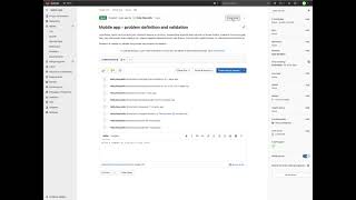
A
Hi,
my
name
is
matthew
nerens,
I'm
a
product
designer
in
the
fulfillment
stage
at
git
lab
and
I'm
doing
a
ux
scorecard
with
holly
reynolds
in
the
plan
stage
and
the
job
to
be
done
that
I
walked
through
was
when
planning
a
release.
I
want
to
prioritize
and
sequence
estimated
work
based
on
feasibility
capacity
and
roi,
so
I
can
incrementally
deliver
toward
business
objectives
and
the
personas
that
were
taken
into
consideration
were
parker.
The
product
manager
delaney
the
devlead
sasha,
the
software
developer.
A
So
what
I
did
with
this
is,
I
tried
to
put
myself
into
their
shoes
and
I
walked
through
the
scenario
that
holly
outlined
for
me
here,
which
is
your
team,
is
working
on
a
new
project
for
the
first
mobile
app
for
the
tanuki
company.
You've
created
the
project
in
the
tanuki
group
and
some
issues
already
but
need
a
way
to
actually
monitor
progress
of
the
work
over
a
specific
period
of
time
as
well
as
track
velocity
and
volatility
metrics
and
in
the
instructions.
It
was
create.
A
An
iteration
object
which
allows
tracking
work
over
a
specific
period
of
time
set
the
object
to
two
week.
Time
add
issues
to
that
object,
reduce
some
of
the
work
estimate,
hours
applied
to
each
of
the
issues
and
evaluate
the
impact
of
this
trend
on
the
new
object.
Close
two
of
the
issues
evaluate
the
work
in
progress
for
this
iteration.
How
much
work
has
been
completed?
How
much
is
still
left
to
do
so.
A
A
A
As
I
was
going
through
this
creation
process,
it's
a
simple
form:
there's
not
too
many
ux
issues
here,
but
the
biggest
issues
that
I
could
see
here
are:
if,
if
I'm
doing
this
for
the
first
time
or
I'm
experimenting
with
this
feature,
I
don't
know
what
a
good
title
should
be.
I
don't
know
what
a
description
should
be
or
who
will
see
it.
A
For
example,
do
I
name
this
according
to
the
type
of
work
that
we're
doing
during
this
time
period?
Do
I
name
it,
for
example,
after,
if
we're,
if
we're
working
on
integrating
the
mobile
app
with
the
api?
Is
this
an
api
integration
iteration,
or
do
I
name
it
according
to
the
time
frame?
So
I
wasn't
sure
on
that,
but
easy
enough
to
create
this.
Just
gonna
fill
this
in
with
dummy
data
here
and
then
for
the
time
frame.
It
was
a
two-week
time
frame.
A
So
if
I
start
today
and
I
go
through
the
31st
and
then
I
can
create
the
iteration,
the
next
thing
I
notice
is
you're
dropped
into
this
very
empty
state
for
your
blank
iteration,
even
though
it's
empty
there's
a
lot
of
visual
clutter
and
it
none
of
it
really
makes
sense
because
the
iteration
is
empty
and
for
somebody
who
again
is
experimenting
with
iterations,
they
might
not
know
what
to
do
next.
So
this
is.
This
is
what
I
would
call
a
dead
end.
A
A
But
for
now
you
go
to
the
issue
list
and
you
click
on
an
issue,
and
it
was
pretty
I'm
pretty
familiar
with
the
right
hand
pane
over
here.
So
it's
pretty
easy
for
me
to
notice
that
there's
an
iteration
object
here
or
an
iteration
property
and
so
clicking
edit
shows
that
there's
a
there's
the
test
iteration
that
I
just
created.
A
A
One
of
my
big
pain
points
here
was
even
after
I
had
added
five
issues
to
the
iteration
it.
It
wasn't
obvious
to
me
that
anything
had
changed
other
than
these
counts
here,
so
I've
completed
zero
of
one
because
there's
one
issue
in
the
iteration
zero
of
one
and
then
unstarted
one
of
one
and
then
I
do
see
the
issue
down
below,
but
I
completely
missed
the
change
that
happened
in
these
graphs.
A
A
A
Okay,
so
I
can
see
on
the
issues
filter.
I
now
have
four
open
issues.
I
think,
because
I
open
the
iteration
and
I
closed
the
issue
on
the
same
day,
the
dot
basically
just
moved
down.
If
this
were
the
next
day,
I'm
assuming
there
would
be
a
line
coming
down
and
then
same
over
here
I
have
completed
one
issue.
A
A
A
Okay,
so
I'm
going
to
show
you
some
data
that
has
some
time
in
it.
So
here
you
can
see
I'm
filtering
by
issues.
I
can
see
that
I
had
two
open
issues
for
this
many
days
and
then
I
closed
one,
and
so
you
can.
You
can
see
your
progress.
You
can
see
it
visually
over
the
time
period.
I
think
that's
really
nice
over
here.
I
can
see
that
my
total
issues
have
stayed
steady.
A
I
haven't
added
or
removed
issues
from
the
iteration
and
then
the
number
completed
has
went
from
one
to
two
and
then
I
filtered
by
issue
weight
and
over
here
I
saw
that
for
a
while.
I
had
zero
open
issue
weight
and
then
I
had
two
so
I
think
I
didn't
have
weights
on
my
issues
and
then
I
added
weight
to
that
issue
or
two.
A
But
it
is
nice
to
see
that
over
time
how
much
weight
you've
completed
and
what
your
total
weight
was
probably
in
a
normal
iteration.
This
would
not
vary
so
much,
but
that
also
presents
an
issue
that,
if
you're
not
using
issue
weights
correctly,
these
graphs
will
suffer
as
a
result
of
that-
and
I
know
I
was
walking
through
this
as
a
software
developer
or
a
pm,
but
as
a
designer-
I'm
not
always
consistent
using
issue
weights
and
that
could
potentially
throw
off
the
graphs
and
make
them
not
really
make
sense.
A
I
do
think
that,
because
there
is
the
potential
for
the
data
to
look
a
little
wacky,
especially
if
somebody's
experimenting
with
iterations,
they
might
add
and
remove
issues,
and
so
their
total
line
might
look
a
little
wonky.
It
would
be
maybe
helpful
to
introduce
the
user
to
what
they're
looking
at
maybe
a
walkthrough
or
some
kind
of
onboarding.
That
says
essentially
here's
the
data,
and
this
is
what
it
means.
A
I
know
that
over
time
I
have
learned
to
read
these
charts
and
they're
a
lot
more
understandable.
Now,
when
I
first
started
seeing
data
appear
on
these
charts,
I
had
no
clue
what
I
was
looking
at
and
it
was
a
little
bit
overwhelming,
even
though
they're
simple
they're,
simple
line,
charts,
there's
a
lot
going
on
all
around
and
it's
it's
just
a
lot
to
take
in
your
first
time.
So
I
think
walking
people
through
this
or
introducing
them
some
kind
of
onboarding
experience
would
be
great
overall.
A
The
benchmark
score
that
I
gave
this
experience
was
a
c
here.
You
can
see
the
rubric,
the
user
can
complete
the
job,
but
it
does
not
exceed
their
needs
and
requires
unnecessary
steps.
I
think
the
unnecessary
steps
come
with
the
way
issues
are
added
to
an
iteration.
There's
not
really
an
easy
way
to
do
that.
You
have
to
go
in
and
do
it
through
the
issue
list.
A
I'm
hitting
that
dead
end,
I
think,
is
a
little
unnecessary
and
there
probably
could
be
an
easier
way
to
make
the
connection
between
iterations
and
issues,
but
the
user
can
be
successful
and
they
can
complete
the
job.
I
don't
think
it
exceeds
their
needs
because
the
metrics
in
there
are
very
basic.
You
can
track
progress,
but
again
I
don't
think
you
can
really
track
velocity.
A
I
don't
see
any
metrics
around.
How
fast
is
my
team?
Maybe
those
metrics
come
in
later,
as
you
complete,
iterations
and
start
new
ones,
maybe
metrics
start
to
gather
around
your
average
velocity
over
iterations,
but
I
definitely
think
this
journey
meets
meets
the
need
of
tracking
progress
over
an
iteration
but
does
not
exceed
that
need,
and
then
the
experience
is
okay.
I
think
it's
on
the
verge
of
being
good.
I
don't,
I
don't
think
it's
leaning
towards
bad.
A
I
think
it's
closer
to
good,
but
I
think
it's
okay,
because
there
just
could
be
a
lot
more
help.
A
lot
better
empty
states,
more
education,
more
helpful,
placeholders,
walk
walking
people
through
the
data.
I
think
there's
a
lot
of
opportunity
to
really
hand
hold
and
help
the
user
not
be
overwhelmed
by
what
they're,
seeing
and
also
help
them
to
be
more
confident
with
their
experimentation.
With
this
issue,.