►
From YouTube: UX Showcase – Pajamas scaffolding, structure, and ops
Description
Sharing the work being done on the Pajamas Design System to rethink the IA and how content and concepts are organized.
A
So
I'll
switch
over
to
take
a
look
at
the
Epic
and
I
won't
read
all
of
this,
but
the
main
purpose
of
this
effort
for
pajamas
is
twofold.
First
pajamas
today
has
components-
and
it's
very
you
know
basic
form
of
components.
It
has
some
foundational
elements
and
then
we
go
on
the
other
end
of
the
spectrum
and
we
have
objects
and
I'll
just
flip
over
here
quick.
So
we
have
our.
You
know
some
foundations.
A
A
A
A
The
first
is
is
Pajama
scaffolding,
so
this
is
about
creating
definitions
around
what
those,
what
those
different
parts
of
the
system
are
dealing
with
the
website
itself,
which
is
a
direct
reflection
of
of
that
structure
so
dealing
with
the
information
architecture,
content
mapping.
The
third
piece
of
the
scaffolding
is
Gap
analysis.
A
A
A
How
can
our
structure
of
the
pajama
site
reflect
that
that
meaningful
organization
of
of
all
these
different
concepts,
and
then
last
the
last
phase
in
this
is,
is
what
I'm
calling
pajama
Ops,
so
you
might
have
heard
of
design,
Ops
or
other
Ops
devops.
Obviously,
but
pajamasops
is
about
creating
useful,
tooling
and
features
around
design
to
create
more
efficiency
and
Clarity
in
execution.
So,
for
example,
storybook
you
might
have
an
actual
storybook
playground
where
there's
different
features,
robust
layouts,
accessibility,
testing.
A
You
know
how
do
we
handle
triage
and
contributions
to
to
kind
of
help
with
the
the
ecosystem
around
pajamas
and
prioritization,
so
as
part
of
the
Ops
determining
what
what's
important
to
work
on?
What's
going
to
benefit
the
team
and
I
mentioned
the
outcomes
a
little
bit,
but
just
to
cover
it
here:
consistency
and
design,
execution
user
experience
like
a
shared
design,
language
being
able
to
have
more
informed
decisions
and
and
contribution,
and
then
pajamas
and
product
planning,
prioritization,
so
I
won't
go
into
to
the
rest.
Here.
A
A
So
if
you're
thinking
about
Atomic
design
or
in
in
that
line
of
thought,
where
you
have
this,
these
building
blocks
today,
these
are
what
I
would
consider
are
building
blocks
and
just
a
quick
note
on
Atomic
design.
It's
something
that
that
I
think
is
is
fantastic.
I've
used
it
before
I
know,
others
have
too,
but
one
of
the
shortcomings
that
I
had
with
it
is
is
not
directly
related
to
Atomic
design
itself.
A
You
can
see
there's
section
headings,
there's
a
little
Legend
here
page
or
a
link
opens
a
new
page
or
composite
component,
so
this
just
Maps
out
what
we
have
today
and
you
can
see
we're
pretty
deep
in
the
the
product
section
and
the
other
sections
are
relatively
light.
Nothing
wrong
with
that
quick
note
on
composite
component.
A
So
what
that
basically
means
is
that
if
you
think
about
a
component
having
a
single
purpose
serving
a
single
purpose,
some
of
these
components
that
have
a
single
purpose
are
built
up
of
other
components
that
have
a
single
purpose.
So
an
alert,
for
example,
has
a
button
in
it.
It
has
an
icon
in
it.
It
has
other
layout
properties.
So
it
it's
it's
more
of
a
composite
of
a
few
different
things.
Even
something
like
you
know,
Banner
breadcrumb
that
has
avatars
it
has
links,
has
icons.
A
These
are
more
composite
components,
but
they
still
serve
a
single
purpose,
so
just
calling
those
out
how
those
get
communicated
later,
not
not
100
on
yet.
But
the
reason
for
calling
those
out
is
just
to
know
that
there
are
deeper
relationships
here,
we're
not
going
to
break
these
down
further
in
an
atomic
way,
but
we're
going
to
allow
these
to
to
reflect
what
they're
made
of
and
so
like
an
alert.
A
For
example,
if
I
make
a
change
to
the
close
button,
I
should
have
some
sort
of
an
understanding
that
there
are
implications
of
that
change.
That
will
impact
other
components.
So
it's
it's
basically
just
calling
that
out,
and
so
it's
part
of
my
process
I've
gone
through
an
exercise
with
the
concepting
concepting
here
and
rework
some
definitions
put
a
little
Graphics
to
it.
Rework
the
Ia
a
little
bit
or
a
lot
a
bit
created
some
section
mapping
and
a
quick
excuse.
Me.
A
There's
been
much
discussion
and
and
things
that
have
helped
shape
these,
but
it
starts
with
foundations
and
Foundations
are
just
those
foundational
items
that
communicate
the
opinionated
way
in
which
basic
visual
design,
attributes
and
elements
and
Concepts
come
together
to
create
a
a
very
distinct
git
lab
personality,
that's
expressed
in
the
UI
right
now
we
have
these
items,
but
the
key
word
for
me
here
is
opinionated.
If
you
think
about
IBM,
you
think
about
material
design
even
to
a
degree
iOS,
there's,
there's
very
opinionated
design
decisions.
A
You
can
look
at
it
and
you
know
what
you
know:
who's
who's
speaking
that
out,
where
that's
coming
from
what
the
mindset
is
behind
it
and
with
gitlab
I
feel
like
maybe
go
off
on
a
little
bit
of
a
tangent,
it's
kind
of
a
bootstrap,
influenced
and
and
I
think
we
could
be
more
opinionated
in
that
and
so
by
by
honing.
In
this
definition
on
foundations.
A
What
I
really
want
to
capture
is
the
ability
to
to
begin
to
shape
and
express
gitlab
personality
in
the
UI
and
have
our
own,
meaningful
and
opinionated
way
to
do
that.
Where
you
you
look
at
that
you're
like
okay,
that's
that
skill
lab,
that's
their
expression,
and
it
starts
with
these
foundational
elements
so
then,
moving
on
to
components
and
that
just
being
a
UI
element
that
serves
a
single
purpose
or
function
and
two
or
more
of
those
combined
with
with
other
things
potentially
like
text,
are
what
I
mentioned
earlier
with
a
composite
component.
A
Next
up
is
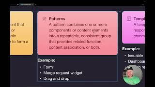
patterns.
Now,
patterns
itself
is
is
kind
of
a
term.
That's
thrown
around
a
lot,
and
if
you
look
at
different
Design
Systems,
it's
used
in
different
ways
and
we
looked
at
other
terms
like
module,
for
example,
but
that
still
spoke
to
more
of
a
single
kind
of
plug
and
play
item
and
I.
Think
pattern
is
applicable
and
here's.
Why?
Because
it's
it's
it's
kind
of
a
useful
term,
and
it
speaks
to
things
that
are
repetitive
and
that's
really.
A
The
goal
here
is
combining
one
or
more
components:
content
elements
into
a
repeatable,
consistent
group
with
the
purpose
of
providing
a
related
function.
Content,
Association
or
both
so
patterns
are
they're
pretty
Broad.
And
if
you
look
at
the
examples
you
know
there's
a
form,
a
merge
request,
widget
or
drag
and
drop.
So
an
example
of
a
form
is
going
to
be
combining
content
elements
into
a
repeatable
pattern
or
group.
A
A
merge
request.
Widget
is
the
same
kind
of
deal,
but
it
has
related
function
and
grouping.
Drag
and
drop
is
a
pattern.
That
is
it's
a
micro
interaction.
It
happens
without
larger
changes
outside
of
itself.
It's
it's
a
way
to
do
things
in
the
UI,
that's
functional
and
repeatable,
and
so
all
of
these
things
fall
under
a
pattern
and
I
will
say
that
we
are
in
the
midst
of
discussion
with
all
of
these.
So
if
I
turn
on
comments,
you
can
see.
There's
there's
discussion
happening
all
over
I.
A
Invite
you
to
also
jump
in
and
add
your
thoughts
any
any
place.
You
see
my
my
little
Avatar
there
I've
created
a
prompt
with
a
question,
a
thought
that
will
hopefully
spurn
spawn
spurn,
initiate
some
some
conversation,
so
please
jump
in
and
do
that
so
jumping
from
patterns
is
templates
and
that
is
just
prescribes
a
layout
and
potentially
responsive
behavior
for
a
page
or
a
common
content
layout.
A
So
we
could
think
about
maybe
an
issue
wall
or
a
dashboard
or
search
results,
page
or
even
a
section
of
a
page,
but
really
think
of
this
as
more
of
the
show
that
is
going
to
tell
things
where
to
be
and
how
to
interact
with
one
another
and
a
pattern
could
live
in
that.
So
in
that
regard,
it's
it's
it's
more
of
a
it's
more
on
the
side
of
layout
and
it's
more
along
the
lines
of
helping
prescribe
where
things
go
and
how
they
relate.
A
Next
up
is
objects,
objects.
We
have
today
they're
conceptual
building
blocks
and,
and
it
defines
how
we
think
about
something
and
it's
independent
of
its
visual
representation
or
interaction
model,
and
so
there's
Concepts,
like
a
job
emerge,
request
a
repository.
These
are
Concepts
that,
depending
on
where
you
are
in
gitlab,
can
take
different
form,
and
so
we
have
these
today,
but
I
think
by
providing
more
definition
and
space
for
these
we
can.
We
can
start
to
build
on
this
and
and
further
clarify
this.
A
These
are
I
say
some
of
the
most
heady
stuff
in
pajamas
is
in
objects,
and
for
that
reason,
I
want
to
be
able
to
to
keep
it
there,
but
also
figure
out
how
we
can
develop
it
further
to
make
it
repeatable
and
have
that
section
grow
in
a
meaningful
way
and
then
the
last
step
is
flows.
So
what
I've
defined
a
flow,
as
is
it's?
It
standardizes
a
macro
interaction
and
it
Mac
I'm.
A
Sorry,
macro
interactions
and
sequences
that
help
a
user
complete
a
task,
so
a
flow
is
kind
of
the
verb
to
an
object's
noun.
A
noun
is:
is
that
concept
that
thing
a
flow
shows
like
how
that
acts
and
behaves
and
works.
So
some
examples
would
be
saving
a
feedback,
Discovery
and
learning
editing,
and
this
is
something
that
Mike
Nichols
was
working
on
and
actually
I
give
credit
to
him
on
that
definition,
because
we
have
a
lot
of
things
in
that
are
very
similar
saving
and
feedback.
A
It
happens
in
many
places,
Discovery
and
learning
editing
and
in
each
instance
the
flow
might
be
a
little
different,
and
so
what
happens
with
the
ux
is
it
becomes?
You
know
in
one
place,
I'm
doing
settings
here
and
another
place
I'm
doing
settings
here.
It's
the
same
function,
the
same
desired
outcome
for
a
user,
but
it's
done
in
a
completely
different
way,
and
so
this,
the
goal
of
having
this
section
appended
at
the
end,
is
to
take
everything
else
and
show.
A
So
I've
taken
a
little
bit
of
just
exercise
here
to
create
some
some
visuals
around
this
many
systems
do
that
where
it's
just?
How
do
I
visually
just
kind
of
boil
it
down
and
distill
it
and
represent
it
visually?
So
this
is
my
take
on
that.
Where
we
have
these
foundational
elements,
we
have
components
that
are
built
on
that
we
have
patterns,
we
have
templates
objects
and
a
flow,
so
just
a
little
pyramid
there
that
shows
kind
of
the
the
layering.
A
Do
a
quick
time
check
here.
Let's
look
I,
don't
know
if
that'll
stop
me
so
I
don't
have
a
time
check.
That's
all
right!
You
can
watch
this
at
2x
right
so
with
the
Ia
updates.
I
have
included
new
pages
and
links
and
also
moved
in
rename
pages.
So
those
are
new
additions.
I'm
not
going
to
go
through
all
the
changes
here,
but
it's
based
on
these
definitions.
So
this
is
where
the
structure
is
so
under
the
product.
A
We
have
our
guidelines
and
that's
a
whole
other
deal
to
talk
about
right.
Now
it's
getting
started
or
get
started,
but
I
think
that
if
we
just
frame
those
as
guides,
then
there's
going
to
be
more
opportunity
to
talk
about
things
like
how
do
we
contribute
like
what
is
like?
How
do
we
approach
responsive,
first
or
affordance
or
context
things
like
that
that
are
more
guide
like
will
live
there?
Then
we
go
into
our
our
sections
where
we
have
foundations
and
components.
A
Our
patterns
templates
objects,
flows,
Etc
and
then
accessibility
moved
under
here.
So
if
we,
if
we
look
at
our
current
IA
accessibilities
on
its
own
and
with
this,
it's
it's
specifically
related
to
the
product
and
the
expression
of
the
product
and
so
placing
it
under
the
product
section,
not
only
minimizes,
our
our
top
layer,
but
it
also
gives
more
meaning
to
that
section.
A
A
It's
concept
so
take
some
time
there
and
then
I
just
wanted
to
this
is
this
was
kind
of
my
own
way
of
seeing
like
how
is
this
expressed
if,
if
I'm
updating
this
IA,
how
how
is
it
going
to
be
presented
to
a
user
of
the
pajama
site
in
a
way
that's
meaningful
and
doesn't
make
sense?
Does
the
the
way
it's
stacked
and
ordered
makes
sense?
And
so
this
is
my
my
take
at
that,
along
with
some
Design
Liberty.
A
So
a
few
things
to
note
today,
we
we
lead
with
Git
live
design
system
like
when
you
go
to
pajamas.
That's
what
you
see
I
want
to
flip
that
and
say:
okay.
This
is
pajamas,
it's
the
gitlab
design
system
and
make
the
site
really
more
more
ownable
and
meaningful
as
pajamas.
That's
what
we
refer
to
it
as
so.
Let's
reflect
that
in
here,
moving
search
up
and
over
and
there's
more
room
here
for
other
items.
A
You
know
this
is
the
typical
Focus
click
to
expand,
enter
your
query,
Etc
and
then
you
can
see
just
a
little
more
hierarchy
here
with
with
the
brand
section
product,
section,
research
and
some
additional
kind
of
utility
items
where
there's
design
resources
repository.
So
this
is
just
a
really
quick
design
exercise
to
show
how
we
could
have
all
the
same
information
and
more,
but
upon
reworking
the
Ia.
What
would
it
come
across
like
as
you're
going
to
navigate
this
and
I?
Think
it's
I
think
it's
pretty
clean
and
and
self-explanatory,
but
I'll?
A
Some
of
the
next
steps
I'm
working
on
would
be
looking
at
the
definitions,
a
little
further
where,
as
we
work
through
feedback
and
comments
going
through
that
and
adjusting
updating,
but
then
creating
some
decision.
Trees
like
how
do
I
know
if
something's
a
pattern
or
a
template,
or
is
it
a
composite
component
whatever
it
might
be,
taking
time
to
go
through
and
and
create
a
decision
tree
so
that
when
we
we
come
to
adding
and
contributing
to
pajamas?
We
understand
like
where
Things
fall
and
why
so?
A
That's
that's
where
I'm
at
this
is
going
to
be
a
mini
Milestone
process
and
I
would
just
again
encourage
you
to
jump
in
and
comment
in
figma
on
those
prompts
also
with
the
Epic,
which
is
going
to
be
linked.
Please
take
some
time
to
read
through
the
rest
of
the
items
in
here
and
add
your
feedback
here
as
well,
but
I.
Thank
you
for
your
time
and
enjoy
the
rest
of
the
ux
showcase
for
this
week.
Thank
you.