►
From YouTube: Protect UX: table and kanban UI toggle
Description
No description was provided for this meeting.
If this is YOUR meeting, an easy way to fix this is to add a description to your video, wherever mtngs.io found it (probably YouTube).
A
A
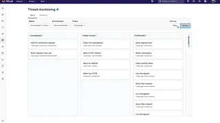
So
much
like
our
security
dashboard,
it
defaults
to
the
ones
that
are
open
and
then
later
here's
a
view
by
toggle
going
in
between
table
and
then
the
kanban.
So
this
is
ideal
for
the
individual
user
to
see
what
are
the
new
alerts
that
they
can
start
taking.
A
look
at
and
they
this
will
open
into
the
drawer
and
expand
to
a
dedicated
page.