►
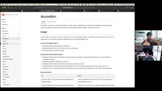
From YouTube: Will it pass? Accordion accessibility audit
Description
In this recording GitLab designers Jeremy Elder and Nick Post take an abbreviated look into performing an accessibility audit of an accordion component.
A
A
Take
a
look
at
some
different
utilities
and
methods
to
do
that.
Report
back
those
findings
and
then
offline,
we'll
go
back
in
and
add
in
what
are
potential
solutions?
How
might
we
do
this
we'll
create
additional
merge,
requests,
etc
so
that
we
can
get
our
components
working
as
intended?
So
I'm
going
to
share
my
screen.
A
All
right
so
give
me
a
little
knob
if
you
can
see
that
or
make
sure
we're
good
all
right
thanks
all
right.
So
what
where
this
is
starting
is
we
have
an
epic
for
pajamas
components,
just
accessibility,
audits
and
so
all
of
our
components
that
exist
in
wi
today
are
slated
to
have
an
audit
set
and
then
in
in
pajamas
we
have
a
table
that
has
accessibility
section,
and
these
marked
as
upcoming.
A
What
to
expect
there's
a
section
for
results
so
when,
when
this
is
complete,
we'll
post
a
you
know
a
link
to
the
the
video
recording
of
this
list
out
any
problem
solutions
and
then
related,
mrs
and
work
through
a
typical
issue,
fashion
and
mr
fashion
to
to
satisfy
that.
So
the
purpose
of
this,
just
really
quick,
is,
is
just
to
make
sure
that
these
update
kind
of,
like
I
mentioned,
are
updated
and
aligned
with
accessibility,
best
practices
and
are
usable
in
a
variety
of
screen.
A
Readers
and
modalities,
mouse
touch,
keyboard,
etc,
making
sure
we
have
parity
between
experiences
for
users
of
those
different
input
types
and
in
this
particular
audit.
The
the
methods
and
tools
there's
more
listed
under
the
the
parent,
epic,
but
today
I'll
be
walking
through
just
testing
it.
According
examples,
in
gitlab
ui,
I'm
on
mac
os
big
sur
using
safari
with
voiceover.
That's
a
a
really
good
pair
on
the
mac
side
for
screen
reader
and
browser.
A
A
So
audit
criteria
here
is
just
to
to
go
through
the
list
and
and
kind
of
list
out.
What's
what's
expected
so
a
little
background
here
I
have
a
little
bit
experience
or
maybe
a
lot
of
experience,
auditing
components
and
and
doing
accessibility
audits,
and
so
this
is
just
a
kind
of
a
high-level
bullet
list
of
things
that
you
would
expect
as
you
work
through
this
particular
component.
A
Looking
at
semantics,
looking
at
how
the
accordion
is
triggered,
the
communication
of
statefulness,
so
accordion
expanded,
collapsed,
focus
order,
visual
design
and
pairing
experiences
so
once
again
I'll
get
into
those.
But
nick
I
do
want
to
ask
you:
do
you
have
any
experience,
performing
accessibility
audits
or
what
is
your
experience
just
in
regards
to
accessibility
in
general.
B
None
whatsoever,
so
if
you,
if
you
speak
simply
hopefully
I'll,
be
able
to
understand
but
yeah,
I
I
I
sort
of
know
why
accessibility
is
important,
but
I
don't
necessarily
know
how
to
check
and
know
whether
or
not
a
component
is
accessible
or
not.
So
be
yeah
really
useful
to
understand
that
over
the
course
of
this
audit.
A
Awesome
yeah,
that's
really
helpful
and
and
definitely
jump
in.
If
anything
is
unclear
or
could
use
some
additional
definition
and
you
you
bring
up
a
great
point
about
the
purpose
of
accessibility
and
and
really
that
is
just
to
make
sure
that
everything
that
we
do
on
the
web
is
is
something
that
users
can
contribute
to
and
consume.
So
there's
kind
of
a
two-way,
a
two-way
functionality
there
and
we
want
users,
regardless
of
input
type,
whether
that's
mouse
touch.
A
We
want
anybody,
who's
working
with
gitlab,
to
be
able
to
use
their
their
own
input,
preferences
and
capabilities
to
be
able
to
contribute
to
gitlab,
but
also
to
consume
the
content
within
gitlab,
and
so
part
of
that
is
just
ensuring
that
our
foundational
components
have
those
capabilities
baked
in
obviously,
there's
there's
time
when
those
components
are
in
a
full
page
layout
and
other
things
may
become
factors,
but
at
least
when
we
started
to
re
of
how
components
created
we
we
set
it
up
for
more
success.
So
that's
what
we
want
to
do.
B
A
Well,
that's
a
great
question.
I
I
don't
think
it's
unique
in
the
sense
that
any
tool
that
that
serves-
I
guess
you
know
any
number
of
of
users-
should
should
be
accessible.
We
align
to
and
strive
to
satisfy
wilcac
2.1
at
a
double
a
level,
and
I
can
follow
up
with
some
links
to
those
resources,
but
I
don't
think
it's
different
in
the
industry.
I
think
what
you
will
find
is
that
some
features
are
are
very
accessible
and
others
are
not
so
the
reason
and
the
reasons
for
that
vary
quite
a
bit.
A
However,
I
would
expect
that
it.
It
is
something
that
is
very
much
considered
and
worked
on.
Anyone
who
is
wanting
to
do
educational
government
contracts
should
to
seek
to
have
an
accessible
product,
because
many
of
those
contracts
will
have
you
know
an
addendum
or
requirements
that
say
you
know
it
must
pass
a
certain
level
of
of
accessibility,
whether
that's
section
508
or
the
oada
in
canada,
or
you
know,
just
whatever
it
might
be
globally.
A
There's
gonna
be
some
requirements
that
go
along
with
that,
and
so
I
think
it's
it's
only
expected.
I
don't
think
we're
unique
in
that
and,
to
be
quite
honest,
I
don't
think
we're
unique
in
how
we're
approaching
this
and
auditing
I've
seen
other
teams
do
that
quite
a
bit
and
I
think
it's
part
of
a
healthy
development
ecosystem
and
so.
A
Yeah,
all
right
so
jumping
right
in
with
the
accordion.
I
just
wanted
to
provide
a
little
definition
for
the
accordion,
and
you
know
it's
its
purpose
as
a
ui
component.
Just
so
we
cannot
have
context
there.
Accordions
are
used
to
just
group
similar
content
and
hide
and
show
it
depending
on
a
user's
needs.
So
it's
kind
of
a
progressive
disclosure.
If
you
will
it's
a
way
to
to
essentially
condense
the
ui
and
have
content
available
when
a
user
wants
to
see
it
rather
than
providing
it
all
at
once,.
C
A
Can
be
used
to
to
group
information
to
keep
content,
succinct
and
so
that's
kind
of
the
purpose
behind
it
just
by
way
of
the
name
accordion
it
kind
of
infers
more
than
one
so
typically
used
as
a
set.
However,
there
is
what
I
would
consider
just
a
collapse
component
where
there
might
be
a
single
instance
that
is
expanded
and
collapsed.
A
B
A
Yeah,
that's
a
good
question
so
at
a
component
level,
you're
able
to
test
this
item
in
isolation
and
since
many
of
these
components
have
somewhat
nuanced
behavior
or
or
functionality,
you're
able
to
test
that
essentially
in
a
vacuum
and
make
sure
that
works.
When
you
start
getting
to
the
page
level,
you
can
noise,
isn't
the
right
term
right,
but
but
there's
so
many
other
things
that
can
come
into
play
and
so,
for
example,
anything
from
page
layout
to
color
and
contrast
to
things
that
might
not
even
have
to
do
with
that
individual
component.
A
I
think
it's
it's
very
helpful
to
start
at
a
component
level
and
obviously
do
those
fuller
audits,
but
really
start
kind
of
even
even
thinking
along
the
lines
of
atomic
design
start
at
that
one
unit
and
make
sure
that
as
you
build
that
out,
it's
semantic
its
design
is
appropriate.
The
function
is
appropriate.
A
So
demo,
I
should
have
done
this
earlier,
but
just
clicking
through
expand
collapse.
You
can
see
on
this
one
they
can
be
expanded,
collapsed
independently.
There's
a
slight
animation,
there's
a
carrot
that
indicates
some
interactivity
as
well
as
a
bit
of
a
link
affordance.
When
that
clicks,
the
carrot
rotates
like
a
chevron,
if
you
will
in
the
gitlab
ui
itself,
there
is
an
additional
example
where
you
can
click
on
one
and
only
have
one
exposed
at
a
time.
A
Excuse
me
well
we'll
take
a
look
at
that
as
well,
but
back
over
to
the
issue
here,
so
I'm
going
to
start
with
the
what
to
expect-
and
this
is
typically
how,
when
I
approach
an
accessibility
audit,
that's
that's
what
I
like
to
look
at.
I
do
some
research
on
what
what
are
the
expectations?
How
should
this
be
authored?
What
is
the
behavior
and
then
from
there
you
can
understand.
A
You
know
how
this
should
be
working
with
keyboarding
and
other
inputs,
and
what
kind
of
attributes
might
need
to
be
about
that
and
and
from
there
you
understand
or
research,
okay,
how
different
screen
readers
handle
this?
How
is
what
is
jaws
versus
nvda
versus
voiceover
handle
some
of
these,
maybe
aria,
attributes
and
and
start
to
look
into
making
it
more
universal
and
understanding
what
you
might
expect
as
a
test
result.
A
So
an
accordion
is
a
good
one
to
start
with,
because
it's
rather
simple,
it's
essentially
a
pair
of
according
header,
an
accordion
panel
right,
so
you
have
a
trigger
object
and
you
have
the
content
object
and
it's
just
a
relationship
between
those
two
and
so,
if
we
take
a
look
at
it
that
way,
it's
it's
pretty
simple.
It's
got
a
simple
behavior,
some
css,
some
javascript
to
make
it
work,
and
so
wrapped
up
in
that
it's
it's
a
it's
a
pretty
tight
package
too,
to
start
with,
initially
so
from
an
accordion
standpoint.
A
I
know
I
have
a
bolted
list
here
of
some
items
that
that
I'm
taking
a
look
at
the
first
is
that
it
follows
the
way
our
aria
authoring
practices
for
an
accordion.
So
we'll
just
we'll
just
jump
over
to
see
what
that
looks
like
when
you,
when
you
excuse
me
when
you
work
with
arya,
which
is
accessibility,
accessible,
rich
internet
applications,
we
can
just
go
to
the
introduction
here.
A
These
guides
are
our
practices
to
help
how
to
understand
how
to
use
aria
to
make
sure
that
the
browsers
screen
readers
can
understand
what
is
supposed
to
happen.
It
it
kind
of
adds
a
layer
to
html
so
that
we
can.
We
can
have
additional
meaning
inferred
and
added,
and
then
the
browser
can
use
that
to
essentially
know
what
to
what
to
do.
So
when
we're
looking
at
the
accordion
section
here,
it
provides
a
few
definitions
that
we've
already
walked
through,
there's
accordion
header
accordion
panel.
A
They
do
provide
an
example,
and
then
one
of
the
areas
I
really
key
in
on
is
the
keyboard
interaction.
So
how
should
this
be?
What
should
the
expected
behavior
be?
You
know,
typically,
as
you're
navigating
website,
you
know
you
might
use
the
tab
key
to
move.
You
know
focus
from
one
element
to
the
next,
but
when
you
get
into
different
components
there,
there
are
different
keyboard
interactions.
That
should
come
with
that
and
that
many
times
in
javascript
have
to
be
tied
to
that
functionality.
A
A
Example,
you
need
to
have
enter
a
space
key
that
that
triggers
it,
the
expansion
and
the
collapsing
tab
key
which
moves
focus
from
the
next
visible
element
or
the
next
focusable
element.
Sorry,
and
when
an
accordion
panel
is
expanded,
tab
should
be
able
to
move
to
any
focusable
content
within
that
panel
and
then
continue
traversing.
The
page
shift
tab
just
moves
focus
to
the
previous
element.
A
Now,
there's
a
few
optional
items
in
here
down
arrow
to
move
from
one
accordion
item
to
the
next
up:
to
do
the
opposite
direction
home
to
go
to
the
first
end,
to
go
to
the
end.
Those
are
all
optional
and,
as
I
was
looking
at
our
implementation,
we
haven't
implemented
any
of
those
optional
keyboard
interactions,
and
so
I
won't
be
won't,
be
worried
about
addressing
any
of
those
at
this
point
in
time.
Adding
those
can
help
keyboard
users
just
to
be
able
to.
You
know
just
traverse
that
quicker,
but
they
are
optional.
A
A
A
A
Each
accordion
header
button
is
wrapped
in
an
element
with
a
role
heading
and
that
is
set
for
re
level,
that's
appropriate.
So,
for
example,
you
might
have
an
h3
with
a
nested
button
and
that
nested
button
is
what
triggers
the
panel
there's.
Some
additional
information
about
using
arya
level
won't
go
into
that
too
much
right
now,
but
that
might
come
up
in
some
of
our
suggestions
based
on
what
I've
seen
and
just
kind
of
initial
run
through
the
accordion
panel
associated
should
have.
A
The
accordion
header
button
should
have
aria
controls
set
to
the
id
containing
the
panel
content.
That's
just
another
way
to
tie
it
together
in
a
little
bit
of
research,
it
does
seem
like
aria.
Controls
doesn't
have
a
lot
of
of
screen
reader
support,
I
think
jaws
supports
it,
the
most
and
so
because
of
that
some
have
said:
hey
it's
not
necessary.
A
A
If
the
accordion
panel
associated
with
it
is
visible,
the
and
it
can't
be
collapsed,
the
button
has
to
have
already
disabled
set
to
true.
So
you
know
that
that
according
always
has
to
be
open.
Then
there
has
to
be
a
way
to
make
sure
that
you
can't
close
it.
We
won't
have
to
cover
that
in
our
because
all
of
ours
are
optionally
toggled
and
then
as
an
option.
Each
element
that
is
the
container
for
the
panel
content,
can
have
a
role
of
a
region
and
aria
labeled
by
two
to
help.
A
C
A
If
we
took
those
things
away,
having
correct
semantics
means
that
that
content
is
still
going
to
be
accessible
if
we're
using
kind
of
incorrect
things,
there'll
be
some
problems
in
in
understanding
that
content
here
again
space
or
enter
triggers
the
accordion.
We
mentioned
that
communication
of
the
states.
We
mentioned
that
as
well
focus
order
was
mentioned
now.
Visual
design
and
text
affordance
this
this
item
here,
that's
something
that
we'd
have
it
covered.
That
would
be
more
under
the
kind
of
the
workout
criteria.
That
would
say
hey
this.
A
A
Okay,
if,
if
an
accordions
collapse
and
content
is
hidden
for
one
type
of
user,
a
sighted
user,
it
should
also
be
hidden
for
a
non-sighted
user
and
and
that
creates
parity
right
so
you're
not
going
to
make
a
sighted
user
traverse
all
that
content
when
it's
hidden,
don't
do
that
to
a
screen
reader
user
in
the
same
way.
So
we
want
to
have
parity
between
both
experiences,
so
we're
going
to
take
a
look
at
that.
So
a
lot
a
lot
said
there.
So
initially
what
I'll
do
with
an
audit?
A
You
know
sometimes
I'll
take
a
look
at
the
design
if
it's
available
I'll
just
say:
okay,
what
was
the?
What
was
the
design
intent?
Okay,
I
understand
here's
a
collapse
date:
here's
an
expanded
state.
I
see
some
indentation,
I
see
you
know
a
change
in
the
the
chevron
state
there,
and
so
because
of
that,
I'm
able
to
to
kind
of
have
an
inference
of
the
behavior
and,
what's
supposed
to
be
happening
and
I'll
happen
to
get
lab
ui.
Typically,
the
reason
for
that
is
in
in
pajamas.
These
are
kind
of
nested
demos.
A
I
could
jump
over
to
hitler
ui
where
the
component
is,
and
actually
these
are
in
storybook,
which
I
find
a
bit
problematic
for
testing
because
of
its
nested
iframe.
So
I
will
pop
that
content
out
of
its
iframe.
If
I
can
and
give
it
a
test
there
I'll
jump
there
in
a
minute,
but
I'll
take
a
look
at
it
in
in
gitlab,
ui
and
just
see.
Okay,
is
it
working?
As
I
expected,
I
can
see.
That's,
okay!
A
It's
it's
expanding
it's
collapsing,
so
I
know
functionally
the
behavior
is
there
if
I
tab
through
here,
I
can
see
that
I
can
focus
on
those
items.
I
can
I'm
using
the
the
space
or
I'm
sorry
the
enter
key
to
expand
collapse
using
the
spacebar,
expanded,
colored
apps,
so
I'm
just
kind
of
giving
it
a
run
through
and
testing
out
a
few
of
these
items
that
I've
uncovered
from
the
authoring
practices
testing
it
out.
A
Oftentimes
I'll
run
a
few
scans
you
can
see
in
in
storybook.
Here
we
do
have
this
accessibility
tab
with
14
passes
this.
This
goes
through
that
some
some
checks
that
can
be
done
automated.
So
the
aria
attributes
are
allowed
for
the
role
it's
you
know
that
there's
appropriate
values.
So
all
of
these
are
passing
so
so
no
red
flags,
initially
right
I'll
jump
over
here
into
actually,
let's
measure
more
to
chrome
for
this
one,
because
I
have
the
tools
in
here.
A
I'll
just
see,
if
I
can
see
if
I
can
pop
this
out
of
its
chrome's,
not
chrome
doesn't
like
doing
that
in
here.
So
what
I
want
to
do
in
here
is
just
do
a
quick
I
like
to
do
it
like
a
quick.
I
use
lighthouse
to
do
a
quick
report
and
I
just
have
best
practices,
accessibility
checks.
So
this
is
just
a
chrome
extension
that
I
can.
I
can
do
a
quick,
automated
scan
just
to
see
if
any
red
flags
come
on.
A
A
You
you
won't
have
that
as
a
flag,
but
you
might
have
a
flag
that
hey
this
image
doesn't
have
an
alt
tag,
and
so
anything
that
could
be
picked
up.
You
know
from
a
code
standpoint
also,
you
know,
color
contrast
is
one
that
it
can
pick
up
and
determine.
Sometimes
it
might
not
be
accurate
if,
if
there's
any
kind
of
positioning
used
from
css
that
might
place
an
object
at
absolute
positioning,
so
in
the
dom
it's
seems
like
it's
over
some
element,
but
it's
really
positioned
when
rendered
over
another.
A
You
might
get
kind
of
a
false
positive
on
that,
but
generally
it's
it's
those
kind
of
things.
It
is
a
good
check,
for
you
know
buttons
and
color
and
stuff
right
away.
I
just
like
it
as
kind
of
a
gut
check
as
a
general
rule
that
I've
followed,
give
or
take
20
percent
of
tests
can
be
automated
for
accessibility,
but
man.
You
know
the
other
80
is
either
manually
validated
or
fully
manual,
and
so
because
of
that
you
know
I
don't.
A
Well,
don't
discover
you
can
see
here
that
it.
You
know
it
has
a
few
errors,
but
it's
not
having
an
accessible
name
and
and
a
few
other
things
these,
as
I
look
through
these,
these
are
actually
related
to
the
storybook
ui
and
not
the
actual
component,
and
so
there's
nothing
in
here
actually
relevant
to
the
component
itself.
So
I'm
just
gonna
jump
out
of
that
and
and
not
worry
about
any
of
those
scans
like
I.
A
Simple
component,
so
that
that
is
helpful
as
well,
so
so
so
far
you
know,
there's
no
issues,
the
behavior
seems.
Okay,
it's
good
another
step
might
be,
or
that
might
be.
Another
step
would
be
just
like.
Let's
look
at
the
the
behavior
of
this
without
javascript
and
styles,
and
so,
if
I
come
up
here,
I'm
going
to
disable
styles,
we'll
see
a
few
things
that
we
call
out
we're
going
to
disable
javascript.
A
So
initially
you
know
I
I
would
read
this
as
okay,
there's
there's
something
going
on
here
right.
We
we
see
that
it
appears
that
there's
a
a
button
and
then
the
the
text
below
which
we
know
from
looking
at
this
elsewhere.
I
guess
that's
disabled
everywhere,
so
we
know
that
from
looking
at
it
elsewhere.
A
This
is
the
the
content.
That's
hidden
within
that
accordion.
So
one
thing:
that's
a
plus
right
now
is
that
this
content
is
actually
visible
at
this
point
in
time,
however,
it's
pretty
quick
to
see
that
there's
no
structure
here
and
the
the
meaning
of
this
content
or
what
it's
actually
tied
to
is,
is
completely
lost,
and
so
there's
you
know,
there's
no
there's!
No
hierarchy,
there's
no
correct
semantics.
A
A
A
C
A
C
A
B
A
So
here,
if
we
see
I'm
going
to
just
jump
out
to
the
container,
even
the
first
thing
that
jumps
out
to
me
is
this
roll
of
tablet
list.
Now.
Nothing
to
this
point
that
we've
covered
mentions
anything
about
these
being
tabs
right
and
indeed
tabs
is
a
a
functionality,
and
we
could
actually
go
over
here
and
and
see
in
the
authoring
practices.
A
Role
equals
tab
list
shouldn't
be
used
on
the
parent
container,
because
already
that
might
be
inferring
something
to
a
different
screen
reader
that
that
is
problematic
right.
It's
like
this
is
your,
maybe
maybe
it's
communicated
as
hey.
This
is
a
set
of
tabs,
but
really
it's
not
it's
it's
an
actual
accordion
with
with
different
functionality
so
and
also
different
capabilities.
As
far
as
how
you
might
traverse
it.
Tabs,
for
example,
arrowing
from
tab
to
tab,
is
something
that
is,
I
if
I
believe,
I'll
just
jump
into
the
spec.
A
A
Correct
correct
and
in
a
minute
I'll,
open
up,
voiceover
and
we'll
see
if
that,
if
this
does
in
indeed
have
any
impact,
but
it's
it's
something
worth
noting,
and
it's
something
that
shouldn't
be
there
just
because
this
is
not
a
tab
list
and-
and
I
do
believe
and
I'll
just
jump
back
over
into
this
one
more
time
here.
If
I'm
looking
at
tabs,
let's
look
at.
A
Let's
see
here,
okay,
so
if
we
look
at
tabs
here,
the
first
item,
the
element
that
serves
as
the
container
for
the
setup
tabs
has
role
tab
list.
So
we
can
see
right
here.
This
is
this
is
relegated
to
tabs.
We
don't
have
anything
like
that
for
accordion,
and
so
because
of
that
you
know,
accordion
is
saying.
Okay,
I've
got
a
one-to-one
relationship
between
the
accordion
header
and
the
accordion
panel.
There's
there's
not
this
extra
container
level.
This
can
excuse
me
relationship
to
define
a
set
of
accordion.
C
A
That
could
that
could
be
just
so
jump
into
this
here
now
we
have
an
extra
div.
That
is
an
accordion
item
again,
this
is
probably
not
necessary
and
a
bit
verbose,
and
this
could
be
added
just
for
for
styling
purposes.
I'm
not
gonna
get
too
into
that
right
now,
but
it
does
indeed
look
like
there's
some
styling
there.
However,
if
we
were
using
headings
and
other
attributes-
or
you
know,
if
the
expansion
reveals
a
paragraph,
those
should
also
have
their
own
css.
A
A
B
B
A
Yeah,
that's
a
good
call,
and
so
that
is
correct,
right
away,
we're
losing
button
semantics
by
assigning
in
a
different
role,
and
and
with
that
that
that's
that's
going
to
be
a
problem,
because
it's
it's
not
a
tab,
it's
still
a
button
and
semantically
we
want
it
to
be
communicated
as
a
button.
We
want
to
have
all
of
the
affordance
or
capabilities
that
come
along
with
the
button.
A
I'll
be
honest,
just
right
away,
I
don't
know
if
type
equals
button,
has
any
negative
impact
or
or
fights
a
bit
with
role
equals
tab.
My
assumption
is
that
it
does
if
this
was
just
purely
a
button
as
it
as
it
should
be,
we
would
need
role,
equals
tab
or
type
equals
button.
So
in
that
case,
both
of
those
attributes
should
be
removed
and
you're
correct
in
calling
that
out.
Another
item
that
stands
out.
A
If
we
look
at
the
spec,
it
mentions
that
each
accordion
or
the
other
guidelines-
sorry
each
accordion
header
button-
is
wrapped
in
an
element
with
the
role
of
heading
and
that
can
either
be
an
actual
h1
h2.
You
know,
however,
that
shapes
out,
but
we
can
clearly
see
here
that
this
button
is
not
wrapped
in
anything
and
that's
why,
when
we
turned
off
javascript
and
css,
there's
no
hierarchy
there,
it's
just
a
giant
button
and
the
text
so
we're
we're
losing
that
type
of
relationship.
A
A
A
All
right,
so
those
those
items
themselves
are
are,
are
going
to
be
helpful
in
fixing
this
and
we
do
see
there.
There
is
aria
controls,
and
that
was
mentioned
that
we
can.
You
know
we
can
have
that
it
has
accordion
item
too.
So,
let's
see
here,
what's
let's
look?
Okay,
here's
accordion
item
two,
I'm
just
gonna
expand
this
to
see.
A
All
right
so
accordion
item
two.
I
find
the
naming
a
bit
confusing
just
because
it's
the
first
item,
but
it's
recording
item
two,
so
I
won't
get
into
that.
The
the
matter
is
is
that
it
actually
does
control
this,
and
this
reference
here
in
aria
aria
controls
according
to
item
two
that
points
to
the
id.
It
should
be
a
unique
id
of
that
div.
Now
we
can
see
that
that
does
that
we
can
see
now.
Error
rex
demanded
equals
true
if
it
collapses,
our
expanded
is
false.
So
that's
that's
correct
that
is
changing
and
appropriate.
A
If
I
come
down-
and
I
look
at
this
icon
on
here-
I'll
notice-
that
it
also
has
aria
hidden
equals
true-
and
that
is
a
that's
appropriate,
because
that's
just
a
visual
indicator,
if
that
had
any
kind
of
text
or
something
it
would
also
be
announced
in
that
in
that
button,
and
that's
that
would
be
unnecessary.
So
having
that
aria
hidden
is
is
is
good
and
we
have.
We
do
have
the
the
label
for
that.
A
That
button
itself
again,
there's
probably
a
lot
of
extra
elements
in
here
that
don't
need
to
be,
but
for
now
we
won't
we'll
get
too
much
into
into
that
and
focus
more
on
the
accessibility
side
of
it,
as
you
called
out
button
roll
tab.
I
notice
this.
The
div
for
the
content
has
roll
equals
tab
panel,
and
so
again
somebody
has
has
built
this
in
a
way
where
they're
trying
to
mimic
the
functionality
of
tabs
and
use
these.
But
this
is
this
is
not
a
tab
and
it's
not
a
tab
panel.
A
A
C
A
Isolation
so
so
far,
yeah,
I'm
just
gonna,
take
a
step
back.
I'm
gonna
jump
back
over
here.
Obviously,
I'm
building
out
some
things
to
to
identify
in
here.
I
know
that
okay,
the
semantics
are
not
correct.
I
know
it's
not
following
all
the
practices
for
an
accordion
space
and
enter
keys.
They
do
trigger
the
accordion.
So
that's
correct.
There's
a
you
know,
communication
of
states
that
we'll
test
here
more
in
a
second
with
with
voiceover
book
sorter
is
moving
from
here.
A
A
And
affordance
is
an
alignment.
We
see
a
change
in
states,
we
see
the
link
and
the
hover.
You
know
it
has
the
style
necessary,
ensure
purity
and
experience
between
sighted
and
non-sighted
users.
Let's
just
double
check
that
quick
with
this
hidden
we
can.
We
can
indeed
see
we
have
display
none,
so
that
will
not
be
visible
to
screen
reader
users
or
to
anyone
and
if
I
or
just
cited
users-
and
so
if
I
expand
that
we
can
now
see
that
that
is
visible
here
and
the
display
is
is
available.
A
To
just
jump
into
voiceover,
and
hopefully
you
can
hear
it
if
not
the
the
panel
should
be
visible,
but
when
I
start
it
you'll
hear
it
search,
speak
items
and
I'll
work
through
and
focus
on
a
few
of
those
and
move
through
it.
Let
you
listen
to
it
and
then
turn
it
off
and
come
back
to
to
kind
of
close
that
out.
C
Voiceover
on
safari
storybook
window
toolbar
has
keyword
focus.
You
are
currently
on
toolbar
to
interact
with
the
items
on
the
toolbar
store
book
web
content
item
one
collapse
tab.
You
are
currently
on
tab
inside
of
web
item.
One
expanded.
Tab
item
two
collapse:
tab!
Your
item,
two
expanded
tab
item:
two
collapse:
tab
item
three
collapse:
item:
three:
expanded
tab:
you
are
currently
on
tab
item
two
collapse:
tab
item:
one
expanded
tab
item
on
collapse;
tab!
You
are
currently
on
item
two
item:
three:
expanded
tab.
You
are
currently
item
three
collapse:
tab
voice
over
off.
C
C
Voiceover
on
safari
accordion
example.
Example,
you
are
currently
your
personal
information,
expanded
button.
You
are
currently
on
heading
level.
Three
name
required
edit
text
with
autofill
menu,
personal
information,
email,
one
extension
country
city,
slack,
billing,
address
collapse,
button
main
building
address
expanded
button.
You
are
currently
on
hitting
level
three
address.
One
edit
attack
building
address
expanded
button
main
you
are
currently
on
heading
level.
Three
address
one
address
state,
zip
code,
shipping
address
collapse,
button
main
shipping
address,
then
expanded
button.
C
C
A
Let's
see
here,
they
do
have
the
button
within
the
heading
they
do
have
the
billing
address
the
shipping
address,
etc.
So
this
one
I
this
one's
a
bit
interesting,
just
because
the
button
is
the
text
for
the
heading
so
that
that
to
me
is
still
like
visually.
I
wouldn't
get
it.
If
I
was
looking
at
the
dom,
I
would
get
it,
but
that's
something
that
I
might
look
into
further
just
to
to
kind
of
investigate.
If,
if
this
should.
A
If
it's
not,
you
know
collapsed
or
expanded,
and
I
bet
if
I
turn
off
javascript,
I
would
expect
that
other
content
to
be
visible.
So
that's
kind
of
interesting
too,
that
this
content
is
is
still
hidden
under
either
of
those
I
would
actually
want
those
to
be
expanded
as
well.
So
all
right,
so
we've
kind
of
gone
through
a
few,
a
few
demos
and
a
few
issues.
I
I
will
make
a
note
that
you
know
voiceover
communicates
these
at
this
tabs.
B
A
Yeah
good
question
and
I
think
that
that's
a
good
segway,
I
know
we're
just
about
a
time
or
bad
time,
so
what
I
would
do
is
I
would,
I
would
fill
out
this
issue.
First
of
all,
with
the
problem
and
if
I
didn't
know
the
solution,
I'd
do
some
investigation
around
that
to
come
up
with
the
solution
and
link
to
resources
and
then
I'd
create
a
related
mrr
to
to
fix
those,
and
so
that
would
be
what
my
next
steps
would
be.
A
A
Badges
is
one
that
was
done
recently
in
a
recording
of
the
audit.
You
know
there'll
be
there'll,
be
some
things
captured,
but
you
can
see
there's
a
problem
solutions.
There
aren't
any
mrs
open
yet
for
this,
but
that's
what
I
would
expect
is
is
kind
of
how
we'd
approach
it.
So
you
can
see
how-
and
here
I've
listed
for
each
problem,
there's
a
solution,
so
that
would
be
how
I
would
approach
it
from
next
steps.
B
A
A
Accessible
just
by
default
right.
That
should
be
something
that
we
bake
into
every
level
of
mvc.
If
we're
starting
with
correct
semantics
in
in
in
a
way
I
develop
or
in
work,
is
I'll
start
with
an
outline
and
I'll
start
with
writing
semantic
markup
before
I
add
any
styles
or
structure
other
you
know
outside
of
that,
and
if
we
think
of
that
as
an
mvc
like
minimally
viable
for
this
is
having
a
heading
with
the
content
heading
with
the
content,
and
then
we
start
to
layer
in
the
next.
A
What's
the
next,
you
know
minimally
viable
change,
would
it
be
adding
the
the
functionality
and
and
aria?
So
I
I
view
the
underlying
semantics
as
part
of
the
mvc
for
it,
but
given
that
it's
in
this
current
state,
I
would
say
that
mvc
would
be
going
into
just
opening
mrs
to
address
a
few
of
these
changes,
and
some
of
them
might
have
to
be
larger
than
not
and
depending
on
how
the
components
used
in
the
in
the
product.
A
Can
it
easily
be
migrated,
you
know:
are
there
hamel
and
ruby
templates
that
have
to
be
updated
and
patterns?
Those
types
of
things
would
all
have
to
be
gone
through
and
so
from
there.
That
would
help
inform
what
might
be
you
know
the
minimal,
viable
change
that
would
maybe
not
have
as
many
downstream
impacts
it
might
be.
There
might
be
a
need
to
even
branch
this
off
and
to
create
another
variation
and
work
on
it
in
isolation
before
migrating
it
in,
but
I
hope
that
does
that
answer
that.
A
B
So
I
think,
like
I'm,
not
the
most
skilled
when
it
comes
to
just
like
semantics.
I
know
some
rudimentary
html
and
so
on.
So
I
think,
like
having
an
understanding
or
like
just
like
a
reading
list
of
things
that
I
should
know
going
into
this.
Just
for
additional
context
would
would
would
be
useful
for
people
like
me
who
don't,
who
don't
code
so
much.
B
I
think,
having
an
understanding
of
this
is
at
the
component
level,
but
having
an
understanding
of
what
we
need
to
take
into
account
when,
when
designing
features
would
be
useful,
then
like
whether
it's
checks
that
we
do
on
the
components
to
ensure
that
they
they're
they're
sort
of
accessible
or
how
we
lay
out
the
page
with
the
components
whatever
it
may
be.
That
would
also
be
useful.