►
From YouTube: Defend ux: alerts MVC threat monitoring
Description
design review for alerts MVC (threats monitoring): https://gitlab.com/groups/gitlab-org/-/epics/3438
A
A
Hopefully,
we
can
just
basically
adopt
it
and
it
starts
by
defaulting
to
the
most
recent
alerts,
so
in
the
sort
border
here
again,
where
we're
taking
it
from
this
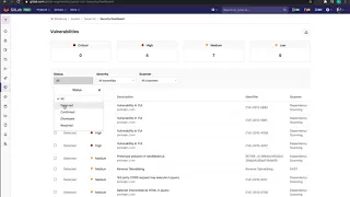
table.
Something
notable
here
is
that
it.
It
shows
it
by
one
day,
two
day
days
and
then
week
and
then
months
and
then
multiple
months
and
then
years
if
we
could
adopt
that
as
well
and
then,
notably
there's
a
timestamp
when
you
hover
over.
That
shows
you
exactly
when
this
alert
occurred.
A
So
we
can
adopt
this
pattern,
this
component
as
well.
For
this,
the
other,
the
last
part,
is
or
two
more
parts
actually
questions
about
cluster
on
the
Sam
to
speak.
To
that
a
little
bit
more
but
I
know
we
had
questions
and
then
needed
some
feedback
about
how,
if
and
how
we
can
display
it
and
then
further
filtering
and
by
it
it's
shown
here
and
the
designs
is
displaying
what
the
cluster
is.
A
We
didn't
include
the
the
filter,
but
just
any
thoughts
or
feedbacks
on
that,
if
it's
within
the
scope
of
this
MVC
or
if
there's
any
challenges
there
to
displaying
that
the
last
thing
is
the
one
action
that
the
user
can
take
to
this
page
is
to
dismiss
it
so
I.
Wouldn't
the
thinking
is
so
far
and
I'm
not
sold
on
it,
but
each
one
has
a
dismiss
button
and
then
the
user
can
also
undo
dismiss
and
when
they
dismiss
it,
we
could
put
like
50%
opacity
on
the
table
row.
A
We
we
see
this
right
now,
and
this
could
also
be
something
that
we
adopt,
especially
given
there's
a
number
of
upcoming
statuses
that
that
may
be
following
up
with
this,
including
adding
an
issue.
Maybe
that
would
be
a
breakout
button
or
some
other
way,
but
just
as
a
start
to
to
kind
of
show
that
the
actions
are
located
here,
and
this
is
the
first
one,
it's
the
simple
dismiss
and
undo
dismiss.
The
ability
to
undo
dismiss
is
also
seen
in
the
merge
requests.