►
Description
Daniel Fosco (Senior Product Designer on Release Group) does a design walkthrough for the environments table and how to tweak its design to better fit new content
Issue: https://gitlab.com/gitlab-org/gitlab/-/issues/322600
Prototype: https://www.figma.com/proto/prnDR7lxJ7mR6zt9YIZfo9/%23322600---Display-Environment-Tier-on-the-Environments-Page?page-id=108%3A148&node-id=108%3A177&viewport=590%2C892%2C0.03813393786549568&scaling=contain
A
Hello,
my
name
is
daniel
fuschko,
I'm
senior
project
designer
on
the
release
group
in
gitlab,
and
today
I'm
going
to
walk
you
through
an
issue
I'm
working
on
called
display
environment
here
on
the
environments
page
to
start,
where
is
an
environment
here,
an
environment
here
on
gitlab
is
essentially
the
type
of
deployment
tier
that
an
environment
is
targeting.
What
does
that
mean
right
today?
You
can
have
your
production
environment,
you
get
a
lab
called
production,
but
what?
If
it's
called
customer
portal
or
has
an
auto
generated
name
by
your
system?
A
So
that's
the
idea
today.
This
already
exists.
You
can
add
your
tier.
Where
is
it
well,
it's
not
showing
up
here
yeah
deployment
to
your
keyword
to
your
gitlab
yaml
file,
but
it's
not
on
the
environments
page
right.
So
this
is
what
it's
about
so
go
into
the
environments
page.
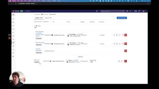
This
is
what
it
looks
like
today.
It's
pretty
crowded,
some
of
the
content
is
already
breaking
you
see
here.
A
This
screenshot
was
taken
on
a
16
inch
screen,
so
it's
a
pretty
large
screen,
but
it's
just
buckling
under
the
weight
already
and
if
we
add
another
column,
this
is
what
happens
right.
The
actions
at
the
end
are
further
clipped
and
it's
really
it's
not
working.
So
what
would
be
the
minimum
change
required
to
add
this
information?
Well,
we
could
add
within
the
the
name
of
the
environment,
so
we
indicate
environment
tier
and
then
we
can
say
that
these
are
development
environments,
and
this
is
the
production
environment.
A
In
case
it's
not
called
production,
but
what
would
it
take
to
actually
add
more
information
to
this
table
because
we
might
need
to
do
that
in
the
future
and
in
the
process
fix
up
some
of
the
issues.
So
the
first
thing
to
fix,
which
is
actually
pretty
solid
here,
is
the
name
of
this
environment
folder.
This
is
essentially
a
group
of
these
environments
that
has
a
folder
structure.
You
can
click
show
all
to
go
to
a
page
that
shows
all
the
2591
in
here,
but
you
can
see
this
label
is
broken
right.
A
This
other
project
has
a
bunch
of
environment
folders.
You
can
clearly
see
the
problem
here,
it's
even
clipped,
so
essentially
we
can
make
a
small
css
change
and
have
this
fixed
once
we
do
that.
The
next
thing
that
you
can
see
is
a
problem.
Is
that
the
environments
in
the
folder
they
are
shifted
to
the
right
to
make
to
give
you
the
affordance
that
these
three
are
inside
this
row
opposed
to
this
one
which
which
works
as
as
an
affordance
but
visually.
A
It
doesn't
really
because
you
see
it
creates
a
misalignment
in
the
table.
So
this
is
already
a
very
complex
area
with
complex
information,
lots
of
information
and
we
are
making
it
harder
to
read
by
by
shifting
the
text
outside
of
the
grid
lines,
so
what
we
can
do
to
fix.
This
is
essentially
undo
this
padding
and
just
use
color
to
communicate
the
same
thing.
So
here
when
you
open
this
folder,
you
see.
The
rows,
marked
in
gray,
are
the
ones
that
belong
to
this
folder.
A
That
is
also
understandable
and
it
doesn't
visually
break
the
table
and
then
the
final
thing
right
this
this
table
is
not
working
at
this
size.
So
let's
make
it
full
width,
so
we
can
finally
add
add
the
deployment
tiers
and
here
an
optional
thing,
but
I
think
this
row
here
also
visually
breaks
the
table
because
it
it
goes
away
from
the
visual
logic
of
the
table
where
everything
is
in
a
grid
cell
and
has
a
centered
element.
A
So
we
could
perhaps
just
move
this
link
here
to
the
top,
so
it's
even
cleaner
and
then
we
can
finally
have
the
space
to
add
the
tier.
Now
I
don't
think
the
table
is
necessarily
the
best
ui
to
show
this
complex
information
about
environments.
We
can
definitely
rethink
this
in
the
future,
but
that
would
be
a
much
bigger,
bigger
iteration.
So
this
is
a
faster
and
smaller
way.
We
can
make
this
table
more
readable
and
more
clean
and
more
scalable
to
add
more
information
in
the
near
future.