►
From YouTube: Pajamas Figma Tip: Swapping content in Modal component
Description
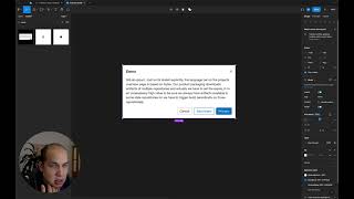
With component properties introduced in Figma, we should be swapping components instead of detaching components when we want to add custom content to existing components.
#figma
A
Hi
there,
my
name
is
michael
and
today
I
will
be
going
over
the
modal
component
that
we've
updated
within
the
pajamas
library,
so
it's
still
called
moto.
But
what
we
want
to
highlight
is
the
fact
that
there's
now
properties
on
the
side
here
that
you
can
control
visibly
the
headers,
the
footers,
the
title
and
inside
the
title
you
can
actually
type
inside
here
or
you
can
continue
typing
like
what
you're
used
to
inside
here,
and
it
goes
really
long.
A
A
The
thing
that
is
really
new
as
of
last
week
is
this
idea
of
component
properties
and
with
component
properties.
What
we
need
to
what
it
allows
us
to
do
is
to
replace
the
content
inside
here.
So
in
our
case,
is
this
area
inside
here
outlined
in
the
purple
and
historically,
if
you
wanted
to
change
something
in
there
beyond
text,
you
would
have
to
detach
the
component
and
put
your
stuff
in
there
and
yeah.
That
component
is
always
detached.
A
So
if
there's
any
changes
to
the
padding
headings
or
buttons,
your
component
wouldn't
get
those
updates,
but
there's
a
better
way
to
do
that.
So
let's
say
I
wanted
to
add
this
thing
here
as
the
body
of
my
model.
So
here
is
my
component
and
my
frame.
Let
me
just
let
me
just
call
commit
box
and
the
key
thing
that
these
things
need
to
be
is
for
it
to
be
a
component,
so
it
can
be
detected
inside
here.
A
A
A
2
now
appears
up
on
the
side
and
I
click
on
it
and
you
get
all
the
benefits
of
resizing
or
do
you
for
those
who
are
really
astute
and
can
see
things
clearly
here
this
one
and
the
text
box
is
going
outside
the
screen,
so
the
thing
that
you
need
to
be
mindful
of
is
to
ensure
that
your
components
fill
the
container
and
not
to
use
a
fixed
width.
So
I
can
go
into
my
component
here.
A
There's
this
thing
here
over
on
the
group
side,
we
have
fixed
and
I
want
to
change
that,
to
fill
container
by
changing
it
to
fill.
It
goes
right
up
to
where
the
padding
is.
I
don't
need
to
worry
about
what
exactly
that
is,
because
that's
already
determined
by
the
component
and
yeah
it's
16
pixels.
So
I
didn't
need
to
do
anything
extra
to
ensure
that
that
thing
works,
and
now
I
can
resize
this
component
to
my
heart's
content
and
everything
stays
in
place.