►
From YouTube: Pajamas design system sentiment survey walkthrough
A
Hello:
everyone,
Dan
Mitzi
Harris
here
product
designer
in
foundations
group,
giving
an
overview
of
a
recent
sentiment
survey.
We
ran
on
the
pajamas
design
system.
We
wanted
to
collect
feedback
from
getting
our
team
members
who
use
the
pajamas
design
system
and
create
a
quantitative
survey
that
we
can
use
to
gauge
the
sentiment.
This
survey
will
be
repeated
and
twice
a
year,
so
we
can
track
and
see
if
things
are
changing
over
time,
if
the
stuff
we're
doing
is
having
a
measurable
impact.
A
This
is
the
first
time
running
the
survey
and
it
will
be
a
benchmark
for
future
comparison.
The
reason
we're
doing
this
is
to
try
and
understand
if
the
design
system
works,
is
it
improving
the
quality
and
speed
for
the
people
building
gitlab?
Does
it
have
enough
depth
and
breadth
for
those
people
and
does
it
make
them
feel
confident
and
enable
them
to
contribute
back
to
the
system?
We
had
43
responses
which,
from
our
total
population
size
of
about
150,
we
think,
is
pretty
representative.
A
It's
currently,
a
component
library
of
styles
front-end
objects,
guidelines
used
by
product
teams
to
build
out
consistent
uis
when
we
make
updates
for
those
changes
to
happen
all
across
features
and
teams
and
maintain
consistency
right
now.
It
contains
components
and
specs
and
the
guidelines
for
how
we
use
them
internally,
the
entire
system
of
generating
the
specs
all
the
way
through
to
usable
Assets
in
the
whole
app.
A
So
the
top
takeaways
that
came
out
of
the
survey
is
our
consumers
liked
that
the
design
system
allowed
them
to
focus
on
user
problems.
There
was
difficulty
caused
by
the
three
different
platforms,
some
usability
issues
and
mistakes
that
came
from
it.
There
are
lots
of
gaps
in
the
system,
both
those
are
documented
as
to
do's
and
those
which
are
undocumented,
which
is
reducing
some
efficiency
and
Trust
in
the
system.
A
Full
contributions
to
the
system
requires
significant
effort,
so
some
challenges
that
arise
because
of
that
and
some
of
the
differences
in
view,
Hamill
bootstrap
view
causes
additional
effort
for
consumers
to
understand
and
implement
the
components
so
reference
in
the
design
system.
We're
currently
spread
across
three
different
platforms:
design.kitlab.com
gitlab
UI
and
storybook,
and
UI
Kim
figma.
A
So
we
asked
respondents
in
the
last
three
months.
How
often
did
they
reference
or
use
different
parts
of
it
design.kitlab.com
and
gitlab
UI?
We
used
more
often
compared
to
the
UI
kit
and
28
of
respondents,
and,
lastly,
meant
never
looked
at
the
UI
kit
in
figma
and
of
those
who
never
looked.
They
were
mostly
engineering,
ICS
sentiment
scores.
Then
the
sentiment
towards
the
statements
that
we
asked
were
mostly
positive.
We
asked
five
questions
and
asked
for
the
first
four
and
asked
people
to
respond
strongly
disagree
through
to
strongly
agree.
A
Our
design
system
makes
it
easier
for
me
to
build
a
high
quality
UI.
Our
design
system
helps
me
Implement.
All
design
features
faster,
I
feel
confident
in
using
the
design
system
and
I
can
contribute
back
to
our
design
system
with
ease
and
then
the
final
question
was
to
gauge
the
depth
and
breadth
in
the
last
three
months.
How
often
did
you
find
yourself
using
something
outside
the
design
system?
Top
two
box
scores
reflect
the
two
highest
most
positive
responses.
These
percentages
will
make
it
easier
for
us
to
make
comparisons
between
studies,
but
here's
the
benchmarks.
A
For
now
we
can
see
positive
all
over
50,
agree
or
strongly
agree
with
the
sentiments
for
the
highest
being
easier
to
build
high
quality
UI
and
the
lowest
being
contributing
back
to
the
design
system
at
ease.
Respondents
were
asked
a
follow-up
question
asking
them
why
they
chose
the
particular
answer
after
analyzing,
their
responses
they've
been
coded
and
grouped
into
these
seven
themes,
but
consistency
and
reusability.
The
good
things
people
mentioned
were
recognizing
making
gitlab
more
consistent
for
composing
basic
uis.
The
system
parts
work
well
together
and
some
room
for
improvement.
A
Consistency
is
lessened
when
proposals
from
outside
the
system
come
in,
spacing
camera
often
and
where
we
have
good
composability
for
the
basic.
The
complex
uis
are
harder
to
compose
and
this
consistency
is
localized
not
present
across
the
whole
product
or
system.
So
when
we
might
have
something,
that's
high
quality
in
one
place
and
another
thing:
that's
high
quality
in
the
other,
when
you
put
them
both
together,
they're,
not
consistent
with
each
other.
A
So
there's
more
than
27
of
the
big
terms
that
talk
about
consistency,
reusability,
there's
a
selection
here,
but
all
of
them
are
in
the
appendix
quality,
the
details
and
polish
taken
care
of
lots
of
comments
about
plug
and
play
and
focus
on
user
problems
and
generally
positively
back
about
the
appearance.
But
there
are
also
some
comments
about
the
quality
being
varying
and
some
challenges
with
components
not
working
well
together.
A
For
uses
and
confidence
lots
of
positive
comments
again,
but
there
were
many
respondents
who
did
acknowledge
they
were
still
learning
how
to
use
the
system.
Some
of
the
big
challenges
that
came
out
in
their
responses
were
differences
between
Hamel
and
View,
and
we
also
see
some
of
this
feedback
overlapping
in
the
system.
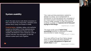
Usability
theme
to
call
out
some
improvements
that
people
have
noticed
recently.
There
were
positive
comments
about
interactive,
figma
components
and
prototypes
and
how
they
make
things
feel
more
realistic.
A
A
A
A
A
For
the
depth
of
breadth.
We
saw
a
low
reported
need
for
use
outside
of
the
system,
which
it
shows
that
we've
got
good
depth
and
breadth
or
consumers
think
so,
but
there
are
many
gaps.
Many
things
marked
us
to
do's,
and
the
many
respondents
mentioned
the
guidelines
it's
missing
or
require
an
extra
effort,
so
some
recommendations
for
how
we
can
prove
here
is
reduce
the
number
of
to-do's
either
by
creating
assets
or
removing
stuff
from
the
design
system.
A
In
confidence
and
contribution,
we
saw
some
usability
challenges
caused
by
the
implementation,
the
three
different
platforms
and
those
inconsistencies.
So
there's
I
think
there's
a
lot
of
room
for
improvement
here.
We
can
do
that
by
finding
some
way
to
reduce
the
inconsistencies
between
the
different
platforms.
A
So
what's
next
as
a
foundations,
team
review,
these
results
and
recommendations,
talk
about
them
and
see
what
stands
out
to
the
team
from
that
identified.
Some
further
questions
for
follow-up
interviews,
additional
research
efforts,
so
we
can
be
sure
that
putting
efforts
in
their
highest
impact
places
some
of
the
problems
that
have
been
identified,
push
them
through
problem
validation
as
part
of
the
product
development
flow.
A
So
we
can
see
some
of
these
implemented
also
set
a
date
for
when
we're
going
to
repeat
this
survey
and
explore
some
other
sensing
mechanisms,
other
Discovery
methods
to
help
the
design
system-
category,
for
example,
things
like
continuous
interviews.
So
thanks
for
checking
out
this
overview,
do
dig
into
the
presentation
there's
a
bunch
of
stuff
in
the
appendix
some
overview
of
the
metrics
breakdown
of
responses
by
roll
and
also
all
of
the
verbatims,
but
in
the
meantime,
have
a
fantastic
day.