►
From YouTube: UX Showcase: Navigation Redesign
Description
No description was provided for this meeting.
If this is YOUR meeting, an easy way to fix this is to add a description to your video, wherever mtngs.io found it (probably YouTube).
A
All
right
so
hello,
everyone,
I'm,
Nick,
Brandt
and
I'm,
coming
to
you
today
as
a
designer
working
on
the
foundations
team,
typically
I'm
within
Global
search,
but
for
now
I'm
helping
out
with
this
team,
just
while
Austin's
on
Final
leave.
So
today,
I
just
want
to
talk
to
you
a
bit
about
some
of
the
work
we've
been
doing
for
the
navigation
redesign
and
where
we're
going
to
be
heading
with
that
and
I
primarily
wanted
to
go
over
this.
A
A
So,
first
off
I
just
wanted
to
briefly
review
the
latest
research
that
Ron
that
we
had
just
conducted-
and
this
was
essentially
refining
the
previous
round
down
to
two
different
concepts
that
we
were
testing
with
users
and
that
round
previously
was
conducted
by
Austin
Anna,
as
well
as
Ashley
from
the
uxr
side
and
for
This
research.
It
was
a
mix
of
both
new
and
mature
and
New
Gate
lab
users,
because
we
wanted
to
not
only
test
this
with
users
who
are
familiar
with
gitlab.
A
So
you
can
take
a
look
at
that
where
you
can
find
additional
details,
but
just
high
level
on
this
users
were
presented
with
both
of
these
two
different
concepts
within
each
session.
We
rotated
the
owner
based
off
of
different
sessions,
and
they
were
essentially
asked
to
go
through
a
series
of
tasks
for
each
one,
along
with
rating
those
tasks
along
each
step.
A
At
the
end
of
each
concept,
they
would
also
rate
their
experience
with
that
concept
and
provide
some
feedback
specific
to
each
concept,
as
well
as
at
the
very
end
they
actually
were
asked
to
essentially
provide
which
concept
they
preferred
out
of
the
two
I'll
note,
some
of
the
major
differences
between
these
two
concepts,
one
being
over
here
in
Elementry
Swizzle,
we
maintained
a
top
nav
bar
versus
here
on
the
right
on
the
super
sidebar
concept.
We
essentially
are
consolidating
everything
over
into
a
sidebar.
A
Some
of
the
other
distinctions
are
on
the
super
sidebar
concept.
We
with
what
we're
calling
a
context
switcher,
which
was
a
different
way
to
change
your
context,
such
as
projects
and
groups
today,
which
I'll
go
into
a
bit
more
detail
in
a
later
slide
versus
on
the
element.
Rest
Wizzle,
changing
context
was
a
bit
more
different
than
today,
where
you
would
actually
have
to
go
back
to
a
root
or
the
home
page
in
order
to
change
your
project
or
group.
A
Some
of
the
other,
smaller
changes
are
on
the
super.
Sidebar
we've
removed
the
exposed
search
field
and
went
to
more
of
just
a
button,
interaction
where
that
would
bring
up
a
modal
as
well
as
there's
an
addition
of
a
what
we're
calling
a
your
work
section
on
the
super
sidebar
concept,
which
I'll
also
go
into
a
bit
more
detail
here
in
a
bit
foreign.
A
Basically,
from
a
high
level
of
the
results
of
this
session,
these
sessions,
the
super
sidebar
concept-
performed
quite
a
bit
better,
so
as
it
relates
to
preference,
81
percent
of
users
actually
preferred
this
concept
over
the
other.
When
it
comes
down
to
task
completion,
I
will
say
it
was
closer,
but
there
was
still
definitely
better
task.
A
Completion
on
a
super
sidebar
Concept
in
comparison
to
the
elements
would
be
Swizzle
concept,
and
this
was
mainly
evident
in
things
like
the
navigation
between
contacts
such
as
groups
and
projects
where
users
actually
often
struggled
with
this
on
the
element.
Respizzle
concept
versus
pretty
much
everyone
got
it
here
on
the
super
sideboard
concept.
A
The
other
main
difference
was
the
super.
Cyber
concept
supported
both
mature
and
nuclear
lab
users
in
their
common
workflows
versus
the
Ella
Marie
Swizzle
concept,
users,
often
struggled
say:
New
Year's
new
users
often
struggle
with
some
of
these
tasks
in
comparison
with
mature
users
who
actually
performed
just
as
well
super
sidebar.
A
A
So
that
said,
there
were
parts
of
element
re-swizzled
that
participants
did
appreciate
and
those
being
one
of
them,
the
icons
for
the
navigational
groupings.
So
one
of
the
things
that
was
part
of
both
of
these
Concepts
is
we
actually
Consolidated
some
of
our
current
nav
items
into
navigational
groupings
and
one
of
the
differences
between
the
two
concepts
is
the
element:
Reef
Swizzle
head
icons
for
the
groupings
versus
the
super
sidebar
head
icons
for
each
individual
page,
but
you
wouldn't
see
the
individual
Pages.
A
Where
you
see
the
issues
item
and
next
to
it,
when
you're
hovering
over,
we
show
you
know
you
have
one
assigned
issue
or
whatever
that
may
be,
for
that
particular
user.
So
it
was.
You
know
a
more
personalized
experience
in
that
case
and
also
users
preferred
having
these
tool
tips
to
help
them
also
identify
different
Navigation
items
or
groupings
as
to
what
they
might
contain,
and
then,
lastly,
there
was
definitely
mixed
feedback
regarding
color
usage
between
the
two
concepts.
You
know
some
users
really
like
the
Bold
contrast
on
super
sidebar,
where
we
had.
A
You
know
that
very
bold
indigo
color
on
the
left,
separating
it
from
the
main
content
area
versus
some
users
really
didn't
like
that
and
pervert
a
much
lighter
appearance
such
as
in
this
Elementary
Swizzle
concept.
So
a
bit
of
mixed
feedback
on
that,
but
I
would
say
it's
probably
expected,
and
the
reason
why
we
have
multiple
themes
today
is
that
you
know
color
is
very
much
opinionated
across
users.
A
So,
based
off
of
the
research,
we've
essentially
indicated
that
we
will
be
moving
forward
with
the
super
sidebar
concept,
and
so
one
of
the
first
tasks
for
us
to
do
was
start
breaking
that
down.
We're
definitely
going
to
be
taking,
like
I,
said,
the
the
elements
from
the
LM
Elementry
Swizzle
concept
into
the
design
for
the
super
sidebar,
but
all
in
all
we're
going
to
be
moving
forward
with
the
super
cyborg
concept
as
a
whole.
A
So
one
of
the
things
that
I
worked
to
do
was
to
break
down
some
of
those
major
changes
for
this
concept
into
an
epic
that
we've
created
and
start
to
one
both
kind
of
weigh
the
effort
behind
some
of
those
changes,
as
well
as
start
to
to
dig
in
and
really
flush
out.
Some
of
the
details
for
about
the
specific
changes
so
I
think
the
easiest
way
for
me
to
go
through
these
is
to
actually
show
you
them
within
the
Prototype.
So
that's
how
I'm
going
to
go
through
this.
A
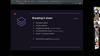
So
the
first
item
on
there
was
persistent
sidebar,
and
so
the
notion
here
is
that
you
know
if
we're
going
to
be
moving
towards
a
navigation
where
we're
consolidating
everything
into
a
left
sidebar.
That
means
that
we're
going
to
need
to
make
sure
that
sidebar
is
almost
always
there
or
for
very
you
know,
specific
instances.
Maybe
it's
not.
You
know
like
the
the
sign
in
page
we
wouldn't
require
it,
for
example,
so
there's
a
lot
of
pages
today
in
gitlab
that
currently
don't
have
a
sidebar.
A
A
A
A
Currently,
it's
only
when
a
specific
scope
has
a
filter,
such
as
the
status
and
confidentiality
for
issues.
However,
we
currently
have
an
MR
that
I
think
was
just
recently
merged
around
making
these
items
actually
left
navigation
items
instead,
and
so
there
would
actually
be
this
left
rail
on
every
single
scope
here.
A
Another
instance
that
I'll
point
out
that
we
don't
really
have
a
sidebar
today
would
be
like
user
pages.
So
today
we
have
essentially
a
variety
of
tabs
underneath
the
contributions
graph
today,
which
a
user
can
essentially
navigate
through,
and
those
made
a
lot
of
sense
to
just
be
navigation
items
moving
in
this
direction,
and
so
the
user
could
simply,
you
know,
change
those
views
based
off
of
having
these
navigation
items
over
here.
A
In
the
left
hand,
side
other
areas
that
I'll
mention
is
things
like
help
where
we
don't
currently
have
a
sidebar,
that
we
have
a
lot
of
other
pages
that
are
associated
to
help
and
within
that
same
section.
It
also
made
sense
to
just
include
those
here
within
that
area,
but
there's
still
pages
that
you
know
perhaps
haven't
been
defined
yet
and
how
we're
going
to
handle
this
or
things
that
we
currently
haven't
simply
gotten
to
yet
in
terms
of
the
design
for
how
we're
going
to
handle
needing
a
sidebar.
A
A
A
Switcher
in
the
past,
in
some
of
the
previous
designs,
such
as
in
the
research,
how
we've
deviated
a
bit
from
that
with
the
more
recent
designs
and
that's
why
it's
being
considered
to
actually
add
the
search
functionality
back
into
this
context,
switcher
just
because,
if
you're
in
you
know,
if
you're
opening
up
this
switcher
to
find
a
recent
project
or
group-
and
you
don't
see
it
it's
easier
to
just
be
able
to
search
from
that
moment
rather
than
going
and
opening
the
search
and
doing
it.
That
way.
A
Let's
see
what
else
in
the
context
was
sure
okay,
so
this
does
provide
one.
You
know
additional
change
here,
since
this
is
no
longer
a
navigational
item
that
could
take
you
to
your
overview
page
we're
essentially
having
to
make
that
a
new
item
here
within
the
left
sidebar.
So
the
project
overview
here
link
will
take
you
to
that
page
that
we're
now
no
longer
able
to
get
to
by
clicking
on
this
element
all
right.
A
The
next
item
on
here
that
I'll
go
over
is
the
navigational
groupings.
So
you
know,
as
seen
below
here
and
I
mentioned
earlier
in
the
process,
we
were
working
to
consolidate
some
of
our
current
navigation
into
some
logical
groupings
that
we
could
use
for
users,
and
really
the
notion
of
this
is
to
just
help
simplify
the
experience,
but
also
we're
still
trying
to
leverage
a
lot
of
the
existing.
You
know
sub
menus
that
we
have
today
that
users
are
familiar
with.
A
Another
thing
this
does
resolve
is
within
like
the
current
navigation.
If
I
were
to
go
to
a
project,
we
currently
have
a
mix
of
groupings
as
well
as
nav
items
within
this
listing
today,
such
as
merge
request
is
actually
just
one
navigation
item
versus
you
know:
CI
CD,
you
have
multiple
items
underneath
here
and
clicking
just
goes
to
the
first
item.
A
It's
a
bit
more
apparent
here
in
the
collapse
day.
As
you
know,
we've
even
had
issues
come
up
where
a
user
will
think
that
this
tool
tip
is
actually
similar
to
these
drop
down
elements
where
they
can
actually
go
and
click
on
that
item,
where
it's
actually
just
a
tool
tip.
So,
as
seen
here,
there's
like
an
intermingle
of
groupings
as
well
as
nav
items,
whereas
in
this
new
design,
we'd
essentially
be
having
all
the
groupings
in
one
area
and
then
the
nav
items
that
are,
you
know
more
singular
Pages
up
above.
A
You
can
actually
favorite
them
or
pin
them
naming
this
kind
of
up
in
the
air
right
now
in
terms
of
what
we
call
that,
but
then
they
would
show
up
here
within
your
favorite
section
and
then
you
could
reorder
those
you
know
based
on
your
preference.
So
this
provides
a
bit
more
of
a
personalized
experience
without
having
to
fully
make
our
you
know,
left
navigation.
A
So
you
know
our
first
iteration
of
this
might
just
be
taking
the
current.
You
know
search
that
we
have
today
and
putting
it
within
this
modal,
but
then
in
the
future
this
can
start
to
actually
act
more
like
a
command
palette.
Where
you
can
do
things
like
navigate,
you
can
perform
some
actions
or
commands
as
well
as
you
can
just
search
from
this
experience
as
well.
All
in
one
place.
A
A
A
I
don't
even
have
time
to
go
through
the
rollout
plan
for
this.
There
is
an
issue
link
that
you
can
view
regarding
this,
but
yeah
otherwise,
I'm
definitely
open
to
I
can
create
essentially
another
video
in
Loom
that
I
can
go
over
some
of
this
as
well,
which
might
be
helpful
and
I
can
share
that
out
as
well
and
yeah.
That
was,
it
I'm
sure
you
all
have
a
variety
of
different
questions
regarding
this
feel
free
to
direct
all
those
to
Tori.
A
Her
slack
handle
is
no
I'm.
Just
kidding
feel
free
to
reach
out
to
me,
in
slack
or
in
the
nav
and
settings
Channel
happy
to
also
have
copy
chats
with
anyone
who
would
like
to
do
that,
but
yeah
happy
to
go
over
this
in
more
detail
as
well
as
like
I
said,
I
can
provide
another
loom
video
with
some
more
details
on
some
of
this
as
well.