►
From YouTube: UX Showcase: Update a Component in GitLab UI
Description
No description was provided for this meeting.
If this is YOUR meeting, an easy way to fix this is to add a description to your video, wherever mtngs.io found it (probably YouTube).
A
So
we
talked
about
it
during
the
discussion.
You
know
during
the
discussion
phase,
checked
and
updated.
You
should
guidelines
and
pyjamas,
then
updated
in
figma
and
then
took
it
through
to
get
lab.
Ui
and
I
learned
a
lot
more
about
our
components,
especially
toggles,
so
much
that
Jeremy
even
designed
me.
A
So
what
the
showcase
is
going
to
cover
is
how
learning
get
lab
UI
can
help.
You
become
a
more
effective
designer
working
with
your
counterparts.
My
experience,
updating
the
gait
lab
toggle
reading
the
view
component
Docs
just
some
basic
overview.
So
if
you
come
across,
these
I
think
it'll
make
you
more
effective
in
being
able
to
read
these
and
things
I
learned
along
the
way
that
might
help
you.
A
So
how
can
help
you
become
a
better
designer
is
for
better
collaboration
when
working
with
your
counterparts,
you'll
speak
the
same
language
and
knowing
how
they're,
built
and
use
can
create
better
collaboration,
and
it
can
also
prevent
some.
You
know
some
examples
of
toggle
that
I
came
across
on
get
lab.
Comm
we're
actually
not
conforming
to
our
usage
guidelines,
so
just
better
collaboration
speaking
the
same
language
being
able
to
recommend-
and
you
know-
show
some
of
these
components
during
your
design
proposals
it'll
make
things
a
lot
of
snow.
A
Therefore,
that
it'll
also
help
you
become
a
component
advocate.
So
as
we
design,
we
not
only
know
the
components
that
we
need,
but
also
what
they
can
do
in
the
limitations
that
they
have.
So
again.
This
sort
of
goes
to
the
collaboration
aspect
as
well,
but
it
helps
you
think
component
first
and
become
a
component
advocate
a
jamuns
advocate
and
then
end-to-end
knowledge.
A
A
Thank,
You,
Jeremy,
Torre
and
Pedro,
for
talking
about
what
seemed
to
be
a
simple
task
was
not
because
there's
a
lot
of
things
happening
around
usage
and
things
I
need
to
be
updated,
so
that
discussion
was
fantastic
to
go
through
and
then
you
know
once
we
it
was
kind
of
during
it
wasn't
necessarily
in
order.
It
was
somewhat
in
conjunction
with
one
another,
so
you
know,
during
and
after
discussion,
to
take
a
look
at
the
usage
guidelines
and
to
update
if
needed.
A
There
was
some
updating
that
needed
to
happen,
particularly
with
the
positioning
of
the
label
for
the
toggle,
and
you
know
a
large
discussion
around
whether
we
put
toggles
in
forms
that
have
a
submit
button
or
if
they
don't,
even
though
our
current
usage
guidelines
say
to
not
have
a
submit
or
sort
of
a
final
submit,
like
in
a
forum
so
to
update
the
pyjamas
documentation.
Is
there
and
then
update
in
figma?
There
was
only
an
individual
toggle
but
help
text
needed
to
be
added,
as
well
as
the
way
so
went
through
that
process
as
well.
A
The
discussion
who
you're
on
board
of
the
discussions
everyone
is
on
board
and
the
figma
update.
This
is
when
I
went
in
to
get
lab,
UI
and
update
this
as
well.
So
our
current,
the
way
we
have
it
set
up
is
we
have
these
stories
and
you'll
see
this
in
the
view
component
Docs,
when
you
look
at
a
component,
these
are
not
set
up
in
a
way
these
don't
conform
to
what
we
had
determined
before
in
all
of
those
other
areas,
and
so
that
was
so
I
updated
it
yeah
and
then
it
was
awesome.
A
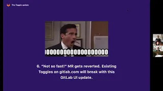
Mrr
was
reviewed,
it
was
merged,
I
thought
everything
was
going
smoothly
and
then
process
was
like
no
no
hold
on
not
so
fast
and
the
EM
are
actually
got
reverted,
so
that
was
really
frustrating,
but
it
was
a
big
learning
experience
that
I
laid
a
lot
from
this
specifically
here.
The
reason
why
it
was
reverted
was
there's
a
check
to
see
if
the
existing
gitlab
toggles
on
get
lab
comm
will
break
with
the
merge
request
that
was
emerged.
A
So
luckily,
we
have
amazing
engineers
who
put
this
check
in
place
so
that,
if
changes
happen
and
they
come
over
to
Ghaleb
comm,
it
will
actually
fail
the
update
because
of
breaking
changes.
It
detects
things
breaking
changes
and
there
were
some
really
cool
features
and
in
so
there's
a
cool
feature
alert
and
it's
the
integration
test
MRR.
So
basically
what
this
does?
A
Not
only
do
we
have
that
that
failing
test,
if
something
does
break
with
your
get
lab
UI
update,
we
have
a
manual
job
in
get
lab
UI,
so
you
can
create
a
branch
on
get
lab
to
review
and
you're
GDK
to
actually
go
and
update
those
toggles.
So
you
don't
have
that
failing
check
afterwards,
so
you
update,
get
lab
UI
and
you
create
an
integration
merger
quest
on
get
lab.
You
can
update
all
the
toggles
to
make
sure
that
everything
is
in
line
and
nothing's
gonna
break.
A
So
if
you
do
go
through
this
process,
I
thought
I
would
pass
this
along
because
I
think
it's
a
really
cool
feature
for
integration,
testing
and
here's
just
one
example
of
a
benefit
for
updating
components
and
sort
of
simplifying
them,
and
so
I
was
a
you
know.
We
were
able
to
save
a
lot
of
code
here
and
simplify
things
to
use
these
the
label
and
in
other
cases
you
can
add
a
help
that
should
be
here,
but
then,
of
course,
it's
failing
pipelines
and
it
gives
us
sort
of
this.
A
You
know
use
it's
so
it
seems
frustrating
because
you
go
through
all
these
and
you
you
know
you
get
something
to
pass
and
then
you're
good
and
then
all
of
a
sudden
there's
another
failing
pipeline.
But
yet
you
have
to
look
at
this
as
a
learning
experience
and
something
that's
going
to
help
you
improve
your
skills
as
a
designer
I,
don't
know
where
my
image
go.
A
Come
on
I'm,
sorry,
my
image:
isn't
here?
Oh
well,
it
was
there
a
second
ago.
Basically
I'll
put
this
in
afterwards.
So
if
people
want
to
check
out
the
slides,
I'll
put
a
link
to
the
figment
dog,
but
there's
a
feature.
Another
cool
feature
and
get
loud
UI
for
gitlab
UI
is
in
storybook
the
place
where
we,
you
know
you
can
go
view
all
the
different
components
and
the
view
component
docks
that
end
up
getting
pulled
in
you
can
check
a
box
that
says
include
get
lab
CSS.
A
So
basically,
what
that
does
is
it
looks
at
your
changes
locally,
but
if
you
check
that
box
it
pulls
in
our
master
get
lab
CSS.
So
you
can
see
if
anything's
going
to
be
overriding
your
changes
and
if
there
are
then
that's
gonna
show
a
failure
in
the
pipeline.
So
this
is
really
useful
when
you're
doing
a
gala
of
UI
update
to
check
this
get
lab
CSS
box
and
see
if
there's
gonna,
be
any
differences
to
prevent
that
sort
of
failure
there
and
then
once
you
do
that.
A
Yes,
we
lo
green
checkmarks
a
lot
better
than
the
red,
so
that
was
sort
of
a
very
small
summation
of
my
experience.
Doing
that
and
there's
oh
there's
a
lot
more
intricacies,
but
you
know
how
only
having
15
minutes
but
I
hope
that
just
sort
of
gives
you
an
overview
of
the
kind
of
things
to
expect
when
up
late,
updating,
gait
lab
UI.
So
this
I
just
wanted
to
just
review
the
view
component
Doc's
properties
for
a
component,
so
just
for
people
that
might
not
know
or
are
a
hundred
percent
sure.
A
So,
basically,
if
you're
looking
at
the
view
component
Doc's
our
view
Doc's
for
the
component,
you'll
see
these
properties
here
and
so,
for
instance,
for
toggle.
We
have
a
label
and
help
text
and,
as
you
can
see
here
in
the
code
itself,
we
have
these
attributes
label
and
help,
and
these
are
what
show
in
the
docks
and
then
it
tells
you
what
it
takes
is
also.
This
is
a
string.
A
And
this
is
what
that
code
actually
looks
like
just
the
actual
like
source
of
the
toggle.
So,
as
you
can
see,
a
label
lives
here
and
it
takes
a
label
string
and
then
help
take
the
help
string.
So
this
is
a
short
sort
of
show
in
relation
with
the
last
slide
as
well,
so
things
I
learned
that
I
wanted
to
pass
along
is
while
it
does
require
little
coding
knowledge,
it's
not
impossible.
A
If
you
are
looking
for
a
new
challenge
and
looking
to
contribute
to
get
lab
UI,
there
is
a
link
at
the
bottom
of
this
actually
and
Thank
You
Tory.
For
giving
me
this
link
yesterday
was
there's
some
one
weighted
issue
so
with
the
weight
of
one
that,
if
you
want
to
tackle
something
simple,
forget
lab
UI,
there's
the
link
there
that
you
can
go
and
see
these
issues
and
new
challenge.
We
always
like
try
and
you
know-
add
new
challenges
to
our
day-to-day
and
make
things
interesting.
A
If
things
are
getting,
you
know
monotonous
and
in
your
realm
of
gear,
lab
or
whatever,
but
to
is
don't
be
discouraged.
So
I
failed
like
a
bunch
of
times,
as
you
can
see
the
red
you
know
so
on
pipelines
can
be
discouraging,
but
just
take
the
opportunity
as
a
learning
opportunity
and
I
wasn't
sure.
Really
what
get
lab
you
I
was
until
I
actually
really
got
into
it,
and
it's
essentially
an
NPM
package
that
we
deploy
and
then
we
pull
in
to
get
labs.
A
So
if
you've
ever
created
your
own
site
or
app,
it
would
be
the
same
as
if
you
were
to
NPM
install
whatever.
So
you
can
actually
npm
install
the
gate.
Why?
If
you
wanted
to
use
a
three
road
project
so
that,
hopefully,
that
makes
you
a
little
bit
more
familiar
as
to
what
gay
lab
UI
is.
If
you
haven't
really
dug
into
it
very
much
and
the
integration
testing
manual
job,
it's
going
to
become
more
common
as
we
get
closer
to
complete
component
adoption.
A
So
I
thought
I
would
point
that
out
it's
something
to
keep
in
mind
as
we
go
along
and
collaboration
is
key,
don't
be
afraid
to
you,
know,
ask
for
help
or
you
don't
know
something
and
that's
okay,
you'll
learn
more
by
trying
and
failing
it's
it's
fun.
It
can
be
discouraging
at
times,
but
once
you
get
it
to
pass
it's
twice
as
encouraging
as
it
was
discouraging
so
yeah
it
actually
gets
twice
as
good
and
I
suggest
everyone
go
through
this
process.
Understanding
how
we
build
components
from
our
designs
is
really
insightful
and
I.