►
From YouTube: Secure UX iteration review: dependency list
Description
UX iteration review on dependency list UI to improve displaying vulnerabilities, usability, readability
00:00 - 02:25 context and problem overview
02:25 - 08:02 iteration proposal review
Issue: https://gitlab.com/gitlab-org/gitlab/-/issues/195928
A
A
It's
gotten
a
bit
cluttered
and
to
some
UI
polish,
so
just
do
an
overview
of
a
few
of
the
pain
points
that
we
see
here.
This
image
is
here:
I'm
not
going
to
show
the
vulnerable
vulnerable
component
on
that,
just
to
not
show
the
vulnerability
zone
for
security
reason
for
a
video,
but
at
first
glance,
when
you
land
here
you
see
the
status
column
which
is
very
redundant
and
it's
for
most
of
the
table.
Rows
like
a
majority
of
them.
A
When
a
minority
of
them
have
vulnerabilities
detective,
which
would
be
under
this
tab
right
here,
vulnerable
component,
so
at
first
glance,
the
problem
is:
is
that
the
most
important
thing
that
we
want
to
surface
on
the
page
for
the
dependencies
is
the
phone
are
ones
that
have
detective
vulnerabilities
and
those
are
being
hidden
behind
into
a
tab,
and
on
that
actual
page
behind
a
collapse,
the
status
is
confusing.
It's
hard
to
understand
what
exactly
this
means.
Is
it
accurate
it's
also
redundant.
A
It
takes
up
a
lot
of
space
so
and,
as
we
see
her
as
we
added
different
things,
the
spacing
has
kind
of
made
the
table
a
little.
Some
strange,
spacing
and
and
a
bit
cluttered
and
then
also
when
you
do
have
a
de
poner
ability,
you're
unable
to
click
it.
So
these
are
some
of
the
problems
that
we
wanted
to
set
out
and
help
with
this
issue,
and
now,
let's
just
jump
over
to
the
proposal.
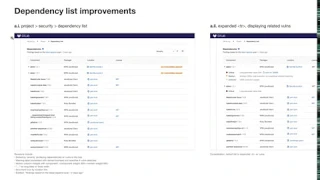
A
Okay,
in
a
separate
video
and
a
separate
issue
on
our
license
list
that
shows
licenses
in
a
very
similar
way.
We
use
the
status
badge
to
show
when
it's
out
of
compliance.
So
for
consistency,
we're
proposing
that
we
use
the
same
status
badge
except
it's
not
about
compliant.
It's
in
this
case
showing
three
vulnerabilities
have
been
detected.
Some
other
changes
to
the
pages.
You'll
notice
that
status
column
is
no
longer
being
shown
so
that
were
redundant
safe,
is
not
there
and
it's
sorted
by
default
by
severity.
A
So
we've
surfaced
the
ones
with
severity
right
to
the
top,
instead
of
hiding
it
behind
a
tap,
so
those
are
front
and
center
to
the
user
when
they
land
here.
The
other
thing
is:
we've
tightened
up
the
table
a
bit,
so
it's
a
bit
more
readable
using
a
higher
font
weight
on
the
component
name
and
adding
an
icon
for
the
location
just
to
signify
that
that's
the
file
name
and
as
we
see
here
in
some
cases,
licenses
can
be
displayed.
This
is
a
cross-match
from
our
license
scanners.
A
Well,
that's
why
some
of
them
are
empty
for
longer
names.
We
can
use
an
ellipsis
at
the
beginning
and
then
the
other
thing
is
is
the
version
column
removed
and
we
merged
it
with
the
component
column,
and
so
they
that
help
these
changes
helped
tighten
up
the
view
a
bit
and
yeah.
So
that
would
be
the
immediate
view
when
you
land
here
just
want
to
show
this
view
is
when
the
actual
table
rows
with
vulnerabilities
is
expanded,
as
we
can
see
here.
A
These
are
listing
the
criticality
of
the
three
vulnerable
three
vulnerabilities
detected
with
this
particular
component,
and
this
is
the
actual
vulnerability
named
one
side
note
here,
is
that
we
see
a
link
here
for
auto
fix.
That's
for
an
upcoming
suggested
solution
feature
when
there
are
solutions
available
and
automatic,
merge
request
with
the
solutions
have
been
made
available.
It'll
also
be
surfaced
on
this
page.
If
the
user
were
to
click
this,
it
would
take
them
to
the
merge
request
with
the
fixes
available.
A
The
other
problem
that
was
noted
earlier
is
these
actual
vulnerabilities
are
not
clickable
on
this
page.
They
are
clickable
on
the
vulnerability
list
and
on
the
security
dashboard,
whether
at
the
group
or
project
level,
and
that
gives
them
more
information
about
what
the
vulnerability
is
and
in
soon
in
the
next
milestone
release.
It
would
go
to
the
object
page,
which
we'll
take
a
look
at,
but
the
other
thing
I
want
to
mention
about
this
page
as
a
consideration
for
this
proposal.
A
It
is
not
hiding
the
vulnerabilities
behind
this
drop-down
table
row
and
just
displaying
then
oh
excuse
me
defaulting
the
table
rows
to
expanded
view
by
default.
This
way,
there's
no
additional
click
needed
and
the
vulnerabilities
are
front
and
center
and
surface
to
the
top
okay.
So
the
other
aspect
that
I
touched
on
just
now
was
the
actual.
A
Vulnerability
being
displayed
to
be
clickable,
so
the
user
can
learn
more
about
it.
So,
let's
take
a
look
at
that
flow.
In
this
case
it
is
clickable
and
they
click
it
and
then
then,
and
that
would
bring
them
to
the
object
page.
So
this
would
be
consistent
with
our
upcoming
flow
that
we'll
see
in
the
vulnerability
list
of
the
project
level
and
the
group
dashboard
where
the
user
would
click
the
table
row
for
ability
and
then
come
to
the
project
or
excuse
me
the
vulnerability
object
page
from
here.
A
The
advantage
of
this
is
that
you
don't
have
to
leave
the
page
and
that
you
could
go
from
vulnerability
to
vulnerability
and
you
could
still
have
the
additional
information
here,
whereas
in
this
flow,
if
you
come
to
this
object
page
and
then
you
go
back
and
then
you
want
to
go
to
this
one,
you
go
back
and
forth
back
and
forth.
That's
the
same
problem
we'll
see
in
the
vulnerability
list,
so
just
wanted
to
surface
this
as
a
future
consideration
to
improve
that
flow.