►
Description
No description was provided for this meeting.
If this is YOUR meeting, an easy way to fix this is to add a description to your video, wherever mtngs.io found it (probably YouTube).
A
All
right,
folks,
I'll
start
by
sharing
my
screen
just
a
moment,
someone
yell
in
case
my
screen-
doesn't
show
up
all
right
thanks
for
being
here.
My
name
is
daniel
fosco,
I'm
the
senior
product
designer
on
the
release
group,
and
today
I'm
going
to
share
a
little
bit
about
our
ongoing
design
process
for
environments.
A
More
specifically,
the
environments
page
before
we
start
a
quick
definition
on
environments
for
those
who
are
not
so
familiar
with
it.
According
to
our
docs
environments,
describe
where
code
is
deployed
right,
if
we
simplify
a
little
bit
with
a
graphic
environments,
are
more
or
less
the
buckets
that
represent
where
your
code
is
going
when
it
goes
in
production,
not
necessarily
production,
because
you
can
also
have
environments
for
staging
for
q.
A
review.
A
Apps
are
also
environments,
so
essentially,
environments
are
the
abstractions
that
represent
the
different
versions
of
your
app
your
application
after
the
code
is
tested
and
is
released
under
the
hood.
Of
course.
The
reality
is
much
more
complicated
than
that,
but
it's
interesting
to
pay
attention
here
to
the
relationship
between
an
environment
and
a
deployment.
These
are
two
very
related
concepts,
in
the
sense
that
the
deployment
is
the
action
that
takes
the
code
into
the
environment
and
that's
also
represented
in
our
ui
today.
A
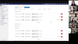
So
this
is
the
environments
page
for
the
gitlab
runner
project.
It
has
a
lot
going
on
over
time.
This
page
actually
accumulated
a
lot
of
bugs
different
ux
issues,
so
we,
as
a
team
in
the
release
group,
decided
to
start
tackling
it,
and
one
of
the
first
issues
that
we
recently
worked
on
was
to
add
the
environment.
To
your
information
on
the
page
environment.
A
Here
is
a
feature
that
we
already
have
on
our
gitlab.yaml
file
and
it's
essentially
a
type
for
your
environment
or
your
environment,
so
you
can
have
an
environment
that
has
any
name
but
has
a
type
production.
So
your
system
knows
it
is
a
production
environment
and
since
the
page
has
a
table
well,
the
first
obvious
solution
was
was
just
to
add
a
column
with
the
environment
here,
but
we
immediately
ran
into
this
problem
right.
A
We
could
try
to
squeeze
the
the
columns
on
the
table
a
little
bit
more,
but
we
can
see
it's
already
clipping
here,
so
we
went
for
the
second
best
choice
that
was
adding
it
as
a
badge
underneath
the
title
which,
for
the
purpose
of
visibility
for
the
user,
it
works.
We
can
say
environment
here
here
on
the
top,
then
you
have
the
environment
and
the
tier.
A
A
This
is
what
you
would
see
right,
so
so
it
was.
It
was
broken
by
default,
so
we
fixed
that
and
it
looks
much
better,
but
it
was
another
symptom
of
of
all
the
many
little
things
that
were
broken
on
the
page.
Next
up
this
issue
about
the
stop
button,
which
didn't
really
give
the
users
a
lot
of
context,
it
was
just
a
red
square
that
was
kind
of
scary.
They
didn't
tell
you
what
it
was
so
again,
our
yeah
our
proposal
was
just
let's
add
some
copy
to
it.
A
So
after
these
these
issues
and
many
others,
we
we
collectively
decided.
Okay,
you
know,
let's,
let's
take
a
step
back
and
rethink
this
whole
page
and
by
when
I
say
page,
it's
mostly
the
table
because
it's
the
core
of
what
the
page
is,
because
we
can
see
in
many
examples
that
it's
just
not
holding
the
weight
of
the
content.
A
That's
in
it
anymore,
and
with
that
in
mind,
I
started
to
you
know:
break
down
the
pieces
of
information
on
the
page.
Almost
like
a
kid.
That's
like
getting
a
huge
lego
set
and
just
breaking
it
down
in
smaller
pieces
and
started
drafting
some
some
proposals
on
which
direction
to
go,
but
it
was
at
this
point
that
hayana
threw
me
a
curveball,
saying:
okay,
we
as
a
team,
we
know
the
page
should
go
elsewhere.
A
A
So
with
that
in
mind,
we
created
a
survey
that
is
linked
directly
within
the
page.
So
if
you
see
go
to
the
environments
page
today
on
any
project,
you
will
see
this
running,
so
any
user
can
take
the
survey
that
is
ongoing
and
we
already
have
really
good
information
here
with
users
saying
telling
us
directly
why
they
are
visiting
the
page,
what
information
they
are
looking
for
when
they
first
land
on
the
page,
which
elements
are
more
important
to
them.
A
This
survey
is
still
ongoing,
so
our
plan
is
to
sorry
just
a
minute.
There's
a
chat
here.
Let
me
see
if
there's
something
broken,
no
fine,
so
yeah.
Our
idea
is
to
close
this
in
maybe
one
or
two
weeks
time
wrap
it
up
understand
what
are
the
main
main
clusters
of
feedback
and
then
use
that
to
direct
the
page
to
where
it
needs
to
go,
and
what
I'd
like
to
leave
you
all
with
today.
Not
this!
Oh,
no,
my
my
last
slide
is
gone,
but
yeah
essentially
is.
A
In
the
past,
when
you
have
worked
with
large
design
or
redesign
efforts
that
were
blocking
the
way
you
iterated
right,
they
were,
it
was
challenges
that
were
hard
to
iterate
away
from
what
was
your
your
methodology
and
what
was
your
process
if
we
still
have
some
time?
If
anyone
wants
to
comment
on
this
feel
free
to
do
so,
otherwise
we
can
do
in
the
doc
I
think
later.