►
From YouTube: UX changes on project/group variables
Description
No description was provided for this meeting.
If this is YOUR meeting, an easy way to fix this is to add a description to your video, wherever mtngs.io found it (probably YouTube).
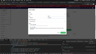
A
Okay,
tattoo
on
the
project
group
variables
refactor,
to
view
some
changes
made,
we
remove
the
variable
type
column
to
provide
some
more
space
and
also
on
the
protected
and
mask
columns.
We
have
a
set
width
of
a
hundred
and
all
following
columns,
have
a
set
width
of
180
pixels
to
provide
a
little
bit
more
space
for
those
columns.
A
Any
values
that
expand
the
width
of
the
column
are
truncated
and
provided
with
the
full
value
and
a
copy
button
to
copy
the
value
to
the
keyboard,
same
width
value
it
doesn't
show
with
asterisks,
but
once
you
reveal
the
value
it
will
show
the
value
one
concern
I
have
with.
This
is
I'm
right
now,
I'm
setting
the
popover
on
the
span.
We
could
set
it
up
on
this
wrapper
div,
but
what
I
found
is
since
it
covers,
or
the
TD
since
it
covers
more
space.
A
The
popovers
aren't
like
as
smooth
as
this
they're
a
little
bit
too
close
together
so
like
they
over
wrap,
but
the
popover
will
be
centered
over
the
entire
value.
By
default.
We
can
set
an
offset
on
that
to
maybe
like
put
all
the
way
to
the
Lev,
but
I.
Don't
know
how
how
accurate
and
reliable
that
will
be.
So
that
is
one
concern.
I
have
with
that
also
masked
checkbox.
There
were
some
UX
issues
on
that,
so
it's
bold
as
recommended
by
Dimitri,
and
then
once
you
hit
the
regex
requirements,
you
then
can
mask
it.