►
From YouTube: UX Showcase - Environment page: when redesigns get big, and how (not) to deal with them
Description
No description was provided for this meeting.
If this is YOUR meeting, an easy way to fix this is to add a description to your video, wherever mtngs.io found it (probably YouTube).
A
A
I
definitely
wanted,
which
I
knew
when
I
started
so
to
set
some
context
here,
I'm
presenting
the
ongoing
epic
to
redesign
the
environments
page,
which
is
a
bigger
design
that
got
bigger
than
we
expected
and
how
we
are
still
dealing
with
it
to
set
some
context
and
by
the
way,
this
whole
presentation
is
just
on
tabs
on
my
browser
and
that's
the
biggest
presentation.
I've
done
like
this,
so
bear
with
me
things
get
kind
of
wild
here
so
yeah.
This
is
the
environment
stage.
For
those
who
don't
know
it
very
well.
A
An
environment
on
gitlab
is
essentially
a
representation
of
where
the
customer's
code
is
deployed.
Right
so
usually
we'll
have
one
or
more
production
environments
that
are
living
either
on
aws
on
google
cloud
or
any
other
infrastructure
that
you
have,
and
you
might
also
have
secondary
environments
like
staging
that
qa.
A
So
in
the
case
of
gitlab,
staging.gitlab.com
is
one
of
our
environments
for
gitlab,
and
so
our
every
review,
app
is
one
environment,
and
the
problem
we
set
out
to
solve
here
was
this
right.
This
is
what
the
page
actually
looks
like
for
for
a
live
project.
This
is
for
the
gitlab
runner
project
and
you
see
there's
a
lot
of
visual
artifacts
here
and
a
lot
of
crunching
of
information
on
this
table,
which
is
quite
complex
by
itself.
A
Since
it's
multi-layered
with
this
folder
structure
and
inside
the
folder
structure,
you
have
the
actual
environments
that
have
much
more
information
inside.
This
is
a
known
problem,
known
issue
by
the
team
and
it's
hard
to
solve,
because
the
table
is
already
fully
maxed
out
in
some
scenarios.
All
of
these
columns
are
filled
up
with
information
and,
as
we
add
new
features
and
develop
more
capabilities
in
the
release
group.
A
A
The
issue
did
have
jobs
to
be
done:
well-defined
and
the
personas
they're
acting
on
it,
and
then
some
some
actual
examples
of
what's
going
on
here,
and
I
also
important
to
note
one
of
the
reasons
why
we
decided
this
was
going
to
be
a
redesign
and
not
let's
iterate
away
from
it
was
also
because
the
page
was
very
overdue
for
a
technical
refactor.
It
was
really
hard
to
work
on
specific
pieces
of
the
page
without
redoing
the
whole
thing.
So
since
we
were
already
scheduled
to
redo
the
page,
we
decided.
A
Okay,
let's
rethink
how
the
design
should
work
in
order
for
us
to
do
technical
refactor
and
as
we
were
describing
the
problem.
We
realized
that
okay,
we
know
what
the
problem
is
from
the
design
and
visual
perspective,
but
we
don't
know
exactly
how
this
is
affecting
our
users
right.
We
don't
know
in
detail,
even
though
we
have
lots
of
past
research
on
environments
and
releases
for
the
environments.
Page
specifically,
we
didn't
know
why
users
were
going
to
this
page.
A
What
was
bothering
them
on
this
on
this
page,
as
it
was
right
now
and
what
was
breaking
for
them
like
we
knew
we
knew
this.
We
know
this
is
broken
right
and
sure,
specifically
this
and
this
can
be
fixed,
but
on
a
broader
scale
like
what
is
not
working
on
the
page
for
them.
With
that
in
mind,
we
decided
to
go
for
problem
validation
with
a
survey
and
trying
to
be
as
as
simple
as
possible
and
and
asking
users
what
brings
them
to
the
page.
A
What
information
is
the
most
important
for
them
when
they
land
on
page
and
what
actions
are
most
important
for
them?
When
does
that
on
the
page,
and
then
around
that
we
have
other
stuff
like
what
is
your
role
in
your
organization?
What
is
the
size
of
your
organization
to
try
to
slice
the
data
a
little
bit
better
out
of
the
survey?
A
We
got
these
aggregated
insights.
That
told
us
a
lot
of
things
that
we
already
knew.
So
you
know,
just
over
half
of
the
users
were
satisfied
with
environments.
Today,
the
top
actions
and
elements
they
were
using
the
top
tasks
they
were
dealing
with
when
they
got
to
the
page,
so
environments
and
deployments,
which
kind
of
make
sense
and
we
knew
about.
But
the
most
useful
thing
was
where
the
detailed
themes
that
we
got
out
of
this.
So
this
was
me
and
will
the
researcher
for
ops.
A
He
helped
me
run
this
research
as
well
as,
and
that
gave
a
lot
of
feedback,
but
essentially
we
took
the
verbatims
from
the
from
the
responses
and
then
aggregated
them
into
these
teams.
So
I
want
to
learn
how
to
set
up
environments.
I
want
to
see
which
commits
are
deployed.
I
want
to
check
the
status
of
my
environments,
and
that
became
the
guiding
direction
for
this
redesign
issue.
These
three
specifically
because
in
context
they
were
what
was
more
important
and
then
one
small
side
note.
A
This
survey
was
in
qualtrics,
but
it
was
actually
added
as
an
alert
on
the
page,
which
in
theory
sounds
extremely
simple,
but
it
was
more
complicated
than
we
wanted
to,
since
there
needed
to
be
a
cookie
to
make
sure
that
the
alert
was
dismissed
for
good
for
every
user
and
even
then
we
had
customers
complaining.
They
found
the
issue
and
they
complained.
Hey
we
don't
want
this.
Can
you
remove
this
for
good?
Okay?
Let's,
let's
think
about
that
for
next
time,
but
then,
after
two
weeks
we
removed
it
anyway.
So
that
was
fine.
A
So
wrapping
that
up
with
the
results
from
the
survey
we
went
into
redesigning
proper
and
then
just
trying
different
variations
as
many
as
we
could.
So
let
me
navigate
on
figma
here
on
the
mock-ups
we
started.
I
started
from
the
core
off
of
the
design,
which
was
the
deployment
itself,
and
this
was
heavily
inspired
by
vitica
in
pipeline
execution,
where
she
also
got
one
of
their
tables
and
compressed
different
columns
and
one
semantic
block
how
we're
calling
it.
A
So
I
started
playing
around
with
the
semantic
clock
understanding
that
this
little
cell
is
the
deployment
and
then
there
will
be
layers
around
it
so
playing
with
this
and
then
eventually
adding
more
information
and
then
adding
some
interactions
to
either
show
more
information
and
hide
some
of
the
information
we
got.
Two
oh
see,
I'm
already
a
little
bit
lost.
I'm
sorry
all
right.
A
We
got
to
a
place
like
this
and,
as
we
got
more
feedback
and
we
find
it-
and
it
was
a
lot
of
feedback
at
some
point-
we
decided
okay,
but
everything
set
up,
and
this
was
the
the
point
we
got
even
though
we
were
happy
and
and
and
confident
with
this
direction.
It
was
such
a
big
departure
from
the
original
page
that
we
definitely
needed
to
validate
customers.
So
that's
what
we
did.
A
We
came
up
with
this
little
prototype
and
you
can
see
here
that,
even
though
it
is
complex
because
you
have
the
folder
structure
and
inside
of
the
structure,
you
have
the
deployment,
the
environments
and
for
each
environment,
you
have
the
deployments
that
can
also
expand.
It's
a
more
streamlined
interface
that
drills
down
instead
of
having
to
parse
horizontally
the
table
with
all
the
information
collapsing
on
each
other.
We
validated
this
on
user
testing.
I
already
had
a
screener
for
devops
operators
that
worked
well
here
and
it
was
pretty
successful.
A
The
users
were
successfully
navigating
the
interface
and
again
we
try
to
be
as
streamlined
as
possible
and
ask
very
direct
questions
that
could
be
could
be
turned
into
a
yes
or
no
answer
so
find
and
navigate
the
environment
production.
Can
the
user
find
that,
yes
or
no,
so
that
was
a
data
point?
What
is
the
status
of
the
environment
production?
Can
they
guess
what
is
the
status
of
the
environment
or
not?
A
If
you
want
to
see
a
complete
list
of
the
previous
deployments,
where
would
you
click
right?
So
all
of
these
were
turned
into
each
one
of
these
data
points
where
you
know
most
users
were
successful
in
doing
this,
so
that
was
a
yes.
Otherwise,
there
was
no,
and
some
of
them
had
some
additional
comments.
So,
with
this
feedback,
we
iterated
some
of
the
small
details
in
the
face
and
here's
here's
was,
here's
was
a
catch.
A
That
was
a
big
learning,
for
me
was
that
jeremy
from
foundations
came
to
the
thread
and
left
a
bunch
of
suggestions
and
feedbacks,
and
it
was
such
a
transformative
feedback
for
the
for
the
design
that
even
at
that
point,
when
we
had
already
validated
like
it,
was
worth
it
exploring
another
avenue
and
see
if
it
was
worth
it.
So
that's
what
I
did
and
at
that
point
we
iterated
into
this
design,
which
in
some
ways
actually
looks
more
closely
to
the
original
folders.
A
But
when
you
navigate
it's
much
more
horizontal,
so
it's
less
boxed.
There
was
a
feedback
he
left
like.
There
are
too
many
boxes
within
boxes,
so
it's
part
of
our
unboxing
effort
for
gitlab,
and
it
is
also
heavily
inspired
by
the
merge
request,
widget
and
all
the
explorations
that
went
into
that.
So
that
was
really
helpful
to
drive
this,
even
though
the
original
design
was
already
validated.
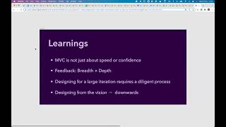
A
A
This
was
roughly
the
work
of
q3
like
us
with
other
things
as
well,
but
this
was
a
big
design
work
of
q3
on
on
release,
and
I
wish
I
had
been
more
mdc
driven,
although
given
the
context,
it
was
a
big
redesign
and
it
was
hard
to
break
down
smaller
parts,
and
I
realized
with
this
process
that
the
mvc
is
not
just
about
delivery
fast
or
delivering
as
much
with
as
much
confidence
as
you
have
as
you
want
to,
but
rather
delivering
large
chunks
is
a
lot
of
work.
So
it's
a
lot
of
comments.
A
So
what
happened
was
I
had
all
of
these
iterations
that
were
overlapping
each
other
on
the
issue
which
was
already
hard
to
manage,
but
then,
when
the
epic
was
created
and
the
implementation
issues
were
created
out
of
it,
all
of
the
designs
were
left
behind.
So
we
were
starting
to
have
comments
on
many
different
places
at
once.
So
this
is
something
I'm
reconsidering.
A
Maybe
you
should
just
use
pigma
for
comments
for
my
next
project,
but
definitely
something
to
keep
in
mind
that
when
it
gets
really
big
either
you
break
it
down
or
you
have
a
very
diligent
process.
And
then
this
last
point
I
think
it.
It
brings
back
to
gina's
and
annabelle's
presentation
right
designed
from
the
research
and
from
the
vision
downwards,
and
I
think
here
in
many
ways
I
designed
from
the
smaller
problem
upwards
and
expanding,
which
is
also
fine.
A
But
it
means
you
learn
a
lot
of
things
on
the
way
and
you
might
waste
some
time
just
course
correcting.
So
I
wish
I
had
taken
more
time
to
build
a
stronger
vision
and
then
break
that
down
and
design
on
the
broken
down
parts
rather
than
just
designing
on
the
big
piece
as
it
grew,
bigger
and
bigger
and
bigger,
and
then
having
all
of
the
works,
coordinate
and
break
that
down.
At
the
very
end.
B
Thank
you,
danielle.
It's
really
awesome,
and
especially
the
part
of
involving
right
to
the
right
party
center
early
and
often-
and
I
don't
see
jeremy
here-
oh
jeremy's
there
and
I
want
to
give
him
a
shout
out.
He
provided
such
a
great
feedback
and
a
sewing
point
throughout
this
process,
and
it
was
really
awesome
to
see
the
collaboration
between
yeah,
the
foundations
and
his
expertise
in
ui
in
the
in
the
feedback
process.
That's
my
comment.
C
D
D
Y'all
voicemail
as
well
I
mean
it
was
really
a
pleasure
to
work
with
daniel
throughout
this
process.
I
kind
of
came
in
at
specific
points
throughout
the
overall
process
that
he
described,
but
he
really
did
a
great
job
kind
of
seeing
the
overall
vision
of
how
the
research
could
go
different
places
to
implement
it,
and
you
know
really
pulling
out
the
the
top
level
insights.
So
thanks
daniel.
E
I
had
a
follow-up
to
christy's
point,
so
I
think
it's
pretty
common
to
run
to
the
situation
where
tables
were
used
as
like
the
most
viable
change
that
was
easy
to
introduce
at
some
point
in
time
in
the
past
in
gitlab.
So
now
we
kind
of
have
all
these
tables
everywhere
that
are
probably
inefficiently
growing
in
size,
and
I
run
just
from
all
time
myself
too
daniel
and
I
have
the
same
challenge
like
take
that
vision
and
like
break
it
down
into
like
implementation
steps
to
get
from
where
we
are
today
to
that
vision.
A
One
one
of
the
outcomes
of
this
work
is
the
an
initiative
I'm
doing
with
vitica
I'll
put
the
link
here
that
points
exactly
to
your
question
right.
How
do
we
deal
with
tables
that
start
ballooning
in
size
and
no
longer
work,
and
then
I
have
to
move
out
of
the
table?
Do
I
try
to
iterate
the
table?
Excuse
me,
cat.
A
So
it's
still
early
stages
for
this
for
this
initiative,
but
we're
trying
to
understand
and
respond
to
this
question
like
how
do
we
help
other
designers
to
go
through
this
process?
Where
what
are
some
small
strategies?
You
can
do
to
iterate
on
your
tables
to
reclaim
space
and
to
get
like
better
usability
or
if
you
do
need
to
leave
a
table.
What
is
a
recipe
for
that,
and
at
this
point
in
documentation,
it's
even
hard
to
decide
what
what
to
use
a
table
a
list,
a
list
of
cards?
E
Yep,
that
makes
sense,
and
now
it
kind
of
reminds
me
of
I'm
forgetting
who
opened
it.
But
someone
opened
an
epic
to
like
revisit
the
card
component
in
pajamas,
so
I
think
maybe
extending
that
documentation
and
then
building
a
base
component
might
actually
help
with
that
conversion
long
term,
but
a
thread
for
a
different
discussion.
Thanks
for
following
up
daniel.
F
I
just
wanted
to
add
a
comment
kind
of
towards
christie's
point
of
designing
downwards,
like
when
I
started
doing
that
a
little
while
ago,
it
felt
like
this,
like
weight,
was
just
lifted
off
my
shoulders
and
there's
so
much
benefit
to
that.
Just
even
outside
of
like
our
you
know,
design
scope
like
it
allows
engineers
to
kind
of
see
where
you're
going
and
be
able
to
anticipate
your
moves.
It
allows
other
groups
and
stages
to
see
where
you're,
appointed
and
kind
of
create
those
opportunities
for
alignments
like
oh,
you
know
this.
F
This
group
is
doing
this
with
environments,
like
we've
heard
chatter
from
our
users
that
they
want
a
little
more,
but
our
stage
can't
support
that
so
seeing
like
vision
and
then
the
iteration
coming
off
of
that
which
is
very
difficult,
but
that
also
can
help
you
with
the
dependencies
so
that
engineers
aren't
backed
into
corners
and
you're
like
oh
well.
We
have
to
redesign
that
again
sorry
about
that,
like
that,
saves
all
of
the
time
and
headache
and
then
allows
for
collaboration
early
and
often
so.
I
love
that
process.
A
Thanks
for
sharing
that
andy
yeah,
it's
it's
it's
interesting
that
you
mentioned
the
weight
of
your
shoulders
because
this
process
has
been.
I
guess
I
mentioned
stressful
for
me,
because
it
started
as
theoretically
as
malting
and
then
like
yeah.
I
can
ship
this
within
this
milestone
right
right
and
then
it
starts
to
get
bigger
and
bigger
and
bigger,
and
then
more
things
hang
on
to
it
and
since
it
was
bigger,
it
required
more
validation
both
from
the
problem
and
solution
side.
A
So
I
felt
like
if
I
had
just
just
framed
this
as
this
is
the
vision
for
where
it
could
be.
We
could
pick
up
small
pieces
along
the
way
and
then
build
towards
that,
rather
than
this
is
the
thing
we're
gonna
build,
and
then
we
already
committed
to
that
big
piece.
So
so
that's
definitely
an
ongoing
learning.
For
me,
thanks
for
sharing.
F
Yeah
and
there's
different
pathways
to
creating
a
vision
right,
it
kind
of
was
like
a
bottoms
up
and
then
turned
into
top
down
like
if
you
don't
know
all
the
pieces
that
you
have
to
create
that
big
picture,
it's
easy
to
kind
of
get
lost
in
the
mvc
after
fvc
after
mvc
versus
taking
the
time
to
say
you
know
all
these
things
are
kind
of
linked
together
and
relate
like
what,
if
we
just
kind
of
designed
the
big
thing
first
and
then
then
we're
working
downwards
so
yeah
the
approach
is
not
incorrect.
It's
just
enlightening.
A
Yeah,
I
think,
to
to
anabel's
point.
I
think
there
was
also
a
piece
of
for
me
that
was
I
wanted
to
do
this.
You
know
it
was
like
my
biggest
design
at
gitlab
so
far,
and
I've
been
here
for
less
than
a
year,
so
I
think
there
was
a
little
bit
of
like
a
selfish
part
of
me
that
I
just
want
to
do
this
page.
It
looks
really
bad.
A
I
want
to
make
it
good
like
I'm
going
to
do
it
sure
there
was
research
and
the
team
context,
and
everyone
was
a
board,
but
the
the
little
designer
he
was
like
yeah,
let's
just
redesign
this
whole
interface,
so
you
know
I.
I
punched
that
thirst
now,
let's
take
a
step
back
and
work
more
on
the
vision
level.