►
From YouTube: Grafana UX Community Call 2020-11-02
Description
No description was provided for this meeting.
If this is YOUR meeting, an easy way to fix this is to add a description to your video, wherever mtngs.io found it (probably YouTube).
B
B
B
History
of
grafana,
so,
basically,
when
in
in
the
beginning
it
was,
it
was
more
like
a
grafana
basically
had
like
a
dark
ui.
There
was
a
light
ui,
but
I
mean
I
think
the
most
used.
One
was
the
dark
one
and
there
was
not
much
effort
put
into
the
light
one
compared
to
the
dark,
but
it
was
done
with
the
launch
draft
graph
on
a
four
which
sort
of
tried
to
bring
up
the
light
team
on
par
with
the
dark
theme.
B
B
Three
or
four
years
ago,
so
yeah
and
yeah,
and
after
that,
basically
the
themes
have
been
like
sort
of
iterated
slightly
improved
for
each
release,
but
it
was
done
with
grafana
6,
who
also
introduced
the
themes
into
the
actual
visualizations.
We
had
had
it
before.
I
think
in
the
single
steps,
but
now
where
the
the
color
picker
also
changed,
depending
on
which
theme
you
used
so
a
dashboard,
so
the
dashboard's
colors
also
changed
unless
you
added
your
own
custom
colors.
Of
course.
B
B
It's
also
harder
to
manage.
I
mean
there
are
a
couple
of
hacks
in
there
to
make
things
work
so,
especially
in
the
dark
theme
where
you
have
one
page
background
for
the
dashboard,
but
then
you
have
to
change
it
for
the
the
admin
pages
so
that
the
content
page
the
content
background
is
the
same
as
the
panel
background.
So
there's
a
lot
of
yeah
hacking
there
going
on
so
that
brings
us
today.
So
what
are
we
doing
today
with
these
with
this
issue?
B
B
We
want
consistency
between
the
themes
and,
of
course,
we
don't
also
want
beautiful
dashboards,
something
that
would
be
cool
that
we
are
talking
about,
are
themes
as
plugins
or
at
least
making
it
easier
for
like
white,
labeling
and
so
forth.
But
at
this
point
we
our
priority
is
making
it
manageable.
In
the
code
I
mean
that's
really
the
the
top
priority.
B
B
We
also
looked
into
taking
inspiration
from
the
branding
colors
used
by
marketing
and
going
slightly
bluer,
and
that
is
basically
us
for
creating
more
appeal
in
the
dashboards,
especially
the
dark
theme,
but
this
is
still
sort
of
an
exploration
state.
I
mean
we
haven't
implemented
anything
of
this
at
all,
so
just
going
to
show
you
some
mock-ups
just
to
see
like
where
we
are
at
the
moment
and
see
what
you
think
and
hopefully
get
some
feedback
on
it.
B
And
here
we
also
looked
into
like
changing,
as
you
can
see
here,
maybe
toning
down
the
buttons
and
so
forth.
I
mean
this
is
still
just
exploration
and-
and
it
gets
like
this
slightly
more
bluish
tone,
the
big
change
is
done
in
the
dark
theme
and
and
here's
the
tricky
part,
because
we
want
dark
panels
on
the
lighter
background,
so
the
as
you
can
see
here,
the
contrast
between
the
panels
are
pretty
low,
but
it
still
looks
yeah.
So
this
is
what
where
the
big
challenge
is
basically
color
wise.
B
So
here's
what
the
panel
would
look
like
could
look
like
a
dashboard,
and
here
you
have
the
in
the
admin
pages,
what
they
would
look
like,
and
here
we
were
also
trying
like
new
buttons,
because
we
got
some
feedback
that
the
ones
we
have
now
are
quite
intense
and
we're
taking
some
inspiration
here
from
materials
design
with
buttons
and
having
black
text.
So
then
we
can
have
bright
buttons,
but
are
not
that
intense
and
that's
basically
it
now.
I
hope
we
can
get
some
questions
or
comments
or
thoughts.
B
A
D
Hey
everyone,
I'm
joshua,
I'm
a
tam
that
started
recently.
This
is
my
third
week.
Can
you
talk
a
little
bit
more
about
accessibility
and
what
that
exactly
means,
because
I
know
some
of
the
other
platforms
that
I've
used
have
certain
considerations
for
folks
who
are
colorblind
or
have
difficulty
distinguishing
between
different
colors.
B
So
we
haven't
really
figured
out.
We've
been
testing
with
greens
and
reds,
for
instance,
in
these
panels
and
so
forth.
And
if
you
have
the
more
severe
types
of
green
blindness
or
red
blindness,
it's
really
tricky,
then
you
have
to
use
sort
of
light
intensity
to
differ
them,
but
they
haven't
really
come
that
far.
It's
looking
to
use
just
those
things.
B
A
A
A
A
C
A
A
F
B
B
F
G
E
E
G
So
then
people
want
to
change
the
background
color,
because
currently
it
is
very
much
hard
coded
to
black
white
right,
so
they
may
want
some
rng
colors
pink
colors.
So
there
are
different
requests.
Individual
users
may
have
different
contrast,
colors,
so
so
the
boom
theme
panel,
which
I
have
giving
the
ability
to
customize
dashboard
level.
So
people
ask
me
to
okay.
Can
we
have
this
as
a
graphana
level?
Can
we
set
up
somewhere
that
our
it
can
change
all
the
dashboards
background
to
this
color?
G
A
F
B
I
got
it
that's
kind
of
interesting
actually,
but
then
we
still
have
the
the
thing
where
you
would
you
could
prob.
As
just
talked
about
just
from
an
accessibility
standpoint,
you
would
still
have
sort
of
a
limitation
to
what
colors
you
could
choose
for
the
background.
So
if
you
were
using
the
light
theme,
you
could
change
the
background
color,
but
probably
just
to.
G
Okay
say
for
example:
so
let's
let,
let's
have
some
color
picker
at
the
top
of
the
dashboard
say,
for
example,
the
there
comes
some
kind
of
slider
that
user
can
change
the
color
and
see
okay,
this
this
nice
yellow
color
fits
background.
They
will
choose
their
own
color.
They
can
see
the
preview
what
the
dashboards
would
look
like,
so
so
they
will
have
the
flexibility
to
choose
their
own
color
right.
So
that's
what
I
meant
to
say.
B
Yeah,
I
I
understand
yeah,
but
it
it
still.
It
will
still
be
sort
of
a
slightly
limited.
So
you,
if
you
have
like,
for
instance,
since
you
have
the
header
and
the
buttons
and
so
forth
at
the
top,
and
these
need
to
be
visible.
So
as
long
as
it's
a
lighter
color,
that's
not
a
problem
in
the
lighting
or
a
dark
color
in
the
dark
theme,
but
it's
an
interesting
idea
that
be
able
to
pick
your
own
background
color,
I
kind
of
like
it,
but
it's
an
interesting
idea,
and
also
that's
quite
interesting.
B
G
E
B
G
B
B
E
E
G
C
G
C
But
we
do
not
plan
to
actually
expose
the
styles
per
se,
because
what
we
want
to
do
is
to
deliver
kind
of
a
unified
experience
rather
than
giving
develop,
giving
developers
too
much
of
a
control
over
how
the
how
the
ui
looks.
I
mean
the
amount
of
the
control
that
we
want
to
give
will
be
constrained
by
the
components
that
are
available
via
grafana
ui.
C
So
the
goal
is
to
have
set
of
basically
components
that
you
can
use
without
the
need
of
writing
your
own
custom,
styles,
etc.
So
whenever
you
feel
like
there
is
something
that
you
miss,
then
feel
free
to
drop
an
issue,
and
we
will
consider
what
are
the
second
of
that
four
design
system
component.
Basically,.
G
C
Yes,
I
mean,
if
you
want
to
consume
the
styles,
the
grafana's
class
names,
etc.
There
is
no
way
to
do
that,
but
you
can
always.
I
mean
at
least
now-
and
this
is
not
a
recommended
way,
but
I'm
going
to
mention
it
anyways
you
you
of
course
can
use
the
old
class
names
or
the
class
names
that
we
that
we
use
all
over
the
place
in
grafana,
but
our
goal
is
to
get
rid
of
those.
I
cannot
say
whether
it's
gonna
be
graffana,
nine
or
grafana.
C
Eight,
probably
I
mean
for
sure
it's
not
gonna
be
grafanan
eight.
Where
are
we
gonna?
Remove
the
class
names
all
the
clusters
that
we
have
currently,
but
with
the
react
migration
we
try
to
remove
more
and
more
classes
the
kind
of
human
readable
class
names
that
we
have.
So
I
would
consider
using
this
as
an
empty
pattern.
Currently.
H
H
G
H
C
Okay,
I
mean
I,
I
believe
that
this
is
I'm
not
sure
how
the
cast
the
configuration
file
is
being
treated
when
you
update
version,
but
I
would
assume
that,
since
we
are
not
changing
the
format
of
that
file-
and
we
are
not
changing
the
the
name
of
that
custom
configuration
file,
then
I
would
expect
that
the
configuration
file
is
persisted,
but
maybe
I'm
wrong.
Maybe
this
is
something
that
we
could
that
yeah.
F
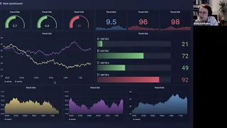
C
C
They
are
vibrant
enough
for
me
to
distinguish
these
two
and
they
look
and
they
play
nice
with
the
entire
look
and
feel
of
this
dashboard.
I
believe
I'm
not
a
fan
of
the
gradient
at
the
bottom
row,
but
that's
just
the
perfect
personal
preference.
I
just
don't
I'm
just
not
into
the
gradients
that
much.
C
Yeah
and
other
than
that,
I
think
this
looks
great.
I
want
one
thing
that
is
actually
pretty
nice
about
this
particular
design
and
the
light
theme
as
well
is
that
if
you
haven't
told
me
patrick
that
there
is
a
gradient
going
on
in
the
background,
I
would
probably
never
notice
that,
but
it's
actually
a
pretty
nice
addition.
It
kind
of
gives
some
kind
of
a
perception
of
a
depth.
B
Yeah,
I'm
glad
you
like
it
and
the
the
gradient
does
give
it
depth
and
because,
when
trying
to
add
the
panels,
on
the
lighter
background,
the
the
space
between
the
gutters,
the
sort
of
felt
on
top
these
sort
of
protruded
between
the
the
panels.
So
by
adding
the
gradient,
is
sort
of
more
mellowing.
In
the
background,
which
is
nice.
G
G
C
G
C
Yes,
individual,
you
need
to
select
the
schema,
the
this
key,
the
the
palette
or
the
scheme
individually
per
panel.
Yes,
but
yeah.
We,
we
briefly
discussed
a
possibility
to
have
a
configuration
per
panel,
sorry
per
dashboard,
but
I
cannot
recall,
configure
discussing
configuration
per
entire
graphana,
but
this
is
actually
a
really
good
idea
for
making
a
consistently
because
keeping.