►
From YouTube: Grafana UX Community Call 2020-09-07
Description
Grafana on mobile and narrow viewports
A
Okay,
so
thank
you
for
joining.
This
is
grapana
ux
community
call
it's
september
the
7th
labor
day
and
afternoon,
and
probably
only
for
a
handful
of
people's
normal
working
hours,
but
thank
you.
Everyone
who
joined
and
it's
a
community
call,
so
it's
mostly
about
discussion,
but
we
need
to
like
just
put
few
things
on
slides.
So
everybody
knows:
what's
the
framework
for
doing
the
community
calls,
so
we
meet
on
the
first
monday
on
every
month
and
sometimes
it's
a
labor
day
like
today.
A
So,
yes,
this
is
exactly
a
topic
that
probably
is
very
opinionated
inside
the
graphana
as
well.
So
we
are
really
eager
to
hear
also
from
you.
What
do
you
think
about
graphanol
on
mobile
and
how
it
works
for
you
in
terms
of
like
responsive
web
design,
some
urls,
the
meeting
url?
You
probably
know
that,
because
you
are
here,
but
please
remember,
that
you
can
edit
and
review
the
public
documents.
A
A
A
Like
a
drop
shadow
of
the
ux
team,
currently
working
at
grafana
labs,
you
can
feel
free
to
reach
us
whenever
you
feel
it
is
relevant
and
you
can
talk
to
us
using
especially
slack
or
just
mailing
us
or
finding
us
on
a
social
media,
and
we
are
hiring.
So
if
you
want
to
be
part
of
graphene
labs
as
a
designer
or
you
know,
someone
who
should
be,
please
find
a
link
to
the
ux,
ui
designer
job
offer
or
to
other
roles.
A
We
are
also
looking
for
product
managers
and,
of
course,
engineers
and
support
people
and
go
to
market
team
members,
but
without
further
adieu.
Today
we
are
discussing
grafana
on
mobile
and
in
narrow
viewports,
which
it's
a
bit
of
a
clumsy
way
to
say
that,
but
I
haven't
found
any
other
sentence
that
like
makes
it
more
nice
or
easy
to
read
or
more
interesting.
So
it's
like,
like
now
a
viewport,
but
I
hope,
hopefully
everyone
knows
what
happens
between
behind
those
two
words.
A
C
Let
me
check
again
whether
everything
is
fine
kind
of
that,
like
quick,
look
at
a
panel
to
get
some
information
type
of
deal
and
then
the
other
case
was
when
I
was
at
hacktoberfest
last
year
there
were
just
some
grafana
enthusiasts
and
they
used
it
to
monitor.
I
don't
know
their
private
projects
like
their
smart
home
or
their
weather
station
or
that
type
of
stuff,
and
then
they
would
when
they
are
outside
of
their
house,
they
would
just
check
on
their
stats
on
mobile.
A
And
in
the
meantime
suryam
I
I
don't
know
if
I'm
pronouncing
that
correctly,
but
that's
okay,
my
name
is
lukas
and
almost
no
one
from
outside
of
poland
pronounced
that
correctly.
So
I
think
we
are
like
destined
to
make
that
mistake.
So
hopefully
I'm
not
like
hurting
your
feelings,
but
sirium
wrote
as
well
that
my
support
team
used
regularly
during
out
of
office
hours,
mostly
a
single
dashboard
with
some
kpis,
is
with
a
single
stat,
so
so
yeah.
A
The
question,
probably
like
a
follow-up
question,
is:
is
that
like
for
just
checking
what's
up
or
is
it
for
doing
some
incident
management
or
responding
to
some
things
that
happen
in
terms
of
like
alerts
or
outages?
Or
is
it
just
like
knowing
what's
happening
in
general,
as
probably
just
described
as
well.
D
Hello
guys
hope
you
can
hear
me
yeah
hi,
so
it's
mostly
support
team
guys
used
to
receive
alerts
on
their
slack
channels
and
immediately
jump
into
graphing
to
get
some
quick
overview
of
what
the
numbers
and
why
the
trap
is,
then
they
will
escalate
it
to
the
support
team.
The
second
level
supporting
other
analysts.
So
basically
it's
for
quick
overview
to
get
what
is
going
on.
A
D
Yeah
the
thing
is
when,
when
the
users
try
to
load
the
graphs,
I
won't
be
that
much
nice.
So
what
we
did
is
we
tried
to
optimize
the
kpi
dashboards
in
such
a
way
that
only
shows
single
stats.
What
what
that
matters
when
they
are
commuting
or
when
they
are
in
hotel,
like
that,
so
only
the
single
stats
we
we
are
using
because
the
other
panels
they
are
very
content
rich,
so
they
might
not
be
fit
with
fit
into
the
mobile.
D
A
D
D
A
And
do
you
do
you
think,
like
it's
struggle,
and
I
will
like
right
now
just
like
right
on
the
screen?
Do
you
think
it's
a
struggle
that
we
have
this
navigation
up
here
and
not
us
probably
most
mobile,
apps
or
host
novel
applications
that
we
just
have
navigation
at
the
bottom
or
what
are
all
of
your
thoughts
on
on
that.
D
A
Yeah,
because
there's
a
lot
of
discussion
also
happening-
maybe
you
other
people
or
graphics
has
heard
that
as
well,
that
a
lot
of
people
are
creating
this
health
dashboards
or
a
general
overview
of
of
dashboards
with
their
grafana
as
a
just
a
quick
glance
of
what
is
happening,
and
is
it
even
worth
to
check
the
dashboard.
So
the
question
is
how
important
that
workflow
or
use
case
is
for
for
mobile,
and
is
that
something
that
can
happen
the
most
often
on
the
mobile
devices.
D
Okay,
so
the
only
the
challenge
we
had
is
we
use
single
stat,
but
it
would
be
nice
if,
if
we
can
fit
many
single
stars
say,
for
example,
if
you
fit
10
single
sets
into
a
mobile
viewport,
that
would
be
awesome.
Currently
there
it's
just
showing
only
two
or
three
single
star,
so
they
have
to
scroll
through
everything,
something
like
that.
They
have
those
challenges.
E
G
A
Yeah
I
found
that,
let's
struggle,
let's
say
when
I
was
once
working
with
a
dashboard
and
open
it
in
the
narrow
view
bar,
but
on
the
vertical
scale.
Let's
say
so.
Everything
like
was
squished
and
I
was
wondering
how
often
that
might
happen
as
well
for
the
other
people
have
you
ever
heard
about
using
grafana
in
a
such
way,
or
I
was
just
like
really
weird
with
doing
this,
like
having
my
browser
window
really
small
on
the
vertical
size.
G
A
Yeah-
and
that
is
interesting,
because
I
often
hear
that
when
we
are
discussing
responsiveness
or
mobile
grafana,
there
is
like
a
voice
that
oh,
like
showing
panels
or
showing
stats
on
mobile.
This
sounds
reasonable
and
we
can
find
out
many
use
cases
for
that.
But
for
sure
people
are
not
editing
panels
or
using
like
more
advanced
features.
As
with,
let's
say
us
with
like
editing
panels,
and
this
is
why
probably,
there
is
a
lot
of
work
ahead
of
us
to
think
about
those
screens.
A
G
If
we
have
some
information
about
browser
and
device
skills
like
that's
the
only
way
to
go
and
to
have
some
quantitative
knowledge
about
the
use
cases,
I
would
start
as
an
mvp
with
having
dashboards
that
work
and
the
menu
that
works
right
now,
even
if
it's
responsive
because
rafale
is
part
of
it
responsive.
We
have
some
issues
with
the
menu
like
if
we
fix
that
and
start
from
there.
G
As
for
panels,
we
can
definitely
have
those
responsive,
but
in
time
just
like
to
base
out
the
work,
and
they
could
be
I'm
not
sure
about
overrides
or
anything,
but
the
most
used
thing
we
can
like.
We
need
to
decide
what
are
the
most
used
feature
in
graphing
and
go
from
there.
Maybe
another
thing
that
I'm
thinking
could
be
helpful.
Is
the
team
access
like
you?
G
Have
admin
access
on
grafana
or
you
have
an
edit
level
and
you
are
away,
and
you
have
to
give
that
permission
to
somebody
else
to
do
changes
right
and
that's
another
possibility
for
you
to
check
out
from
your
phone
or
from
your
tablet
into
the
operation
to
somebody
on
their
own
forms.
Being
responsive
is
not
that
hard
to
achieve.
A
That's
maybe
a
challenging
question,
but
if
our
dashboards
are
so
hard
to
edit
on
mobile
or
in
narrow
screens,
will
that
just
be
like
the
small
number
of
people
using?
That
will
be
not
to
proof
that
people
don't
need
that,
but
it
proved
that
it
is
really
hard
to
hard
to
do
because
yeah.
We
can
then
interpret
such
analytics
like
both
ways.
B
I
think
there
are
a
couple
of
things
here
so
when
I
interviewed
our
users
about
managing
dashboards
and
fixing
broken
dashboards,
they
were
saying
that
they,
they
don't
have
a
process
around
it.
So
until
someone
complains
it's
often
and
unless
it's
a
heavily
used
dashboard,
it
can
be
broken
for
quite
long
time
and
all
the
stuff
that
we're
working
on
with
analytics
is
to
help
people
identify
broken
dashboards.
So
it's
hard
for
me.
B
The
other
thing
is
that
what
we
know
from
interviews
for
alerting
is
that
a
very
heavy
use
case
is
when
people
are
on
call,
so
basically
they
open
grafana,
especially
when
it's
in
the
middle
of
the
night.
So
people
were
telling
me
that
if
I
get
an
alert
in
the
middle
of
the
night,
I
just
want
to
check
the
graph
to
see
whether
I
need
to
get
up.
B
E
But
that
also
mirrors
my
experience
where
either
everything's
on
fire-
and
I
really
need
to
have
this
quickly
or
I'm
in
total,
leisure
and
just
traveling,
or
not
even
caring,
to
look
in,
but
in
no
case
would
I
be
really
trying
to
edit
anything
it's
more
about
consumption
of
something
which
already
exists
or
if
everything
is
absolutely
on
fire
explore
mode,
but
explore
mode
doesn't
mean
we
need
to
provide
a
way
to
do
super
intricate
changes
for
that
one
panel
with
all
options.
It's
just
everything
is
on
fire.
I
make
it.
A
I
think
that's
sometimes
it's
that
it
gets
really
tricky
to
like
put
that
boundary
between
what
mobile
means
and
what
is
actually
that
narrow
screen,
because
as
oana
mentioned
sometimes-
and
I
don't
know-
if
that's
the
case-
because
I
haven't
seen
that
as
something
that
people
do.
But
I
can
imagine
that
when
someone
is
on
fire
or
there's
a
hugely
important
dashboard
for
the
whole
company,
that
it
got
broken
by
some
edits,
and
you
need
to
check
like
different
data
sources
and
all
of
that
stuff.
A
You
can
have
like
a
lot
of
windows
open
as
well,
and
then
grafana.
The
edit
panel
for
for
grafana
might
be
that
really
small
narrow
screen
on
your
very,
very
big
dual
or
quadruple
screen
setup.
And
it
will
not
be
mobile.
But
it
will
be
a
small
screen
and
you
would
like
to
like
edit
there
and
see
they
can
do
it
more
comfortably
or
just
see
the
things
there.
G
C
Yeah
I
mean
it's
been
a
while,
since
I
talked
to
external
about
this,
but
the
main
complaint
that
I
got
from
users
last
year
was
that
they
are
editing
dashboards
when
they
don't
want
to
edit
them
so
basically
on
android.
Sometimes
when
you
are
trying
to
scroll,
you
end
up
dragging
and
dropping
a
panel,
and
they
were
like
yeah.
I
don't
want
to
edit
this
at
all.
Can
I
lock
this
you
know
so
basically
they
were
trying
to
take
away
functionality.
C
I
guess
thinking
about
this.
The
main
challenge
with
explore
would
be
restructuring
the
view,
because
the
query
editors
are
basically
big
forms
and
when
you
make
a
form
responsive,
then
it
takes
up
a
lot
of
real
estate
and
the
question
would
be:
how
do
you
bring
a
complex
query
editor
together
with
a
graph
on
such
a
small
screen,
without
it
being
really
hard
to
manage
and
even
understand?
Okay?
Where
does
my
query
stop
and
is
this
graph
or
this
query
or
for
you
know
like
just
getting
an
overview
of
everything,
that's
happening.
E
E
It's
actually
real
complexity
and,
if
you're,
a
mobile
you're
miserable
anyway,
if
you're
on
mobile
and
on
call.
So
it's
more
about
not
making
it
needlessly
painful
and
not
breaking
something.
For
this
use
case
by
mistake,
and
at
least
to
me
not
so
much
about
making
it
a
a
nice
experience
because
to
me
it
will
always
be
a
bad
experience.
If
I
have
this
tiny
of
a
device,
I
need
to
do
ten
different
things
at
once.
Like
it,
it
will
be
horrible.
A
I'm
always
thinking
as
well.
Aren't
we
like
too
old
for
that
mobile
discussion,
because
when
I
sometimes
see
how
what
young
people
are
doing
with
their
those
small
screens
and
what
magic
they
can
produce
with
such
things?
I
I
cannot
do
it
even
on
my
big
screen,
not
to
mention
like
a
phone
with
like
less
features
and
no
like
pointer
and
all
that
features
packed
into
such
a
small,
real
estate.
So
yeah,
I
think
we
are
like
putting
the
average.
A
It
seems
like
thanks
to
the
auto
layout
feature
and
because
how
nice
the
grafana
dashboards
are
right
now
and
how
good
looking
are
the
graphs
and
it's
not
bragging.
It's
like
things
that
we
hear
from
from
our
users
and
customers
as
well.
What
makes
the
the
graphs
like
nice
on
mobile?
That's
the
that's
the
question
or
how
far
are
we
from
saying
that
our
panels
are
beautifully
looking
on
mobiles
as
well,
so
what's
stopping
them
from
being
beautiful
on
the
mobile
screen
and
deciding
that?
C
Screen
I
mean
beauty
is
a
different
property
because
it's
subjective,
but
I
think
the
what
makes
grafana
dash
what's
purposeful
is
probably
the
ability
to
compare
things,
and
I
guess
the
main
limitation
of
mobile
is
that
currently
we're
just
stretching
out
panels
so
much
that
it
gets
hard,
if
not
impossible,
to
compare
things.
That's
probably
why
3ram
also
just
uses
single
stats
most
of
the
time,
because
then
you
can
use
the
real
estate
better
and
compare
stuff
more
easily.
A
E
We're
looking
at
panels,
sorry
at
bar
gorgeous
and-
and
I
don't
think
we
like
a
lot
of
users-
use
the
bar
gorgeous
because
they
tend
to
to
be
not
be
very
useful
for
for
a
lot
of
operational
data.
For
this,
for
example,
you
can
already
see
you
can't
see
the
labels
and
you
can't
really
click
on
anything
to
see
the
labels
and
you
don't
have
a
good
solution
for
the
labels.
Maybe
you
can
write
upwards,
but
I
don't
think
we
should
be
optimizing
with
bar
gorgeous.
E
We
should
be
looking
at
sparklines
at
single
step
or
step
at
graphs
and
such
because
those
will
be
the
ones
which
are
used,
so
this
hex
overview
is
often
used
as
kind
of
what
screen
works
red
and
also
when
we
talk
about
mobile
and
that's
in
my
tying
back
to
when
you
said
earlier,
it's
always
about
the
narrow
screen.
I
don't
really
fully
agree.
A
So
is
that
that,
like
the
the
type
of
panel
as
well
dictates,
how
well
it
will
perform
on
mobile
seems
that
that
is
the
case
yeah
so,
and
I
agree
with
that
beautiful,
but
somehow
we
are
the
ones
also
shaping
how
it
visually
looks.
So
we
need
to
at
least
make
some
assumptions
what
will
be
perceived
as
as
nice
and
many
what
is
mentioned
with
the
mobile
experience
is
that
this
visual
or
micro
interactions
or
animation
experience
animations
as
an
experience
with
the
interface,
is
what
makes
the
mobile
stand
out.
D
Because
we
have
some
different
things,
so
user
gate
alerts
in
slack
channels
without
the
beautiful
images
craft
and
everything.
That's
absolutely
fine.
But
when
they're
trying
to
diagnose
the
quick
plants
in
the
mobile
first
thing
they
want
to
see
is
a
single
stat,
because
the
more
graphs
won't
appear
good
in
mobile.
As
of
now
right.
D
So
there
are
two
different
things
for
the
quick
first,
first
responses
with
the
graph
and
the
immediate
next
space,
the
single
step,
the
single
step,
because
one
single
graph
might
be
splitted
into
two
or
three
single
stats
right.
So
what
we
did
is
every
every
graph
we
we
are
supposed
to
create
a
single
step
so
duplicating
some
efforts
to
make
it
mobile
friendly
for
our
our
support
needs.
A
A
D
So
we
have
all
the
graphs
mapped
into
the
single
stack,
so
whenever
there
is
a
red
in
the
single
stat
user
click
that
corresponding
single
stat
to
see
what
is
happening
as
a
trend,
vice
versa.
But
the
other
challenge
we
had
is
quick.
Sometimes
single
stars
might
turn
into
red,
but
users
want
to
know
why
this
is
red
quickly
right,
so
they
want
to
see
the
thresholds
behind
that.
D
D
Or
the
panel
of
the
dashboard
just
to
see
the
about
the
thresholds
behind
or
the
configuration
begin,
a
particular
panel,
because
no
one
interested
to
edit
the
dashboards
in
the
mobile.
That's
not
that
much
decide
right
that
we
accidentally
we
may
broke
anything
so
just
as
a
viewer,
we
want
to
see
what's
the
thresholds
behind,
what's
the
configuration,
because
why
it
was
red,
that's
it.
D
Out
of
this
800
developers
in
my
my
team,
only
I
tend
not
to
want
people
using
explore
feature
because
they
don't
use
exploring
the
mobile
sub.
The
support
teams
usually
don't
use
the
explore
feature
at
all.
They
just
want
to
know
it's
a
binary,
whether
it's
a
good
or
not.
That's
it.
We
don't
want
to
do
deep
dive
in
the
mobile.
A
D
Oh
yeah
you're
able
to
see
my
screen
yep
okay,
so
this
is
one
of
the
dashboard
I
want
to
show
so
you
you
can
see
it's
full
of
single
stats
right,
so
people
we
really
want
to
see
what's
behind
this
number.
So
if
I
edit
this
see
the
edit
button,
the
rest
of
the
buttons
going
behind
this
kind
of
experience,
the
developers
having
and
each
corresponding
single
stats,
we
have
a
graph
at
the
bottom.
D
D
A
D
A
F
A
Sorry,
I
just
took
the
one
that
I
had
to
like
make
a
screenshot
wasn't
putting
too
much
of
even
like
a
thought,
what's
relevant
there
yeah,
so
that
vertical
spacing
is
also
like
really
interesting
use
case,
but
I
guess
we
need
to
like
explore
it
further
as
well,
because
like
for
example,
the
title
bar
here
is
like
a
state
lost
in
that.
In
that
context,
this
is
at
least
what
I've
been
thinking
when
I
was
like
just
trying
to
find
challenging
questions
for
this
discussion.
E
Would
it
be
possible
here
to
maybe
have
like
a
button
which
I
click
and
then
I
maximize
that
series
or
whatever
that
graph
is
showing
and
I
tip
again
and
it
becomes
smaller
because
most
of
what
I'm
seeing
here
on
my
mobile,
I
don't
care
I
care,
maybe
as
an
overlay,
but
only
as
an
overlay.
Maybe
I
care
about
pattern
tests
graph
edit
panel,
like
the
the
subject
and
the
rest,
I
only
care
about
the
graph
and
the
rest
is
completely
irrelevant.
A
Could
be
thought
as
something
that
glues
to
this
to
the
screen,
so
it
when
you
scroll,
it
just
sticks
to
the
to
the
top
part,
and
then,
when
you,
you
get
more
space
for
all
the
stuff
that
you
would
like
to
explore
here,
but
you
can
also
like
hide
it
and
show
it
or
just
just
close.
So
what's
the
architecture
also
for
for
all
the
things
that
are
happening
on
the
screen
as
well,
you
had
a
thought.
E
A
Yeah
so
yeah
so
like
the
intention
would
be
exactly
what
you
what
you
said
so
not
not
to
take
that
real
estate
when
it
is
when
someone
doesn't
want
that
and
right
now,
this
graph
actually
is
pretty
useless
because
when
you
just
makes
it
make
it
bigger
it's
actually
it
looks
like
this,
so
it
is
just
like
so
squished
on
the
vertical
scale
that
it's
look.
It
looks
like
a
straight
line,
so
there
there
is
no
information
behind
that
graph
at
this
moment
whatsoever.
So
so
yeah.
D
D
Something
so
when
I
was
in
edit
mode,
I
accidentally
dragged
the
editor
to
the
bottom,
but
suddenly
disappeared.
I
don't
know
how
to
bring
it
back,
so
I
have
to
clear
the
cookies.
Then
only
it
came
up
so
those
kind
of
challenges
I
had
in
this
edit
panel.
So,
although
what
I
feel
is
the
edit
panel
should
be
floating
on
top
of
the
graph
instead
of
adjusting
its
graph
size,
so
graph
should
be
taking
the
entire
screen,
and
the
editor
should
be
on
top
of
that.
E
D
A
D
If
you
ask
me
that,
doesn't
matter
because
users
want
to
see
only
whether
it's
good
or
not,
that's
it,
we
don't
want
to
see
the
animations
classy
things
because
we
are
not
go,
we
are
not.
Will
the
users
who
were
using
the
mobile
will
not
be
full-time
mobile
users
right
only
they
will
be
checking
rafana
whenever
that's
an
incident
because
that's
not
frequently
used
in
the
mobile.
D
A
And,
and
outside
of
the
incident
use
case,
do
you
also
use
grafana
to
show
the
dashboards
for,
for
example,
like
c-level
people
or
department
directors
or
people
who
just
require
an
overview?
Also,
do
you
like
create
dashboards
for
them
or
create
reports
for
them?
Is
that
something
that
that
is
relevant
to
you
and
your
team.
D
Yes,
yes,
we
do
have
those
kind
of
dashboards,
kpi
dashboards,
for
I
see
people,
but
I
don't
know
whether
they
will
be
really
liking
that
in
the
mobile
view,
because
for
the
mobile
they
have
some
different
experience.
They
have
separate
dashboards
created
for
them,
so
graphene
is
not
really
for
them
in
the
mobile.
A
G
I
have
a
thought
and
a
lot
of
it
is
based
on
front-end
and
usability,
but
it's
also
based
on
what
on
your
idea
of
having
something
beautiful
and
thinking
on
the
mobile
internet
of
viewports.
Is
you
get
a
lot
of
data
and
it's
very
hard
to
fit
everything
in
a
very
small
screen
right?
So
I'm
thinking,
if
is
there
any
way
to
reduce
the
number
of
points
on
the
first
view?
G
A
Like
connecting
the
different
or
like
narrowing
the
scope,
for
example,
on
the
x
or
y
axis,
on
the
fly,
let's
say
when
we
see
yeah,
that's
a
very
tempting,
probably
thing
to
do.
The
question
is
whether
it
means
that
we
are
actually
interfering
with
how
people
design
their
panels
and
their
and
their
dashboards,
because
at
some
point
that
the
grafana
would
have
to
make
a
decision
on
the
fly,
what
data
to
connect
to
average
to
or
to
transform
on
the
fly
to
show
to
show
less
so
so
yeah.
A
D
A
D
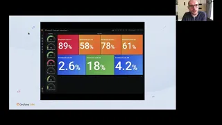
Okay,
so
this
is
the
executed
dashboard
I
was
talking
so
this
will
give
you
some
interesting
insights
of
what
is
the
sales
since
midnight
so
that
that's
what
the
executives
want
to
know
right.
So
some
quick
graphs,
some
quick
numbers,
some
quick
graphs,
that's
it,
but
the
thing
is
we
have
some
challenges
like
these
kind
of
things:
the
too
much
smalling
mobiles.
So
these
kind
of
challenges
we
have
yeah.
A
Does
it
make
the
the
panels
better
for
you,
so
please
feel
free
to
to
reach
to
us
if
you
need
an
like
some
thoughts
on
that
or
when
you
have
a
time
to
to
use
7.0,
because,
hopefully
7.0
an
auto
layout
feature
can
help
with
some
of
those
struggles
for
the
sure
two
small
things
sure
and
thank
you
for
sharing
the
dashboards.
It's
like.