►
From YouTube: Jenkins UX SIG Meeting - June 10 2020
Description
The bi-weekly Jenkins UX SIG meeting discussed Color Variable updates, a new theme manager proposed by Tim Jacomb as well as providing an update on the status of the migration from tables to divs.
A
All
right
so
welcome
everybody,
we've
got
a
small
group
today.
It
looks
like
we
don't
have
anyone
who
has
been
here
before,
but
welcome
to
the
fourteenth
Jenkins
UX
cig.
We're
special
interest
group
online.
Meetup
move
this
bar
out
of
the
way
myself
the
zoom
bar
alright.
So
before
we
jump
into
it,
I
doesn't
have
anything
they
want
to.
You
add
to
the
agenda
or
or
bring
up
casually
or
anything
like
that.
A
A
Let
me
know
if
items
are
not
big
enough
on
screen
and
I
can
adjust,
so
this
I
posted
about
back
over
at
Gator
earlier
I
guess
around
the
middle
of
last
week,
I
had
experimented
previously
with
providing
sort
of
some
contrast,
ratios
and
more
detailed
accessibility,
information
about
different
swatches
on
these
color
palettes,
and
it
ended
up
being
a
little
bit
I
think
perhaps
counterintuitive.
The
information
was
so
specific
that
I
think
the
better
that
it
could
become
confusing,
and
how
does
this
particular
contrast?
A
Ratio,
for
example,
apply
to
my
unique
use
case
so
I
think
a
better
approach
here
would
probably
be
to
provide
a
resource,
provide
a
link
to
the
resource
that
people
can
go
ahead
and
test
out
those
very
basic
foreground
and
background
combos
using
a
commonly
accepted
tool
and
instead
having
some
very
general
guidelines
with
each
swatch
here
now.
These
can
be
a
bit
vague
and
we'll
talk
about
that.
In
a
second
too,
but
if
you
didn't
happen
to
see
him
over
in
Gator,
essentially
these
are
updated.
A
Color,
palette
resources,
we've
talked
about
sort
of
the
methodology
in
the
past.
There's
five
categories:
each
category
has
these
different
swatches
and
something
that
came
up
in
discussion
and
Gator
which
I
wanted
to
address
here.
Was
this
idea
of
as
these
base
tiles
are
becoming
more
solidified.
We
don't
expect,
for
example,
these
colors
to
change
immediately
right,
whereas
a
few
months
ago
it
didn't
make
sense
to
document
them
very
thoroughly
because
we
knew
they'd
involve
quite
dramatically
and
they
did,
but
as
they're
becoming
more
solidified.
A
Now,
how
do
we
want
to
go
about
documenting
these
publicly
so
that
they're
less
of
a
thing
we
look
at
in
this
call
and
more
of
a
guide
in
a
resource
for
contributors
around
the
world.
So
I
thought
I'd
just
kick
off
that
little
discussion
and
does
anyone
have
any
thoughts
on
there
and
sticking
to
it?
I.
C
Think
it
would
be
helpful
if
we
have
these
resources
on
our
Jenkins
homepage,
where
we
have
the
developer
documentation.
I
think
it
would
be
really
helpful
if
we
have
a
kind
of
documentation
of
colors
to
use
and
maybe
also
which
fonts
we
should
use,
and
things
like
that.
It
would
be
really
helpful
if
we
have
that
on
the
home
page
and.
C
A
Yeah
I
agree:
this
isn't
something
I
expect
to
have
a
lot
of
resistance
to
as
an
idea
right.
So
we've
got
these
we've
also
got,
as
you
mentioned,
a
type
scale.
Formalized
we've
got
different
interactive
treatments
for
interactive
States,
there's
a
lot
that
we
have
gotten
to
a
stage
where
we
can
now
share
these
out.
People
could
serve
referencing
them.
So
as
far
as
where
to
do
that,
that
makes
sense
to
me.
A
I
need
to
kind
of
look
at
how
that
would
work
and
maybe
try
and
establish
a
way
that
we
can
update
it
pretty
easily
and
basically,
I
need
to
look
into
how
efficient
it
would
be
to
put
jenkins
thought
io
and
continuously
keep
it
updated.
So
let
me
look
into
that,
but
that
sounds
like
the
right
choice.
Certainly
cool.
A
All
right
awesome,
so
we'll
start
with
something
like
this,
probably
because
color
is
such
a
big
question
mark
for,
for
so
many
people
who
are
trying
to
contribute
to
a
project
right.
So
I
think
these
are
a
pretty
good
shape.
We'll
start
with
these
and
I
think
I
should
be
able
to
follow
up
on
the
format
in
the
execution
well
before
the
next
cig
meeting.
Just
let
me
run
it
by
a
couple
of
teams
who
are
involved
with
that
Jenkins
Iowa
website
and
look
at
it.
We're
gonna
come
next
steps
for
the
palates
really.
A
A
Now
that
I've
got
this
format
going
for
these
colors
and
then
I
think
it
was
you
Tim
who
over
and
get
her
asked
saying
you
know,
some
of
these
guidelines
are
a
bit
a
bit
general
right
so
like
when
we
look
at
alerts
and
warnings.
I
forget
the
one
that
you
called
out,
but
basically
saying
I,
don't
know
how
this
instruction
would
apply
to
an
actual
UI
elements,
so
something
else
I'd
like
to
do,
which
won't
be
quite
as
soon
as
getting
these
publicly
documented,
but
we
can
iterate
would
be
to
provide
some
visual
examples.
A
Some
very
simple,
visual
examples
of
different
elements
on
screen,
as
we
create
them
to
cook
to
accompany
these
palettes
and
say:
here's
what
this
guideline
actually
means.
So
when
I
say
avoid
using
behind
text,
maybe
say
maybe
have
a
little
example
of
what
that
looks
like
behind
text
and
say:
here's
why
it
produces
this
poor
contrast
ratio,
you
can
see
it
doesn't
look
good
or
something
more
along
those
lines,
but
the
format
still
need
to
work
on.
A
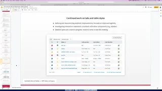
All
right,
so
the
next
item
here
still
doing
a
lot
of
investigation
here
on
my
own
with
tabs
and
table
Styles.
So
what
we're
looking
at
is
I
know
means
final.
In
fact,
there
are
a
couple
ways:
I
was
talking
about
with
Felix
very
recently
just
yesterday
that
these
are
going
to
evolve
a
bit,
but
we
looked
where
we
talked
a
couple
weeks
back
about
how
we
could
improve
these
through
just
these
surface
level.
A
C
D
D
C
D
D
A
All
right
and
then
I
use
the
screenshot
for
the
next
topic,
just
because
it's
we're
looking
at
something
on
on
the
same
image
here.
So
this
is
a
pretty
straightforward
proposal.
We
had
these
RSS
links
for
following
progress
down
underneath
and
currently
their
text
links
with
it
all
right,
this
icon
next
to
them
so
oops,
sorry,
my
mouse
does
that.
So
this
is
just
saying:
we've
established
button
styles,
so
we
have
a
you
know
easier
to
understand
interactive
States
on
those
buttons
as
well.
A
So
this
is
saying:
hey,
let's,
let's
take
this
opportunity
opportunity
to
do
one
of
those
small
improvements
and
maybe
change
these
text
links
down
here
to
buttons,
and
so
what
we
see
on
screen
is
the
default
state
for
the
transparent
button
style.
Where,
when
you
hover
over
it,
then
it
has
a
background
treatment
and
it's
it's
again
kind
of
hard
to
convey
in
this
static
format.
But
we
also
have
that
kind
of
documented
in
our
previous
slides.
D
D
C
A
The
next
item
proposed
here
is
its
updates
to
the
to
the
header
bar
and
breadcrumbs,
and
this
was
the
first
component,
of
course,
that
we
really
dug
into
as
a
group,
and
it
really
came
out
a
lot
better
than
those
initial
explorations
on
my
end
because
of
the
group
collaboration
here.
So
that's
awesome
as
we've
refined
the
base
Styles
a
bit
more
in
the
the
recent
parts.
A
There's
an
opportunity
for
some
improvements
here,
potentially
so
something
I'm
proposing
is,
is
keeping
sort
of
what's
become,
really
well
known,
as
or
really
well
recognized,
as
the
black
bar
here
at
the
top
of
Jenkins
and
then
also
adjusting
type
size
and
also
the
height
the
breadcrumbs
area.
So
it
would
look
something
more
like
that,
and
this
is
a
sort
of
an
update
in
keeping
with
these
these
Styles,
as
we
refine
them
so
currents
and
knew
nothing
life-changing.
A
B
D
Yeah
so
basically
updated
color
hierarchy
and
that
you
well
what
Joe
did
was
also
not
know
these
formalized
in
the
color
hierarchy,
but
also
updated,
for
example.
Right
now
he
switched
the
primary
colors
and
the
hover
color,
because
our
de
facto
primary
color
was
not
the
one
we
were
having
so
yeah.
So
these
changing
color,
we
include
a
several
changing.
This
is
variable
a
P
I.
D
For
that,
because
I
know
you
also
want
to
take
the
chance
to
formalize
all
the
colors
into
this
is
variables
with
the
same,
maybe
the
same
naming,
but
they
already
have
on
the
design
deck.
So
yeah,
that's
something
a
PR
next
week,
because
it
should
support
or
further
work.
So
it
will
also
mean
for
dark
mode.
That
may
be
a
breed
breaking
news.
D
D
Yeah
I,
but
I
think
it's
going
to
be
a
much
healthier
way
if
we
just
can
expect
a
specify,
a
unnamed,
a
for
example,
five,
four
or
five
shades
of
gray
primary
color
and
because
I
think
maybe
plugins
shouldn't
use
the
side.
Panel.
Header,
color,
but
I
mean
you
should
be
able
to
use
the
primary
primary
Hager
a
light
gray
or
something
like
that
see
this
variable
and
that
also
will
empower
maybe
Willie
to
to
try
to
use
the
see
this
variables
when
configuring
bootstrap
in
the
bootstrap
for
APA
theme.
C
D
E
C
B
D
I
think
that
the
colors
that
are
circled
up
in
Java
sighs,
there's
nothing.
We
can
do
about
it
in
the
same
regard
that
we
are
not
making
work
with
dark
mode,
it's
just
we're
just
not
able
to,
and
that
will
require
duplication
of
the
color
codes
early.
So
maybe
you
can
point
them
to
me
where
they
were
reaction.
Java
code
is
may
be
linked
and
you'll
agree.
D
B
B
They
don't
get
stuck
on
one
version
forever
and
they
just
manage
the
updates
the
same
as
any
plugins
and
also
decouple
the
theme
for
the
system
theme
and
they
use
a
theme
so
that
users
don't
get
forced
to
use
a
certain
theme.
They
get
the
choice
so
two
sides
they
can
just
so
it'll
default
to
the
system
theme,
but
then
they
can
override
it
and
they
can
even
turn
it
off
and
just
go
back
to
the
default
theme.
B
B
So
here
we
go,
we've
got
I've,
got
built-in
themes,
possibly
rename
it,
but
so
we've
got
a
selection
of
themes.
It's
an
extension
point
in
Jenkins,
so
any
plugin
can
come
along
in
an
add
its
own
theme
and
it
will
just
get
automatically
picked
up
and
the
dark
mode
is
contributing
to
themes.
One
is
dark,
which
is
just
that
which
is
just
fully
dark
and
the
other
is
dark
with
the
OS
settings.
So
if
I
go
to
my
system
settings
here
and
if
I
go
to
light
mode,
we
just
straight
away
changes
to
light
mode.
B
And
he's
getting
the
default
system
thing
so
I've
got.
This
is
currently
one
issue
that
I
have.
Is
that
blogging
themes
not
working
so
it
is?
There
is
a
pace
generator
which
is
modifying
the
login
theme,
but
Gingka
says
login
system
is
stopping
access
to
that
I'm,
not
sure
if
there's
a
way
that
I
can
get
around
that.
B
B
The
the
theme
manager
has
will
find
out
the
URL
for
you.
If
you
don't
need
to
do
anything
fancy
you
just
get
it
so
it
looks
it
up
based
on
the
descriptive
name,
and
then
you
just
need
to
serve
your
CSS
file
and
in
this
display
name
is
just
what
shows
up
in
the
Jenkins
UI
and
then
here's
the
dark
theme
system
manager.
It
was
very
similar,
simply
asked
to
serve
up
to
CSS
files
used
to
serve
this
file
and
this
file,
but
it
just
loads
them
in
the
same
way.
B
E
B
B
B
E
B
It's
going
to
show
you
the
just
a
quick
update
on
how
the
dark
thing
is
going
seems
getting
a
lot
of
views
traffic,
so
its
head,
nearly
six
hundred
unique
visitors,
mostly
coming
in
from
Jenkins
I/o,
but
if
you're
coming
in
from
Google
as
well,
and
it's
mostly
just
looking
at
mostly
looking
at
the
readme
and
a
few
of
them.
Looking
at
the
issues
as
well.
E
D
D
D
B
E
So
I
guess
we
shouldn't
revisit
as
J
plug-in
until
we
make
a
decision
whether
it
goes
to
the
court
or
not.
So
what
we
introduced
recently
is
a
concept
of
incubated
projects,
so
the
projects
which
are
available
in
the
main
update
center,
but
with
some
disclaimers.
So
probably
it's
a
way
to
go
here.
Yeah.
A
Well,
thank
you
for
the
demo
Tim
I,
you
know
like
I,
I
can't
speak
as
and
as
well
about
the
implications.
Here's
the
rest
of
you
quite
frankly,
but
just
looking
at
it
sort
of
objectively
as
a
user
right
like
I,
like
that
idea
of
not
necessarily
having
to
to
have
my
theme
mandated
by
by
the
by
the
previous
election
made
by
my
admin.
So
I
think
this
is
worth
exploring
and
appreciate
the
share
so
good
stuff
tables
to
do
status,
Tim
and
Felix
yeah.
B
B
So
all
four
of
these
were
reported
out
of
the
so
three
of
them.
We
report
from
the
hackfest
and
mark
reported
this
one
a
couple
of
days
ago
or
in
the
weekend,
I
think
so
we
fixed
the
Help
button
in
the
subsection
titles
issue
over
the
last
few
days.
I
think
docker
hub
notification,
plugin
is
a
PR,
and
so
does
this
one,
which
is
the
ownership
plugin
I,
think
Felix
was
going
to
try
and
see
if
we
could
handle
some
of
those
issues
on
the
chickens
course
side.
B
The
problem,
so
one
of
the
problems
that
we've
had
is
with
table
tags
that
are
cleared
on
plugins.
Where
is
the
lower
level
elements
defined
in
tickets,
cause
of
the
TRS
and
the
TV's?
Their
control
they're
still
that's
all
generated
in
the
core,
but
in
some
cases
the
table
is
actually
just
put
into
the
HTML,
and
so
we
can't
automatically
change
that
to
add.
D
It's
it's
something
that
was
related
on
my
problem.
The
brown
I
think
is
that
this
is
really
something.
It's
anger
that
the
PA,
the
change
should
be
half
of
all
work,
and
the
code
should
be.
The
JavaScript
code
should
be
reversed,
because
the
layout
of
the
basically
with
this
problem,
also
it's
not
as
the
form
fields
on
work,
is
the
whole
layout
of
the
a,
for
example,
of
the
manage
changes
page
of
the
config
your
system
paid
his
brakes.
You.
D
B
D
D
B
Cool
okay,
so
let's
try
and
fix
that
a
show
and
then
see
if
we
can
move
it
along
and
there's
also
there's
also
a
risk
of
some
of
these
conflict
resolutions
have
not
been
the
easiest,
so
I've
done
my
best
to
resolve
conflicts
for
something,
sometimes
in
some
cases
that
codes
change.
Just
not
just
so.
It's
not
something
easiest
to
resolve,
especially
in
CICS
when
you
can't
visually
view.