►
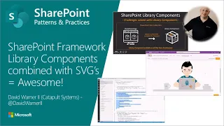
From YouTube: Community Demo - SharePoint Framework Library Components combined with SVG's = Awesome!
Description
This community call demo is taken from the SharePoint Framework community call recording on 20th of June 2019. In this video, David Warner (Catapult) demonstrates how to build a SharePoint Framework Library component and use it in your solutions to provide centralized assets... in this case to provide SVG's which can be then used by UI components.
Presenter - David Warner (Catapult) - @DavidWarnerII
https://developer.microsoft.com/en-us/sharepoint/blogs/sharepoint-framework-community-call-recording-20th-of-june-2019/
More details on the SharePoint dev community calls from http://aka.ms/sppnp.
A
So
library
components
are
a
way
to
combine
functionality
that
you
otherwise
might
build
into
your
web
part
or
extension
into
an
a
a
SharePoint,
a
framework
module,
and
that
allows
you
to
access
them
from
your
webparts
next
editions.
So
it's
a
way
to
be
very
performant
with
your
functionality,
one
of
those
things
that
can
also
be
included,
as
you
can
see
here,
our
SVG
files,
so
those
are
files
that
are
fully
supported
to
be
packaged
together
in
your
shipment
framework
solutions
such
as
library
components
all
right
now.
A
What
are
SVG
so
SVG
stands
for
scalable,
vector,
graphics,
so
think
of
it.
As
a
hundred
percent
vector
graphics,
like
icon
fonts,
you
might
find
icon,
fonts
use
those
kind
of
iconography
images
flats,
sometimes
that
are
completely
and
totally
scalable
because
they
are
vector
so
Skate,
scalable,
vector,
graphics
or
SPG's
are
very
similar,
but
but
way
better.
So
you
might
say:
well,
is
it
file
or
is
it
markup?
A
That
gives
you
much
more
increased
control,
as
we
see
in
just
a
moment,
but
it
looks
more
like
your
typical
XML
you've
got
close
and
in
tags,
along
with
information,
you
may
remember
recently,
a
demo
by
Chris
on
using
x,
SVG,
XML
map
data
for
list
and
column
formatting,
and
so
we'll
talk
a
little
bit
more
about
that
in
a
moment.
The
increased
control
that
it
provides
you.
So
you
look
here
at
a
particular
SVG
file,
URL
being
referenced.
We
can
see
here.
A
We've
got
this
little
handshake,
a
nice
community
contribution
kind
of
handshake
working
together
when
you
reference
it
from
an
SVG
file.
Url
you'd
have
very
limited
control
so,
where,
as
an
icon
font,
you
might
be
able
to
change
the
color
using
the
CSS,
you
can't
even
do
that
with
an
SVG
file.
Url
reference,
it's
very
limits
of
control
because
it
is
XML,
so
you
don't
have
a
lot
of
control
over
it
when
you
reference
it
from
a
URL
just
to
the
dot
SVG
file.
A
But
as
you
can
see,
when
you
can
access
the
SVG
markup
here
on
the
right,
you
have
much
more
increased
control.
So
each
of
these
little
elements
here
are
paths
within
the
XML
that
can
be
modified
by
something
like
CSS
or
otherwise.
Java
Script
could
modify
them
as
well,
so
how
oh
so?
How
does
that
all
work
together
within
a
SharePoint
library,
components,
I'm
gonna
jump
over
here
to
visual
studio
code,
I
scaffold
out
a
library
component.
A
Now
this
library
component
will
be
up
in
the
PNP
repository,
so
I'm,
actually
on
vacation
right
now,
so
I
apologize,
I'm,
traveling
I
didn't
get
it
up
in
the
pull
request
yet,
but
it
will
be
shortly.
I'll
work
on
that
with
us
in
the
next
few
days.
This
library
component
is
that
is
a
simple
library
component.
You've
seen
you
can
see
here,
I've
included
a
folder
called
icons
to
a
theme.
A
Category
called
teamwork
and
a
bunch
of
SVG
I'll
make
sure
that
it
includes
all
of
these
when
it
gets
uploaded
to
the
repo
and
all
of
these
get
packaged
together.
Now
you
may
be
saying:
well,
I,
don't
really
want
to
include
those
in
my
library
complain
you
don't
have
to.
You
could
use
the
tenant
asset
library,
it's
gonna,
be
coming
out
soon
and
store
them
externally,
I
personally,
like
the
library
component
for
the
scalability
and
the
modularity
of
it,
so
it
packages
it
all
together.
A
It's
one
nicely
very
portable
solution
that
you
can
send
or
deploy.
However,
you
need
to
without
any
external
dependencies
now
what
makes
this
library
component
unique,
so
I've
included
three
primary
functions.
One
is
return
the
SVG
URL,
so
maybe
you
do
just
want
to
use
the
SVG.
As
you
see
it,
the
color
is
okay
and
everything
is
fine,
so
you
just
want
to
go
ahead
and
reference
it
there.
This
will
return
to
you
the
SVG
dynamically.
So
you
can
call
this
from
your
library.
Excuse
me
webpart
or
your
extension.
A
You
may
also
want
to
get
access
to
the
actual
markup.
You
may
want
the
additional
control.
So
in
this
particular
function
it
is
going
to
return
the
SVG
markup
and
then
you
can
do
what
you
want
with
that
markup
use
it
in
one
or
more
places,
modify
it
using
javascript,
CSS
sass,
whatever
the
case
may
be,
and
then
the
last
function
for
now
is,
you
may
just
say:
hey
look.
I!
A
Don't
want
to
have
anything
to
do
with
the
SVG
markup,
but
I
do
want
to
benefit
by
it
being
inserted
and
available
into
my
content
in
my
web
part
or
extension.
So
you
can
actually
make
a
request
to
insert
the
SVG.
You
would
provide
the
category
name
as
we
see
here,
there's
only
one
category
name
for
now:
teamwork
you
would
provide
the
icon
name
and
the
class
name,
and
then
this
is
going
to
go.
A
Look
for
that
class
in
your
content
and
go
ahead
and
insert
the
SVG
for
you
and
there
we
go
for
you
automatically,
so
very,
very
low
lifting
there
for
you.
It
does
all
the
heavy
lifting
for
you
if
you
wanted
to.
So,
let's
see
how
that
looks
when
everything
is
working,
so
I've
got
a
site
that
I've
created
here.
I've
created
a
web
part
that
goes
in
and
taps
into
that
particular
component
and
will
give
us
access
to
everything.
A
So
let's
go
ahead
and
start
with
the
SVG
URL,
one
of
them
I
know
is
called
handshake.
We
saw
that
in
the
slides,
so
I'm
just
going
to
go
ahead
and
request
that
SVG
and
we
see
that
because
I've
already
packaged
up
and
deployed
out
my
library
component,
it's
referencing
that
within
my
particular
tenant
here.
So
it
gives
me
access
to
that.
A
Svg
I
can
then
grab
that
URL
and
do
whatever
I
want
with
it
within
my
web
browser
extension
and
an
image
tag
or
an
object
tag
where
the
fun
really
get
started,
though,
is
here
in
the
markup.
So
I'm
gonna
go
ahead
and
open
up
the
network
tab
here.
My
dev
toolbar
I'm
gonna
I'm,
going
to
filter
to
justice
BG,
and
this
is
where
we
really
see
some
benefits.
Over
and
above
icon,
fonts
I'm
gonna
go
ahead,
make
the
same
request
for
a
handshake
request.
A
Markup,
and
you
can
see
it's
now
pulled
over
that
mark-
are
that
particular
SVG,
but
it's
done
the
actual
capturing
of
the
market.
For
you,
it's
still
using
just
the
SVG,
but
the
library
component
is
what
is
actually
going
ahead
and
giving
you
that
markup
and
you
see
it's
only
1.3
K,
it's
very
small.
So,
whereas,
where
with
an
icon
font,
you
have
everything
coupled
together
and
if
you
want
one,
you
have
to
take
them
all
here.
You
can
actually
access
them
individually,
which
is
very
nice.
A
So
if
I
were
to
go
over
to
another
another
icon
called
focus,
we
see
now
it's
able
to
pull
that
one
individually
again,
just
1k
and
just
for
benefit.
I'll
show
you
handshake
again,
because
there
is
the
benefit.
Oh
look
at
that
off
there.
You
can
see
it's
now
pulling
it
from
disk
ash,
which
is
nice,
because
then
it
will
get
cached,
and
so,
if
you
do
pull
back
on
the
same
one
more
than
once,
you
benefit
from
the
disk
cache.
Caching
it
which
is
fantastic.
A
Now,
let's
see
the
option
for
SVG
injection
we'll
go
ahead
and
do
this
same
handshake
and
what
we're
doing
here
is
we're
saying
we
want
the
icon
to
be
injected
into
our
PNP
containers.
We've
got
two
here.
Those
are
done
by
class
name.
This
one
should
remain
empty.
So
if
I
request
my
SVG,
you
can
see
it's
now
populated
I
can
change
that
to
focus,
focus,
focus
and
you
can
see
it
changes
and
these
have
been
set
up
as
well
to
inherit
from
the
theme.
A
So,
if
I
go
up
to
change,
the
look
and
I
select
change
to
look
and
I,
go
back
to
theme
and
I
were
just
to
change
that.
To
my
primary
purple
theme,
you
see
they
inherit
that
as
well,
so
you
can.
You
can
style
those
perfectly
so
now
you
may
be
saying
why
SVG
it
seems
like
a
lot
of
heavy
lifting
compared
to
something
like
an
icon
fought
well
again,
they're
100%
vector,
which
is
about
the
same
as
the
icon
font.
A
That's
where
the
similarity
is
end,
but
it's
smaller
than
Nikon
font,
so
you
can
actually
access
them
individually,
which
is
the
benefit,
and
it's
just
cooler.
So
let's
see
it's
actually
telling
me
to
stop
talking
and
to
click
here
to
show
you
why?
So
here
is
a
little
example
of
why
SVG
Zircaloy
we've
got
our
developer
here.
Sharepoint
feel
everybody
looks
sad.
A
So
it's
because
he's
got
no
stickers
on
his
laptop
there's,
a
secret
button
here
on
his
P&P
coffee
mug,
so
we're
gonna
go
ahead
and
click
that
takes
us
into
this
sticker
lab
we've
got
our
instructions
that
say,
move
the
proper
ingredients
into
the
lab
beaker
to
create
a
sticker.
So
we've
got
some
icons
here
that
we
want
to
play
with
and
we
want
to
move
them
in
the
right
equation
into
our
beaker
over
here
on
the
right.
A
A
Yes,
so
he
needs
the
on
the
trash
because
P,
if
he
doesn't
want
any
bullies,
all
right
handshake
for
the
community
great,
and
we
got
this
little
creature
here,
whoops,
okay,
let's
toss
him
in
and
all
right
now
our
beaker
looks
ready
to
go
so
I'm
gonna
click
it
and,
let's
see
what
happens
when
we
click
it.
It's
actually
morphing
into
Parker.
That
is
one
of
the
cool
benefits
of
SVG's,
because
they
are
a
plotted
points.
Geometric
shapes
you
can
actually
morph
between
objects
very
easily
using
some
JavaScript
libraries.
A
So
our
stickers
ready
all
right
we'll
go
ahead.
We
see
he's
getting
some
stickers
now,
once
Parker
gets
placed
on
the
stickers
pay
attention
to
his
face,
that
frown,
gets
turned
upside
down
and
he's
got
this
creepy
little
look
at
you
that
will
probably
hunt
your
dreams.
I
know
it
has
mine,
but
you
can
see.
The
benefit
here
of
using
SVG's
is
that
this
is
one
big
SVG
with
multiple
paths.
Everything
is
animatable,
so
you
can
actually
modify
it
using
javascript.
So
what's
next,
it's
more
features.
A
So,
when
I
get
this
library
component
added
to
the
repo
I'm
going
to
add,
more
oops
seems
to
be
move
around
me.
I'm,
going
to
be
adding
more
icons,
I'm
going
to
be
adding
the
functions
that
allow
you
to
ottoman
icons
listed
within
there,
so
you'll
be
able
to
make
a
request
to
do
that.
I'm
also
creating
an
SPF
X
command
set
for
list
formatting.
That
will
include
the
icons
and
give
you
back
the
individual
path,
so
those
icons
are
going
to
be
single
paths
which
make
them
friendly
for
list
formatting.
A
So
you
all
you'll
have
to
do,
is
kind
of
copy
and
paste
and
there's
there
any
other
requests
that
you
have
so
feel
free
to
reach
out
to
me,
and
let
me
know
if
you
have
any
other
requests.
No
by
the
way
you
may
have
noticed
the
little
animation.
I
know
how
well
it's
coming
across
in
the
video.
That's
completely
SVG
to
this
menu
system
up
here.
So
last
but
not
least,
let
me
just
go
ahead
and
bring
up
the
last
particular
line
or
slide
here
check
out
the
library
component
tutorial.
A
If
you
are
interested
learning
more.
The
repo
is
right
here
and
there's
a
couple
of
the
guys
in
the
community
they're
doing
fantastic
work
with
library
components
alex
has
a
react.
Template
blog
that
just
came
out
and
vardaman
has
a
using
my
stuff
rush
to
manage.
Sp
effects
so
definitely
check
these
guys
out
as
well.
They
are
doing
a
lot
with
that
too,
and
I
will
include
those
links
there
in
the
chat
window.
Alright,
so
thanks
for
your
time
great
stuff,
thanks
thanks,
David
appreciate
that.