►
From YouTube: Pajamas UI Kit 16.0 Release Notes
Description
A walkthrough of the recent changes in the Pajamas UI Kit that are listed at https://design.gitlab.com/get-started/uik-release-notes#160.
A
Foreign
ER
I'm
a
Staff
product
designer
on
the
foundations
team
and
wanted
to
walk
through
the
16.0
UI
kit
release
notes.
So
the
pajamas
UI
kit
includes
all
the
figma
files
that
we
use
internally
and
we
have
a
release
process
that
started
last
Milestone
to
document
all
of
the
updates
and
to
have
a
single
release
at
the
end
of
a
milestone
to
hopefully
make
changes
more
predictable
and
understandable.
A
So
I
want
to
walk
through
what
those
changes
are
so
first
off
I'm
just
on
the
pajamas
website,
I'm
going
to
go
to
get
started,
pajamas
UI
kit,
which
is
figma
and
the
release
notes.
If
you're
curious
about
the
release
process,
you
can
view
the
release
process,
link,
there's
information
there
and
I
want
to
focus
on
the
16.0
items.
A
This
was
published
on
the
22nd
so
just
two
days
ago
and
I'll
just
walk
through
this
quickly.
If
you
have
any
questions,
please
drop
a
comment
and
slack
over
the
video
all
right.
So
starting
off
with
additions,
we
added
the
following
icons
and
I
say
we,
because
it's
not
just
foundations
team,
but
several
people
have
contributed
and
worked
on
that.
So,
thank
you
all
for
for
doing
so.
If
you've
been
a
part,
so
additions,
we've
added
the
following
icons.
These
links
go
to
the
SVG
project
and
I'll
view
the
respective
icons
under
that.
A
So
you
can
view
that,
once
something
is
in
the
the
release
notes,
this
link
will
go
to
the
SVG
project,
which
is
the
source
of
Truth
for
it.
How
and
also
the
the
icon
file
is
updated.
Part
of
the
process
with
the
icons
is
to
export
from
that
icon
file
in
the
UI
kit,
so
the
final
design
should
be
in
that
figma
file,
but
we
want
to
link
to
the
final
output
of
that
all
right.
A
So
then
added
the
following
illustrations
not
going
to
read
all
of
these,
but
there
are
several
empty
States
as
well
as
a
few
others.
Thank
you
Julia
for
working
on
those.
It's
awesome
to
have
all
of
those
additions,
some
enhancements
added
text,
properties
to
the
link,
UI
kit
and
Link
you
link
mentioned,
which
allows
link
content
to
be
edible.
Editable,
not
edible,
editable
from
the
sidebar.
So
if
I'm
in
figma,
let's
go
over
to
our
link
component
and
you
can
see
we
have
this
text
property.
A
Let's
see,
I
think
it
was
the
inline
but
I'll
read
that
in
just
a
second
here:
let's
go
back
to
the
release,
notes,
UI
link
and
the
mention
link.
Okay.
So
let's
go
ahead
and
change
this
to
let's
go
back
to
the
UI
link,
all
right!
So
now
you
can
see
the
text
here
is
editable
and
you
can
change
that
here.
A
A
A
A
It
wasn't
explicit
that
it
was
related
to
break
point
and
not
a
preferred
size,
and
so
we've
updated
that
so
under
typography.
Actually,
if
I'm
just
over
here
with
Styles,
you
could
see,
let's
see
if
I
zoom
in
here,
you
can
see
Excel,
breakpoint,
medium
break
point
or
greater
than
equal
to
less
than
equal
to.
So
those
are
more
clear
that
it's
related
to
a
break
point
and
not
a
preferential
Style.
A
There
were
some
illustrations
that
were
updated
again.
I'll
just
mention
that
those
are
linked
but
I'm
not
going
to
visit
them
here.
Last
change:
increased
contrast
for
label
instances
that
didn't
meet
451..
Obviously
the
labels
are
color
or
the
color
of
the
labels
can
be
user
selected.
But
we've
gone
through
an
effort
to
try
to
make
that
our
default
options
have
sufficient
contrast,
and
so,
as
part
of
that,
wanted
to
make
sure
that
our
default
examples
in
figma
had
sufficient
contrast
as
well.
A
Okay
on
to
fixes
a
breaking
change,
which
has
a
medium
impact
depending
on
how
much
you've
used
this
or
if
you've
experienced
it
in
your
files,
but
the
option
the
individual
option
height
was:
there
was
a
regression
where
the
height
had
been
decreased
and
it
caused
some
problems
with
States
and
whatnot.
So
that's
that's
now
fixed
it's
been
resized
and
it's
correct
in
prototypes.
Etc.
There's
some
notes
here
about
what
to
watch
for
and
how
to
fix
that.
A
Just
a
side
note
on
the
drop
down.
If
you
want
to
test
what
something
might
look
like
or
do
there
are
interactive
states
in
the
drop
down?
So
if
you
were
to
go
to
the
component,
Library
click
on
instances
and
go
into
the
Prototype
mode,
you
will
be
able
to
actually
use
these
I'm
scrolling.
The
whole
page
here,
but
I
could
scroll
within
I
could
actually
select
these
if
I,
if
I
wanted
to
some
of
the
ones
that
have
buttons
Within.
A
A
State
example:
plain
text
instead
of
an
option
with
a
state,
the
drop
down
has
an
empty
state
right
here
previously
we
were
just
using
another
option
component,
and
the
result
of
that
would
be
that
it
would
actually
have
these
states
as
well,
which,
if
it's
plain
text
it
would
not.
So
we
we
remove
that
capability.
A
We
remove
the
bottom
padding
from
some
of
the
other
drop
down
list
items
this
just
cleaned
it
up
a
little
bit.
Some
of
these,
for
example,
you
could
see
it's
a
nice
even
padding
all
the
way
around.
Some
of
these
had
a
little
additional
padding
at
the
bottom
after
they
were
scrolled,
and
so
that
was
just
some
cleanup
that
was
fixed
in
there.
A
Moving
on
to
icons,
the
nested
layer,
names
of
some
of
the
icons
were
updated,
so
if
you
get
icon
updates
for
existing
ones
generally,
it's
it's
pretty
low
impact
changes,
not
breaking
changes,
it's
just
to
help
with
overrides.
So
if,
if
the
layer
name
is
an
icon,
then
color
overrides
won't
persist
as
you're
changing
and
choosing
different
icons.
So
that's
been
fixed
in
these
four
icons.
So
now
the
color
overrides
will
be
preserved.
A
The
code
icon
has
been
recreated
from
the
ground
up.
There
was
some
some
funky
rotation
issues
in
there
in
the
original
design.
That
could
cause
it
to
be
flipped
when
placed
in
a
component,
and
so
we've
rebuilt
that
and
it's
been
fixed
so
that
it'll
no
longer
do
that.
I
I
do
believe
that,
with
that
the
icon
also
has
a
little
bit
of
the
math
adjusted
so
that
it's
a
little
more
symmetrical
and
last
fixed
last
fix
is
the
broken
type
scale
code
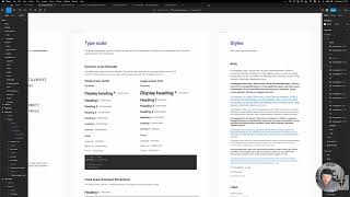
blocks.
These
are.
A
A
And
that
does
it,
that
is
everything
for
16.0.
If
you
have
any
questions,
please
please
ping,
someone
in
the
foundations,
the
the
G
underscore
manage
underscore
Foundation,
slack,
Channel
or
comment
here,
or
you
can
comment
in
the
figma
channel,
figma
maintainers
channel,
so
a
few
different
ways
to
to
reach
out.
If
you
have
questions,
I
hope
this
is
helpful
next
time.