►
From YouTube: UX color palette discussion
Description
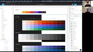
This discussion was between two members of the UX team as they consider updates and additions to the GitLab color palette. Specifically, this addresses normalizing the UI and neutral color sets for accessibility and ease of application, as well as the addition of an accessible data visualization palette.
Reference:
• https://gitlab.com/gitlab-org/gitlab-design/issues/720
• https://gitlab.com/gitlab-org/gitlab-design/issues/719
A
A
B
A
So
in
that
regard,
you,
you
could
always
say
like
hey,
you
know,
use
this
button
and
when
you're
designing
you
would
always
know.
Okay,
the
fill
is
always
going
to
be
the
500.
The
border
can
be
one
or
two
steps,
above
that
you
can
normalize
that
for
hover
States,
for
focus
where
you're
always
saying.
Okay,
the
base
is
to
500
the
hover
States,
the
700,
whatever
it
might
be,
and
that
way
you
can
have
some
rules
that
normalize
that
across
the
the
board.
A
So
even
when
we're
using
icons,
we
don't
have
to
change
it
up
per
color.
Do
you
try
to
align
that
everything
is
it's
kind
of
synonymous,
so
it
kind
of
normalizes
it
in
that
sense.
So
that's
that's
goal
number.
One
and
then
goal
number
two
would
be
to
make
sure
that,
like
all
of
those
500
values
passed
at
a
certain
contrast
ratio
so
meeting
the
451
for,
like
our
type
and
UI
elements,
I'll
get
into
like
the
data
vis,
which
is
like
a
3.1
or
three-to-one
ratio
for
those.
A
B
A
Here
this
is
some
initial
exploration,
but
basically
just
showing
how
mmm-hmm
the
range
changes
a
little
bit.
It's
a
little
more
of
a
linear
easing
to
it
that
way,
the
the
darkness
or
the
you
know
the
passing
can
happen
at
500
and
and
we
have
a
little
more
room
on
either
end
to
kind
of
go
out
from
there.
So
starting
with
that
middle.
A
There's
there's
some
use
cases
that
I
won't
go
through
here,
but
that
have
come
up
with
other
UI
elements
and
since
it's
part
of
our
brand
and
we're
incorporating
that
I
think
we
can
use
that,
but
also
include
it
as
another
layer
for
for
some
of
the
UI,
what
we're
doing
States
or
status
so
that
we
can
assign
a
meaning
to
it.
Similarly,
to
how
the
other
colors
in
our
UI
have
meaning
so
I'm
going
to
keep
that
in
there
as
well.
A
Another
piece
of
this
was
also
considering
surfaces,
so
oftentimes
you'll
see
like
okay
contrast
ratio
on
white,
but
then
you
go
and
use
that
color
on
a
different
surface,
and
it's
like
well
sudden-like,
that's
enough
of
a
difference
where
it
no
longer
passes.
Curtains,
usually
since
we're
using
a
lot
on
the
the
current
gray
50.
A
The
fa-fa-fa
I
wanted
to
set
that
as
our
baseline
for
the
for
meeting
the
4:45
1
contrast
and
then,
conversely,
on
the
dark
side
using
our
darkest
grade,
950,
the
1
F
1
F
1
F
enough
as
the
the
darkest
value
so
that
that
way,
it
actually
makes
the
outcome
a
little
more
robust.
So
we
know
it's
always
gonna
work
on
white.
A
Into
that,
where
we
have
like
our
different
surfaces,
so
I'll
jump
into
figma,
really
quick
here
and
just
show
what
what
I've
got
so
in
figma
in
our
Global's
beta
I've
got
a
color
page
here,
and
you
know
I
label
this
as
colors
beta
for
now,
and
what
I've
done
is
outline
UI,
neutrals
themes
in
doubt
of
is,
and
then
transparencies
all
in
one
you'll
notice
these
values.
They
are
the
contrast
ratio,
given
both
the
dark
and
light
surface
right.
A
B
A
Be
a
bit
more
vibrant
exactly
and
with
that
I've
also
made
down
of
his
and
I'll
jump
into
that
a
little
bit,
but
data
is
for
the
500
values
and
go
either-or
right
there.
The
middle
500
value
is
3
1
on
either
surface,
and
the
reason
for
that
is
then,
since
we
have
11
steps
in
each
in
each
hue,
1
you
do
like
light
or
dark.
You
have
6
steps
to
use
for
light
or
dark,
rather.
B
A
Like
5
on
1
and
6
on
another,
so
having
those
middle
values
go
either
way.
I
think
helps
with
that
in
Figment.
Really
quick,
like
I,
have
a
like
a
color
chip,
mm-hmm
kind
of
based
symbol
where
you
can
easily
turn
on
and
off
those
ratios,
so
that
so
I'm
just
gonna
turn
them
off
for
now.
Just
to
to
look
at
these
hues
a
little.
B
A
B
A
A
B
B
A
More
of
a
linear
transition
so
that
it's
normalized
and
at
the
end
of
the
day,
you
know
just
just
making
sure
that
they're,
equal
and
and
not
having
too
much
of
a
curve,
either
end.
So
a
little
more
linear
steps
rather
than
exponential
one
of
the
key
I'll
just
jump
in
real
quick
on
this
orange
is
that
you
know
like
notoriously
hard
to
get
yeah.
A
So
that's
one
of
the
areas
where
you
know
it's
close
and
we'll
have
to
rely
a
lot
on
context
to
help
differentiate.
Some
of
that
and
I
think
I've
got.
You
know
you
can
see
here
in
some
of
the
exploration
where
you
know
a
large
scale,
its
DIF.
You
know
there's
enough
of
a
difference,
but
in
a
smaller
UI
you
know
it's
gonna
be
a
little
different
to
try
to
figure
out
the.
B
A
Making
sure
that
that
value
works
equally
in
grayscale,
so
you
can
see
how,
if
we,
if
we
go
down
each
step,
you
know
each
column,
they
feel
and
grayscale
like
they're.
Almost
the
same
they're
not
gonna,
be
perfect.
Reds
skew
a
little
darker
here,
just
because
of
wanting
to
make
sure
that
they
are
differentiated
more
so
than
the
orange
when
necessary.
B
A
B
B
A
B
Door
or,
on
the
other
end
as
well
and
the
other
surface,
but
about
it
at
the
end
of
the
day,
it's
it's
always
very
subjective
and
how
people
react
to
colors.
So
what
I
would
say
is
that
so
the
exercise
like,
for
example,
that
when
you
were
showing
those
four
examples
of
what
an
alert
could
look
like
like
the.
B
So
what
if
we
could
have
this
color
palette
that
pasts,
everything
and
all
accessibility
standards
and-
and
there
was
yeah-
it
doesn't
look
like
right
right
off
the
bat,
it's
not
possible
to
vary
as
appealing
as
the
the
more
vibrant
ones,
of
course,
but
at
the
same
time
there
was
a
lot
of
pushback
from
most
people
on
the
team
at
the
time,
so
I'm
I'm
curious
to
see
how
that
goes
this
time
around.
Maybe
people
are
already
bit
used
to
the
fact.
B
There
was
there
was
some
pushback
to
make
it
a
bit
darker
and
to
make
it
pass
all
or
the
4-5-1,
and
that's
why
we
relied
on
the
three
one
to
still
keep
it,
keep
it
vibrant
and
for
those
two
specific
cases
like
the
orange
and
the
green,
those
the
purple.
We
we
don't
use
a
lot
in
the
app
today,
but
those
two
or
success
information
and
communicating
success
for
communicating
warning
states.
B
It
was
very
difficult
to
get
them
right
and
to
get
them
to
pass
certain
accessibility
values,
while
keeping
them
vibrant.
So
so
I'm
curious
to
see
how
people
react
to
that.
My
my
initial
concern
is,
or
my
main
concern
basically
is
the
differentiation
that
you
were
saying
between
the
oranges
and
the
plants,
because
yeah
I
believe
it
context
is
very
important,
but
it
kind
of
loses
a
bit
of
its
meaning
when
it's
so
close
as
we're
seeing
here,
I
think.
A
And
I
think
we'll
have
to
test
and
bear
that
out.
I
did
I
did
approach
this
in
a
you
know
in
a
sense
of
we
like
we
want
to
pass
and
and
doing
that
requires
the
4-5-1,
and
so
that's
that's
where
that
is
that's
kind
of
why
I've
anchored
there
is
just
so
that
it's
like
a
guarantee
like
we
are
accessible
in
our
color,
where,
where
there
aren't
any
caveats
in
and
how
it's
used
so
I
think
we
can
test
that
out.
The
the
other
advantage
that
that
may
or
may
not
be.
A
If,
if
in
you
know
as
we
go
through
accessibility,
testing
and
whatnot,
we
do
still
because
of
the
way
the
pallets
normal.
We
still
have
other
Hugh.
You
know
or
other
steps
in
that
hue,
that
we
can
leverage
to
maybe
differentiate
more
but
I
want
to
I.
Do
want
to
try
out
of
the
gate
to
like
satisfy
right,
the
four
or
five
one.
A
A
That's
why
I've
skewed
with
a
little
more
red
in
in
the
orange,
in
order
that
it
stays
vibrant
and
not
kind
of
a
brown
across
the
board
yeah,
and
so
that
is
definitely
something
those
it
take
away.
We
can
explore.
You
could
see
for
DataViz
here's
here's
an
option
for
data
VA's
that
skews
more
towards
the
you
know
a
little
more
yellow,
less
less
of
the
red
in
there
and
you'll
notice
how
it
gets
this
one.
You
know
this
one
works
pretty
good,
it's
kind
of
a
an
orange
gold.
B
A
Which,
at
that
point
I,
don't
know
how
orange
it
feels,
but
I
could
I
could
explore
somewhere
between
the
data,
va's
orange
and
the
UI
orange
you
know
in
in
that
regard,
the
other
consideration
why
this
it
skews
a
little
more
red
in
the
UI.
Is
that
wanting
to
separate
it
from
data
vis
so
that
we
have
that
separate
palette
so
like
in
our
color
exploration,
you
know
taking
a
look
at
like.
Where
do
our
current?
You
know
items
align
today
and.
B
A
Can
kind
of
see
the
bell
curve
where
we
right
UM's
will
really
pass
yellows.
Are
you
know,
obviously,
is
you
know
notoriously
difficult
and
so
yeah
there's
there's
kind
of
this
medium?
You
know
where
it
starts
to
got
kind
of
more
of
a
greenish,
yellow
and
skews
done
more
Brown.
So
you
know
we
could
definitely
yeah.
B
I
look
to
see
some
some
experiments
with
making
it
bit
more
yeah
like
I,
think
if,
if
it's
not
as
appealing
like,
for
example,
this
orange
for
data
visualization
that
you're
showing
here
it's
not
as
appealing
as
the
other
orange
for
you,
I
yeah
but
I,
think
it
it
would
communicate
better.
The
difference
between
orange
and
red,
sorry
warning
and.
B
B
B
Take
care
before
you
activate
this
and
they're
in
the
same
context,
I'm
not
necessarily
next
to
each
other,
doesn't
communicate,
I,
think
very
well
with
that
difference
and-
and
you
were
so
going
down
to
so
that
that's
my
I,
think
my
main
concern
with
the
UI
now
that
you
were
talking
about
the
beta
of,
is
you
have
me
to
scroll
a
bit
down,
so
in
that
case
for
the
orange
and
I
guess
for
the
other
values
as
well.
If
I
wanted
to
use
an
orange
color
for
text
in
the
light,
a
lighter
background.
A
A
But
if
you
had
to
use
one
of
these
values
for
text,
then
I
would
you
know
I
would
skew
towards
the
ones
that
actually
meet
the
4-5-1
and
rely
on
the
ones
that
are
the
500,
so
600,
values
and
I
would
use
the
the
$400
sorry,
the
500
values
for
the
UI
elements.
So
so
that's
where
you
know
with
with
the
data
as
we
could
step
it
up,
just
to
make
sure
yeah.
A
B
A
B
A
Definitely
they
do
yeah
in
fact,
there's
a
few
examples
of
charts
in
I
link
to
it
and
the
data
is
new,
so
it's
basically
you
know.
Ui
components
and
graphical
objects
must
have
that
3-1
against
exact
colors,
and
so
you
know-
and
that's
where
we
use
other
separators
to
help.
You
know
separate
that,
but
they
do
have
some
some
examples
in
here.
Where,
let's
see
you
know
yeah,
you
can.
A
And
obviously
you
know
these
don't
even
contrast
in
there,
and
so
that's
where
a
lot
of
what
we're
doing
is
where
there
are
no
data
points
specifically
related
to
these.
So
the
color
is
what
helps
indicate
the
difference
and
I
think
there's
here's
a
another
example
here:
they've
got,
let's
see
yeah,
so
this
one
is
a
fail
because
of
you
know
it
passes
for
color,
but
it
fails
because
you
can't
discern
the
edges,
so
they
don't
contrast
against
each
other.
B
A
You
know
it
is,
and
that's
actually
what
I
have
in
in.
Let's
see
here,
let's
go
back
to
exploration
here,
so
some
of
the
the
executions
are
done,
I
actually
explore.
You
know
like
using
that
the
same
value
as
the
border
and
then
using
other
items
as
the
spacers,
so
in
the
I
think
in
the
dead
of
is
issue
itself
I
have
there
is
a
section
on
visual
separators.
A
Yeah
so
so
using
you
know
different
separators
or
values
to
actually
help.
You
know
separate
those.
So
you
know
in
these
cases
you're
talking
about
vibrance
for
one
one
of
the
things
we
could
do
is
you
know
here,
I've
I've
used
the
passing
value
for
the
border,
but
you
know
keeping
more
of
a
transparent
inside
just
for.
B
A
Sake
of
for
that
passing,
but
we
could
also
say
hey.
You
know,
let's,
let's
come
over
here
and
I'll
use
the
the
400
value
for
the
border.
Cuz
I
know
that
that
passes
on
the
the
white
surface,
but
maybe
the
fill
I
actually
just
want
to
you
know,
use
you
know
something
like
I.
Guess,
that's
the
value,
but
you
know
we
can
use
something
along
these
lines
or
whatever
do
to
kind
of.
Oh.
A
I,
like
that
popular
anymore,
depending
on
the
you
know
in
the
use
case,
but
yeah,
the
the
other
consideration
with
DataViz,
is
making
sure
that
these
colors
work
against
or
with
each
other
or
don't
conflict
where
they
look
too
too
similar.
And
so
that's
part
of
the
reason
for
yeah,
for
where
they're
at
as
well
I.
Think.
B
This,
what
you
were
this
small
exercise
that
you
are
doing
not
necessarily
with
this.
These
colors
are
too
vibrant,
but
just
making
them
a
bit
more
vibrant
I
think
would
be
less
of
a
challenge
for
people
to
get
used
to
I.
Think
the
initial
our
first
and
we
can
we
can
test
this
easily.
But
my
gut
reaction
personally
is
that
the
the
colors
were
too
muted
and
too
muddy
and
yeah,
and
thinking
about
also
the
visual
culture
that
users
have
a
view.
Other
apps.
B
You
know
that
they
use
where
they
use
more
vibrant
colors
that
perhaps
they
don't
pass
the
contrast
guidelines,
people
find
them
appealing
and
then,
if
they
come
to
get
lab
they're
going
to
see
these,
they
would
see
these
muddy
colors
that
are
not
very
attractive,
I.
Think
in
middle
term.
Here,
if
we
can,
could
use
the
border
for
that
yeah
like
something
that
you're
doing
right
there,
where
it's
it's
a
bit
dark,
not
that
vibrant,
but
it's
still
more
attractive
than
what
what
was
there
for
I
think
this
is
a
good
exercise.
Yeah.
A
So
I
mean
it's
all
great
points
of
your
points.
I
think
there's
some
fluidity
in
here
and
I
know.
As
you
can
see.
There's
you
know
some
very
vibrant
values
in
here,
but
I
really
want
to
make
sure
that,
first
and
foremost
like
it's,
it's
a
hundred
percent
accessible.
There
are
I.
Think
I
had
some
examples.
A
A
B
A
Ibm
has
like
a
they
they're
kind
of
one
of
the
places
that
I
really
looked
to
just
based
on
their
exploration
and
they
had
kind
of
these
six
steps
and
I
guess
I
to
that
and
I
should
walk
through
those
steps
forward.
Out
of
is
just
to
kind
of
explain
how
I
got
to
where
I'm
at
you
know,
first
and
foremost,
is
to
say:
okay,
like
let's
take
an
audit
of
what
we
have
today.
Alright,
so
we
know,
we've
got
UI,
neutrals
and
themes,
those
all
have
very
specific
use
cases
and
applications.
A
So
we
don't
want
to
use
those
right,
so
we're
not
going
to
be
selective
in
there.
Contrary
to
that,
we
don't
have
like
a
broad
palette
that
extends
beyond
those.
So
we
can't
just
say:
oh
here's,
another
set
of
values,
a
hues
that
we're
not
using,
let's
use
those.
So
it's
it's
completely
additive.
At
this
point
and
knowing
that
we
have
specific
use
cases
for
UI,
that's
where
the
the
exploration
was
to
know
like,
let's
find
some
gaps
in
our
current
sequence
and
and
leverage
those
we're
okay
and.
B
A
Brand
were
using
this
UI.
We've
got
these
themes.
We've
got
these
okay.
That
leaves
some
gaps
for
data
and
that's
where
you
know
come
in
and
say:
okay
for
data
we
can.
We
can
skew
this
a
little
more
vibrant
for
the
blue.
Look,
maybe
a
little
more
magenta.
You
know
a
little
more
gold,
the
green,
a
little
more
lime,
etc.
So
that
that's
where
yeah,
that.
A
That
regard
you
know,
we
end
up
with
a
palette.
That
is
it's,
it's
not
conflicting
with
existing.
So
that's
why
some
of
these
might
look
less
saturated
or
just
slightly
different.
So
then,
once
you
level
in
on
that,
okay,
here's
here's
the
relative
hues
at
that
point:
it's
okay!
Let's
pick
the
actual
natural
hue
and
then
establish
the
scale.
Okay.
So
we
got.
We
know
three
point
one
there.
You
know
three
to
one
ratio
at
the
five
hundred
values.
So
let's
establish
what
those
are
and
then
build
off
from
there.
A
So
then
you
build
off
from
there
and
then
after
that
you
say:
well,
we
need
to
really
normalize
these
so
that
you
can.
You
know
once
again
choose
you
know
correct
values
across
each
hue,
but
you
know
that
they're
gonna
be
able
to
be
applied
in
a
consistent
fashion.
So
you
go
to
front-end
and
you
could
say
any
of
these.
You
know
five
hundred
values
you
can
use
for
the
border
any
of
X
values.
You
can
use
on
this
and
then
you
know
in
the
future
when
we
actually
have
more.
A
You
know,
hopefully
like
a
dark
theme
in
in
get
lab,
we'd,
be
able
to
say
okay,
this
here's,
this
I
use
for
the
dark
surface,
the
north
Qi,
here's
for
the
light
UI,
so
so
a
lot
of
those.
So,
as
you
start
to
narrow
in
like
the
constraints,
the
the
range
of
color
that
you
can
use
starts
to
get
pretty
limited
based
on,
like
I,
said
the
fact
that
we've
already.
B
A
And
then,
lastly,
with
the
hues
is
the
actual
Blanken
right
now
as
far
as
just
color
simulation
and
an
actual
color
blindness.
So
not
only
do
you
have
all
those
other
factors,
but
also
making
sure
that
the
hues
that
you
pick
are
going
to
work
with
each
other
and
actually
stand
out.
So
you
know
just
a
cycle
through
here.
You
know
you
can
see
how
green
and
orange
tend
to
ski
the
same
aqua
and
magenta.
A
B
And
that
also
misters
into
the
priority
of
usage
right.
So
if
you
only
need
to
use
one
color
for
the
charts,
I
use
this
first.
If
you
need
to
use
two
colors
use
these,
because
we
know
that
these
stand
out
the
most
when
you're
doing
when
you're
dealing
with
color
blindness.
So
that's
that's
the
very
good
exactly.
B
A
Know
he.
This
is
also
based
on
a
lot
of
work
that
IBM
is
done,
but
choosing
a
pattern
that
that
is
consistent
for
choosing,
and
in
this
case
it's
you
know,
it's
the
reverse,
Chevron
skipping
pattern,
so
we're
going
from
you
know,
have
five
hundred
value
of
green
to
a
six
hundred
value
of
magenta,
back
to
a
five
hundred
value
of
the
blue,
etc,
and
you
know
and
so
on,
and
that
way
you
know,
that's
actually
where
I
arrived
at,
like
this
sequence
here,
so
that
when
we
use
these,
you
know
in.
B
A
See
all
of
that
and
I
will
say.
Let
me
I'll
talk
back
up
another
sketch
here.
You
know
in
in
some
of
the
exploration.
I,
don't
know
that
it's
that,
how
do
you
say
less
less
appealing
right,
so
you
know
here's
yours
today
know
you
know
we
have
this.
This
bar
chart.
Let's
go
down.
Here's
you
know
this
area
chart
not
you
know
this
just
tends
to
get
kind
of
kind
of
muddy
and
you
get
some
kind
of
weird
colors.
B
A
A
B
I
think
I
think
it's
for
the
server
response
times.
The
callers
might
be
blending
better
with
the
transparency,
and
that
wasn't
the
case
of
the
example
that
you
showed
in
sketching
it
room
for
the
the
column,
charts,
I,
I,
think
the
other
one
looks
more
at
least
to
me
personally,
it
looks
more
appealing,
so
yeah
I
think
the
exercise
that
you
were
doing
of
trying
to
increase
the
vibrance
a
little
bit
by
choosing
other
values
yeah.
It
was
interesting,
yeah.
A
And
it'll
depend
on
the
the
use
case
right
like
if
we,
if
we
need
that
these
to
show
through
you
know
the
the
different
data
lines
then,
and
that's
obviously
the
you
know
the
more
transparency
the
the
list
of
the
vibrance
is
going
to
be
there.
But
if,
if
that's
not
the
case,
then
you
know,
then
we
do
have
the
opportunity
to
to.
A
Potentially
you
know
go
more
of
this
route
where
we
could
actually
which
one
that
actually
would
overlay,
but
we'll
just
pretend
it's
that
one
for
now,
but
if
it
anyway
yeah
we,
you
know
where
we
could
do
that.
The
other
thing
that
we
can
explore
is
also
just
different
blend
mode
with
CSS,
so
we
could
use
more
vibrant
and
use
like
a
blend
mode.
We
could
also
have
these
keep
these
vibrant,
but
then,
instead
of
the
data
lines
being
behind
making
them
actually
like
a
transparent
black
on
top.
So
so
we
can
keep
the
viola.
A
B
A
B
Not
going
to
touch
a
lot
of
those
I
think
it's
it's
a
good
exercise
and
let's
see
later
how
we
can
apply
it.
I
wanted
to
focus
on
so
like
we
talked
so
the
foot.
It's
basically
three
things
that
are
there.
I
have
some
concerns
in
feedback
like
the
first
one
we
already
talked
about.
Is
the
UI
orange
not
being
too
different
from
the
red
so
that
we
already
touched
on?
The
other
thing
was
the
usage
of
the
data
visualization
palette
and
then
the
third
one
is
to
so.
B
B
So
I
wanted
to
touch
on
what
you
explained
in
the
beginning
of
how
the
progression
was
made.
Different
is
different
between
the
two.
It's
basically
two
different
approaches,
so
and
and
and
so
basically
what
I
did
was-
and
you
can
see
that
very
clearly
on
the
green
palette
is
the
the
tones
closer
to
the
edges.
I
increased
the
saturation
that
they
would
have
more
vibrance
and
would
be
more
appealing
and
less
and
yeah,
just
more
vibrance
and
and
also
so
I
had
to
pair
the
vibrancy.
B
And
because,
if
you
try
to
do
that
linearly,
you
would
get
just
some
more
muddy
tone,
yeah,
yeah
and
also
when
you
have
very
any.
You
know
this,
probably
better
than
I
do.
When
you
have
the
like
very
dark
colors,
you
can
effectively
increase
the
saturation
much
more
than
you
would
with
other
colors,
and
they
would
be
there.
They
start
to
be
more
appealing,
because
when
you
reach
that
darkness,
the
color
doesn't
shine
so
much
right,
and
so
it
was
two
things
that
I
had
to
balance.
B
B
It
was
because
of
testing
how
those
outer
values,
so
the
lightest
one
and
the
darkest
one
would
function
as
background
colors.
So
my
perception
of
the
the
color
palette,
regardless
of
the
current
approach
that
we
have
implemented
or
the
one
that
you
are
working
on
and
eventually
will
propose
I-
think
that
the
colors
closer
to
the
center
will
help
us
pick
the
like
text,
colors
and
icon
colors
for
different
backgrounds.
So
for
white
backgrounds
or
dark
backgrounds,
you
would
choose
for
text
and
icons.
B
Colors
are
closer
to
the
middle
and
for
backgrounds
you
would
choose
the
colors
that
are
far
away
from
this
room
right,
so
yeah
I'm
just
so.
This
is
my
my
rationale
and,
and
that's
what
I
wanted
to
share
with
you
and
what
I
wanted
to
to
hear
from
you
is
how
would
and
when
you
were
showing
that
that
diagram.
That
has
one
side
that
is
dark
and
the
other
side
is
lights
yeah.
B
How
did
you
test
those
colors
in
Reverse,
so,
for
example,
in
if
we
had
a
dark
mode,
and
you
wanted
to
use
a
very
like
a
green
background-
probably
wouldn't
use
in
in
the
dark
mode?
You
wouldn't
use
the
lightest
green.
You
would
probably
go
to
the
other
side
of
the
spectrum
and
use
a
darker
tone.
So
how
do
you
see
those
like
the
middle
values
used
in
conjunction
with
the
values
that
are
on
the
outer
edges,
yeah.
A
That's
a
great
question:
I
for
one
I
stay
in
here.
These
values
I
have
dart
or
lightened
the
at
least
the
the
lighter
scale
up
quite
a
bit
so
that
there
is
more
contrast
between
the
ends
and
so
in,
and
then
also
I.
Guess
in
here.
You
can
see
that
these
are
pretty
saturated,
probably
more
so
than
current
towards
the
darker
end.
That
was
one
of
my
goals
as
well
like
yeah.
A
They're,
more
saturated
but
I
did
lighten
these
up
so
that
this
this
the
distance
between
each
step
was
a
little
little
greater.
So
yes,
back
to
that
I
you
know
I'll,
just
pull
this
up!
Click
you'd
see
that
what
we
could
do
is
again
normalize
that
and
say
hey
if
you're
going
to
be
using
this
500
value,
you
can
overlay
that
on
the
50
value,
and
you
always
know
that
it's
going
to
pass
yeah.
So
that's
that's
kind
of
the
thinking
there
yeah.
A
A
A
Some
testing
but
we'd
still
be
able
to
normalize
it
and
say:
okay
because
I'm
in
a
dark
you
I
always
use
300
on
950
or
200
on
900.
So
once
again,
that's
where,
like
the
normalizing
really
does
I
guess,
I
guess
help
it's
going
to
just
put
in
really
quick.
Here.
I
took
a
screenshot
based
on
our
current.
B
A
A
B
A
B
Know
for
sure
and
I
think
back
to
to
what
I
said
to
be
I.
Think
the
the
the
the
biggest
job
besides
the
the
red
and
orange
difference,
I
think
the
biggest
struggle
would
is
possibly
to
win
the
the
hearts
and
minds
of
designers
and
hit
libraries
about
having
the
500
values
or
the
values
that
we
would
use
the
most
be
a
bit
more
toned
down.
B
B
A
B
The
challenge
now
is
to
in
win
over
I
mean
you
win
me
over
because
I
as
a
designer
and
and
having
worked
through
this
I
know
how
hard
it
is
to
get
to
this
place
where
you
can,
if
I
could
literally
have
a
palette
that
passes
everything
and
is
perfect
from
the
accessibility
standpoint,
but
it's
and
then
rationally,
I'm
I'm
I'm
I'm
in
love
with
it.
Now
it
comes
the
more
emotional
and
more
fierce.
A
A
Well
that
no
it's
I
appreciate
that
and
to
me
you
know,
as
a
as
a
designer
like,
first
and
foremost,
that's
like
the
the
toughest
part
about
it
is
is,
is
like
hey
I
want
this
to
really
have
like
this
vibrancy,
but
then,
on
the
other
side
of
things,
understanding
like
we,
you
know
the
product
is,
is
used
globally.
It
is
fixable.
B
A
We're
using
this
for
all
kinds
of
of
human
eyes
and
in
hands
and,
like
you
know
and
other,
and
so
I
really
wanted
to
make
to
take
a
step
back
and
like
how
can
we
make
this
as
universally
usable
as
possible
like
first
and
foremost,
and
then
from
there
like?
Let's
push
like
how
much
you
know
saturation,
can
we
get
out
of
this
while,
while
staying
within
those
constraints,
so
I
do,
and
you
feel
that
kind
of
that
pull
in.
A
The
the
positive
constraint,
but
then
within
that
constraint
how?
How
vibrant
can
we
make
this
within
that
constraint
and
it
and
I
think
that
you
know
in
looking
at
kind
of
industry-wide
like
where
IBM
is
landed,
I'm
gonna
see
if
I
can
find
that
link
really
quick
here,
but
I,
don't
know
if
I
have
theirs
in
here
or
in
their
design
systems.
But
you
know
seeing
where
some
of
the
you
know
kind
of
our
leaders
right
now
for
UI
are
at
I
think
that
that
there
were
we're
following
in
some
really
good
footsteps
and
I.
A
B
A
A
A
A
Was
for
their
dad
of
is,
but
they
might
have
some
some
screenshots
so
yeah,
so
here's
kind
of
a
screenshot
of
their
palette
and
you
know
they
I'm
sure
they
have
different
rules
like
you
can
see.
You
know
if
we
look
at
the
orange
50
yeah,
it's
what
you
were
seeing
you
know
it's
it
starts
to
get.
You
know,
I
mean
that
might
be,
and
so
that's
where
you
know
we'll
have
to
bow
and
their
red
gets
a
little
more
candy
like
a
little
more
magenta.
A
So
you
know
that
might
be.
Another
option
is
hey:
let's
leave
orange
where
it's
at,
but
let's,
let's
maybe
add
some
more
magenta
to
the
red
and
perhaps
and
and
move
that
that
way.
Then
we
you
know
we
start
to
get
into
more
of
the
that
the
data
of
is
where
we're
starting
to
cross
into
that
place.
But
I
think
it
could
still
be
different.
A
B
A
B
A
B
Because
because
I
thought
that
it
looked
very
different,
like
we
had
a
cherry
like
you
were
seeing
more
cherry,
more
magenta
red
and
then
you
had
the
red
in
the
logo
and
that
we
use
a
lot
the
marketing
site
and
it
looks
so
different.
It
looked
like
separate
things
yet,
but
yeah
that's
food
for
thought.
One
last
thing:
I
wanted
to
at
least
from
my
side
too,
to
see
the
experiment.
B
Because
this
this
room,
like
this
effectively
shows
how
a
light
theme
would
look
versus
a
dark
theme
right
and
I'm,
always
I'm,
always
in
that
mode
of
immediately
thinking.
How
can
I
use
this
palette
right
and
for
me,
my
procession
and
I'd
like
to
hear
your
thoughts
as
well
as
like,
as
I
said
before,
like
maybe
the
middle
values
I
would
use
for
text
and
icons
and
like
in
this,
and
this
and
maybe
use
some
darker
tones
like
if
it's
a
hover
or
active
or
selected,
maybe
for
a
background.
B
A
Yeah,
you
know-
and
you
know,
I
would
100%
subscribe
to
that
where
I
like
we
do
today,
you
know
a
button
on
hover.
It
gets
darker,
but
maybe
in
a
in
a
you
know,
in
a
converse
way
that
way
we
could
start
with
kind
of
the
vibrance
of
the
400.
You
know
on
a
button
as
you
hover.
It
gets
lighter.
So
in
a
dark
mode,
love
the
lightness.
B
B
And
I
was
interested
in
seeing
how
the
dark,
specifically
in
in
this
case,
how
the
dark
colors
worked
with
the
the
the
darker
background,
whether
the
black
or
a
dark
gray
background
and
yeah
the
the
950
values
there.
They're
tough,
they're,
not
easy,
and
and
to
be
honest,
I,
don't
know
like
when
I
was
thinking
about
the
initial
color
palette.
I
just
had
them
there,
but
I
don't
know
exactly
when
they
would
be
used.
B
Exactly
and
here
we're
seeing
these
larger
blocks,
these
colored
chip
exactly,
but
we
don't
have
anything
like
that
and
I'm
get
loud,
so
I
don't
know
when
they
would
be
used,
but
that
that's
the
problem
with
the
color
palette
is
also
deciding
and
I
so
that,
on
the
issue,
how
many
tones
you
would
have
like
Jim
is
nine
ten
eleven?
How
many?
How
much
is
too
many.
B
V
V,
so
that's
so
the
line
that
points
to
the
arrow
that
points
to
the
left
versus
the
arrow
that
points
there
right.
You
have
more
tones
on
the
right
than
on
the
left.
We
have
eleven
in
the
set
yeah,
so
I
mean
I'm.
If
we,
if
we
do
a
quick
search
on
the
code
base-
and
we
find
that
today
we're
not
using
the
950
value,
for
example-
maybe
we
can,
we
can
I,
consider
removing
it
right.
Yeah.
A
The
the
other
thing,
though,
is,
is,
if
let's
say
in
a
dark
UI
we
want
to
have
you
talk
about
themes?
Well,
I,
guess.
Obviously
we
have
these
themes,
so
we
can
leverage
that,
but
so
maybe
that
I'll
just
stop
there.
I,
don't
know
that
that's
actually
even
necessary,
because
we
have
the
darker
value
for
the
themes
already
so.
B
Yeah,
it's
it's
not
it
not!
No
chromatic
colors
are
being
used,
the
19
value,
so
I
mean
we
don't
have
to
keep
something
just
for
the
sake
of
exactly
and
I.
Think
you
like.
What
do
you
have
done
here?
It's
it's!
It's
very
good
and
we
already
have
this
value
if
we
want
to
come
back
to
it.
But
if
you
think,
like
okay,
the
way
we
present
this
and
we
implement
this,
we
don't
meet
this
value
now.
Maybe
we
can
remove
yeah.
A
Yeah
I
think
that's
good,
and
and
on
that
note,
you'll
notice.
Speaking
of
like
the
ends
of
the
values,
I
did
add
a
like
a
zero
value
to
the
the
greys
and
the
reason
for
that
is
because
I
also
wanted
neutrals
to
be
normalized
with
the
rest
of
the
UI
palette,
so
that
a
500
gray
has
the
same
contrast
ratio
as
a
500
in
one
of
the
hues,
and
so
but
doing
that
means
that
the
50
value
is
a
bit
darker
than
I
want
for,
like
our
surfaces.
A
B
A
They
and
the
one
F
one
F
so
that
we
have
those
in
the
neutrals
which
I
think
is,
has
a
lot
of
value,
because
just
that
slight
nuance,
I
think
is
critical.
So
if
we,
you
know,
even
if
we
shortened
up
the
UI
palette
to
be
50
to
900
I,
think
that's
a
nice
clean
approach.
What
I
also
like
about
that
is
that
when
we
say
dark
theme,
light
theme
there's
like
a
clear
split,
we're
like
if
you're
on
a
dark
theme,
you
use
the
400,
250
values
or
50
to
400.
B
One
thing
I've
noticed
in
dark
themes,
however,
is
that
they
don't
like
in
good
lab.
Today
we
have
mostly
a
white
background,
and
then
you
use
for
other
large
surfaces
for
secondary
content.
You
use
the
lightest
possible
gray
and
I
think
that
makes
sense,
but
if
you
try
to
do
it
like
with
the
very
just
basically
flip
it
over
and
do
it
the
inverse,
you
would
get
a
black
background
right,
I
am
and
and
I
don't
know.
B
So
if
some
some
dark
themes
that
I've
been
seeing,
they
have,
they
either
like
just
have
one
version
of
the
dark
theme,
but
I've
seen
some
apps
and
some
websites
that
have
two
versions.
They
have
the
dark
and
then
they
have
the
black
right
and
the
dark.
It
uses
the
like
a
dark
gray,
as
you
are
seeing
here
in
this
dartboard.
A
And
that's
that's
why
I've
used
you
know
the
the
1f
and
the
FA
for
our
surfaces,
just
as
kind
of
contrast,
9
and
then
I
I
would
say
that
if
we
went
that
way,
we
we
make
that
an
accessibility
feature
for
like
a
high
contrast
mode
know
that
we
can
do
all
the
way
white
and
all
the
way
black
and
the
palate
can
remain
because
we
know
that
it
passes
regardless
right.
So
that's,
what's
that's
what's
kind
of
a
benefit
to
that,
so
it's
the
next
steps
you
know
for
me.
A
I
would
really
like
to
implement
the
database
palette
and
get
some
of
those
variables
out
there
to
test,
because
we
just
don't
have
that
today
at
all
we're
we're
kind
of
picking
and
choosing
from
current
variables
based,
you
know,
I
think
pulling
from
UI
and
themes
today.
So
I
think
it
would
be
great
to
have
that
dedicated
doubt
of
his
palette,
where
you
know
some
of
the
work
that's
happening
now
with
the
area.
Charts
and
bar
charts
and
and
whatnot
could
start
to
leverage
that,
and
we
could
really
put
it
through
its
paces.
A
A
That's
how
I'd
like
to
you
know
to
move
forward
with
DataViz.
Neutrals
is
a
little
different
because
there's
some
different
mapping
where
you
know
there
there's
a
shift
there.
So
it's
you
know
today.
You
know
tokens,
look
like
this.
In
order
to
have
them
look
similar
tomorrow,
we
would
have
to
come
in
and
you
know
kind
of
her
components
say:
okay,
it's
its
fill,
100!
Now
it's
you
know
our
fill
200.
Now
it's
fill
100
a
little
bit
of
we.
A
Create,
like
the
exact
same
feel
it's
just.
We
have
to
adjust
those
those
values,
but
then
again
it
it
there's
a
benefit
because
we're
normalizing
things
and
saying,
like
hey,
500
values,
you
know
as
the
developer
as
a
designer.
If
you
use
a
500
value,
it's
gonna
pass
on
FAF
a
period,
and
you
can
always
do
two
steps
darker
for
the
hover
State
or
the
border
or
whatever.
So
we
can
really
start
to
to
bacon
some
of
those
rules.
So
I
think
it'd
be
interesting
to
to
test
out
this
palette
further.
A
B
A
B
B
So
what
if
you
removed
the
black,
the
950
value
of
the
neutral
would
be
our
new
black
right,
and
so,
when
you
change
themes
from
the
light
theme
to
the
dark
theme,
the
backgrounds
usually
are
white
in
the
light
theme.
But
then
in
the
dark
theme
it
would
be
just
switching
to
our
black
right,
so
our
darkest
color
would
be
the
950
and
not
black
I.
B
A
I
think
in
that
regard,
I
still
want
to
leverage
pure
black
for
like
a
high
contrast
or
accessibility
mode
in
the
future,
just
to
have
that
in
the
back
pocket.
However,
what
you
could
do
is
keep
black
as
a
variable,
but
but
assign
it
the
950
and
then
in
a
high
contrast
mode.
You
just
change
the
variable
of
black.
You
override
that.
So
you
know
what
I
mean
you
just
have
like
right:
okay,
okay,
okay,
so
so
we
could
do
that
so
that
black
essentially
consumes
the
950
variable.
A
B
A
A
It's
you
know,
and
even
when
you
talk
about
themes,
you
know
themes
are
still
using
eleven.
The
database
is
using
the
eleven
with
the.
Obviously
the
middle
has
the
crossover
which,
by
the
way,
I
explored
doing
that
for
for
the
UI
trying
to
have
the
500
value
meets
the
contrast
on
bold,
but
it
was
just
not
really
possible
they're
just
too
far
apart.
So
yes,.
B
When
I,
when
I
updated
the
you
were
mentioning,
how
can
we
go
about
updating,
trample
the
neutrals,
yeah
I?
Think
it's
it's
reasonable
to
do
it
in
one
go
even
in
the
app
today
I
remember
when
I
was
updating
it
in
the
beginning
that
we
had
I
had
like
one
first
version
of
the
neutrals
and
then
I
had
to
add
the
50
value.
B
So
in
the
beginning,
I
only
had
a
hundred
to
nine
hundred
I
didn't
have
the
nine
fifty
or
the
fifty
values
that
be
the
edges,
and
so,
when
the
second
version
came
out
and
I
added
those
basically
I
had
to
go
through
almost
everything,
or
at
least
where
we
were
using
the
values
and
see.
Okay,
what
makes
sense
here-
and
it
was
just
changing
and
looking
at
one
example
changing
that,
seeing
how
it
looked.
Okay
and
now
I
know
that
all
200
values
are
100
and
they
were
also
always
good
everywhere.
B
A
So
we'd
have
to
look
at
that,
but
but
per
the
data
that
was
pulled
on
that,
like
those
those
are
like
themes
are
they're,
not
common,
like
the
where
somebody
goes
in
and
changes
that
from
the
default,
it's
it's
almost
really
to
not
used
at
all
so
yeah
I
think
that
would
be
a
relatively
low
impact.
We'd
have
to
look
at
a
few
of
them
and
just
see,
but.
B
A
I'm
a
hundred
percent
agree
on
that,
so
you'd
take
that
offline
as
well
and
when
I
say
offline,
that's,
like
old-school
being
in
an
office
talk
outside
of
this
meeting,
we're
always
online
so
yeah.
You
know
going
back
to
the
neutrals.
I
do
I
still
think
it'd
be
really
interesting
to
have
a
zero
and
a
950
value
where
we
always
said
like
those
are
surfaces
like
those
are.
A
You
always
know
like
if
I
see
a
gray,
zero
I
know
that
that's
a
surface,
that's
a
background.
If
I
see
a
gray,
950
I
know
that
that's
what
that,
how
that's
being
used
so
we
can.
We
can
really
start
to
like
it
solidify
those
values.
You
know
if
I
see
a
500
I
always
know
like.
Okay,
that's
passing
on
white.
A
B
A
Warm
grace,
but
you
know
this
would
have
to
to
lighten
up
just
a
little
bit
to
have
a
little
more
contrast
on
the
on
a
dark
UI,
so
that
the
400
value
would
work
in
the
neutrals,
but
any
way
that
there
can
be
a
small
tweak
but
yeah
so
testing.
Those
would
be
great,
I
think
as
far
as
the
UI
color
palette,
I
want
to
do
some
more
exploration
and
and
testing,
because
we're
not
one
of
our
rules
right.
B
A
Random
thought
I
know
you
you
had
mentioned
brand.
That's
probably
another
reason
why
I,
just
in
the
back
of
my
mind,
kept
this
orange
a
little
more
on
the
red
side
instead
of
going
more,
the
gold
is
just
to
keep
it
more
in
a
line
with
that,
but
considering
that
we
actually
do
have
that
the
brand
light
orange
I
think
that
I
could
try
to
skew
it
more
towards
and
mustard
and
yeah.
A
B
A
B
I
think
the
difference
there
is
when
you
put
them
with
with
elements
like
with
texts
and
an
icon,
yeah
I
think
that's
where
you
can
see
like
you
could
put
them
that
side-by-side
and
you
try
to
see
the
difference.
It's
not
as
much
as
the
difference
as
with
the
like
info
or
success,
yeah
yeah
and
just
the
the
cool
and
warm
neutrals
it
was
just
well.
What
do
you
have
a
specific
intention
for
for
those
or
was
it
more
of
just?
Let
me
let
me
experiment
while
I'm
at
it
well,.
B
A
To
it,
it
gives
it
a
different
quality.
I
think
that
that
would
would
be
like
very
subtle,
but
I
think
it
would
be
it'd,
be
awesome
yeah
in
in
that
being
said,
we
could
also
say
you
know
what
like,
let's,
let's
just
make
the
neutrals
a
little
more
on
the
cool
side
and
and
just
still
have
one
level
of
neutral,
but
we
skew
it
more
towards
the
cool.
So
it's
just
another
exploration
and
something
else
to
test
it.
B
Long
a
little
bit
every
release
so
that
they
get
used
to
because
because
it's
like,
if
from
especially
for
us
and
other
organizations
that
use
it
like
every
day,
changing
the
neutrals
to
a
lighter
color
tone
in
this
case
it
it
would
be
felt
like
people,
maybe
at
the
beginning,
would
know
what
changed
the
diet.
Something
changed
like
this
is
different.
Did
my
monitor
change
but
I,
agree,
I,
think
Italy.
B
A
A
B
B
That's
completely
right,
but
I
would
say
in
addition,
I
would
change
it
in
the
product
right
now.
Okay,
because
the
neutrals
have
a
very
small
impact,
so
it
would
be
basically
changing
the
values
a
little
bit.
The
impact
wouldn't
be
major.
We
would
know
that
they
changed,
but
probably
users
wouldn't
notice,
and
it
would
also
can
reassigning
the
existing
values
like,
for
example,
we
don't
have
the
zero
right
yeah.
So
we
would
have
to
add
that
in
and
change
all
of
the
gray
50s
to
be
gray,
zero
I
think
yeah
right.
B
It
would
be
just
doing
this
shift
that
you're
seeing
they're
doing
that
by
hands
and
in
fury,
no,
not
in
theory
like
I'm,
almost
positive,
that
all
of
the
grades
that
we
use
today
are
mapping
to
the
variables
file,
okay
to
just
the
the
big
race
that
I
designed,
and
so
it
would
be
a
easy
change
Caracara
and
if
and
do-do-do
them
in
both
places.
That's
what
I'm
trying
okay
or
else
you
would
have
to
wait
a
long
time
to
see
that
implemented
and
in
Ghana.
A
Got
it
that
makes
sense
and
and
I
dunno,
you
know,
there's
no
negative
impact,
obviously
like.
If
we
missed
a
place
it
would,
it
would
just
appear
at
darker
yeah
we're
a
period,
so
it
actually
have
more
contrast
would
be
the
other
way.
So
so
that's
that's
how
it
would
end
up
skewing,
but
it
would
be
great
to
be
able
to
jump
in
and
make
sure
that
we
changes
and
it's
and
it's
not
like
a
one-to-one
either.
So
that's
where,
like
you
know
here
it
goes
from
border
400.
Yes,.
A
B
B
A
Yeah,
just
I
would
I'll
keep
the
values
here
just
for
reference,
but
if
I-
actually
just
you
know,
do
do
more
of
this
and
then
I
would
I
could
actually
just
let's
get
that
lined
up
here.
Yep
and
then
I
could
keep
that.
Take
these
and
just
dupe
those
four
right
here,
I
think
I'll
go
over
one
more
yep
yeah,
then
anyways,
so
yeah,
essentially
yeah
I'm
just
delete
I,
probably
a
better
way
to
exactly
represent.
B
B
A
A
B
B
This
was
great
yeah.
Thank
you
so
much
Jeremy
for
for
sharing
it.
It's
a
amazing
work
and
it's
much
better
than
what
it
is
today
and
yeah,
specially
the
data
visits,
of
course,
like
a
brand
new
thing,
and
it
looks
amazing
and
yeah
I'm
hoping
to
see
as
I
said,
like
other
people's
reaction
to
it.
Yeah.